graphic comparison

The internet crosses the ocean

What works

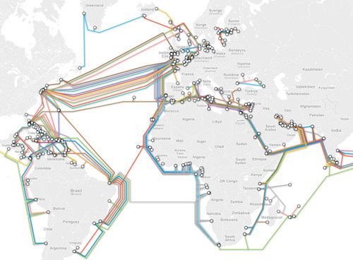
I like the colors in the graphic above, however, the version I found does not come with a key but if you click through you can see one. The internet does not always deliver material the way it was originally designed or in the way that we would prefer it.

So I went looking for the original, the one that would probably have had a key attached to it, and found this map of the same information instead.

The internet's undersea world | The Guardian

I realize it is hard to see the tiny thumbnail of a graphic so you can either click through to the full version at the Guardian or look through the images I’ve distilled from the original below.

The internet undersea world | Thumbnail from the Guardian

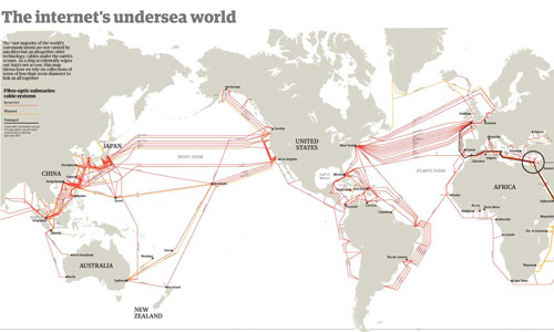
Besides the map above, which shows where all of the cables are laid out and is very similar to the colored version at the top of this post, the Guardian cartographers/infographic designers included useful contextual graphics. Often, there is much more to maps than just the map, and to fully understand why and how the geography matters, it is critical to understand characteristics of the relationship that are not available through the map alone. For instance, in the case of undersea internet cables, the paths and linkages indicate that connections between, say, New York and London are probably quicker than connections between Minneapolis and Leeds. But it is also useful to know how fat the cables are because this is a good proxy for their bandwidth. If the traffic between two points in this network approaches the carrying capacity of the cable, connections might slow down, there would be reasons to build more cables, and so forth.

Undersea internet cable width | The Guardian

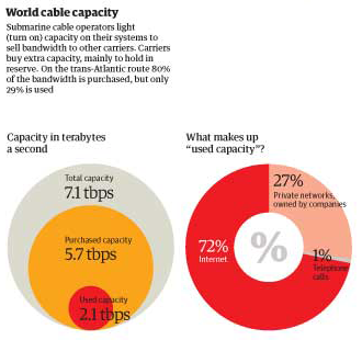
The Guardian carried on with this sort of critical analysis by showing how submarine operations sell capacity to other carriers, who mostly buy it as back-up. On the busy trans-Atlantic route, 80% of the capacity is purchased but only 29% of it is being used. This kind of arrangement is in place for times when communication bandwidth needs spike far, far higher than normal and when cables are cut.

World cable capacity, inset | The Guardian

Discussion

I was turned on to ferreting out these maps by a book I’m reading by Michael Likosky called “Obama’s Bank: Financing a Durable New Deal.” In the book, Likosky points out that one strand of the global internet infrastructure was privately financed, though still heavily reliant on governmental cooperation.

He writes:

In 1995, the US West finalized an agreement fo the construction of the Fiber Optic Link Around the Globe (FLAG). This $1.5 billion project would run a fiber-optic cable from the United Kingdom to Japan. In the process, it would link up twenty-five political jurisdictions. It contributed to a series of interlacing global information infrastructure project. Although underwater telegraphic cables had been laid at the close of the previous century, this project represented the first ever privately initiated and financed transnational communications link of this size and scale. FLAG was only as strong as the public guarantees of the twenty-five licensing authorities involved in legitimizing the project. In other words, it was a transnational public-private partnership.”

I was left wondering who financed the other strands of this aquatic internet infrastructure, realizing that it was probably more reliant on the public sector than the private sector, which is why FLAG is so unique. One of the reasons this matters is that global communications connectivity makes the current trans-national spoke and hub pattern of US business development possible. Without high speed communications connectivity, it would not be feasible for multi-national corporations to situate call centers and other communications-heavy activities far from the hub of commercial activities they are supporting.

If the US Federal government was indeed responsible for some of the early undersea internet bandwidth, I wonder if they had an inkling of how that might impact the development of off-shoring. It has been argued, though maybe not recently, that off-shoring is a good thing because it puts environmentally and socially negative jobs outside of America. Then we can reap all the rewards of growth up the management chain by locating the better jobs here. Clearly, it is irresponsible to locate environmentally detrimental projects in places were regulations are lax for the sake of increasing profits here. The same argument holds with respect to social ills like poor safety standards for workers, child labor, inhumane hours, and other negative working conditions. Increasing the ability to communicate instantly with far flung places makes the spoke-and-hub pattern more possible.

What needs work

Neither of the maps show who paid for the cables or who generates what kind of revenue from their use. I really want to know. I was hoping the color-coded one might do that, but without the key it’s impossible to tell.

References

Likosky, Michael. (2010) Obama’s Bank: Financing a durable New Deal. New York: Cambridge University Press.

Johnson, Bobbie. (2008, 1 February) How one clumsy ship cut off the web for 75 million people. The Guardian, Technology Section. Map graphic by telegeography.com.

Market data for natural gas, 1990 - 2011
Market data for natural gas, 1990 - 2011 | The New York Times

What works

If one graphic cannot tell the whole story, use three. Or four. Or four static graphics plus an interactive graphic (keep reading)! Most people would have stopped creating graphics after they produced the first graph – the one that tracks oil and natural gas prices from 1990 up to 2011. I appreciate the second graph which compresses the salient point from the first graph into a single line. It hammers home the point that what we are meant to notice is not the fluctuation in natural gas prices so much as the fluctuation in the difference between gas and oil prices. The other two graphics both deal with oil consumption only, something I find slightly odd given that the story is about natural gas. Yes, it is clear that there is a relationship between oil and natural gas consumption – we see that with the first two graphs. But we also see from the first two graphs that the relationship between oil and gas is not always predictable, especially not right now where natural gas is significantly cheaper than oil, cheaper than we would have predicted if we had to use the past as a guide. Yes, of course oil prices might go up as they respond to increasing demand from “the rest of the world” (weird terminology that means NOT US, Japan, or “developed Europe”).

It’s also true that oil prices are sensitive to political unrest in the middle east, which has been underway lately in a number of countries. It is difficult to tell if these graphs are using numbers crunched before the revolution in Egypt and unrest in Middle Eastern countries or after. The graphic was published 25 February 2011, well after the Egyptian revolution began. But the weekly price is listed in January 2011 dollars which means the rest of the information might have preceded the Egyptian revolution. Still, the path towards divergence appears to have begun in 2009, which renders the timing question I raised a bit beside the point. And this is why we look at trends over long periods of time. Point estimates can be misleading.

More is more

Natural Gas Fracking

The Times has been covering natural gas regularly, and it seems they decided that more is more in pursuit of a fully comprehensive understanding of natural gas not just as a brute commodity being traded in a free market, but as a potentially harmful environmental toxin, especially when it is seen as being at the center of brutal extraction practices. There is an elegant slideshow-animation that describes how natural gas is extracted and explains what the consequences of this practice can be as a result of the mechanical changes the drilling process leaves behind.

The combination of slideshow and animation works well here. If it were just an animation, it would be hard to fit the explanatory text within the temporal flow. Giving the viewer a chance to watch a small segment of animation and then read an explanation about what is supposed to happen and what can go wrong brings appropriate pacing to the explanatory experience. What’s more, I think it is a great idea to force the viewer to keep clicking in order to advance the slides. It’s barely above a fully passive learning experience, but anything that raises the level of participation – like reading or having to click somewhere – helps keep the viewer’s body and mind more fully engaged and pumps up retention.

My favorite slide came near the end – these people built up some narrative tension. I kept wondering where this drilling process went wrong. So when do the toxins hit my drinking water? That’s what I was wondering, and this slide filled me in. It’s a simple question, one that we know we’ll find the answer to based on the title of the slideshow, but it’s always good if your viewer goes in with some direction. An obvious question is fine. Getting viewers to envision a more complicated question might be better, but overall I think this approach works well.

Natural Gas Fracking - Water problems

Please click through to make sure you understand why fracking presents environmental problems. I do not want to spell it out here because I think that would lessen your experience of the interactive graphic as a learning tool.

References

Norris, Floyd. 25 February 2011 Two Directions for the price of natural gas and oil New York Times.

Graham Roberts, Mika GrÖndahl and Bill Marsh. 26 February 2011 Extracting Natural Gas from Rock [Interactive Graphic]. The New York Times.

PS

It feels like swearing to talk about fracking. Thank you, Battlestar Galactica.

Time and Newsweek Circulation from the year 2007

Time and Newsweek Reader Demographics - Table
Time and Newsweek Reader Demographics Table (US Pop. data from 2008 American Community Survey)

Time and Newsweek Reader Demographics - Graph

What works

These graphics accompany the graphic in my previous post about the counts of humanitarian images in Time and Newsweek. They are meant to give context to the methods section which describes these two magazines in terms of a few demographic variables and circulation information. I do not have access to the original source so I could not go back and get more demographic information besides household income and readers’ ages. It is possible that those were the only two pieces of information available in that source about reader demographics.

What needs work

The big question is: do you like the graph of the demographic data or should I just leave it in a table? I won’t tell you which way I’m leaning so as not to prejudice your opinions.

Go ahead, feel free to leave a one word comment (the one word being graph, table, or neither). If you’re feeling especially motivated, it would be nice if you explained your reasoning. But it’s August, so I’ll cut you some slack if all you can muster is a single word.

References

American Community Survey – 2008.

Mediamark Research & Intelligence (MRI). 2008 (Fall). Magazine Audience Estimates. New York: MRI.

Admissions rates at top schools drop | Yale Daily News

What Works

The above graph was produced by Yale Daily News. It is clean and does a good job of displaying their admission status compared to their competitors. The reason I thought it was worth mentioning is that a few small aesthetic decisions make the graph pleasing. I like the open circles. I like the fact that the ending values are included as numbers. I would have liked it if they had included starting numerical values, too.

Comparison

For those going through the college admissions process, it can be all-consuming. The New York Times runs a blog called The Choice that focuses solely on this process from the testing to wait lists to moving, transferring and everything in between. Unsurprisingly, then, they ran a table showing similar information about a larger number of schools which they gathered through a mix of old-fashioned reporting – contacting schools and asking them – and Web 2.0 reporting in which schools who had not made the initial deadline could email their data in to be added to the table. Have a look below.

The Choice blog at New York Times 2010 admissions data |  J. Steinberg
The Choice blog at New York Times 2010 admissions data | J. Steinberg

Ask yourself about the difference between a table and a graph when it comes to conveying information. Edward Tufte is a fan of tables because they can display a great deal more information than a graph. That is true in this case – look at how many more categories of information there are in the table. What do you think? When is it better to present a table full of all the details and when is it better to display a graph like the one above?

References

Lu, Carmen. (5 April 2010) Admissions game getting riskier. Graph. Yale Daily News.*

Sternberg, Jacques. (2 April 2010) Applications to Selective Colleges Rise as Admission Rates Fall. The New York Times “The Choice” blog.

*Note that I wonder if the graphic designer got the data from The Choice blog piece – the publication dates could just be coincidental.

The graph below was originally posted at Flowing Data with an invitation for readers to take the same information and display it with clarity and meaning. The image below is difficult to understand – it brings to mind one of my favorite tricks which is to see if the infographic would deliver more or less the same message if it were in gray scale. This one would suffer in gray scale even more than it already is, a bad sign.

The original chart showing the increase in obesity (confusing)

Jonas Sekamane took up the challenge posed by Flowing Data and came up with what you see below as a first stab. He said, “My main “beef” with the graph above, is that comparison is difficult, if not impossible. This is of course due to the data gaps, but it could easily be fix with a guideline of some sort. Adding an age-group average, makes it much easier for the viewer to see if the level of obesity is in fact high or low.”

The second draft - now there is a single trend line, but still confusing

But he didn’t rest on his relatively simple fix. He decided that starting over altogether would be the only way to wrestle this information into a clear, meaningful infographic. First, he massaged the data into a more visually relevant format by calculating, “an index in Excel where 100 = the age-group average.”

I agree with his assessment of the original – that it was too far gone to be saved. I’d also like to take this opportunity to address social scientists more accustomed to the writing process than to graphic design process. Just as a paper will require several drafts before it reaches it’s potential, most graphics get better with revision. And like this reworking proves, sometimes it is necessary to scrap it all and start over, even after you think you have something could work. The key is that you cannot fall in love with your graphic designs (or your papers). In order to maximize their potential, some of them will need demolition and redesign, not just a new coat of paint.

No more trend line - Easy to see that obesity is increasing, especially for young people

Reference

Sekamane, Jonas. (29 April 2010) “Obesity Trends – Makeover”

Flowing Data (29 April 2010) Challenge – Graphing Obesity Trends

Recidivism rates of US prisoners - reduced color palette
Figure 6.3 from Henslin's Intro to Soc - Recidivism of US Prisoners

On color

When architects draft plans and sections, they pay close attention to line weight. Part of the craft of draftsmanship is knowing which line weights are just right and making sure to apply the right line weight in the right instance. One of the criticisms older architects who were used to drafting boards and pencils levied against younger architects who draft using AutoCAD programs is that they just don’t do line weights properly. CAD displays layers in different colors and the younger architects were happy to rely on the appearance of these different colors as they worked on their monitors without making smart choices about line weights. When the documents were printed, all the lines could be the same weight, or if there were different line weights, they appeared to be arbitrarily chosen. Why were the older architects so upset? Because line weight carries meaning in architectural drawings. Get it right, and a simple section can speak volumes to the trained eye. Get it wrong and it’s like hearing a sentence without inflection (or perhaps worse, with inflections in the wrong places).

I feel the same way about color that the older architects feel about line weight. Color should mean something in a graphic. When the paint bucket comes out, there better be a reason for it beyond ‘decoration’. Graphic design is not about decorating otherwise drab diagrams. It is about enhancing the amount of information that can be communicated that privileges the image over the word because words always already require translation and the potential for misunderstanding.

The two bar graphs above depict the same information. One uses color with no apparent meaning attached to it – the bars are different colors just because it looks nice. The backdrop is yellow perhaps “to make the graphic jump off the page”. In my opinion, the full bleed back drop is like a heavy cloak, burying the information the chart contains in a Halloween costume. This Halloween celebration continues with the use of randomly selected colors for each bar on the chart. And the use of italics and bold where it isn’t needed is much like costume jewelry.

The gray-scale graphic uses color to highlight the originating question for the graphic. Each of the bars is shaded in accordance with the recidivism level for that crime – those imprisoned for auto theft have a 79% chance of being rearrested so that bar is 79% saturated with black. The bottom bar represents a 41% rearrest rate so it is 41% saturated with black. In this way, the saturation level reinforces the length of the bar and the numerical value printed in the bar.

References

Color graphic from: Henslin, James. (2009) Essentials of Sociology: A down-to-earth approach 8th ed., Pearson Publishing: New Jersey. Figure 6.3.

Gray-scale graphic: By Norén.

Michael Schwabs poster design for the Art Center College of Design in Pasadena, CA

How to go from inspiration to design?

There are plenty of great graphic designers plastering walls with posters, filling magazines with intelligent ads, and even getting their work into museums. A lot of the time, it’s hard to see how all the inspiration and excitement of graphic design for advertising can make it’s way into the information graphics social scientists use to communicate their findings.

I took a fake example to show you how I translated my appreciation for Schwab’s design into some thoughts about enlivening a basic line graph. Let me emphasize this one more time: this example is fake. I didn’t use real data. Yes, global consumption of meat is increasing per capita, but no, it’s not as dramatic at it appears here. I went ahead and left off scales on the X and Y axes to ensure this graphic doesn’t end up traveling around the interwebs as truth.

Step 1

Break down Schwab’s graphic. He’s basically got a right triangle sitting on a single color background that bleeds into a thick border. The border contains the only text. The only realist element – the pencil – intersects the triangle to make what is like a giant X in the center of the poster.

How is this at all like social science graphics? Well, if you flip the triangle, it’s a lot like any positive relationship as depicted by a line graph.

Basic positive relationship depicted by a line graph

What next?

Now that you can see how a line graph is a little like Michael Schwab’s elegant pencil poster we can start to apply his decisions directly to our graphic. First, we can add a clearer background. If it’s just white the thick borders do not read as thick borders. They just look like the same old place everyone puts their axial labels. I distinguish this by adding a background color which will pull the borders into a relationship with the background behind the graph. I also go ahead and fill in the area under the graph to help nudge it into reading as an area, rather than some jiggly line.

The tough part here is the graphic. Not all stories we want to tell are going to be linked to a slender X-making image. I chose to depict the rise in meat consumption. Sure, I could have picked a cattle prod or other cattle killing tool dripping with blood. It would have been slender and I could have made an X. But I was trying not to appear unbiased so I just went with an iconic image of a beef cow. I planted the cow in the middle. We do lose a few data points in the middle – there are ways to deal with that if it’s important (overlay a yellow line across our cow’s gut where the data points are missing).

Here’s what we’ve got. The point is that the graphic below is the basically the same data as our line graph above except far more arresting (I took the liberty of adding two more lines of text – not necessary, but I was trying to closely follow Schwab’s concept). If you are trying to keep the attention of the audience in a presentation, be they sleepy students or sleepy colleagues, it might be worth your while to take a little extra time on your most important graphics. And if you do have one or two major points you want the people to take away from the graphic, you can write them across the top or up the side. Writing up the side is not as good – use it only for secondary points or graphic credits in the case that you hire someone to craft your graphics.

Simple line graph copying Michael Schwab's concept

References

Schwab, Michael. (2009) “Instrument of Creativity” [poster design] Art Center College of Design in Pasadena, CA.

Hirasuna, Delphine. (2009) “Art Center’s Instrument of Creativity” in At Issue Journal: The Online Journal of Business and Design. San Francisco, CA.

Top 10 States by HIV Rate 1987 and 2007 (CDC data)

Top 10 States by HIV rate - modified

What Works

This data could easily have been thrown into a table – the bars make it a graphic. It is more visually interesting and instantly legible than a table, but are the bars enough?

What Needs Work

Most of the states on the top ten list in 1987 are not still on the list in 2007. That’s the most interesting part for me, and I would like the graphic to address that somehow — either by focusing on the four states that stayed on the list or by making sure it’s easy to see just how much movement there is on and off. What did the states at the top of the list in 1987 have in common? What about the states at the top in 2007? It appears that having a high percentage of the state living in urban areas makes some kind of difference but the graphic doesn’t give any clues at all about what is going on to get on or off the top ten list. Quite honestly, it doesn’t make sense to talk about the top ten states by HIV rate. It just doesn’t. That’s what the graph tells me.

I did try my hand at nudging the graphic in the right direction with the pink barred example. I don’t know if those converging lines pointing to somewhere outside the top ten help viewers to key into the large amount of movement on the list, but that is what I was thinking.

In the end, it would be better to go back to the data and come up with a more thoughtful analysis than to alter this graphic. The moral of the story is that the graphic can only be as helpful as the underlying data and the logic of the analysis.

Relevant Resources

CDC HIV Report – 2007

Centers for Disease Control. (2008) HIV/AIDS in the US – Factsheet

Kaiser Family Foundation. Topic: HIV/AIDS Fast Facts – Slides

The Story From Across the Pond

There are so many stories that get played out on the legal stage and the stakes are highest when death is involved. I found two graphics each of which attempted to provided an overview of the death penalty in America. We start with the view from London (though the writer of the article was in New York while he was writing).

The Death Penalty in the US - An Overview with an emphasis on Texas

The graphic they’ve come up with over at The Independent does a great job of summarizing the story of the death penalty in the US. The best part of this graphic is the right-most graph showing that the states with the death penalty started with lower murder rates and *still* have lower murder rates than those states that have the death penalty. Murder rates in both types of states change over time, but those changes seem to be largely independent of the death penalty. Great way to show that the death penalty does not make a good deterrent.

One last notable point from this article is that the graphic seems to do a better job at representing “just the facts” than the text. From the other side of the pond, the continued use of the death penalty in the US looks, well, barbaric beyond anachronism.

From Usborne writing in The Independent: “China tops the world’s executions league table (officially it used the death penalty 470 times last year, though Amnesty International believes the true figure is far higher), followed by Iran and Saudi Arabia. Among developed industrialised nations, only the US, Japan and South Korea persist in retaining capital punishment. None of the United States’ European allies entertain it nor do its neighbours, Mexico and Canada.”

In case you aren’t accustomed to decoding dry British writing, it is most certainly not a good thing to fall into the same category as China or Iran when it comes to human rights.

The Story from the Backyard

Not to be outdone, the New York Times has also run a number of graphics about the death penalty which is a recurrent topic of popular and academic debate.

Death Penalty Overview - The New York Times

Here’s where the difference between the US depiction and the UK depiction starts to stand out. The UK added up all the executions since 1976 which tends to imply a great magnitude of death. There’s a big red 409 over Texas in their graphic and ‘just’ 20 in the NYTimes graphic, because the Times took a statistician’s more favored approach of looking at the number of death sentences per 1,000 murder convictions. This makes it easier to compare state by state data because it acts as a control for population size and murder rate. In this version, Oklahoma, Nevada, and Idaho appear to be more invested in the death penalty than Texas. Don’t mess with Texas becomes don’t mess with Nevada. (I guess what happens in Vegas really does stay in Vegas…but not in a good way).

The NYTimes graphic also looks at the sentencing rates when the race of the victims and perpetrators are the same and when they’re different. The way they’ve simply represented the facts speaks clearly to the continued machinations of racism in America. When whites are the victims, the perpetrators are more likely to be sentenced to death, especially if those perpetrators are black. Look at that part of the chart for a while then think about why the writer from The Independent has such strong negative feelings about America’s death penalty.

The Story from the US – 2003

Juries Reluctant to Give the Death Sentence

This post is not about how the general population in America feels about the death penalty – check out some of the death penalty blogs listed below for more on public opinion. I was beguiled by this next graphic because it so simply illustrated ambivalence which is not all that easy. Each block is a case, every case has to have only one outcome with respect to death sentencing, and the designer manipulated this binary to produce a picture of declining conviction. Bravo.

The article’s text offered about five competing reasons for the decline in the rate of death sentences applied, including poor representation. They ended with this one:

Alan Vinegrad, a former United States attorney in Brooklyn, said the recent statistics represented something larger.

”It reflects that the tide is turning in this country with regard to attitudes about the death penalty,” Mr. Vinegrad said. ”There has been so much publicity about wrongfully convicted defendants on death row that people sitting on juries are reluctant to impose the ultimate sanction.”

Relevant Resources

About.com’s list of the Top Ten Death Penalty Blogs. Most are not big on graphics or visuals of any kind.

Amnesty International’s Human Rights Now blog which hosts their posts on the death penalty.

The Death Penalty Information Center

Liptak, Adam. (18 November 2007) Does the Death Penalty Deter Murders? in The New York Times. National Section.
–Including this, ““You have two parallel universes — economists and others,” said Franklin E. Zimring, a law professor at the University of California, Berkeley, and the author of “The Contradictions of American Capital Punishment.” Responding to the new studies, he said, “is like learning to waltz with a cloud.””

Liptak, Adam. (15 June 2003) Juries Reject Death Penalty in Nearly All Federal Trials. National Section.

Usborne, David. (7 August 2008) Why is the United States still imposing the death penalty? in The Independent.

Mapping the location of crimes committed in Brooklyn, 1998
Mapping the home addresses of the imprisoned population in Brooklyn, 2003

What Works

The beauty of these graphics is that, given their captions, they are instantly legible. On the left, the map shows where crimes are committed in 1998. It’s a diffuse pattern with a few warm spots. On the right, the map shows where the imprisoned population calls home (2003 data). It’s an image with vivid hot spots amidst a sea that’s mostly dark. In thirty seconds or less, viewers can see that while crimes are committed all over Brooklyn, the population in prison tends to come from a handful of very localized neighborhoods. It would have been easy, and easy on the eyes, to use two different colors for the different maps, but because this idea works as a comparison, it’s important to keep the color scale the same across both images.

These maps are used as tools of analysis and pattern recognition, helping to make data legible both for the public and for the researchers who use these tools not only as tools for publication but also as tools of analysis. They go further, augmenting these maps with finer grained maps as you’ll see if you keep reading.

What Needs Work

A stronger outline of Manhattan would help non-New Yorkers recognize the location immediately.

More Than Critique

This post reminds us that there are many victims of crime. The authors’/graphic designers write, “If crime maps succeeded dramatically in mobilizing public opinion, redefining the city as a mosaic of safe and unsafe spaces, and forcing the reallocation and targeting of police resources on specific neighborhoods, the gains were short-lived. The resulting crime prevention techniques, and the community-policing movement in general, soon reached the inevitable limits of any purely tactical approach. The city spaces that were targeted came safer, but too often crime incidents were simply displaced to other locations.”

Nobody is denying that being mugged or raped or murdered is fun for the person who was mugged or raped or robbed or murdered. But the report by the Spatial Design Lab at Columbia University sponsored by The Architectural League that uses maps as a tool of analysis and discovery to suggest that because perpetrators live in areas with lots of other perpetrators, those entire communities are also the victims, not of the crimes per se, but of the impact of high concentrations of recurrent incarceration. Convicted people go away to prison leaving these neighborhoods with a gender imbalance (only 12% of the prison population is female). The money spent to imprison this largely male population is not being invested in developing these communities. This study finds a block where $4.4m has been spent to imprison its one-time residents. One block, $4.4m.

Million Dollar Block, Brownsville neighborhood in Brooklyn 2003

The authors pose the question their maps have helped make obvious: “What if we sought to undo this shift, to refocus public spending on community infrastructures that are the real foundation of everyday safety, rather than criminal justice institutes of prison migration?”

Relevant Resources

Spatial Information Design Lab at Columbia University (2006) Architecture and Justice sponsored by The Architectural League.

Spatial Information Design Lab Main Page

The Architectural League