Archive: May 2009

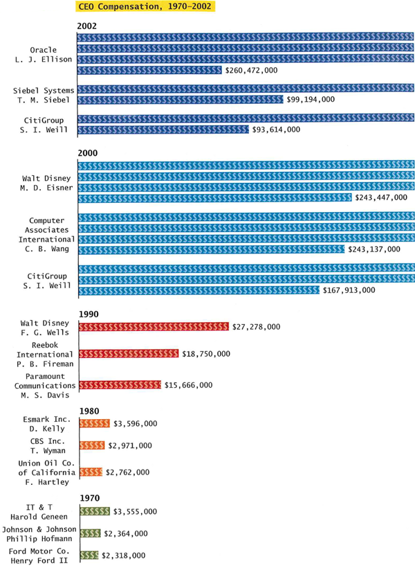
CEO Compensation 1970-2000 (Conley, D.)

What Works

This is a great concept because CEO compensation has ballooned relative to compensation for the rest of us.

What Needs Work

I would like to see some of the comparative data on compensation for the rest of the work force somehow, not just CEOs.

It would be nice for the graphic to say that the figures are all in year 2000 dollars.

Collapsing the bars instead of stringing them out diminishes the visual impact dramatically. If the highest compensation was displayed end-to-end instead of broken up and stacked it would look far more disparate compared to the 1970 compensation data. Now, realizing that this would skew the page layout, the graphic designer could have pursued a volumetric portrayal instead of just a two dimensional version.

Relevant Resources

Conley, D. (2008) You may ask yourself: An introduction to thinking like a sociologist New York: W.W. Norton & Company. p. 563.

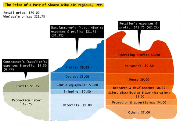
The Price of a Pair of Nike's in 1995 (Conley, 2008)

What Works

The smart thing about this graphic is that it does not oversimplify. The story about Nike that gets told in popular conversation often reduces the profit makers to a monolithic Nike entity. But here we see that profit is extracted at three points in the process – only one of those profit chunks goes to Nike, the other two go to the suppliers and the retailers. It’s also instructive to see just where the rest of the money is allocated – rent, shipping, materials, labor, import duties, marketing, and some rather large “other” catch-all.

What Needs Work

The shape of the shoe just confuses things. It makes it hard to visually compare the relative volumes of the various chunks. It would have been more helpful to skip the gimmicky shoe shape and line up the profit chunks in one row, the labor chunks along a row, and so on for ease of visual comparison. Right now “production labor – $2.75” for the supplier looks to be only a bit smaller than “materials – $9.00” for the manufacturer when in fact, they differ by a factor of three.

Relevant Sources

In case you recognize this citation from yesterday, I should say that I am currently looking at Intro to Sociology text books so I pulled a few things from the same book.

Conley, D. (2008) You may ask yourself: An introduction to thinking like a sociologist New York: W.W. Norton & Company, p. 399.

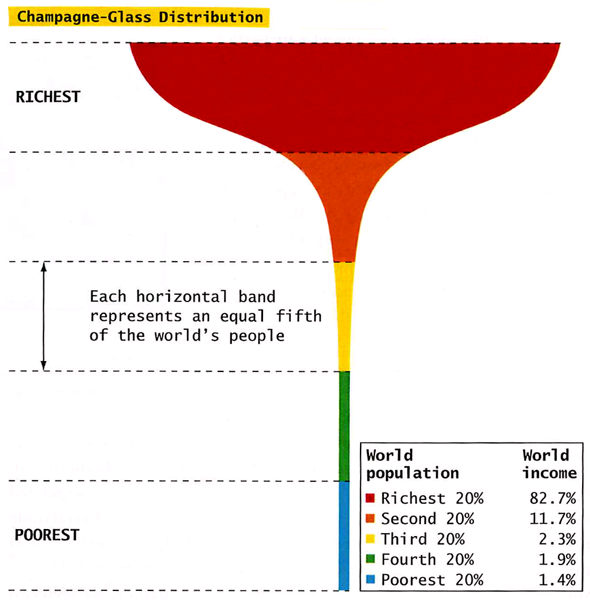
Champagne Glass Distribution from Conley (2008) You May Ask Yourself

What Works

This graphic works as well as it does in part because it evokes the too-delicate feel of a champagne glass in hand. All that wealth resting on so little. The shape does what a data table alone cannot – it subtly suggests that the wealthy are resting on the poor and that the balance is quite precarious.

Relevant Sources

Conley, D. (2008) You may ask yourself: An introduction to thinking like a sociologist. New York: W.W. Norton and Company. p.392.

Chandler, David. L curve [another graphic depicting wealth distribution by a mathematician/educator – it’s interactive.]

Update

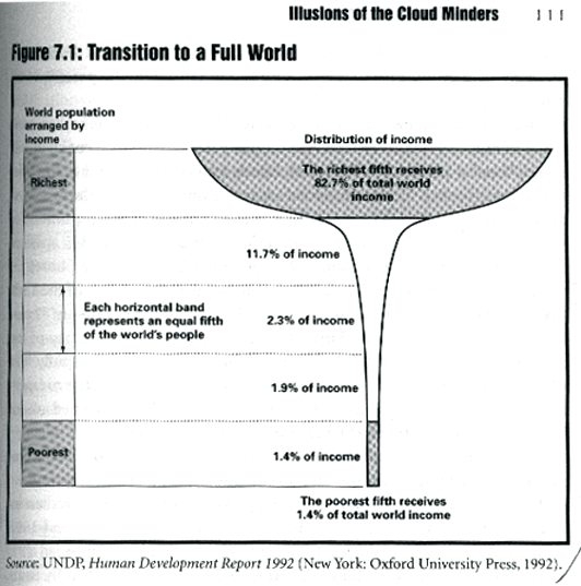
Champagne glass distribution of wealth from UNDP 1992, reprinted in "When Corporations Rule the World"
I found a much earlier 1992 version of the champagne glass distribution of wealth graphic and wanted to give credit where credit is due. It came from the UNDP 1992 “Human Development Report” and was republished in chapter 7 of When Corporations Rule the World by David Korten.

Deja poo - Visualizing wastewater recycling in commercial buildings (Wired, June 2009)

What Works

For some reason, sewage lends itself to visualization quite well. This info-graphic uses less than 100 words to describe the process of wastewater recycling in a commercial building. From toilet bowl back to toilet bowl via a potted garden in the lobby and a UV pipe light.

These kind of cartoon-like diagrams are quite useful as communication tools. The fact that they leave out important details is usually compensated by a verbal presentation or accompanying text.

What Needs Work

In this case, the accompanying text only references a few places where this system will be used in the future. There’s no word on whether it can be installed as a retrofit or any additional technical information about how it works.

Important unanswered questions

Just how many plants per person are needed in the lobby? Do most commercial lobbies have enough space for all that greenery? Could it be installed on a rooftop instead? Would the whole system work better if inhabitants adopted the “if it’s yellow let, it mellow; if its brown, flush it down” toileting strategy? What happens to the sludge at the bottom of the septic tank?

Relevant Sources

Illustration by Leandro Castelao for Deja Poo: The Living Machine Sewage System in Wired Magazine, June 2009: p. 32. Text by Nate Berg.