world cup

Diagram of a World Cup Game | Michael Deal, Umbro Blog

What works

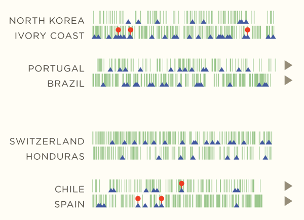
Right on, no? I think so. This comes to us from the Umbro blog where a much bigger version is available, designed by Michael Deal.

This graphic simplifies a match into completed passes, shots on goal, and completed goals. Each completed pass gets a thin green bar – no difference for the length of the pass (good decision, Michael) – which has the visual impact of displaying possession across the course of the game. And we all know how important possession is. Then the blue triangles show shots on goal and the red balloons show us where goals are made. The success of this graphic is a result of the simplification – we have only three channels of information – possession, shots on goal, goals. There was no attempt to break the team down into its constituent members, which was probably the most important decision. There was also no attempt to do much with numbers – no percentage of time under possession, no counting up all shots on goal, no display of penalties in any way.

Before I forget, this is a time line. The main organizing axis is time. In fact, the only organizing axis is time. There was no attempt to represent space. Great decision because representing space – like some map of the field – would have muddied up the message beyond recognition. Take home point: when the goal is to show change over time, just stick to time and leave space out of it. We all know what the soccer field looks like and we all know that it’s hard to take a shot on goal from far away.

To the right of the graphic proper, the little grey triangles show which teams moved on from the round of 16.

What needs work

For the football neophytes, I would have loved to see a small number where the little grey triangle appears (except for every game played by every team) that showed how many points the team racked up during that match. In the first round, I know lots of US fans had trouble figuring out the round robin scoring system all added up. And even if you are totally familiar with the rules of the scoring system, it got to be difficult to play out all the hypotheticals – I happened to be sitting in a room full of MIT PhD students during one of the early Germany games that was being played at the same time as a critical match in the same group. There were many, many hypothetical outcomes accruing different scores in group play that had to be imagined and added up in order to understand Germany’s chance of moving into the round of 16. Sorting them all out was not easy, not even for ten MIT PhD candidates. Having a little chart that at least kept clear which points had already been earned would have been useful.

On representing space
I know I said Deal didn’t need to represent space because the point was to show change over time. However, I had some thoughts about how he might have been able to represent space in football-centric ways that would not have cluttered up the simplicity of the visual.

If the length of the passes were represented by the length of the green bars (maybe in a 4-step range progression), would we have been able to detect differences in styles of play from one team to the next? Or from one time period during the game to the next? I know that this would have added much more time during the creation of the graphic without increasing the value all that much. But it would have been one way to give each team a little specificity. Right now, the only way we know which team is which is by looking at the names. If, say, one happened to know that Spain plays a short game, then we might have been able to recognize the Spanish-ness of a time line full of short green bars.

One other thought on representing space, shots on goal from inside and outside the box could have been rendered in different saturation levels of the same color. Keeps things simple but adds depth to the information displayed.

References

Umbro Blog. (30 June 2010) Football As Art: the vital stats as you’ve never seen them before.

Deal, Michael. [graphic designer] Michael Deal’s graphic design site.

What facebook has to say about the World Cup
What facebook has to say about the World Cup | New York Times interactive graphic

What works

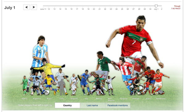
This is really fun to play with and technically sophisticated. Move the slider around the the image of the players grow and shrink relative to their mentions on facebook that day. Hold the mouse over a player and it will tell you their name, what country they play for, and the percentage of facebook wall posts in which they were mentioned that day.

Try it. You’ll like it.

What needs work

Of course, I lament the fact that so much time and effort is devoted to sport when it could be devoted to making similarly complex graphics about social science topics. On the other hand, I am somewhat glad that social scientists aren’t using facebook wall posts as evidence. Sure, they are useful within the realm of facebook, but even this example amply demonstrates that facebook is not holding a mirror up to the “real world”. (I believe facebook to be part of the real world, not a mirror of the real world. As such, it cannot be taken to contain some kind of 1:1 relationship with the rest of our experience, if only we can use bigger processors and more sophisticated techniques to analyze the steady flow of new data.)

I wonder how the mentions of individual players matches up with viewership information. While we’re wondering about that, I’d also add the wonder that the World Cup has inspired collective watching like nothing I can think of besides the Super Bowl and the World Series. Bars in Manhattan can barely contain all the people who want to watch. And people are watching on their computers (thanks univision!) at work. How does Nielsen deal with that? Will we ever have more or less accurate information about how many people watched the 2010 World Cup? Besides advertisers, does anyone care about how many of us watched this? (Personally, I’m curious to see the demographic breakdown of who watched – seems to skew quite young as far as sporting events go.)

Important note

Viva España!
But I won’t be posting to facebook about their match tomorrow because I’ll be too busy watching it. And then celebrating their win.

Reference

SHAN CARTER, BEN KOSKI and KEVIN QUEALY. (2 July 2010) Top World Cup Players on Facebook, Day by Day. New York Times interactive graphic.

World Cup Carbon Footprint | EU Infrastructure

Background

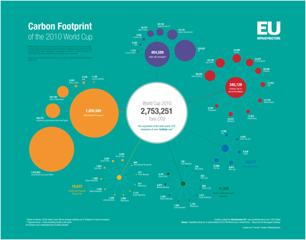
Timon Singh at EU infrastructure looked at the travel distance of the fans, the efficiency of the hotels, all the concrete used to build the new venues, and a bit of a credit for intra-venue mass-transit to create the graphic above. By way of comparison, the previous World Cup in Germany released far less carbon because the fans didn’t travel as far and they used existing venues instead of building new ones. So perhaps that isn’t even the relevant comparison, you’re thinking. Singh predicted that response and notes that this World Cup will release more carbon than the Beijing Olympics. Before I believe that claim, I’d like to see the numbers in more detail. No matter which one was worse, the point is that large-scale one-off events in which hundreds of thousands of people travel great distances come with environmental costs.

What works

I like these flower chain graphs, sort of. They are colorful and allow information of the same sort to be broken into categories; it is all about carbon emissions but we get to see all the different sources that funnel into the big pot in the middle. There’s plenty of space for labels and numbers to appear with the circles, which is critical.

What needs work

What do you think, readers? Is this kind of circle comparison easy on your eyes? I mentally struggle when circles get close in size and when I am trying to sort of visually add the area of two or more circles. Personally, I think a more linear version would have been easier for me to handle. The longest line would be the biggest carbon contributor, the color codes could have stayed, the labels could have stayed, and I would have had an easier time mentally adding one segment to the next. (I really wanted to try to mentally add all the ‘flight’ components together but I couldn’t do it visually so I ended up just doing it mathematically. But I could have done that more easily in a table.)

Reference

Singh, Timon. (June 2010) The carbon footprint of the World Cup. EU Infrastructure.

European football revenues, 2008-08 | The Economist

What works

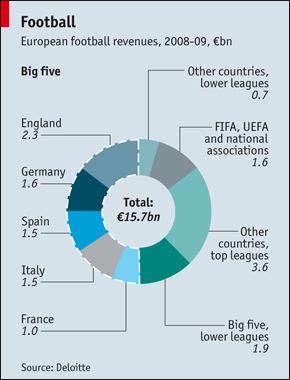
This is not my favorite graph (donuts, pie charts, any graph named after a pastry seems doomed to be difficult to digest). Having trouble finding much to like, except that it is about the economics of a current event, which adds a data-driven contextual angle to a cultural event. That part I like.

What needs work

The text accompanying this graph points out that, “Most of the money coming in from television, tickets and so forth goes out in wages. Deloitte says that only two of the big five, Germany’s Bundesliga and the English Premier League, operate at a profit.” However, the graph doesn’t give any indication of profit, only of revenue. It also doesn’t explain where the revenue comes from and goes to, which leaves this infographic horribly flat.

Further, reading these donut things, the next generation of the hated pie graphs, is visually difficult. Bar graphs would have been better. At least they included the numbers so we can forget looking at the graphic and just compare the numbers.

References

The Economist. (10 June 2010) “Football”.

Alcohol Statistics, England | from The Missing Graph

What works

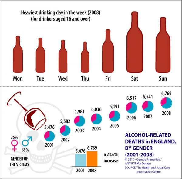
Leading up to the World Cup I am going to try to focus on World Cup related issues. It isn’t that much of a stretch to think about the relationship between sport and the larger category recreation, which often includes drinking. I found this graphic at The Missing Graph by Antiforma Design. The point here was to look at drinking in England – when is it happening? who is doing it? and who is dying? As you can see, men drink more and die more from drinking. Most drinking happens on the weekend and on holidays (there are more Monday and Friday holidays than other weekday holidays in England). Most alarming is that drinking deaths are increasing, not decreasing. Hard to blame it on the recession since the collection period ended in 2008 and increased the most rapidly from 2005 to 2006, a period of relative prosperity and optimism.

What needs work

I would have loved to see a couple more points of information about drinking in England. First, I assume that the information that generated the size of the bottles for each drinking day was somehow related to gallons consumed. I want to know those gallon figures per capita. Then we would be able to compare England’s data to some other country’s data, assuming we ever had a similar set of information about some other country (like, say, South Africa).

I would also have liked some information on what it is that these folks are drinking. Wine? Whiskey? Beer? Absinthe? Something from the bathtub? Perhaps the drinking culture of the country supports more beer drinking but the death-drinkers are drinking something else. Or maybe they just drink too much of the standard fare. Again, since I’m thinking about cross-national comparisons, I’m interested in things that might contribute to a deadly or less deadly drinking culture.

One other consideration: a friend of mine has long been interested in the relationship between drinking and HIV transmission. You’d think someone would have done extensive research on this because it’s rather obvious – drunk folks may have less in the way of cognition and patience when it comes to reaching for a condom. But it has not been well explored. Out of that existing curiousity of mine, I wouldn’t have minded seeing some trend lines for HIV transmission, serious auto accidents, and other sorts of ill-planned behavior that we might associate with drunkenness.

Overall, I love the notion that there is a blog out there dedicated to making infographics out of an intrinsic interest in presenting information for public consumption.

Reference

Primentas, George. (May 28, 2010) “Alcohol-related deaths in England” at The Missing Graph.