music

ZKO Rollercoaster // GREAT EMOTIONS from virtual republic on Vimeo.

What works

This short video does a pretty good job of teaching someone how they might learn to experience the suspense and exhilaration of classical music. I won’t try to explain it. I just thought Graphic Sociology readers might like it.

It got me thinking about how our senses work separately and together. I don’t experience chamber music as a rollercoaster but I might have learned to think of the peaks and swells of the musical dynamics this way if I had seen a video like this at the outset of my classical music listening. In a way, it’s a little like seeing the characters in a book come to life on screen in a movie before you get a chance to imagine them into life in your head. Once you’ve seen the actors and all of their particularities onscreen, it’s hard to reimagine the character otherwise.

As a radical empiricist, I hesitate to speculate about things like imagination that cannot be measured. Thus, let me be clear that I am not suggesting this one minute Vimeo could forever alter a child’s experience of classical music. Rather, I’m curious about the impact of an initial vision of something in comparison to both the initial aural and the subsequent visualizations of an experience. Does an aural first impression have the same impact as a visual first impression? After hearing a voice for the first time, can you imagine someone’s voice otherwise? I certainly can imagine aural qualities otherwise – I hardly remember the specific qualities of voices after hearing them only once. And I don’t think second and third visual exposures are as meaningful as the first one. But I have no clever experimental research in my back pocket that I can pull out to support or refute my position.

Are there any newcomers to classical music out there? Did watching this video provide enough of a framework to classical music listening that you think you would be more willing to do it going forward? And have you tried thinking of classical music as, say, a series of ocean waves (which was how I used to think of it)? Or some other kind of visual metaphor? Are you stuck thinking of it as a rollercoaster or some other amusement park ride (maybe the songs you don’t like are imagined as merry-go-rounds, pumping away repetitively to the point of nausea)?

References

Virtual Republic. (January 28, 2012) Video Advertisement of Classical Music as a Rollercoaster. For Zurich Chamber Orchestra.

Philosophy is concerned with questions of perception. Does what I have learned to call ‘red’ elicit the same sensory experience for you? Or are we seeing two different things that become equivocal only through language?

I cannot answer that question.

But I was thinking about it recently because I spend a lot of time thinking about how physical things cross boundaries into digital space. What gets translated well? What is lost? And are there properties of physical objects that are actually richer in digital space than they were when they were physically tangible?

The Shape of a Song
The Shape of a Song

Seeing sound

Coming up with ways to visualize sound is not new. Musical scores ‘show’ players what they are supposed to do in relation to all of the other players. But any good player knows that the score is no substitute for figuring things out together – there is always more to be worked out than the score would seem to allow.

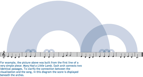
The project “Shape of a Song” by artist Martin Wattenberg and crew takes MIDI files and uses them to map out repetitive elements in songs in order to ‘see’ the patterns in the song.

The shape of "Mary Had a Little Lamb"

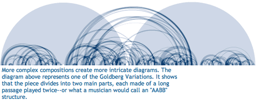
I found this to be quite enlightening, at least with respect to repetitive musical elements. It doesn’t do much for pitch, tempo, or anything else critical to song-making. The point is not to detail what is missing here, the point is that seeing the song diagrams helped me to think differently about the experience of listening to songs.

The shape of "Clementine"

This brought me back to the original quandary about whether humans perceive sensory input equally or differently. It seems to me that trying to depict sound as visual or the emotional register of an afternoon as sound requires border crossings, translation processes, that help pin down the original perceptual experience in such a way that it becomes more possible to assess whether the original perception is a shared experience.

The medium for this exchange seems to be a combination of emotion and hard-wired neurology which are not mutually exclusive categories. This isn’t a blog post about those questions. It is a blog for exploring the way that translating a perceptual experience – like hearing a song – into a visual infographic can change our understanding of the element (i.e. the song) in its original format.

First, just translating something into a visual medium might alter the emotional register. Colors are thought to have emotional registers. I’m not going to get into color theory in any kind of depth, but there have been a number of studies, some from evolutionary biology, that have shown red and orange to be routinely associated with danger. Thus, using them in graphics can evoke heightened awareness much like a little burst of adrenaline in a fight-or-flight situation would. Blue is supposed to be more calming; that’s probably why it is the go-to color for corporate America. All of the marketing people will have had color theory 101 beaten into them.

Secondly, translating a perceptual experience into something quantifiable offers are fairly rigid and particular framework for taking measurements and making assessments. I have a feeling that the quantitative turn itself has just as much impact on the interpreted meaning of the piece as the translation into a new perceptual format.

The shape of "The Goldberg Variations"

For ethnographers

Why are these questions about translation coming up? Because ethnographers – those whose craft is translating observations into written words – are constantly occupying themselves with the task of translating experiences and thoughts (often rather layered thoughts) into a static more-or-less linear narrative. Sometimes looking at how translation happens in another context – like from sound to image – can help isolate the process of translation so that the work of that mechanism becomes more obvious.

References

Wattenberg, Martin. (2010) “The Shape of a Song” at turbulence.org

Magnatune Pricing | Evidence from Voluntary Musical Album Pricing

Voluntary Pricing

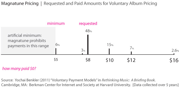
I put this simple bar graph together to illustrate the following text that I got from Yochai Benkler’s paper and he got from a paper about Magnatune pricing,

In the recent paper on Magnatune, the data revealed that over a five year period, 48% of users paid $8 per album where $5 was the minimum, and only 16% paid the minimum. Another 15% paid $10, 7.3% $12, etc., up to 2.6% who paid $18 per album. Payments were highly anchored around coordination focal points — for example, the drop down menu called “$8” the “typical” donation. While 48.05% of fans paid $8, only 2.93% paid $7.50 and 0.34% paid 8.50.

I wanted to see how these numbers looked as a graphic because it was a little hard to make sense of what was happening just reading about them. What concerned me was that Benkler seemed to have crafted his text to imply – but not state directly – that voluntary music pricing schemes lead people to pay more, not less, for their music. This would make a fantastic story, but for some reason I wasn’t entirely comfortable just going ahead with that implication tucked into my subconscious mind.

When I graphed it, I added a block on the lower end of the scale to help illustrate the fact that Magnatune will not sell albums below $5. So, if we were expecting a bell curve of payment choices, all of the people who might have paid less than $5 were bunched up at the $5 mark or priced out altogether. Maybe they grumbled and agreed to pay $5 when they would have chosen $2 or $3 or perhaps they just didn’t buy the album at all. It’s hard to say.

Of course, I wouldn’t really expect people to distribute their payments for an album along a bell curve. I would have expected more clustering around the lower numbers – why would people pay more if they could pay less? Especially because they may not have taken the time to listen to the whole album for one reason or another…so they are paying for something that is not completely known. We’ve all been there before – some songs on albums just aren’t as good as others.

On the other end of the spectrum are the people who not only have taken time to get so familiar with the music that they aren’t worried about the dreadfulness of the unknown. Benkler’s paper indicates that people who develop close relationships with the musicians through collaborative efforts or fansites might be willing to pay more as a sign of respect and admiration.

Getting back to the graphic as a mechanism for making sense of the information, the point is that there are actually FEWER people in the lower range than in the higher range. Nearly half of people paid the requested amount ($8) but where they deviated from the requested amount, more people paid decided to give more, rather than less.

How can we explain that irrational behavior? I’m guessing that it has something to do with the free riders, the people who aren’t paying anything at all. These are not people who are getting their music from Magnatune, these are the friends of those paying people who are sharing iTunes accounts and getting their new music for free. There are other ways to get music for free besides sharing iTunes accounts but I’m not trying to get into all that. My point is that, after having graphed this information, I feel reasonably assured that there are quite a few people who are listening without paying a thing. It doesn’t really matter to me how they are doing that.

What matters is that the shape of the graph and the distribution of payments that we can see leads me to believe that there ought to be a substantial proportion of people – at least 14% – who are free riders. That’s a very rough estimate, but it complicates the happy story that if musicians pursued voluntary pricing they might stand to make more. It’s hard to say if that’s true or not. I guess it’s nice to allow your biggest fans to ‘vote with their dollars’ and just shrug off the free-rider problem as being outside the pricing structure. If people don’t want to pay, they are going to find ways not to pay no matter how the pricing structure is set up. But if people DO want to pay more, they can only do so under a voluntary pricing scheme. If the prices are set, they cannot opt to ‘vote’ with their dollars and pay more.

*I stick ‘vote’ in scare quotes when I am linking it up to economic activity because I like to reserve the term voting for direct political participation rather than for political participation that is supposedly possible by participating in capitalist exchanges. I hardly think that consumer behavior is as critically important as electoral behavior. Not everyone agrees with me, but that’s not a topic for this post.

References

Benkler, Yochai. (2011) “Voluntary Payment Models” in Rethinking Music. Cambridge, MA: Berkman Center for the Internet and Society at Harvard University.

Introducing diagrams from a humanities scholar – Michael Gallope

Passing by a shared conference room last week, I was captivated by this series of graphics that Michael Gallope, a musician (electric organ) and scholar (Ph.D. student) at the NYU Humanities Initiative, developed to present his dissertation research. His work stems from his interest in music and an Adorno-inflected understanding of cultural criticism. Most of the rest of this post is by Gallope, which is for the best. He does a better job of telling you what his dissertation is about than I ever could. And I’m sure you’re sick of hearing my voice all the time.

I’m thrilled to see humanities scholars using diagrams to communicate their ideas. It helps. And that’s the point. It’s hard to get on the same page of a complex discourse if nobody is quite sure where that page is. Using words and graphics and…I don’t know…performance? Or whatever other avenues scholars have available to make sure that their points are clear and that the rest of the discourse can unfold is extremely useful. It’s not frilly, it’s not an add-on that’s ‘nice to have’. Communicating clearly is necessary for fruitful discourse. I, for one, tend to think that most academics are good at processing words and helped along by images. I don’t know if performances are always clarifying, but when the topic is music, performance is a useful mechanism for communication, not to mention a nice change of pace from the usual academic humdrum of meetings and presentations.

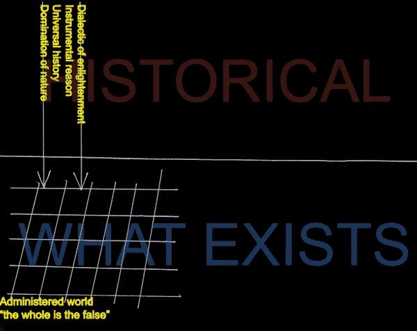
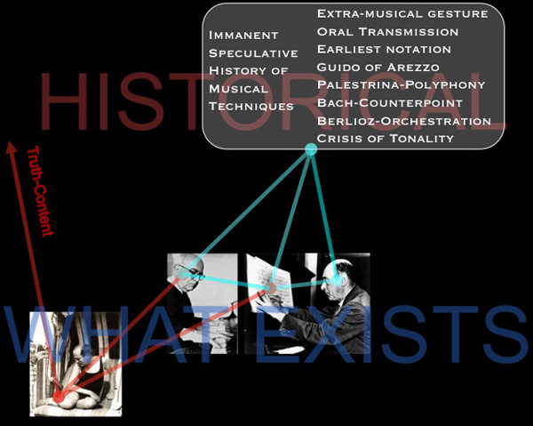
This is a representation of the role of negative dialectics in Theodor Adorno’s understanding of a resistant artwork.

Adorno -01
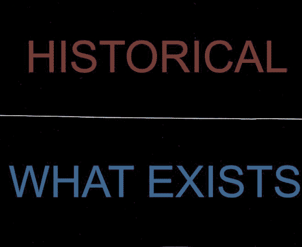
1. Below the middle line is “what exists.” Above is “what we can think.” If this were a diagram of Plato’s philosophy, everything above the line would be filled with ideal forms. But in Adorno’s philosophy, everything above the middle line is marked “historical” because Adorno believes in our power (indeed, our ethical imperative) to think about everything around us as *a congealed product of history.* Thus, if we were to think about a chair, we would not imagine a perfect immaterial chair in our heads (Plato). Instead, we would look at an actual chair and attempt to think about the history of this specific chair—all the industrial design, the history of chair-making, and the concrete manufacturing labor that brought this chair to be what it is.

Adorno -02

2. The arrows on the left side pointing down represent Adorno’s *universal* understanding of world history—that there is really just one history, and it is the history of an Enlightenment that never made any meaningful break from mythology, and thus, bequeathed to us “disaster triumphant.” We live in a world that, despite outward signs of historical progress, is in truth little more than a world of domination, cruelty, and un-reflective mechanistic thinking.

Adorno -03

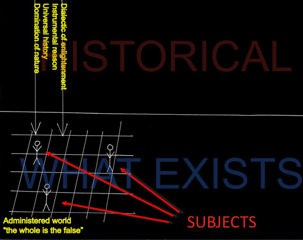
3. These stick figures represent existing subjects. Their capacity to “think freely” does not escape the strictures of existence (as dictated by universal history), thus they are securely “on” the grid.

Adorno -04

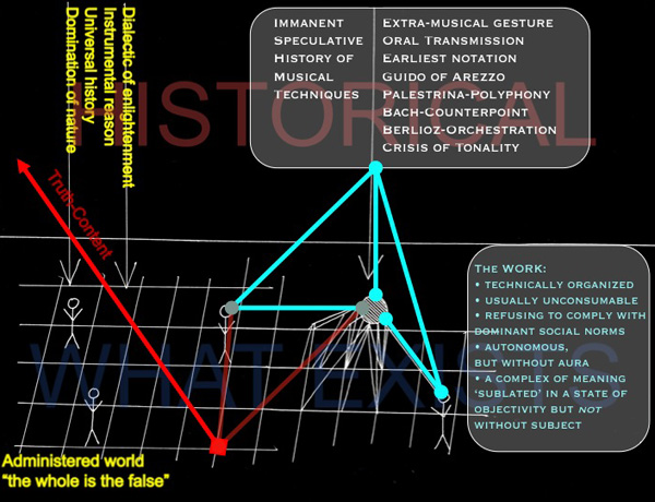
4. For Adorno, there is an important way for a subject get past the impasse of a devastated world: one must find an exemplary work of art that seems, itself, to recognize the horrors of modern existence. This is represented on the diagram by the white beach-ball drawing that is attached to (but struggling out from) the grid of existence. And of all the arts, musical works were exceptional in indicating an obscure sense of resistance, suffering, or utopia, in Adorno’s vocabulary. Now the question arises: how do you know a specific musical work (like a composition by Schoenberg) is genuinely resistant?

Adorno -05

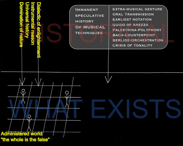
5. We answer this question by thinking of the musical work at hand as historical. In order to do that, we adopt a quick and dirty universal understanding of the history of music as having its own history of musical techniques (chant notation, polyphony, tonality, new orchestration techniques, discourses on absolute music and romanticism, a crisis of tonality, etc.). This is represented by the bubble above the musical work that, like universal history, points down to the work that exists, implying that thinking it is a necessary prerequisite for understanding a musical work. Why? Because a resistant musical work understands that it cannot just imitate the music of Bach or Mozart in the twentieth century—it must have a historically honest relationship with the modern state of musical composition. (Certain techniques, like the diminished seventh chord, have lost their power to astonish, and thus should be laid aside).

Adorno -06

6. If one links this cognitive historical recollection of music history with the act of composition (represented by the stick figure to the lower right of the work), one might end up composing a certain kind of musical work that seems to refuse the adoption of any simple musical cliches (as in some of Schoenberg’s atonal compositions). If this has happened, the work must then be heard by a listener (represented to the left of the work) who understands precisely this very same history. When composer and listener and work are linked together, one can then think of this work from the perspective of an “immanent critique” that might negate (via the red arrow) the horrors of the existing world. Only then, through a kind of mirror reflection, do we get a glimpse of what Adorno calls “truth-content” or Wahrheitsgehalt in German. By negating (and only by negating) the horrors of modern life, do we glimpse a sense of the utopian.

References

Adorno, Theodor. (1983 [1966]) Negative Dialectics. New York: Continuum.

Gallope’s music projects:

Janka Nabay and the Bubu Gang (as featured in a 2010 Village Voice article)
Skeleton$ an avant-rock project led by composer Matt Mehlan
Starring a riot-prrrog psychedelic music collective

Selling Out:  How do musicians earn money online? | Information is Beautiful via Flowing Data
Selling Out: How do musicians earn money online? | Information is Beautiful via Flowing Data

What works

Here’s another graphic from David McCandless atInformation is Beautiful (though I came across it when Nathan Yau wrote it up at Flowing Data) which was originally motivated by McCandless reading a piece written by independent recording artist Faza at The Cynical Musician. After the infographic hit the blogosphere, Faza ended up receiving some sort of secondhand criticism which he then countered by trying to explain what he was up to in a follow-up blog (see below for all the blogs in question).

Here’s how he described what he was originally trying to figure out:

“Most of what I write (apart from broader policy or economic issues) is aimed at the independent artist. I’m one myself, so I know the pain all too well. I know that deep down the independent artist hopes for the day when they are making enough money to be able to concentrate solely on their art.

The independent artist does not have a huge fanbase – the evolution of the Internet thus far has not changed this. The independent artist has few resources and usually cannot afford a huge marketing push. The independent artist’s financial situation largely depends on getting the most from her limited fanbase with the least expenditure possible. The biggest bang for the buck, if you will.”

This was in response to folks who pointed out that the future of the music is the past (ie live performance) or that the the profitability of music is not just in the ticket sales but the merchandise! Rightio. But Faza pointed out that for truly independent folks who do not have the resources to get out there and market themselves, going on tour and selling a bunch of tickets (and merch) probably isn’t going to happen. And, selling band t-shirts online is tougher than selling them at concerts, so the interwebs aren’t exactly making a huge difference there either.

10.000 ft view
10.000 ft view

One more thing before we get to the graphic itself. When I was fiddling with it in photoshop I realized that I had a greater appreciation of it when I started with the 10,000 foot view and then slowly zoomed in.

The colors are good. For some reason, black + some bright color is a good idea when it comes to contemporary cultural products like music and fashion. Smacks of a certain dynamism and ‘cool’ factor, which is just the spot this graphic is aiming to hit. Of course, the black + bright color = cultural cool formula will change and it doesn’t mean there are not many other components that could add up to cultural cool. Just saying, I think the basic strategy with the full bleed black background and a single bright color (100% M) is working here. The growing circles also do a good job of making the point that streaming music will not pay the bills and neither will selling downloads on napster or other similar sorts of sites.

The most surprising fact for me was that self-pressing a CD and selling it directly to consumers was more rapidly profitable than any of these other options. New respect for all the folks in New York and LA who have stopped me and tried to get me to buy their music while I’m walking down the street/beach.

What needs work

My biggest issue with this graphic is the the little pie charts are really where it’s at – they are not part of the big picture story that the more ‘advanced’ online music sales techniques are the less profitable per unit of effort they are for the artists. The little pie charts try to show us how the money is allotted. But the revenue pie is never a full pie and it’s difficult to tell where the money that doesn’t go to the artists or labels is going. Some clearly goes into things like the cost of the physical CD (where there is a physical CD) and some goes to the other players involved, right? But how much? And who are these other players? And why choose a pie graph technique if the pie is never completed and the incomplete part is not fully specified? In the end, what those pie charts do is compare revenue streams to two recipients – labels and artists – while offering a general sense of the amount of money going elsewhere (though we don’t know where that elsewhere is). Maybe a flowchart of dollars moving from consumers into different pots would have done a better job of demonstrating that portion of the story.

I would also point out, from a sociological perspective now, that minimum wage is both a logical reference point and a difficult reference point. Minimum wage puts a single person just over the poverty line but the poverty line is incredibly low. Poverty lines are tied to the cost of food rather than to some composite cost of daily living that includes not only food but rent, transportation/energy, health care, and all of those things that people have to spend money on which have increased more rapidly than the cost of food. It’s my long-winded way of saying that even if artists could make minimum wage they would not actually be able to live comfortably, especially not in cities like LA and NYC where there are large, vibrant music scenes. They would have an easier time in Nashville.

References

Faza. (10 January 2010) “The paradise that should have been” at The Cynical Musician.

Faza. (15 April 2010) The paradise that should have been – revisited at The Cynical Musician.

McCandless, David. (13 April 2010) How much do music artists learn online at Information is Beautiful.

Yau, Nathan. (4 June 2010) “How little musicians earn online” at Flowing Data.

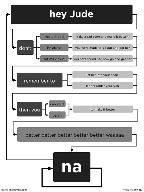
Flowchart of Beatles song 'Hey Jude' created by dannygarcia inspired by jeannr

What Works

I love it when I find evidence that someone has taken something not at all visual or even all that hierarchical and turned it into an information graphic. It can be difficult to convince people (and here I mostly mean academic sociologists) that developing information graphics is a critical part of communicating research findings or teaching concepts. Coming across examples like this helps – then again, it’s pretty easy to dismiss this as a silly exercise unrelated to the important work sociologists are doing.

I love the loop on ‘na’ at the end.

Good use of gray scale, too.

What needs work

I am now curious about developing a way to understand how to choose a path. When should Jude ‘make it better’ vs. ‘let her into your heart’?

References

dannygarcia at the blog Danny Garcia.