internet

Obama Inauguration Animation - FlowingData

What Works

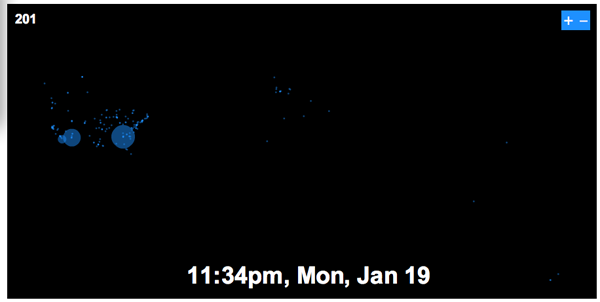
This is an animation based on twitter data from Obama’s inauguration day in the US – Inauguration was at noon. In case you weren’t a twitter user at the time, it is worthwhile to point out that twitter had partnered with Facebook for the day to increase usage. Both twitter and facebook were encouraging users to point their comments towards the topic of the inauguration.

I like it because its like watching fireworks from above and gives a tangible sense of the excitement amongst Obama fans that day. Best thought of as an emotional animation of political temperature than as any kind of quantitative data. I wouldn’t even call it an information graphic/animation. I would call it popcorn, animated.

What Needs Work

I have the same problem with this animation that I have with twitter which is that I really don’t know what good they do, even though I’m intrigued. I’ve been trying to figure twitter out by using it and I still don’t see the appeal. Thus, it is quite alright to think this animation is pretty, but dumb.

Relevant Resources

Flowing Data (2008) Worldwide Inauguration via Twitter

World Wide Web Usage - Browser Market Share

What Works

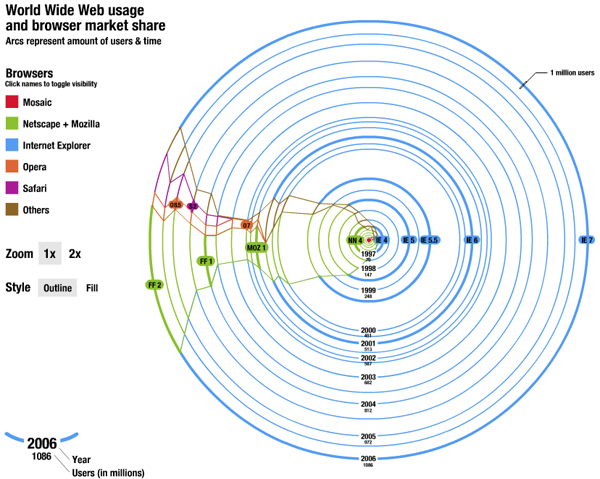
This is one amazing piece of advanced pie chart. The trouble with mapping browser market share is that the number of people online keeps growing so absolute numbers don’t mean anything for more than a minute – most figures with respect to market share are giving no more than a cross section, a snapshot in time. This goes way beyond that and breaks out of the cartesian coordinates, too.

This works by starting at T=1, a red dot in the middle of the graph when the internet was in its infancy. At that point Mosaic was king which got clobbered by Netscape. Then Internet Explorer grew and then took off when it started to be bundled with all Windows installations. Remember those lawsuits? Who can forget. Netscape became Mozilla, which is now known as Firefox to most of us. Safari and Opera have some share, but it’s negligible. The game now is between IE and FF with enough representation by the smaller browsers that we cannot ignore them.

The graphic is great as it shows how many total users are online over time and what proportion of those users log-on with IE, FF, Safari, Opera, and others. So smart. Even managing to capture the changing names and ownerships of the browsers without cluttering things up with text box descriptions.

What Needs Work

I’m so impressed by this that I can’t think what needs work. Here’s where readers come in. What is wrong with this graphic? Anything? It was just a class project, so it’s hard to fault him for anything, even little things, knowing that he wasn’t aiming for a professional audience.

Relevant Resources

Gimpl, M. (2006) Systems of Representation – Affective Map Exercise. Research Group at Media Lab Helsinki.

amazon.com, walmart.com, target.com, kmart.com
City Data
City Data

What Works

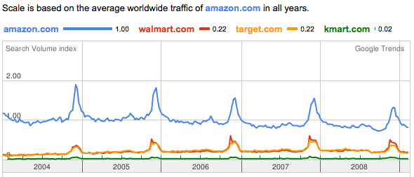
This is a graphic generated by one of google’s trend analysis tools. I simply typed in the web addresses I was curious about and google graphed their relative traffic patterns, using the first page I entered to set the scale. In their words, this is what the tool does: “Google Trends analyzes a portion of Google web searches to compute how many searches have been done for the terms you enter, relative to the total number of searches done on Google over time. “ If I were you, I would ignore the value of the scale and just keep in mind that it is relative. We’re measuring not total volume, but the volume of these four sites relative to one another.

Amazon clearly has far more traffic than the other three sites. Because walmart, target, and kmart rely on their physical stores, just looking at this web traffic does not tell you much about relative sales. I don’t who else is like me, but I often use amazon as a sort of loosely organized reference site, finding it faster to look their for publication dates of books than to go to my library’s site or fish the book off my shelf. I might be an outlier in this regard – most people don’t spend time every day wondering about publication dates – but there is probably a fair amount of traffic on amazon related to their product reviews that may not result in sales at amazon. All of this activity generates traffic, not sales. All three of the other retailers also feature customer reviews, by the way.

What works here is sort of unclear. On the one hand, just look at how similar walmart.com and target.com are. They track each other so closely they are visually difficult to distinguish. And just look at how important the holidays are to all these retailers.

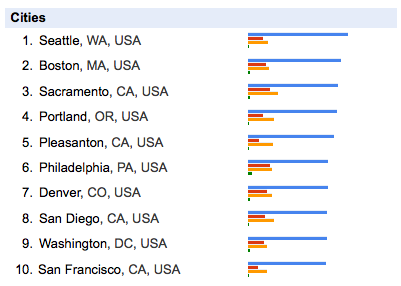
The city data relies heavily on which website is input into the search field first. Seattle might not have even been included if I had put walmart.com first, but many cities in the south would have been. Minneapolis would be up there if I had put target.com first. kmart.com first motivates Philly to the front of the pack.

What Needs Work

My biggest critique of this sort of thing is that it’s unclear what the heck to take from it. If you are just trying to beat some competitor, having google show you their relative traffic is immensely useful. But what else is this good for? Anyone?

Let me just point out that this only works for large sites. Google can’t tell us much about the vast sea of smaller sites.

Open Access – Transparency

In the end, though, the move towards making data publicly available is fabulous. I can’t see how this particular instance is broadly useful to me – it’s fascinating, sure, could be good for marketing departments internal to these companies, but then what? My confusion just means that I am a short-sighted fool. Google should be applauded for creating a non-prescriptive tool to explore the data they have that is so basic it can be used by anyone for who knows what.

Relevant Resources

Benkler, Y. (2006) The Wealth of Networks: How Social production Transforms Markets and Freedom. New Haven: Yale University Press.

Google Trends Information.

Google Trends the digital widget or digi-wigi.

Himanen, P. (2001) The Hacker Ethic. New York: Random House.

Raymond, E. (2001) The Cathedral & the Bazaar: Musings on Linux and Open Source by an Accidental Revolutionary. Sebastopol, CA: O’Reilly Media.

Network Structure of the Internet - Carmi et al

Necessary Background

This visualization is going to take a bit of explaining. Mapping the internet is a question that has intrigued folks who are worried about internet security, the digital divide, robustness, even artists who just wonder about all those bits of information flowing around us.

Remember The Matrix?  Couldn't help but mention it here.
Remember The Matrix? Couldn't help but mention it here.

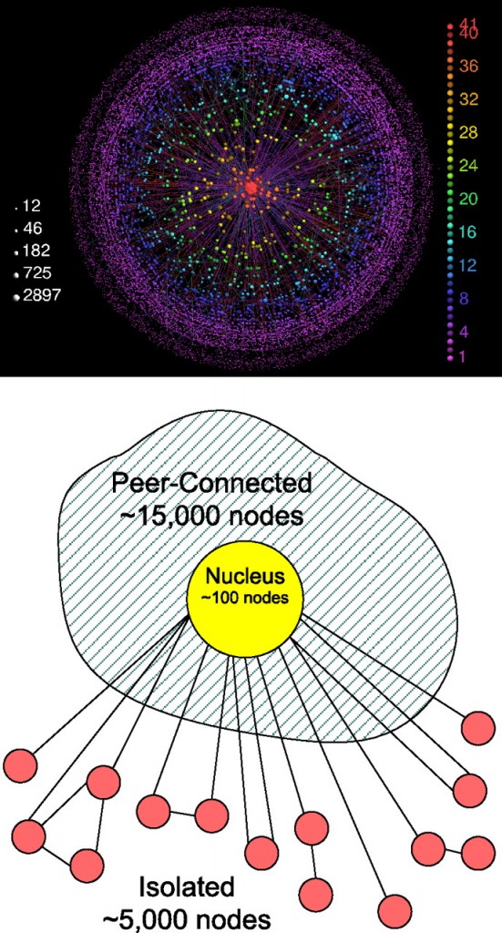
This visualization attempts to describe the structure of the internet as a network, not to map its black holes, censorship holes or describe actual geographic nodes like Akamai in yesterday’s post. This is a different sort of map and it requires some background reading. The authors set up a strategy for exploring the network terrain of the internet that generated these three areas – the central nucleus area consisting of the most highly connected nodes, a fringe around the edges of a whole bunch of pages that would be cut off completely if the nucleus were removed, and then a sort of spongy area in between these extremes full of nodes that could connect to each other if the nucleus were removed but not nearly as efficiently. Call it the peer-to-peer zone.

Here’s how the authors described the process that generated the three classes of nodes:

First, we decompose the network into its k-shells. We start by removing all nodes with one connection only (with their links), until no more such nodes remain, and assign them to the 1-shell. In the same manner, we recursively remove all nodes with degree 2 (or less), creating the 2-shell. We continue, increasing k until all nodes in the graph have been assigned to one of the shells. We name the highest shell index k max. The k-core is defined as the union of all shells with indices larger or equal to k. The k-crust is defined as the union of all shells with indices smaller or equal to k.

We then divide the nodes of the Internet into three groups:

  • 1. All nodes in the k max-shell form the nucleus.
  • 2. The rest of the nodes belong to the (k max − 1)-crust. The nodes that belong to the largest connected component of this crust form the peer-connected component.
  • 3. The other nodes of this crust, which belong to smaller clusters, form the isolated component.

Even if you don’t spend your days dividing networks into k-shells, I hope you now understand that this model’s strength comes from the fact that the structure was generated rather than imposed by initial assumptions. There were no initial assumptions.

What Works

Success here is that people who do not study networks can understand what these researchers did at all. Most highly specialized research (and pretty much all research is highly specialized) only makes sense to the people occupying the sub-sub-discipline actively working on those questions, equipped with the right language, fully immersed in the discourse of the niche. That would have been true if I had just tried to read this article without the accompanying image.

I also think it helps immensely to see the sketchy, comparatively unglossy schematic along with the polished final image. The glossy version adds in enough detail that I might have missed the big picture without having the schematic there to remind me that it isn’t about color or distance – that the contribution is all about the three types and their relationship to one another.

What Needs Work

Similar problem with this image as I had with yesterday’s image: the final image is so glossy and sealed that I feel like it’s hiding something. The more gloss on an image, the more it becomes impenetrable to critique. It presents itself as hermetically sealed – how can anyone get under the skin and assure themselves that this is a trustworthy image? This glossiness of the final image is probably why the schematic has so much appeal. It’s easier to see how the two were put together and *why* it is the way it is.

Aesthetically, I am not sure I like the colors and I think I would have tried to achieve the look of a solid core, a very fringe-y outer layer that has more volume but is almost insubstantial in its lacy-ness, and then a middle layer that sort of looks like a network made of jello. It is so easy to say these things when you don’t have to kill yourself in photoshop and illustrator making them happen.

Note

[There is another post on Graphic Sociology about mapping the internet about visualizing the map of an individual site which is here.]

Relevant Resources

Carmi, Shai; Havlin, Shlomo; Kirkpatrick, Scott; Shavitt, Yuval; and Shir, Eran. (2007) “A model of Internet topology using k-shell decomposition” Proceedings of the National Academy of Sciences of the United States of America.

Moskowitz, Clara. (11 April 2008) Black Holes Charted on the Internet. msnbc.com, Technology and Science.

Reporters Without Borders (2007) Internet Black Holes.

Wachowski brothers (directors, writers) The Matrix.

Akamai Internet Traffic - Click Through for Interactive Graphic

Internet Traffic

This week we’re going to have a look at the internet. Here are two reasons why:

  • 1. The not entirely superficial reason is that there are many great visualizations out there dealing with the internet, internet traffic, internet usage patterns, and so on. Many are interactive so you can play around with them yourselves.
  • 2. The larger theoretical question about studying the internet and online behavior goes something like this: How much is people’s online behavior reflective of their offline behavior? Are people role-playing when they’re online, trying out personas they may not fully embrace offline (see Sherry Turkle)? Or is online behavior seamlessly integrated with offline behavior? We IM the people we’re about to have dinner with indicating that the people we talk to online are just about the exact same people we talk to offline? And if the relationship between online and offline behavior is somewhere between these two, how can we figure out just what is going on?

What Works

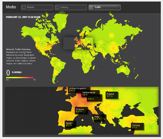
The graphic above is just a screen capture from Akamai’s site. In order to get the full impact, you have to click through and play around with it. Akamai has a slew of other visualizations you can play with that deal with network attacks, latency/network failure, retail data, news traffic, and so on.

Just to be clear, Akamai is a private company providing web-optimization services. In their shareholders’ quick facts, they say they serve up 10-20% of global internet traffic. What does this mean? It’s easy to forget that the internet requires physical structures, but this is part of what Akamai does. They maintain “40,000 servers in 70 countries within nearly 950 networks” all over the world slurping up electricity and information at about equal rates. The reason they do this is because if you are, say, a blogger in New York and you store your files on a server just down the hall (which is unlikely, but play along), if someone in Singapore wants to read your blog, the request is going to have to come all the way from Singapore to the server down the hall from you in New York and then the files will have to be sent all the way back to Singapore. This takes time, there might be network congestion along the way and if you are serving your readers in Singapore something a bit more bandwidth intensive than text (say a little clip of a new car racing around a track or a high quality music download) the person in Singapore may just lose interest before they even get the whole file. Akamai gets around this in part by duplicating files and storing them on servers all over. So if your reader in Singapore wants to access your site and you’re an Akamai customer, they will end up pulling those files from a server much closer to them, maybe in Singapore, but at least somewhere much closer than New York. Akamai’s clients tend to be Fortune 500 companies with global client bases and companies that rely on being able to transfer heavy files reliably and quickly (like music and software downloads). They do more than just the physical infrastructure, they mobilize their resources to detect net attacks, congestion, and then to re-route and avoid those things. The bottom line for us is that they make some of their knowledge of the ‘net available in these visualizations like the one above.

What Needs Work

I would love to have more granularity and access to the actual numbers and the methodology. All these shiny interactive graphical toys run the risk of being too glossy, not data-transparent enough.

Not as Shiny, Quite Helpful

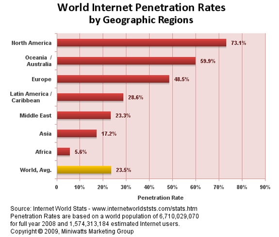
Internet Global Penetration Rates - Internet World Stats
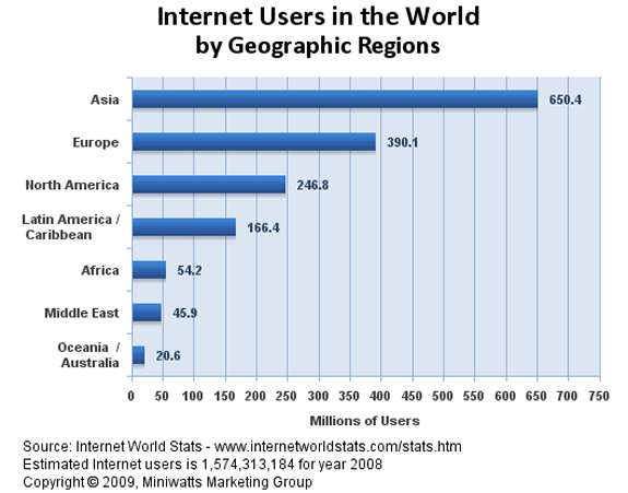
Global Distribution of Internet Users - Internet World Stats

These two graphs give a quick overview of who is using the internet by geographical location. You’ll see that rates of traffic can be a bit misleading – not all continents have the same population. That’s why I included the rate of internet penetration within the continents. A low rate of penetration tells you a lot about how the digital divide which is a very real problem. More on that later this week when we will address the digital divide directly. For now, it’s enough just to notice the difference in looking at the flashy, glossy Akamai graphic and the simple bar graphs. I don’t know about you, but I quite enjoyed playing with the Akamai graphic and encourage interactivity. Still, the combination of these two bar graphs above gave me a clearer answer to the big question about who in the world has access to the internet in the first place.

Relevant Resources

Akamai – Data Visualizations

The Berkman Center for Internet and Society at Harvard University School of Law.

Deibert, Ronald, Palfrey, John; Rohozinsky, Rafal; and Zittrain, Jonathan (2008) Access Denied: The Practice and Policy of Global Internet Filtering Cambridge, MIT Press.

Internet World Stats

Turkle, Sherry. (1984) The Second Self: Computers and the Human Spirit Cambridge, MIT Press.