food

Food Blog Study | Web Crawler Progress Egg

Food Blog Study Update

I heard there was a graduate student once who used egg timers to break her dissertation down into writeable chunks. She had these timers all over the apartment, flipping one over to start a new bout of writing. Once it ran out, she might keep on writing since there was no buzzing or beeping to interrupt her. If she looked up and the sand had all run through, she would flip over another egg-timer to measure out a dose of ‘free-time’. Maybe I had her strategy in mind while I was trying to come up with a way to monitor progress on the food blog study. Large, long-term projects can envelope me, making it hard to see either where (and why) I started the project and where I mean to end up while I’m toiling away in the trenches of the day-to-day. This post is not about a final product. Rather it is about how I use information graphics to help me keep my mind on both the questions I started with and the place I mean to end up when all is said and done.

The food blog study is broken into three parts. The interviews (N=22) have all been conducted and are out being transcribed. The survey cannot begin until the web crawler has gotten to a stopping point. So where do things stand with the web crawler? That is not an easy question to answer except to say that it is doing what good bots do, chugging along finding food blogs to add to its growing collection with minor down times for maintenance here and there.

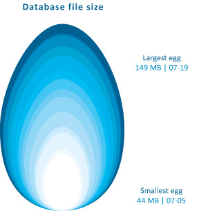
The graphic above demonstrates how the network set is growing – I simply used the file size of the daily cumulative db output to tell me how big to make each day’s egg. Still, looking at file size is kind of silly – it does not help me figure out when the network has been sufficiently crawled. It simply represents the absolute size of the database and because I do not have some target absolute size as my endpoint, knowing the current absolute size is mere trivia and not analytically useful.

Rather than considering absolute size or the linear growth of the network data, it is a lot more meaningful to examine the rate of change of new nodes from one day to the next. For comparison sake, I graphed both the linear growth of the network (top graph) and the number of nodes added per hour for each day in July (bottom graph) with the exception of July 17th when the crawler was down for maintenance. The linear growth is chugging along consistently enough with a few exceptions for reasons like maintenance and accidents (someone unplugged my computer from the internet for six hours one day. oops.). The rate of new food blogs added to the network set per hour is finicky, a pattern that is much easier to see in the bottom graph. That graph was calculated by taking the number of new food blogs added to the network during a given run and dividing it how long the run lasted to generate an hourly rate of growth. That hourly rate is what is plotted below – the crawler’s sweet spot seems to be when it is adding about 60 – 90 new food blogs per hour.

Food Blog Study | Graphs of Web Crawler Progress

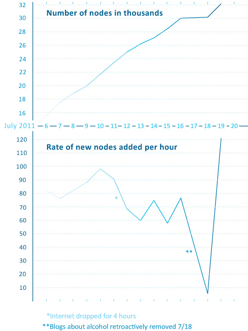
The plunge in the rate of new blogs added per hour around the 18th of July is artificial. I happened to add a command that day which retroactively removed all of the blogs primarily focused on cocktails, wine, and beer. Their removal nearly outweighed the new food blogs that were added to the network that day so the overall rate of new blogs added appears to be extremely low at only 6 per hour.

This graph is extremely useful for keeping in mind where I started and helping me to figure out when I have gotten some where. I will know that the food blog bot is exhausting new nodes and that I have started to run into the bounds containing the food blog network when the rate of newly discovered food blogs per hour starts dropping and does not recover. Right now, the crawler is still pulling in new entries fairly rapidly so I know I am probably going to be babysitting it for at least another week. Thus far, the roughly-cleaned network includes about 32,000 nodes. Yes, folks, that means there are greater than 30,000 food blogs out there in the world. Probably a lot more, especially because the bot speaks food in English, Spanish, French, Italian, and German so the network under consideration is multi-national though not quite global.

Note on graphics

Could that egg have been perfectly round? Yes. And would perfectly round circles have been easier for average humans to measure with their eyes? Yes. So why did I choose an egg shape? Because I feel like this project is an incubation period. Data collection can be a delicate process – I would say that is especially true with respect to the web crawler because it was a tool custom-built for this project and thus has not been used and tested elsewhere. I also chose an egg because it is not important if viewers understand exact figures – this graphic was intended to provide an impressionistic view of the rate of growth of the network that the crawler is gathering. It grows incrementally, not by leaps and bounds. Like tree rings, the concentric nature of these eggs demonstrates that some days generate fatter rings than others.

As for the two graphs, I wanted to try using the same horizontal access because I wanted to make sure people understood that those two graphs are best understood as a pair. Basically, one is the derivative of the other, though there’s no need to pull out your calculus textbook just to understand these two. The top one just shows the total number of food blogs in the network so far. The bottom one shows how fast new blogs are being added from day to day. I didn’t want to clutter up the graphs with too many words so I opted to go with a single horizontal access, short titles, no labels for the vertical access (they are implied in the title), and I kept the two points about strange days outside of the bounds of the bottom graph. I don’t know if it is acceptable to stick asterisks in a graph, but I did it.

References

Noren, Laura. (2011) Food Blog Study.

Anatomy of a Cupcake | Allen Hemberger

What works

Not all information graphics arise from the same design process. In this case, the graphic creator went so far as to make a video of the creation process so, if you are so inclined, you can click through to Allen Hemberger’s “Things” blog to see how the Anatomy of a Cupcake went from sketch to photography and then to poster-sized graphic. If you love it maximally, you can even buy a print. [Note: If you like Hemberger’s work he has a food blog “The Alinea Project” and a photography blog.]

I chose this image for three reasons: first, I love that Hemberger took the time to make a video showing the process of going from idea to a tightly composed stylized photograph. Second, I am always happy to find people who construct information graphics differently. This one is a hybrid between photography and baking. What makes it work is the proper execution of both the baking and the photography as well as the care that was given to the original sketches that determined the storyboard for the idea. If the flow chart failed, he could have had the same cupcake components and the same photographic skills, but ended up with something that was merely ‘cute’ rather than something that is simultaneously aesthetically pleasing and clever.

The third reason I chose this image is even more personal than the first two. My summer research project, funded in part by Microsoft Research in Cambridge, MA, uses food blogs and food bloggers as a lens for focusing on the tensions between material and immaterial creative skills. I’m interested in figuring out how people move between the material world in which all of their senses can engage with a process and the not-quite-as-material world of the web in which the sensory world is reduced to the visual (though in some cases there is an audio component). The rest of the sensory experience of the material world has to be represented by text, photography, and graphic design. Why are there so many food blogs when food is something that has long been understood as a part of the material world that has to be tasted and smelled in order to be experienced properly? Why do people choose to blog about food and what keeps them going? Making and serving food are also ritualized practices for building connections between people – it is one of the primary physical elements through which culture is expressed. How does the collective experience of food work online?

The project has three components:

1. A web crawler is out poking around the English-speaking portion of the internet, creating a network of all of the food blogs that are linked in some way to an initial list of 50 top food blogs. So far, we have about 22,000 blogs in the English-speaking food blog network. Visualizations coming in another 6 weeks or so. The point of the web crawler is to see how many food blogs there are, how they connect to one another, and whether or not there are discernible lobes of the food blogosphere (say, for instance, a vegan lobe or a molecular gastronomy lobe). Because the food blog network is a grassroots sort of place – very few people are getting paid or prodded to start blogs and they are then free to link to whomever they want – there are some interesting social network questions we can answer about self-selecting networks. For instance, how many outlinks do food bloggers use? Is there geographical clustering or is the network oblivious to geography? Are bloggers who are more heavily linked to (or from) more likely to keep at it?

2. Once the crawler begins to reach a plateau in terms of adding new links, we will stop it, clean up the returns a bit, and then take a random sample of blogs who will receive an invitation to participate in a web-based survey. The survey does three things: it gathers blogger demographics (gender, race, age, kids or no kids, location, education, income), demographics of the blog (proportion dedicated to restaurant reviews vs. recipes, frequency of posts, perceived and measured audience, site traffic, comment traffic, presence on twitter and facebook, amount spent and earned), and the survey finishes with a few questions about motivations and perceptions of one’s blog.

3. To help construct a good survey instrument and to deepen the context within which the analysis of the survey results will take place, I am also interviewing 20-25 food bloggers. So far, the interviews have been fantastic. They are much better at getting at the nuances of practice – especially the crafting practices that are part of cooking/baking and blogging (photography, writing, graphic design, and online social networking…this last one may not be a craft practice).

All of this has been taking up a significant portion of my time and keeping me away from the blog. However, as the data comes in, I will have an opportunity to make graphics from scratch, rather than critiquing other people’s work all the time. I start to feel a bit like Oscar the Grouch when I’m in the midst of a string of critiques, especially since I know my own work is far from perfect.

If this blog uses the first person more than normal, it is because I have been reading so many food blogs where writing in first person is the norm. This just goes to show: if you want to be a good writer, be a good reader. The linguistic and grammatical styles we read eventually start to influence the way we speak and write.

References

Hemberger, Allen. “Anatomy of a Cupcake”.

Loneliness and Fat Consumption among middle-aged adults | Cacioppo and Williams

What works

Written by a social neuroscientist, the book Loneliness contained this heartfelt graph on page 100. Yes, even I feel the phrase ‘heartfelt graph’ is an oxymoron. But the way that the graphic artist worked over the details here – the way the edges of the butter columns are rounded, the way that the paper is folded back, even the way that the grid lines are rendered makes this two bar graph captivating. I am also intrigued by the mix of digital and hand-rendered – most everything was hand-drawn except the axial numerals and the text labels. I like the mix. I probably would have liked it better if the lettering had also been hand-rendered but I think that’s just me being a bit too precious about hand-rendered images.

The book describes the way that loneliness is a neurological event, one that overlaps with social and psychological parameters to produce a more or less predictable set of occurrences. In this graph, authors Cacioppo and Williams are discussing recent findings that indicate lonely middle-aged adults tend to get more of their calories from fats than non-lonely middle-aged adults. For younger adults, loneliness does not seem to have an effect on either food consumption patterns or exercise patterns.

Socially contented older adults were thirty-seven percent more likely than lonely older adults to have engaged in some type of vigorous physical activity in the previous two weeks. On average they exercised ten minutes more per day than their lonelier counterparts. The same pattern held for diet. Among the young, eating habits did not differ substantially between the lonely and the nonlonely. However, among the older adults, loneliness was associated with the higher percentage of daily calories from fat that we noted earlier (and that is illustrated in Figure 6).

Perhaps because this book is about empathy-inducing loneliness, it is especially nice to see a tenderly hand-drawn graph rather than something far less engaging, the standard excel-produced item. The same numerical information would have been conveyed – and in fact that information was conveyed fairly well in the text itself – but the hand drawn element indicates that the topic is worthy of more than quantitative concern alone.

I am about halfway through this book and so far, I recommend it. Even if you are not interested in loneliness, the book does a good job of demonstrating how diverse research fields can be woven together to examine a topic common to all. The book draws from psychology, sociology, evolutionary biology, and neuroscience to help explain why some people are lonelier than others and what the impact of loneliness can be on the short-term and long-term health and social outcomes for individuals.

What needs work

For the record: I cannot draw or render or do anything good with a pencil besides finding a way to hold my hair out of my face. I tend to be overly appreciative of drawings and people who can draw. My critique here is of myself and others like me who swoon over the hand drawn.

I also wish there might have been a way to get the exercise information included, if not on the same graph, than on a companion graph right next to the butter sticks.

In a public announcement sort of way: folks lonely and nonlonely seem to take much solace in eating. That’s a large amount of fat consumption.

References

Cacioppo, John T. and William Patrick. (2009 [2008]) Loneliness: Human nature and the Need for Social Connection. New York: W.W. Norton.

Caloric availability in the US by food source, 1970

nutrition_circles_1990

nutrition_circles_2008

What works

These infographics are based on data from the United States Department of Agriculture. They depict the calories available per capita for the average American. It’s not an exact measurement of what’s on everyone’s plate, but it’s not bad. They made adjustments for waste and spoilage (which is not insignificant in this bountiful country of ours) saying:

Data on the availability of different foods per capita is adjusted for losses like spoilage and waste. Take for example the produce that goes bad at grocery stores or the leftovers tossed into the compost. By calculating such food losses, the USDA data closely approximates the amount of food that actually makes its way from the farm into the average American stomach.

This leaves us with a decent proxy for what passes through the average American in terms of nutritional categories. I think they’ve done a good job of breaking the categories down – looking at added fats and sugars as their own categories is useful and infrequently done in the world of nutritional infographics.

One more thing: this infographic is actually an interactive graphic that uses a slider bar to move across time. It’s a bit more pedagogically useful than the stills I have posted here. I encourage you to click through and play around with the full version of this infographic.

What needs work

Adding up the 2008 numbers shows a total intake of 2678 calories per person per day up from 2169 in 1970. As an infographic, I think this could have done a better job of showing the growth in total consumption – maybe just a bar somewhere that is either broken down by category or not. This is a meaningful change. The purpose of the infographic is to communicate that the change has mostly taken place in the grain category but that’s a little tough to see. I imagine part of the reason it’s tough to see is the way the graphic is constructed – lots of things are changing besides grain. But it’s also a problem inherent in the numbers since grain doesn’t change all that much. However, I still think this could have been done more clearly without the bubble approach. I still argue that the best way to show changes over time is by using line graphs. Humans are very adept at translating an upward sloping or downward sloping line. Of course, people tend to think that the upward and downward sloping lines are horribly boring and gravitate to bubbles and other mechanisms of pizzazzification.

References

Jezovit, Andrea. (5 April 2011) Is Grain Making Us Fat? From the Civil Eats blog as part of an ongoing collaboration between Civil Eats and the UC Berkeley Graduate School of Journalism.

Cheesecake Recipe Diagram | Keys Corner

Trick or Treat

This post has nothing to do with sociology. It offers proof that I should probably learn to leave things alone sometimes.

Recipes

I have long had this hunch that recipes would be better depicted not as lists of ingredients stacked upon lists of instructions but as something more well-integrated. I have many times forgotten an ingredient or messed up an instruction, and I like to think that better graphic design might be able to get me out of this problem. Professional cooks already tend to know which ingredients require what kind of process within certain recipes. For instance, when making cookies, the first step almost always involves creaming the sugars and fats together. But if you didn’t know this and you were used to making cakes (in which the wet and dry ingredients are kept separate from one another), you might absentmindedly tally up all the dry ingredients with your fats when making cookies. That would be a mistake.

So I found the recipe diagram above which is based on the Nassi-Shneiderman structured flowchart and thought it was worthy of consideration.

But…

I wasn’t thrilled with it. In particular, I couldn’t figure out why there were so many separate ‘mix’ steps when some of those ingredients could clearly be mixed in all at the same time. I also wasn’t all that keen with the way the heating instructions were handled. I was also perplexed at the way in which the graham cracker crust was just thrown out there as an ingredient – most people make this from scratch (but I don’t have the ratios for that on hand so I didn’t try to rough them in lest someone actually use this as real recipe).

Here is my modification of the diagram, in grayscale even though I know it would look snazzy in color.

Cheesecake Diagram
Cheesecake Diagram

I still have difficulties with this diagram – where are the instructions? “Mix” is too broad a term. The other problem is that I still need to incorporate mention of tools into the diagram. This is related to the lack of instructions generally – if it said ‘hand mixer’ and ‘medium speed mix’ that would be clear enough for me. There has to be a good way to list ‘spring form pan’ in the graham cracker crust box, too. I could have just tools into the text, but that seemed to be cheating on the graphic sensibilities of the diagram. If there is a reason to be listing tools, one should have a place to put them outside the mention of instructions. That’s my biggest problem with recipes – all of the tools, times, temperatures, techniques, and ingredients are mashed together.

What needs work

I am not convinced that further modifications to the Nassi-Shneiderman flowchart are going to solve my problems. There has to be a better way to depict recipes that can provide the overview at a glance – including tools – but that doesn’t sacrifice all of the necessary details.

References

John. (2005) Key’s Corner Blog

Shneiderman, Ben. (2003, May) A Short History of Structured Flowcharts (Nassi-Shneiderman Diagrams) Department of Computer Science, University of Maryland.