family

Living Single is More Expensive than Marriage? | The Economist Online

What Works

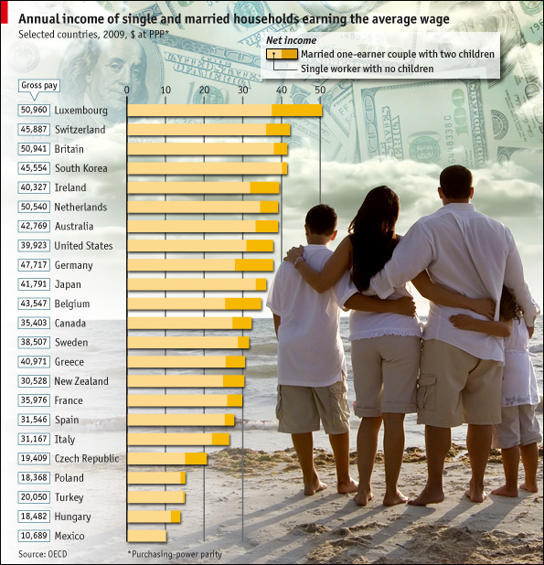
In this particular case, where the point is to show the difference between two groups (not three or four) it is acceptable to use the stacked bar graph approach. This technique emphasizes the difference between the two groups. When people use the same technique with three or four groups, it becomes very difficult to pick out the visual differences. But the folks at the Economist stuck to two groups and it does show the difference in earnings between singles and married-with-two-kids people.

What Needs Work

The picture is not helping anything. Please, people, think twice before inserting stock photography in your infographics. There should never be an element of an infographic that fails to communicate information clearly. The whole money in the clouds motif is also…questionable in terms of the art direction.

Aside from my qualms about the aesthetic choices, I have a more important contention. It would seem that the point of this graphic is to suggest that married people operate under more favorable tax laws than unmarried people. If that is the case, I think it would be nice to see some information about the taxes coming into play. I say this in part because the commenters to the article revealed that they mistakenly believed this data is pre-tax. But it isn’t. Furthermore, this graphic implies that marrieds have more money on hand than singles in the same income brackets, but that isn’t necessarily true either. Those kids do cost something – they need clothes, food, bigger houses, bigger cars, and an endless list of other things. So even though Mr. and Ms. Single do not take home as much, I bet they have fewer carrying costs. Granted, the graphic is about taxation policy, not about discretionary spending opportunities, but it fails to emphasize taxation and leaves itself open for other interpretations. These interpretations are available for your reading pleasure in the comments section following the original post. I do encourage you to read the comments because it makes clear that people do not read, not even the single paragraph of explanatory text.

Reference

Economist Online Staff. (11 May 2010) Single supplement: The average single worker takes home less than his married counterpart. The Economist online.

Divorce rate - the short and incomplete story

Zoom in and it looks like poverty could be good for marriage

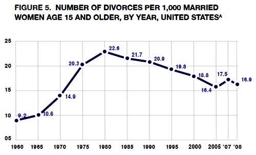
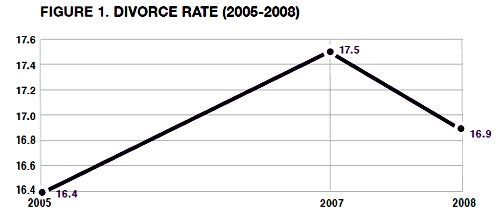
Philip N. Cohen from the Family Inequality blog (and the sociology department at UNC Chapel Hill) sent along the two line graphs in this post saying, “For the last week I’ve been steamed about these two figures from a report on marriage by W. Brad Wilcox.” [Note: W. Bradford Wilcox is the director of the National Marriage Project at the University of Virginia where he is also Associate Professor of Sociology.] The zoomed-in graph above was used in the main text to show that the divorce rate is going down during the current recession. Poverty must be great for marriage! No matter how folks feel about their spouses, they must feel more strongly about having enough money so they stay together. Or, to put it slightly differently: what unemployed person is about to leave the comforts of an intact home, even if that home is a disgruntled one?

Cohen goes on to point out that Mr. Wilcox’s strategy of zooming in on the data was also picked up by the media who are happy to run a story about the unexpected positive impact of the recession on lasting marriages.

Mr. Wilcox did include a complete picture of the divorce rate since 1970 in his appendix which is copied below.

Divorce rate in the US |  1960 - 2008
Divorce rate in the US | 1960 - 2008

Zoom out and it just looks like the divorce rate hit a speedbump on the way down

As evidenced by this line graph, the divorce rate has been declining for years. The brief period of increasing divorce from 2005 to 2007 was more like a speedbump in a declining trend than the end of a trend of increasing divorce rates.

Read more about why this matters at Philip Cohen’s blog.

An improved graphic

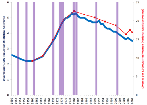
Philip Cohen's sketch including recessions in purple

My point is simply that all infographics tell richer stories the more data they depict. Zooming in is generally a bad idea because it reduces the context from which the reader can draw solid conclusions. If the recession were going to be part of the story about divorce, recessionary periods should be indicated on the graph, too. That would make it easier to tell if all recessions tend to decrease divorces or if somehow a decrease in divorce just happened to coincide with this current recession. It’s easy to ‘lie’ with info graphics by being overly selective. And lying just isn’t what we’re after.

References

Wilcox, W. Bradford. (2009, December 11) “Can the recession save marriage?” in The Wall Street Journal. Opinion Section.

Cohen, Philip. (2009) Recession, resilience, divorce?” in The Family Blog.

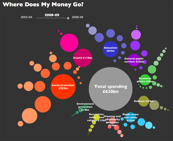
Where does my money go? in the UK - Open Knowledge Foundation, raphic by Iconomical

What works

This visually arresting graphic does a great job of presenting data about national spending in an apolitical but altogether fascinating way. It’s interactive, by the way, but I’m not commenting on the interactive part, just the static graphic. I find that getting the static graphic clear is an important first step towards making a functional interactive graphic. If ever I hear someone say ‘but it’s interactive’ as an excuse for having a weak static graphic, I cringe. See my post about the USDA mypyramid food guide for a case study on the importance of a strong relationship between the static and interactive iterations of graphics as tools.

Each dot represents a different department or governmental program with the size corresponding to the funding level. Smart.

If you link through to the originating site, you’ll be able to follow blog posts that take readers through the development of the graphic. They ask for input and do their best to incorporate it. I like that approach. Good use of technology, OKF.

What needs work

I can’t quite tell why the circles are arranged the way they are or why their hues are the shades they are. Graphics, especially the beautiful ones, are the best when their simple clarity gives way to an elegant complexity. In other words, when I pose the question: “why does the hue vary within given funding types?” I’d like the graphic to lead me to an answer. I’m sure there is a reason for each hue, I just haven’t been able to figure it out.

One tiny, American-centric request: Add ‘UK’ to the page or the graphic somewhere. Maybe change “Total spending” to “Total UK spending”. Or “Where does my money go?” could be “Where do UK taxes go?”. These here interwebs are global. Yes, of course, the £ symbol tends to give it away. Maybe I’m just being too picky.

References

Open Knowledge Foundation. (2009) “Where does my money go?” United Kingdom. Data available

Excerpt from "Knot Tied" infographic at GOOD magazine
Excerpt from 'Knot Tied' infographic at GOOD magazine

What works

I cropped what you see above from an infographic that is part of GOOD magazine’s infographic section called Transparency. If you haven’t checked it out, I highly recommend it.

This was the strongest part of the graphic. It does a masterful job of elegantly illustrating a relationship both in space and time. We see that in 1998 hardly any states cared enough about gay marriage to have banned it or legalized it or had any kind of vote whatsoever. Except Alaska. Hello, Palin family. By 2004 the issue had hit the big time and gay marriage bans blanketed about half the country. The east coast showed signs of tolerance. Finally, in 2009, the east coast is holding out against a national tendency towards homophobia. Iowa surprises many by legalizing gay marriage.

What needs work

Please click through to the larger graphic. I feel that the map time series is by far the strongest part of the graphic. Perhaps because it is so elegantly simple, it was shrunk and deposited in the lower right corner.

References

Porostocky, Thomas. (2009) A History of Gay Marriage in Transparency, a section of GOOD magazine published out of New York and Los Angeles.

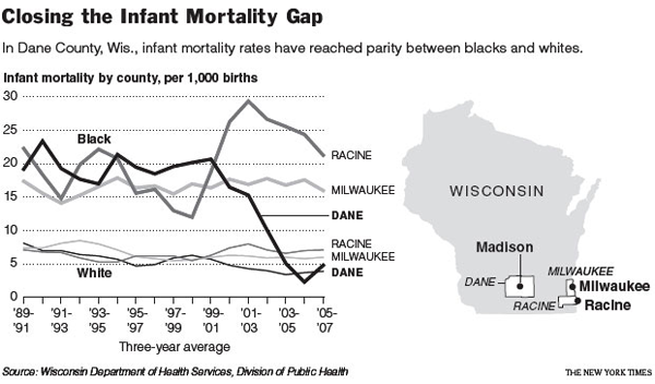
Infant mortality gap between blacks and whites in Wisconsin

What works

I like the inset map. Architects often include a small site map in the main exterior section of a new building to help the viewer understand where the building is in relation to the rest of the world. News programs often start out international stories with maps. I love that this line graph comes with an orienting map. I might have included just a shadow of some neighboring states simply because many Americans have only a fuzzy idea of where Wisconsin is. Sad but true.

The lines show a great deal of information, some of which is not addressed in the article. Quoting the main thrust of the article:
“Here in Dane County, Wis., which includes Madison, the implausible has happened: the rate of infant deaths among blacks plummeted between the 1990s and the current decade, from an average of 19 deaths per thousand births to, in recent years, fewer than 5. The steep decline, reaching parity with whites, is particularly intriguing, experts say, because obstetrical services for low-income women in the county have not changed that much.”

Then it goes on to quote a local doctor and professor: ““This kind of dramatic elimination of the black-white gap in a short period has never been seen,” Dr. Philip M. Farrell, professor of pediatrics and former dean of the University of Wisconsin School of Medicine and Public Health, said of the progress in Dane County. “We don’t have a medical model to explain it,” Dr. Farrell added, explaining that no significant changes had occurred in the extent of prenatal care or in medical technology.”

The graph suggests an explanation that the article (and the doctor) may not have considered. Presenting information visually is about more than presentation; rearranging data to reveal patterns is a research tool in itself.

What needs work

This is a critique of the article, based on the line graph: isn’t it possible that the at-risk folks in Dane County ended up moving to Racine for some reason? Right at the time the infant mortality rate in Dane was plummeting, the rate in Racine was spiking. From the line graph it seems that this happened in the vicinity of Clinton era welfare reform. Maybe there were some reasons for the most at-risk folks to get out of Dane and into Racine at this time.

If there is no medical explanation, let’s have a look at other possible explanations.

References

Eckholm, Eric. (2009, November 26) Trying to Explain a Drop in Infant Mortality The New York Times US Section, reporting from Madison, WI.

Mapping Singles - J. Soma

What Works

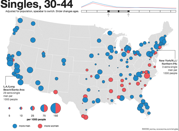
Your sense of who’s single and when they’re single will grow immensely in three or four minutes of playing around with this interactive map of single-ness in the United States, by age and gender. Men get married later and die younger. This means that at young ages, there are more single men than single women because some men who will eventually get married won’t marry until later, on average, than the women they end up marrying. This is just a complicated way of saying that men often marry younger women. In old age, there are more single women than men (the imbalance is because the men start dying younger). During the decade of the twenties and then after about age 65 you’ll find the largest proportions of single-ness. People in the middle decades, from 30-60 or so, are more likely to be coupled. But don’t take my word for it, click through and play around. This data actually understates the number of people who are functionally single because single is measured here as never married. So the folks who have been divorced or widowed and haven’t remarried do not count as single for the purposes of this graphic.

The writer of the text accompanying the graphic is interested in the geographical distribution of single women and single men so there’s more on that if you click through.

What Needs Work

I like this one a whole lot so I don’t have much to say except that I wish the designer wouldn’t have gone with the red/blue, female/male color scheme. How about purple and green? Or orange and teal?

I also think I would have counted people who are divorced/widowed and NOT remarried as single.

The graphic designer is careful to note that since homosexual couples cannot get married, they will erroneously be counted as single, even if they are partnered. That’s a problem with the underlying data collected by the census, not the graphic design.

Relevant Resources

American Community Survey (2006)

Soma, Jonathan. (2008) The Interactive Singles Map

Centers for Disease Control - Current Contraceptive Use of Women 15-44 years old

What Works

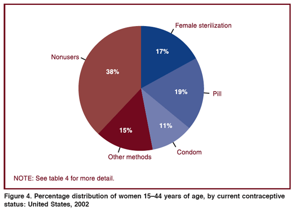
Pie charts are quick and (too?) clean, in my opinion. Their beauty lies in their ability to make data legible – everything will add up to 100%. It’s a world without outliers or oddities and it fits neatly in a perfect circle. Because of this neatness, pie charts can be visually pleasing – I’m not suggesting this one achieves beauty, but the potential is there.

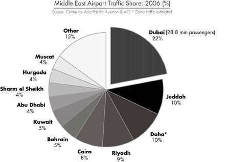
In fact, I’m including this gray scale pie chart that shows the share of airport traffic into the Middle East by city as an exemplar of a beautiful pie chart. One smooth swipe of a gradient.

Share of traffic into the Middle East by city
Share of airport traffic into the Middle East by city

What Needs Work

Pie charts either result in some kind of large residual category – like this one where “other methods” is clearly some kind of residual and accounts for more users than condoms. Interesting to me, the non-users category is also a bit of a catchall. In that 38% there are all sorts of different kinds of non-users. There could have been a 9.5% wedge for women who are either pregnant or trying to get pregnant. On the one hand, this is kind of a no-brainer: of course there are women who are trying to get pregnant. But honestly, I had forgotten all about that category when looking at this graphic because its caption tells me that I am supposed to be thinking about contraceptive users.

The other thing that this presentation obscures is the gender disparity in sterilization rates. We see that 17% of the women in the 15-44 year old age bracket are using sterilization as a contraceptive method. But how many men are sterilized? As a medical procedure, it is easier for a man to have a vasectomy than for a woman to have tubal ligation. Following that logic, one might assume that men are more likely to be sterilized than women, especially because some vasectomies can be reversed. Tubal ligations cannot be reversed. To their credit, they do include a table in the appendix that shows the rates of male sterilization in 1992 (6.1%), 1995 (7%), and 2002 (5.7%). Somewhat illogically then, rates of male sterilization are far lower than rates of female sterilization. What is happening here likely has something to do with the cultural construction of masculinity – male sexual activity following sterilization is likened to “shooting blanks” whereas I can think of no similar term for women (caveat: post-menopausal women might be referred to as “dried up” but this term is not typically used to reference sterilization).

Relevant References

Dudgeon, M.R.; Inhorn M.C. (2003 January) Gender, Masculinity, and Reproduction: Anthropological Perspectives International Journal of Men’s Health Vol. 2 No. 1. Harriman, TN: Men’s Studies Press.

Mosher, W.D.; Martinez, G.M.; Chandra, A.; Abma, J.C; and Willson, S.J. (2004, December 10) Use of Contraception and Use of Family Planning Services in the United States: 1982–2002 Advance Data from Vital and Health Statistics, No. 350. US Department of Health and Human Services, Center for Disease Control, National Center for Health Statistics.

Pew Research Center  - Views on divorce
Pew Research Center - Views on divorce

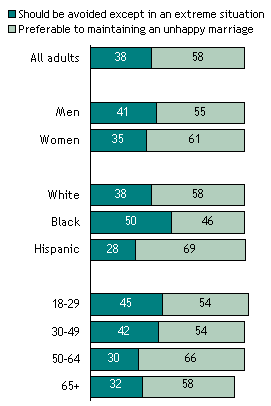
Also in the original graphic: Notes: Whites include only non-Hispanic whites. Blacks include only non-Hispanic blacks. Hispanics are of any race. Don’t know responses are not shown.
Survey Date: February 16-March 14, 2007

What Works

This is one simple way to display data that is supposed to add up to 100%. It doesn’t work well when there are more than two categories, but I would rather see two categories like this than see two categories in pie charts. Two category pie charts often end up looking like pac man which could be particularly unfortunate when it is divorce data that is being displayed.

What Needs Work

I don’t understand why there are colors here. Shades of gray are just fine and would give the graphic a cleaner look overall. More importantly, I am unsure that it makes sense to portray age, race, and gender as the same kinds of data. From a strictly technical perspective, age is ordinal data here but race and gender are nominal data. More broadly, thinking that gender and race and age are having similar impacts on how people feel about divorce just doesn’t make sense.

Another thing that bothers me is the missing data. Sure, there’s a disclaimer than don’t know answers aren’t displayed, but I kept fixating on the fact that the numbers didn’t add up to 100 as they should. I would show those don’t know’s since not knowing how you feel about divorce seems like a piece of data to me, not just something someone forgot. I can forget a behavior (like whether or not I locked the door behind me this morning) but I can’t very easily forget an attitude. I have trouble, for example, forgetting how I feel about leaving an unhappy marriage. It’s also hard to use an “I forget” response when the question has been posed. If you’ve forgotten, now’s the time to remember! How about it, marriage forever or leaving if you’re pretty sure you’d be better off alone? The point is, saying “I don’t know” to this question is a key data point, not just a trivial lapse of memory about what a behavior.

Relevant Resources

Pew Research Center Social and Demographic Trends Views about Divorce by Age, Race and Gender