climate change

What works

This is an example of activism by animation. It’s not an information graphic so I’m not going to offer a critique, but I find it interesting that the economic benefits of coral reefs like tourism, fishing, and pharmaceutical discovery are foregrounded while environmental concerns like species biodiversity and ocean acidity are mentioned afterwards.

Have a happy Friday, readers.

What I would enjoy seeing

I would love to see an animation of this quality that explained the process of ocean acidification and what we would have to do to reverse it. How much would our carbon emissions have to be decreased to make a difference at this point? And how much would that impact the typical American lifestyle?

References

World Resources Institute. (9 July 2012) “Coral reefs: Polyps in peril”. Animation by Jim Toomey.

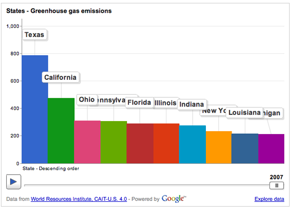
Greenhouse gas emissions graph
Greenhouse gas emissions | World Resource Institue and Google's Public Data Explorer

What works

The World Resource Institute has partnered with Google to create an interactive portal for creating visualizations based on publicly available data. Google has been in the business of doing this sort of thing at least since the time they acquired Trendalyzer from Scottish-based gapminder.org in 2007. To be sure, gapminder.org is still a going concern of its own and IBM also offers free web-based visualization services through their Many Eyes program.

The focus of the trendalyzer is to show change over time and they succeed in making it quite easy to watch panel data change over time.

What needs work

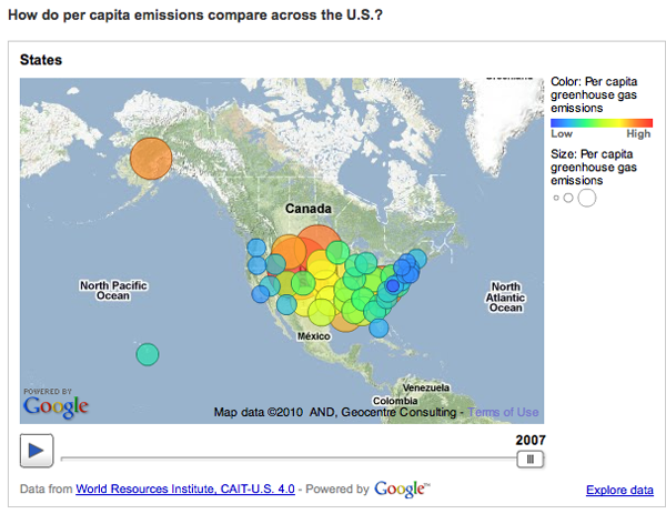
BUT…I find that this particular graphic is a great example of a misleading reliance on time as the key ‘context’ variable. So the graphic above breaks down greenhouse gas emissions by US state over the course of the year. If you have already clicked over to the World Resource Institute and watched the animation of these bars pumping up and down (more up than down) and trading places with each other over time, you will surely have been fascinated. I watched it three times in a row. But I was stuck wondering what the take away was meant to be. Clearly, there is the first order take away that the bars pretty much grow over time, they do not shrink. If I were the World Resource Institute, getting that message out would be important to me. But I would hope for more than just the bullhorn approach, “More is BAD! More is BAD!” which is kind of how this hits me at the moment.

One of the biggest problems with this graphic is: not all US states are the same size. Of course Texas emits more greenhouse gases than most states – many more people live there than in, say, Kentucky, Iowa, Oregon, etc. But the World Resource Institute chose to display per capita emissions with the bubble approach (which has almost no redeeming value in my opinion because I cannot even see half of the bubbles. Maybe they all could have been reduced by half or more? And maybe instead of going with colors on a spectrum, the worst could have been red, the best could have been green, and most everyone else could have been some shade of grey? It’s just not possible to hold 50 changing variables in your active cognitive space at once. Reducing it to three variables – the good, the bad and the mediocre – could actually increase retention and pattern recognition.)

Greenhouse Gas Emissions Per Capita, US 2007
Greenhouse Gas Emissions Per Capita, US 2007 | World Resource Institute and Google

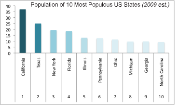
But back to the bar graph at the top. For the purposes of greenhouse gas emissions, it makes the most sense to interpret size as population not square miles, so that’s what I am going to do. In an attempt to be helpful, I threw together a bar graph of the top 10 most populous US states (using 2009 population estimates) in good old Excel. Note that our friend Texas is not the most populous state by about 12 million people – that is a lot of people. California is the biggest and they emit way less than Texas. New York is the third most populous state and we emit far less than our proportional share would suggest. Let’s hope it stays that way because I already find it unpleasant to breathe the air in Manhattan (admittedly, that could be due to many causes besides greenhouse gas emissions).

Most populous US states by size

My suggestion here is clear: prepare a bar graph per state, per capita. And, yes, I would want to see how that changes over time. I would probably watch the animation six times instead of three times. My fantasy is that we could compare not necessarily by state, because that is in many ways arbitrary, but by personal habits. Say we get the most extreme environmentalists – vegan, freegan, won’t even take motorized public transportation, never flies, prefers candles to compact fluorescents, has a composting toilet – to the somewhat average person who has a car but not an SUV, eats meat but not every day, does not pay more for organic food – to the extreme non-environmentalist who owns three houses, drives in an Escalade or something of that nature, flies internationally at least four times a year, pays extra for organic food (but at restaurants), and sends clothes to the dry cleaners twice a week. But that would probably result in a graphic best described as “info-porn”, enticing and exciting but intellectually vacuous.

Summary

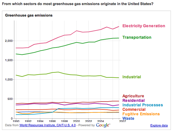
The WRI is on to something with their Google partnership. My favorite of their early work is this line graph that does a better job of telling the emissions story than any data broken down by state.

greenhouse gas origins
Greenhouse Gas Origins | World Resource Institute and Google

But the other great thing about the new partnership is that they ask for suggestions and set up a google group to manage the roll-out and incorporate nay-sayers like myself.

“By pairing [the Climate Analysis Indicators Tool] CAIT data with Google’s tools, there are new possibilities for people everywhere to take part in using sound data to tell stories that frame environmental problems and solutions. In the future, we hope to include additional data sets that can tell even more stories through Google’s visualization tools.

Suggestions for what you would like to see, or have a question about CAIT-U.S. data? Let us know here or join the conversation at http://groups.google.com/group/climate-analysis-indicators-tool.”

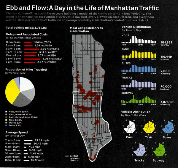
Manhattan traffic patterns
Manhattan traffic patterns | Wired Magazine June 2010

What works

The tendency with geographical data is to try to find a way to portray everything on a map. Surely, there is a map up there, and many people will recognize that the area is Manhattan instantly by looking at the map before they read it in the title. That’s a nice thing about maps – they transcend language and bad captioning to some degree. However, much of the detail is not to be found in the map. The map just shows us where congestion tends to occur, but it doesn’t tell us when we can expect these areas to be congested or just what “congested” means. In Manhattan, the average speed is under 10 mph so does congested mean less than 5 mph? Or what?

But if we look at the other graphs and charts it is a veritable jackpot of traffic information, at least at the collective level. I wouldn’t try to use this collection of information to plan your route through the city unless, of course, this collection of information causes you to take the subway instead of driving.

I hate pie graphs (as in the “Proportion of Miles Traveled”), but I am sympathetic to the triangulated pie graphs in the “Vehicle Distribution” graphic. At least it is visually easier to calculate the volume of a true triangle than a rounded off triangle. So if you find that you have to go with a pie graph, emulate the triangulated version found here and your viewers will come away with a better understanding of the information you are attempting to convey. I was surprised at how many people take taxis to get to work. But I am even more surprised at how many fewer trips there are on weekends. Fewer than half of those made on an average weekday.

Anecdotal evidence warning: When I first moved to Manhattan, I remember sitting in the car for two hours to drive around the block. There was a street fair nearby (not on any of the sides of the block traversed in this trip) and that seemed to slow everything to a standstill.

What needs work

I would have found a way to combine the average speed and the delays and associated costs. Clearly, the two are related – lower average speed must mean more delays. I had a little trouble understanding the delays and associated costs without the text from the article. If the speed and costs had been integrated into a single graphic instead of split into two (with a big pie graph in between), I think the link between speed, delays, and costs would have started to become more intuitive.

Here’s an excerpt from that section for the curious:

“In the end, Komanoff found that every car entering the CBD causes an average of 3.23 person-hours of delays. Multiply that by $39.53–a weighted average of vehicles’ time value within and outside the CBD–and it turns out that the average weekday vehicle journey costs other New Yorkers $128 in lost time.”

For more on how that was calculated, you’ll have to read the article. But the bottom line came down to a proposed $16 toll to enter Manhattan below 60th Street. It’s about what drivers in central London pay and the proceeds would go to bolster public transportation. Such an idea – known as congestion pricing – was proposed by the Bloomberg administration but voted down in 2008.

References

Salmon, Felix. (June 2010) “The Traffic Cop.” in Wired Magazine [infographic by Pitch Interactive].

Bonanos, Christopher. (17 December 2007) “Fare Enough” New York Magazine.

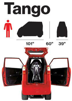
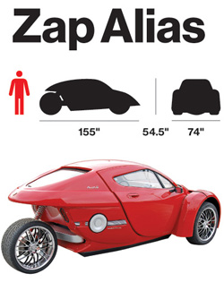
Tango VehicleZap Alias Vehicle

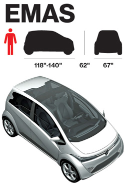
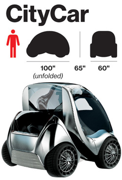
EmasCityCar Vehicle

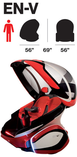
EN-Vehicle

What works

It’s nice to have the dimensions of the cars represented along with their profile and frontal massing.

What needs work

In order to make this work better, I would have put the dimensions and massing images right next to each other instead of next to the renderings/photos. It’s hard to compare when they are so distant from one another.

More important, the choice of these images to tell the story about the electric cars of the future is missing at least half the story. It continues to do for cars what we have long done for cars which is to treat them as fetishized objects. But in reality, most of the time we experience not A car, but cars as streets and highways carving up space or cars as a parking lot (either full or empty, but they always have to exist whether or not they are full at any given point in time) or cars as sources of air pollution or cars as noise. The implied message here is that because these cars are electric, at the least we shift the pollution story out of the city. But to where? We must generate electricity to run these babies and there is no hope to do that with renewable sources right now.

Furthermore, on the parking angle, these cars are smaller and will therefore take up far less space when parked. But if they have to be charged, does that mean that we will have to build new infrastructure on top of the existing parking infrastructure? Will we use the extra space not taken up by these vehicles to park bigger combustion engine vehicles? Will we have two distinct parking set-ups whereby these new cars, because they are green, get to take over sidewalk space? Or will it be something different? At the very least, I would have liked to see how many of these cars can fit in a normal parking space for, say, a Corolla as well as for a Lincoln Navigator. That would have added to the graphic.

And on pollution, I want to know if the faster models above – the Zap! – are less efficient. Generally, to go faster the car will need a bit more on board which will weigh more and thus require more batteries (which themselves weigh more). So what about relative efficiencies? [Was the Tesla left off this list for some reason?]

Also, I’m under the impression that electric cars are quieter simply because the Prius is quiet. But is that always true? I feel like I have also heard some surprisingly whiny electric scooters. Another point: can they engineer these cars of the future so that their security systems make car alarms obsolete? As far as the noise cars make is concerned, the car alarm has to be one of the worst. Every time a bus or sanitation vehicle drives by my house a car alarm goes off. And my apartment is on a bus route for two more weeks which means I am almost happy that the bus route has been eliminated due to budget shortfalls. Can’t believe I am cheering the demise of public transportation because of a pesky car alarm. But in this case, I am.

Overall, these graphics simply fail to tell the story of the future of electric cars. The change is not going to come in the fetishism of the car-as-object, but in the changing relationship between cities, suburbs, energy sourcing, and mobility.

References

Bear, Adrian. (5 March 2010) Ginebra 2010, Protón Emas, Emas3, and Emas Country concept at cocheseco.com.

Bloomberg BusinessWeek. (13 May 2010) Fully Charged.

Commuter Cars. Tango Car.

GM Media. (24 March 2010) “GM Unveils EN-V Concept: A Vision for Future Urban Mobility”. Press release from GM about the EN-V.

Smart Cities Group at MIT – CityCar

Zap Cars Zap Alias.

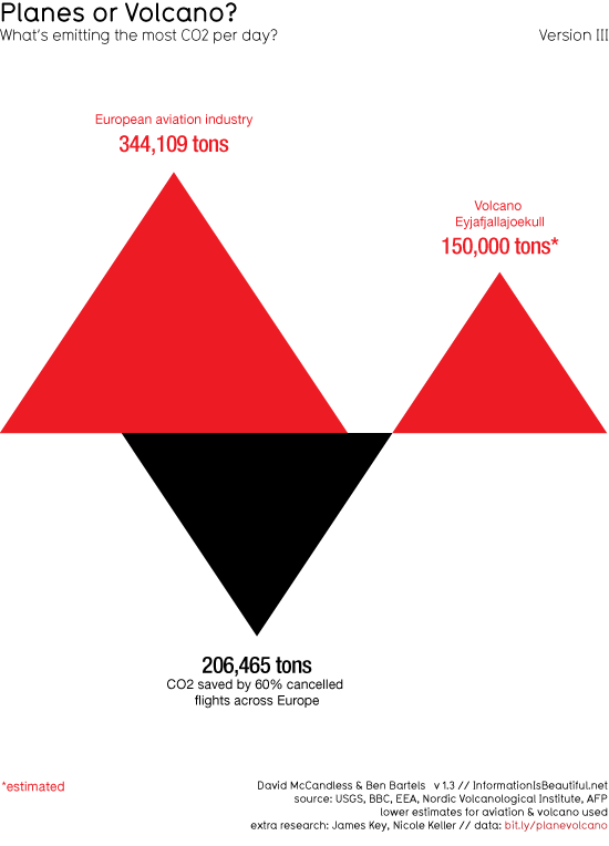
Planes or volcano? What is emitting more CO2?

What works

Volcano = triangle. Love it. Red is bad, black is good = kind of perfect. Being able to see that the volcanic eruptions are actually net benefit events because they release less CO2 than they prevent is great. I do wonder if the uptick in flights that inevitably follows any singular event could be mapped. Furthermore, when I was in Europe during the first major eruption event and I would say plenty of people were renting cars. I know that isn’t nearly as bad as flying, but it does contribute some CO2. I also wonder if this graphic could be expanded over time to see if the volcano ends up contributing or inhibiting contributions to global CO2 over time. Will people stay home or at least stay out of Europe, taking shorter flights (or no flights) because they are worried about the volcano?

What needs work

The volcano needs work. It needs to stop eating my luggage. That’s all I have to say. I know that if you are reading this and even moderately awake, you will point out that if I stopped flying I would not have a luggage problem and I would not be polluting your world with all my flight traffic. So maybe I’m the one who needs work.

References

The Graphic
McCandless, David and Bartels, Ben. (16 April 2010) Planes or Volcano? at Information is Beautiful.

The Data
USGS, BBC, EEA, Nordic Volcanological Institute, AFP [lower estimates used]

Reinventing the Automobile* is a book that lays out a vision for a progressive evolution of urban mobility transition that offers a robust point-to-point on-demand mobility network of 2-passenger fully electric vehicles. These vehicles would take up less parking space because not only are they small, but one proposed design folds up when parked. And they’d be able to tell you where the nearest parking spot is as you’re approaching your destination. Being fully electric they require a plug….or do they? The authors suggest that after an initial period of individual owners plugging these babies into outlets in their garages overnight, folks in city planning departments or franchise owners would trust the technology and economics enough to start installing wireless charging devices available curbside or in the road bed itself. Stuck in a bottleneck at a bridge or tunnel entrance? At least charging pads in the roadway can ensure that your 2-seater won’t run out of juice before you get where you’re trying to go. You can sit there and it will charge itself with embedded charging device in the road surface while plodding through gridlock. Even farther down the timeline, the cars might be able to drive themselves. So you can sleep through the gridlock or make calls or surf the ‘net. Just don’t post facebook status updates about your traffic problems. Nobody cares.

What I like most about the book as an object of intellectual design is that even if readers decide to skip all the words and they only look at the images, charts, maps, and diagrams, they won’t miss much. This book is stuffed with great graphics. I haven’t included them all as that would constitute copyright infringement and be too long for a single post. What you see below is just a small sample from Chapter 9: Personal Mobility in an Urbanizing World.

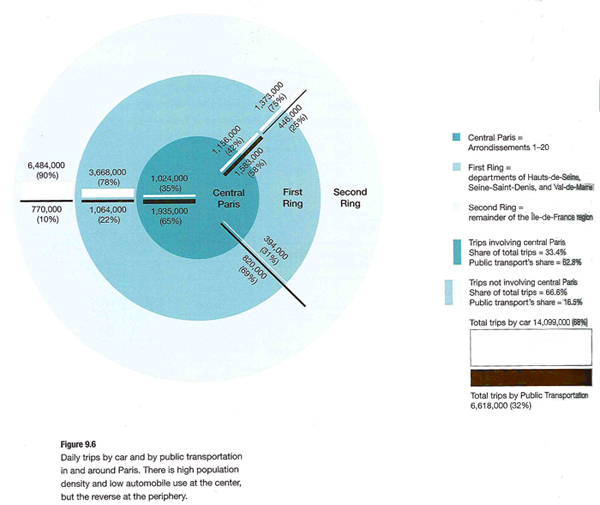
Daily driving in Paris

Daily Trips in Paris - Reinventing the Automobile (Mitchell, Boroni-Bird, and Burns), Figure 9.6

What works

This graphic is both elegant and deep. (Or it would be elegant if I had a better scanner.) It’s a simple form – Paris as concentric circles – but the more you look at it the more you learn. Rewarding that way. What sometimes happens in elegant graphics is that the details become obscured in iconography or approximations. But this graphic includes percentages as well as absolute numbers of two different kinds of trips – public transit and trips by cars. We see that Central Paris is defined as Arrondissements 1-20, the first ring is Seine Saint-Denis, Val-de-Marne, and Hauts-de-Seine, and the second ring is the rest of the Île-de-France region. There’s a summary of all the trips over in the legend so that the graphic itself can just show you the break down of different kinds of trips.

What needs work

In terms of transit, things like rivers often represent real barriers. There are only so many bridges and tunnels which creates a bottleneck effect. Paris is a city on a river so the one thing the elegance of this graphic obscures is the impact of the natural geography on transit choices. Maybe it’s not important when it comes to the cars vs. transit question, but bottlenecks are critical factors when it comes to planning mobility and I’m curious about whether bottlenecks push more people to transit or cars. In Boston/Cambridge, MA only one bridge has a train running across it and I have always assumed that pushed more people into their cars because many of them would have to go out of their way if they took the train and could only go over that one bridge.

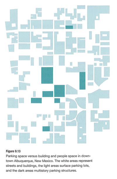
Parking in Albuquerque

Parking in Albuquerque - Reinventing the Automobile (Mitchell, Boroni-Bird, and Burns), Figure 9.13

What Works

What you are seeing here is a simplified map of downtown Albuquerque, New Mexico. The white areas are buildings. The teal areas are parking – darker teal represents multi-story parking structures while the lighter teal shows us where surface lots can be found. Lovely way to show this information. One could imagine the same sort of information as a percentage-of-land-use pie chart or some far less granular collection of numbers. This schematic doesn’t bother to calculate just how many square feet of land are dedicated to parking. Nope. This is the visual equivalent of the ‘show don’t tell’ rule that writing professors are always encouraging their students to adopt when constructing essays. A table with land use percentages would be telling. This graphic is showing.

Albuquerque is like a parking lot with some buildings in it.

What needs work

I have never been to Albuquerque but I’m guessing that if you lived in Albuquerque you might like to see some sort of orienting label. Even just a single recognizable street name thrown in their somewhere to help orient. Now, the point of Reinventing the Automobile is not to provide urban planning for Albuquerque so I know they aren’t all that concerned with just precisely which neighborhood in Albuquerque this schematic represents. Still. It’s almost too cleaned up to read as a city plan right away.

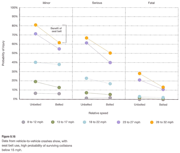
Vehicle-to-Vehicle Crashes

Vehicle-to-Vehicle Crashes - Reinventing the Automobile (Mitchell, Boroni-Bird, and Burns), Figure 9.16

What works

This graph does a great job of providing us with granular data and indicating a couple different trends visual. Keep in mind that they have multiple layers collapsed into a single graphic. It looks easy once it’s done but when one is faced with a pile of related numbers along multi-dimensions it isn’t always clear how to relate them to one another visually.

This graph has three levels of accident severity – minor, serious, fatal. It also shows the probability of injury. It also factors in variation in speed (which it does by creating five speed ranges). And then there’s the belted vs. unbelted division. That is a total of four different dimensions all displayed on one graph with a single measure on the y-axis. Color is used well. Grid lines are all that separates minor from serious from fatal accidents which are more or less three different graphs lined up next to one another.

References

Mitchell, William; Boroni-Bird, Christopher; and Burns, Lawrence. (2010) Reinventing the Automobile: Personal Urban Mobility for the 21st Century Cambridge, MA: MIT Press.

* The book specifically credits Ryan Chin, Chih-Chao Chuang, William Lark, Jr., Dimitris Papanikolaou, and Ruifeng Tian with “Illustration Production”.

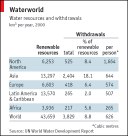
Water Resources and Withdrawals by Continent

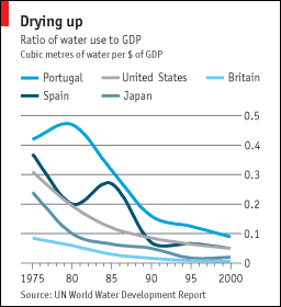
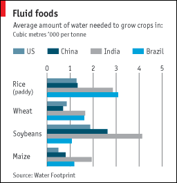
These graphics accompanied a great article about water shortages in episode of The Economist which arrived last week. The article was well written and comprehensive, handily summing up the way water resources are related to the growth of urban centers, climate change, the rising affluence of the world’s poorest people (and their conversion from vegetarianism to omnivorousness) and the question of whether or not fresh water is a global or a local problem. I highly recommend reading it. Unfortunately, I think you would do almost as well reading it without the accompanying graphics as with them.

The first one is so confusing I still don’t know what I am seeing here. Table data usually has the attribute that the longer you look at it, the more you get, with an occasionally painfully long initialization period in which you can’t make out any pattern whatsoever. I spent a good bit of time on this one and I still don’t know how to make sense of it. The article rightly points out that fresh water is unevenly distributed across the globe–some places have a lot, some places hardly have any. No big surprise. Also not surprising: some continents use more fresh water than others based on overall population size and agricultural production practices. So when I looked at this graphic, I was kind of hoping to get a sense of both how efficient each continent was with their resources and how dire their straits were. The graphic sort of does that. Sort of. We’ve got a measure of total renewable water resources but it doesn’t take into account total land area. It does take into account population, sort of, and maybe population is more relevant than total land area in this case.

Ratio of Water Use to GDP

The second graphic does not stand well on it’s own. I can see here that it appears that these selected countries seem to have been becoming more efficient with their water use. Since 1995, all of these countries have lowered the number of cubic metres of water used per dollar (or dollar equivalent) of GDP. This graphic does nothing on its own to help me understand why that might be true. Have these countries moved out of water intensive agricultural production? Have they made their agricultural production more efficient? If so, is it technological change leading to increased efficiency or did they just shift to more efficient crops? Or maybe the change is in the GDP variable, not the water variable. The graphic really just doesn’t clear any of these things up.

What Works

Water Used to Grow the Same Crop in Different Countries

I like the third graphic. It’s clear and adds to the text in the article. This isn’t the first time I have read about water shortages and one of the biggest and possibly easiest changes we could make to prevent the water shortage from becoming any more of a problem than it already is, would be to introduce drip irrigation in places that do not already have it. Yes, it costs some money. But it is far more cost effective than many of the other strategies introduced to combat climate change. Drip irrigation technology is not overly complex nor does it require extensive training or equipment to install. Tubing perforated along its length with small holes, buried under the surface of the earth, delivers water directly to plant roots. Much less water is lost to evaporation or seepage into non-crop areas. Control over water resources is better – during rains cisterns collect and store water for later distribution through the drip tubing during dry periods.

Relevant Resources

The Economist. (2009, 8 April) Water shortages go global: Sin aqua non. Istanbul.

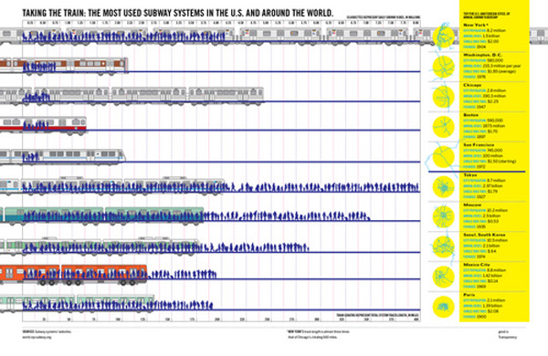
World City Train Comparison

What Works

Good magazine is indeed a good source for thought provoking information graphics. This one has to be clicked through to be seen in any kind of entirety. What I like is the layering – they manage to represent total track length, total yearly ridership (both visually and with absolute numerical data), as well as showing little schematic maps of the systems themselves. You see that many of these systems are hub and spoke systems.

As urban areas continue to grow, transit options are going to need to expand and grow in places that don’t have mass transit infrastructure dating back to the turn of the 20th century like New York and Boston. An article in this month’s context magazine by Michael Goldman and Wesley Longhofer writes about the difficulty of adding mass transit of any sort to the existing urban fabric looking at the Indian city Bangalore: “hundreds of residents marched to protest the widening of streets and felling of trees for the new elevated Metro system. Bicyclists claimed that tearing down more than 90.000 beautiful shade-producing trees ruined the appeal of what was once known as India’s “garden city.” Shop owners and concerned citizens pushed for the Metro to be built underground so businesses wouldn’t be shuttered to make way for it. Advocated for the poor argued that widening roads would turn sidewalks, where so much daily commerce and social interaction occurs, into prime real estate. Purge the city of its street vendors and sidewalks, and you’ve stripped the life out of the Indian city.” That gives a whole new context to systems with hundreds of miles of track.

What Needs Work

I wish that there would be a way to show that the installation of mass transit systems bulldozes old neighborhoods and creates new opportunities. New growth tends to look very different that the old growth it replaces. I think there’s a call for a new kind of mass transit graphic that can show the past and present of transit decisions both in economic and social/cultural terms.

Relevant Resources

Good Magazine Transparency Graphic with Robert A. Di Ieso, Jr.

Goldman, M. and Longhofer, W. (2009) making world cities Contexts, pp. 32-36.

Motorcycle Deaths vs. Car Death Rates

What Works

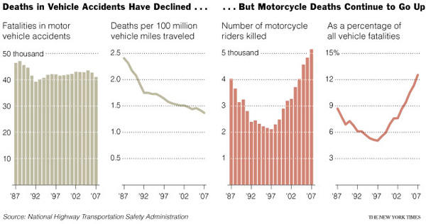
This story is a little dated – it was published when gas prices were at $4 a gallon. The facts, as written, look something like this: “Deaths on motorcycles hit a low of 2,116 in 1997. Since, they have risen 128 percent. Their share of crash fatalities has jumped to almost 13 percent from 5 percent.” In this graphic, we’ve got absolute numbers of fatalities by vehicle type in the bar graph and some sort of relative measure in the line graphs. I am not sure four graphs together is the most elegant way to show this information, but it does the trick. We see that car fatalities are trending downwards slightly while motorcycle fatalities are trending upwards. What we don’t see is that fewer cars were on the road and more motorcycles were out there. People shifted from gas guzzling cars to more efficient motorcycles or to public transportation. One would expect that with more motorcycles there would be more motorcycle accidents and that with fewer overall drivers there would be fewer car accidents. So how much of this is a real change in the relative danger of riding a motorcycle versus driving a car, which is what these graphs and the accompanying story are trying to suggest exists?

What Needs Work

I like that the absolute measures of car fatalities and motorcycle fatalities are directly comparable. I don’t like that they chose to look at two different relative measures. We’ve got deaths per 100 million miles driven for cars and motorcycle deaths as a percentage of all vehicle fatalities for our relative measures and that just doesn’t make for any kind of rational direct comparison. They are two completely different kinds of measures.

Note

Wear helmets. A mind is a terrible thing to waste, especially when it’s your own.

Relevant Resources

Wald, M. (2008, 14 August) Deaths of Motorcyclists Rise Again in The New York Times, US Section.

Cost of Transit - Derived from (1999) Transportation for Livable Cities By Vukan R. Vuchic

Reader Note

It’s been nice to be away at a couple of conferences and a few days alone in Paris, but now I’m back and so is Graphic Sociology. I thought I might come across more material to discuss here. Much to my dismay, I saw hardly anything by way of charts, diagrams, or graphics used to support/illustrate sociological arguments. Tomorrow I have something from the Corporation for Public Broadcasting courtesy of a panel at the Eastern Sociological Association, but that really is about all I’ve got so far.

What Works

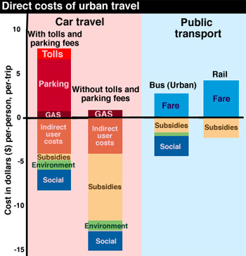
The above graphic is something I found on the interwebs though it was derived from a book that I admittedly have not read. With that in mind, I am not going to be able to comment on the veracity of the data. What I can comment on is the strategy employed to organize the information.

First, the use of color to split public transit from private car travel is quite helpful.

Second, I am pleased at the use of the zero line. The use of the zero line allows the graphic to establish a binary that quickly registers as a sort of good/bad moral binary. Often the zero line draws a distinction between good and bad where the good is growth and the bad is shrinkage (think financial graphics – they’re always sticking growth on the plus side of zero and shrinkage on the negative side). Values above the line mean one thing, things below the line mean a opposite, or at least directly opposed, worse thing. In this case, the good kind of transit expenditure is the expenditure that accrues to the individual and the amounts on the negative side of the zero line represent portions of transit that are paid for by larger collectives.

What Needs Work

I don’t understand the use of color beyond the blue/red division between public transit and car travel. It seems both arbitrary and not especially pleasing to my eye.

The category “environment” and “social” are not instantly legible but at least they’re better than “indirect user costs”. The use of precisely chosen language is critically important in graphics because it’s fairly easy to assume that many people are not going to read your text. Since I don’t have the book, I can’t even post the relevant text here to help clarify what those categories represent in detail.

My biggest concern with this graphic is one of the things I like about it: the use of the zero line. Generally speaking, using a zero line gives graphics greater dimensionality because of the greater symbolic value of zero compared to other numbers. In terms of absolute value, this graphic could have just showed us the net costs of transit options which then could have been represented as values where zero was a minimum value. In that depiction, rail would be the tallest bar and car travel without tolls and parking fees could have been set to equal zero. (what you would be looking at there would be the difference in cost between the modes of transit). Using the zero line here allows for a distinction between public and private expenditures on transit which is good.

BUT…the implication that the zero line divides the positive from the negative, the good from the bad, makes it look like public funding for transit is a bad thing while private expenditures are good. This is problematic. I can see what the author is trying to nudge us towards – that people who drive private cars pass a lot of the cost of that behavior on to collective populations. All the bus and subway riders are still breathing air polluted by passenger and delivery vehicles even as they spend more time out on the street walking to the subway and bus stop. However, this graph implies that all public funding or cost-bearing for transit is bad while private expenditures are good. This carries a decidedly pro-capitalist, up by your bootstraps kind of political implication. If you look closely, it isn’t that hard to see that imposing parking fees seems to decrease the amount of public subsidy to its lowest point.

I don’t know the overall message of the book where this graphic was derived but I imagine that it was pro-public transit. This graphic subtly disservices that message by indicating that all public expenditure on transit is bad. The strongest message I draw from this is that parking isn’t expensive enough and neither is gas. Also, that the social costs are incorrectly calculated – how can they be non-existent for rail and the same for cars with cheap parking, cars with expensive parking, and buses? Buses are louder and smellier than cars but I’m more likely to be killed by a car than a bus. Noise, smell and the potential for fatality seem to be social costs, but how can they be weighed against each other? Seems like a classic apples to oranges problem hidden in a little blue block. This is on top of the bigger problem that public subsidy is going to attend all transit options and is not necessarily a negative thing, neither is private payment for transit necessarily a positive thing. There are those who suggest that mobility should be considered a public good, something to which everyone should have equal access, thus private payment is necessarily a bad thing because it is regressive.

Flattening all the categories into the same kind of value – environmental costs are the same sort of thing as social and public subsidy costs – makes it possible to graph these things, but is troubling. Because I don’t know what is included in the environmental costs or how they are calculated, it’s hard for me to tell whether or not I would prefer to increase subsidies now (or increase fares and parking fees) to avoid environmental costs that could have significant long term consequences which will be even more costly in the future than they are at the moment. I mean, if the environmental costs include things like extremely high rates of asthma in poor communities that abut highways, I might think that’s too high a lifestyle price to pay even if the actual cost of treating the asthma is calculable and relatively low. (Maybe that “social” cost category includes things like monetizing lifestyles – what does a life riddled with asthma cost?)

Context

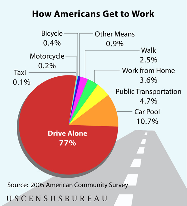
Just to contextualize this debate a little more, the following chart was derived from the American Community Survey of the US Census Bureau (2005) and shows just how people get to work. Commuting is the type of travel in which people are most likely to take public transportation – more so than taking one off trips to shop or visit friends and family. As you can see, public transit makes up a fairly small percentage of American’s transit behaviors. This is changing, public transit is experiencing growth in rider-ship, but chipping away at that three-quarters of the population whose experience of mobility is private and on-demand, is not going to happen overnight.

American Commute - Census Data

Relevant Resources

American Public Transportation Association

US Census Bureau. (2007 June 13) Most of Us Still Drive to Work – Alone from Public Transportation Commuters Concentrated in a Handful of Large Cities. Press Release, US Census Bureau News.

Vuchic, V. (1999) Transportation for Livable Cities. Rutgers: Center for Urban Policy Research.