
Update on references
As you can see in the comments, Christie Boxer, the lead author of the journal article behind the Coontz Opinionator piece has contacted me to let us all know that the article is currently in revise and resubmit phase but will be published in Journal of Family Issues shortly.
What works
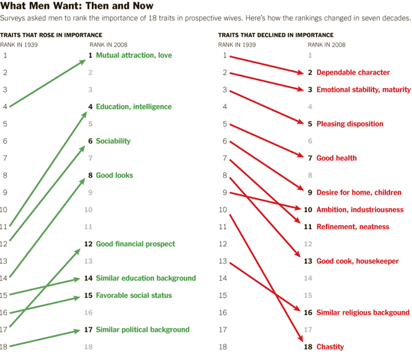
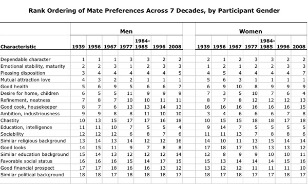
The graphic is more legible than the chart from which the data originated. I’m guessing the Journal of Family Issues would not allow such a “fancy” series of graphics in the final published piece so I don’t mean this as a critique of the article’s authors. Just pointing out that there is good reason for journals and other publishers to reconsider their policies about how data can most usefully be presented.
I happen to have created a few graphics in this style myself and tend to favor it over the chart (e.g. this one about agricultural subsidies) in the past and think they work well for displaying changes in attitudes over time.
What needs work

The article from which this news story is drawn clearly provides information on both what women want and what men want in greater detail than what’s seen here. Why did the news story choose to run with less than half the data?
The chart clearly contains information on what men want in a mate AS WELL AS what women want in a mate. I see no reason for going (less than) halfway on this story. In fact, what I find most interesting is the convergence on some things – nobody cares much about chastity in a mate any more – and divergence on other traits – women rank men’s desire for home and children much higher than men rates women’s desire for home and children. That’s a puzzler worthy of thought in a way that a story that reflects only what men want is…well…just not all that interesting. Pair bonding takes two, as I’m sure Coontz knows because she’s been researching marriage for years. It’s unclear if the Times pressured her to come up with a more attention grabbing headline “The M.R.S. and the PhD” or if she chose that on her own or if it was a combination of factors.
I’m glad to see that, at least as far as I can tell from what is available to scholars other than Coontz (who might have an early full-length, unreleased draft of the Boxer, Noonan, Whelan paper), the scholars whose data led to the graphic were not so singly concerned with what men want in a mate. They were looking at how mate selection characteristics have been adjusted over time for both men and women and I hope that their article looks at the consonance and dissonance between the two genders’ mate selection ideals.
I would have preferred more attention paid to the graphic – like, say, the inclusion of what women want or an integrated graphic that displayed the overlaps and distances between what men and women want – and less time put into the accompanying illustrations which I have included to the left. I welcome regular readers of Sociological Images (and others) to comment on the messages coming out of the illustrations.
References
Coontz, Stephanie. (2012) “The M. R. S. and the PhD”. The New York Times, Sunday Review, Opinionator. [Information graphic by Bill Marsh/The New York Times]
Boxer, Christie; Noonan, Mary; and Whelan, Christine. (forthcoming) “Measuring Mate Preferences: A Replication and Extension” Journal of Family Issues. [Table drawn from Christine Whelan’s research webpage]

Comments 4
Umlud — February 13, 2012
What is also interesting is "sociability" in both men and women. For some reason, it takes a major leap in both responses in 1977. Similarly, why did "Desire for home, children" drop 6 places among men and 5 places among women in 1977? What caused "Education, intelligence" to drop 5 places in 1956 but rise 7 places in 1977?
And why did "sociability" rise 6 places among both men and women in 1977?
CBoxer — February 13, 2012
This paper received an R&R from the Journal of Family Issues, which is why it is not yet publicly available.
scott — February 14, 2012
Most men considered chastity a lost cause. That's why it's probably so low. That and the fact that they plan on sleeping with her before marriage.
“Would that really make you happy?” Jesus and the Paralytic | …thorns compose… — March 6, 2012
[...] People want things. People have priorities. But we should never be so foolish as to assume that such desires are universal. The following chart shows the way that priorities have shifted even in the last century. Credit should go to my friend Glenn Lucke for finding the article on Graphic Sociology the following chart comes from. [...]