What works
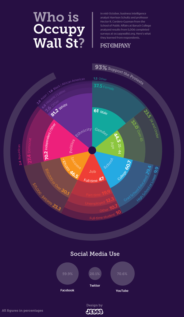
The graphic above was constructed using 5,006 surveys filled out by people who visited occupywallst.org. Here’s what the survey found:
Gender
Men 61%
Women 37.5%
Other 1.5%
Age
45 y/o 32%
Race/Ethnicity
White 81.4%
Black, African American 1.6%
Hispanic 6.8%
Asian 2.8%
Other 7.6%
Education
H.S. or less 9.9%
College 60.7%
Grad. School 29.4%
Annual Income
$50,000 30.1%
Employment
Unemployed 12.3%
Part-time 19.9%
Full-time 47%
Full-time student 10%
Other 10.7%
Politics
Support the protest 93%
———————
Republican 2.4%
Democrat 27.4%
Independent 70.7%
What needs work
I have two issues. First, I think the graphic is beautiful but functionally useless. It is nearly impossible to get any intuitive sense of anything at a glance. The circular shape forces the categories to come in the order of their popularity which is not always the most logical order. Look at the income data. That should come in order of least income to most income, but it doesn’t (why would anyone put incremental numerical data out of order?). The rounded sections of wedges are also nearly impossible to intuitively compare to one another in size, so I cannot figure out what the functional value of displaying demographic data in this modified pie chart is. In summary, it appears that the information part of the information graphic did not win the contest between aesthetics and utility. Remember: there should not be a contest between aesthetics and utility in the first place.
My second concern with this graphic is its overall reliability. The FastCompany article it accompanies is titled, “Who is Occupy Wall Street”. That title more than implies that this survey of visitors to a particular website associated with the movement – but not THE official website of the movement (there isn’t one) – accurately represent the protesters on the ground. I don’t think that the professor and his partner who conducted the surveys would make such grand claims.
References
Captain, Sean. (2 November 2011) Who is Occupy Wall Street? FastCompany.
Jess3. (2 November 2011) Who is Occupy Wall Street? [information graphic] FastCompany.

Comments 5
Are you smarter than a Wall Street Occupier? — 1389 Blog - Counterjihad! — November 18, 2011
[...] of the Wall Street occupiers have been to college. They didn’t get much of an education in return for those student loans that they won’t [...]
Démographie D’Occupy Wall Street et leur Utilisation des Médias Sociaux — [Naro] Minded — November 18, 2011
[...] via The Society Pages [...]
Occupy Wall Street Demographics | #OccupyWallstreet | Scoop.it — November 27, 2011
[...] Occupy Wall Street Demographics [...]
Occupy Wall Street Demographics | "Change.org Sign a Petition Make your Voice Heard by Government and Business Leaders" | Scoop.it — November 27, 2011
[...] Occupy Wall Street Demographics [...]
nathanjurgenson — December 2, 2011
your last point is absolutely correct! also, i cannot seem to find their methodology. is this a representative sample of those who visited the site? how could it be? and, if it was, and it is probably not, would that be a representative sample of the movement? of course not. the title on that info-graphic is incredibly misleading.