What works
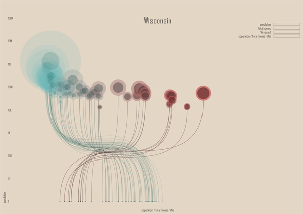
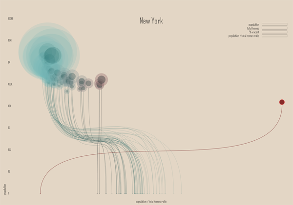
The “Ghost Counties” interactive visualization by Jan Willem Tulp that I review in this post won the Eyeo Festival at the Walker Art Center last year. The challenge set forth by the Eyeo Festival committee in 2011 (for the Festival happening in 2012) was to use Census 2010 data to create a visualization using Census data that did not rely on maps…or if it did rely on maps, it had to use maps in a highly innovative way. This is an excellent design program – maps are over-used. Yet it’s one thing to assert that maps are over-used and another thing to produce an innovative graphic representation that is not a map.
Tulp does a great job of leaving the map behind. He also does a phenomenal job of incorporating a large dataset (8 Mb of data serve the images in the interactive graphic from which the stills in this post were captured). The graphic has a snappy response time once it has loaded and his work makes a solid case for the beautiful union of large data and clear representation thereof.
The color scheme is great and reveals itself without a key. Those counties with low vacancy are teal, those sort of in the middle are grey-green, and those with high vacancy are maroon. The background is light, but not white. White would have been too stark – like an anesthetized space. He experimented with darker backgrounds (see his other options at his flickr stream here) but those ended up presenting an outer space feel. The background color he settled on was (and is) the best choice. Background colors set the tone for the entire graphic, along with the font color, and Tulp’s work is positive evidence of the value of carefully considering them.
Pie charts might be better than circles-in-circles
The dot within a dot is difficult for the eye to measure. Pie charts- which I only recommend if there are very few wedges – would have worked well with this type of data because there are only two wedges (see here for an example of a two wedged pie chart). I just finished reading Alberto Cairo’s important new book The functional art and he had a solid critique of the circle-in-circle approach that helped me realize what’s so appealing, but just plain wrong, about circles-in-circles:
“Bubbles are misleading. They make you underestimate difference….If the bubbles have no functional purpose, why not design a simple and honest table? Because circles look good. (emphasis in original)”
In this case, a wedge in a pie chart could have represented the percent of total housing units occupied.
Why is it so hard to ‘see’ rural vs. urban?
The x-axis is a log scale for population size. It’s clear from what we know about the general trend towards urbanization that we would expect urban areas to have lower vacancy rates than rural areas. Even in 1990 – two census surveys before the 2010 data that was used here – the New York Times ran a story about the population decline in rural America and there has been widespread coverage of the trend towards urbanization by both journalists and academics (the LSE Cities program does nice work).


The two states shown here – New York and Minnesota – both have some big cities and a whole of small cities in rural areas. Some small cities are also in suburban areas. That’s a problem with this visualization, the distinctions that have been established in academic literature between rural, suburban, ex-urban, and urban are difficult to pick out of this visual scheme. While it would be difficult to find a sociologist who could wrangle the data to produce this kind of visualization, I imagine many of my intellectual kin would be confused by this visual scheme and demand to return to a map-based graphic because at least in that case they could see patterns associated with the rural-urban spectrum the old-fashioned way. I am not wedded to the notion that a map is the only way to “see” the rural-urban spectrum, but the current configuration makes it difficult to think with the existing literature about housing patterns even though the attempt to distinguish between population size was built into the graphic on the x-axis. Population size is not always a great proxy for urban vs. rural, so it is a weak operationalization of spatial concepts social scientists have found to be meaningful. For instance, a small, exclusive ex-urban area filled with wealthy folks and their swimming pools is conceptually much different from a small, depopulating rural town even if they have roughly similar population sizes.
It is important in a research community to build on good existing work and reveal the weaknesses of existing work where it’s falling short. Either way, it is a bad idea to ignore existing work. Where a project does not relate to existing work – neither building momentum in a positive direction nor steering intellectual growth away from blind alleys – it will likely become an orphan. In this case, the project is only an orphan with respect to urban scholarship. As a computational challenge, it most definitely advanced the field of web-based interactive visualization of large datasets. As a visual representation, it adhered to a design aesthetic that I would like to see more of in academic work. But as a sociological analysis, it’s nearly impossible to ‘see’ clearly or with new eyes any of the existing questions around housing patterns. It is also my opinion – and this is far more easily contested – that it does not raise new important questions about housing patterns in urban, suburban, or rural America either.
My critique here is not that all data visualization is pretty but useless and that we should stick to our maps because they tie us to our existing disciplines and silos of knowledge. Rather, my critique is that in order for data visualization to become a useful tool in the analytical and communication toolkits of social scientists, the work of social science is going to have to find a way into the data visualization community. As anyone who has tried to use Census data knows, looking at piles of data is not synonymous with analysis. While Tulp’s graphics certainly present an analysis, that analysis seems to have turned its back on a fairly sizable swath of journalism on urbanization, not to mention the hefty body of academic work on the same set of topics.
Graphic Sociology exists in part to find a way to keep social scientists motivated to produce higher quality infographics and data visualizations than what is currently standard in our field. But the blog is equally good for sharing a social scientific perspective with computer scientists and designers who are ahead of us with respect to the visual analysis and display of social data. There is a way to bring the strengths of these fields together in a meaningful, positive way. We are not there yet.
References
Cairo, Albert. (2013) “The Functional Art: An introduction to information graphics and visualization.” Berkeley: New Riders.
Tulp, Jan Willem. (2011) “Ghost Counties” [Interactive Visualization] Submitted to Eyeo Festival and selected the winner in 2012.
