Archive: Jan 2012

Citeology - Step 1
Citeology - Step 1

Step 1

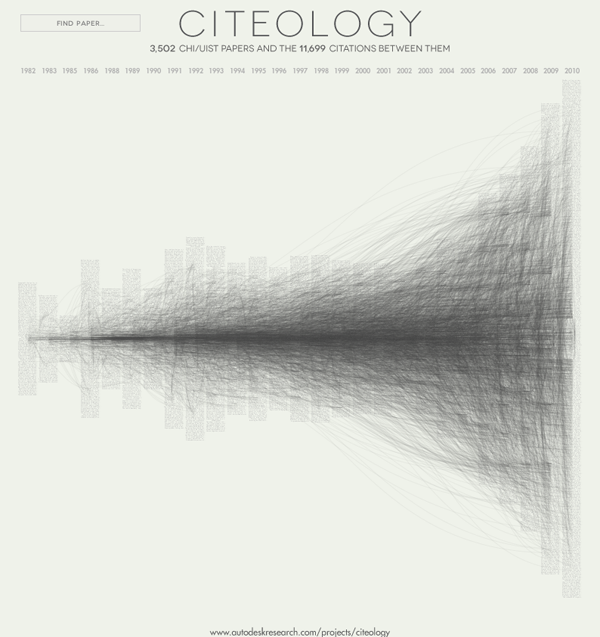
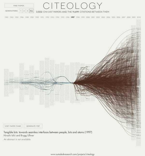
The image above was constructed using the citations from the CHI/UIST papers. CHI stands for Computer-Human Interaction; UIST stands for User-Interface Software and Technology; both are considered to be important and maybe even ‘cool’ by product designers, software designers, and those on the peripherals of the space between product design and software design. UIST had their 24th annual conference in 2011 and CHI started in 1982. By way of full disclosure: Autodesk is a major sponsor of UIST. They paid the people who put this graphic together, too.

The graphic above took the conference proceedings from these two conferences as datasets, compiling all of the articles that were included and their references. Each of the small grey-ish bars is an article.

Citeology | Tangible bits by Hiroshi Ishii and Brygg Ullmer

Step 2

Hovering a mouse over a grey-ish bar will pop up the actual title of the article. Clicking on the bar will bring up a graphic that displays both the articles which the original article cited (in blue) and the articles published after the original article that referred to the original article (in brown).

What works

How is this thing useful? Well, compare the article above about Tangible Bits with the article below about Cooperation in Computer-Aided Design. It is easy to see that The Tangible Bits article is more clearly within the mainstream of this new sub-discipline because it both refers to articles that were published in these two proceedings and is then widely referred to by future publications in the proceedings. The Cooperative Design piece was less firmly situated in the discipline, which is instantly obvious because they did not include citations from within the proceedings in their article (and they have fewer citations by others for quite a few years before this older article gets popular again). Things like disciplines and sub-disciplines are difficult to understand, difficult to define, have fuzzy borders, and suffer from all sorts of other kinds of infringements on their existence. This visualization technique at least allows us to see some of that border-making work happen by following citation patterns.

Citeology | Cooperative Computer-aided Design

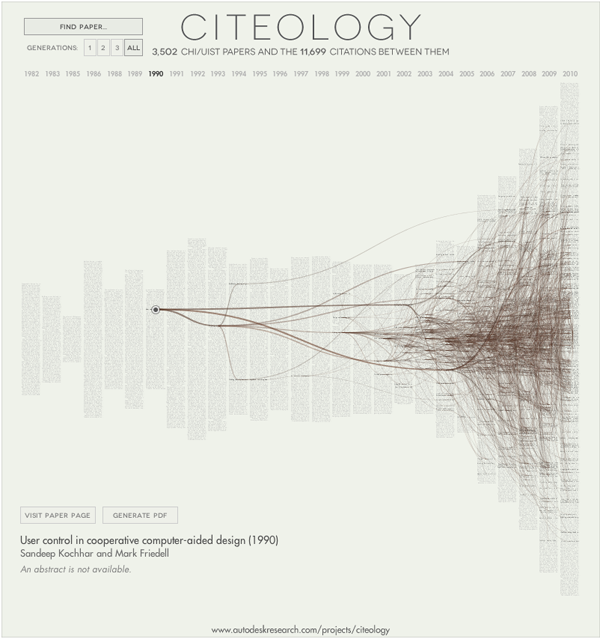
To be fair, the Cooperative Computer-Aided Design paper was written when these conferences were still being established and thus the number of articles available in the proceedings were smaller back in 1990. What’s more, it was probably still a little unclear just exactly what kind of sub-discipline CHI and UIST would come to define. Building up a new research field does not happen overnight and some of the things that seem relevant at first, turn out to fit in better elsewhere.

What needs work

It is a little unclear just how important it is to understand the boundaries of a discipline. For an academic trying to shape a particular kind of career, one in which they believe getting published in CHI or UIST is important, I guess it would be nice to have something like this so they can figure out what the core of popular articles has been so they can get themselves in the stream they’d like to be in. On the other hand, I’m not sure it is always good for academics to create loops in which everyone is citing the things everyone else in their circle has read. Seems problematically narrow to me. Maybe a graphic like this could demonstrate such a narrowing (one would expect the number of cites to grow for a while and then plateau in a false narrowing situation rather than to continue to expand exponentially in a more open-minded, exploratory research field). However, my beef with this kind of thing is that it seems that as a *tool* it will be used to help induce closure in the circle of citations. At the moment, it doesn’t seem like this is happening, but then, we might not expect the closure to be evident until after authors have had a chance to use the tool for a while to help them figure out what to read and cite when they submit to these journals. It does seem like some kind of narrowing of the field happened in about 1992-ish where a plateau in the total number of articles being cited is evident. I would imagine that was a kind of natural impact of having finally settled upon a definition of what the field would be, a necessary winnowing process so that the sub-discipline could find its boundaries and come into existence as a clearly defined entity (a column of water in a glass) rather than spreading out to encompass a little bit of everything (the same water poured out over a table).

Giving credit where it’s due

Thanks to Letta Wren Page, an editor at The Society Pages, for sending the Citeology visualization along.

References

Autodesk. (2010) Citeology Part of the Visualization Project within the Learning Project group.

How many households are like yours infographic.
Overview: How Many Households Are Like Yours? | New York Times using IPUMS and Social Explorer

The American Family – A demographic portrait

The New York Times has been running a variety of stories about American demography ever since the 2010 Census results were made publicly available. In this story (which came out last June…sorry for the delay), the article focused on today’s atypical families by spending time with a family comprised of a mom who used sperm donated by a gay friend of hers to have a baby. The biological dad stayed in the picture more than he had planned, as did his partner, though the end of the article hints that the biological mom and dad might be slowly coming closer to a shared living situation that more closely mirrors the traditional set-up.

That sort of one-off telling of the tale of a particular family is not what drew my attention. The larger demographic trends are what I find more fascinating and the interactive infographic offers a much less linear tool for exploring the changes in the demography of the American family than does the article. The article offers a narrative about a particular set of relationships. The infographic presents a question and then gives users enough historical and national context to poke around the possible answers to that question for themselves.

Married Couple
Married Couple - American Family Demography

The site allows users to start with a head of household – that matches the way the Census is collected and makes sense. I picked a married couple above. Below I pick a variety of others but if you are sick of crappy screen grabs, feel free to go to the NYTimes site and choose the selections on your own.

What works

+ The graphic design is friendly without offending too many sensibilities (OK, the guy’s hair could be different to be more racially inclusive and it would be nice if the woman didn’t have to wear a skirt, but overall, I like the figures).

+ Another thing I like about the design is that they smack the percentage up there without feeling that they have to stick it in a pie chart or a graph or any other visual. They assume people have basic numeracy and can interpret a percentage without having to see it as a pac man…I mean pie chart. This leaves the visual field fairly clean and allows the focus to be on the family.

+ The graphs underneath the main family form do an excellent job of providing historical, racial, and income-based context. I love the history one – I think the big point about American family forms is that they are now and have always been subject to a fair amount of change despite the fact that it is fairly common to hear the “American family” referred to as if it were one kind of thing and had been since time immemorial.

+ The interactive component is excellent. Add some kids. Then kill them off. Or keep the kids and give them a different household head. Or get rid of the young kids and add adult kids. Or forget kids and spouses: just add siblings. Besides how much fun I had doing this, I ended up exploring many more angles of the American family demography question than I otherwise would have.

Of course, I was interested in what the story is for people like me (single women)…

American Family Demography - Single Female

if I were a man

…and whether or not my situation would be different if I were a man. I was surprised that there are more single women than men until I remembered that men die younger so I bet that the difference shows up at the later end of the life course, not so much among my age cohort.

American Family Demography - Single Man

on the other hand

…or had a child on my own like the woman in the article.

American Family Demography - Mom and Kid

What about the same sex couples? Not exactly a huge percentage of the population, but the Census data upon which this was based are having trouble keeping tabs on the variations of legal statuses of same sex cohabiting couples. In some states same sex couples could marry in 2010, in some states not so much. This is a trend to watch in 2020 and 2030.

American Family Demography - Female partners
American Family Demography - Male Partners

What needs work

I wish there were a way to visualize ‘any children’ instead of having everything broken down by age and number of children. I found myself curious to figure out how many households had kids, who they were, and whether or not they were single-headed, couple-headed, same-sex couple-headed and so on. But there’s no way to do the basic kids vs. no-kids comparison here.

Accessing good data online

This contemporary overview of American family demography was put together by some of the digital team at the New York Times and ran alongside “Baby Makes Four, and Complications”. It uses IPUMS data (which came from the US Census but had to be cleaned up and made properly malleable for crunching with statistical software before it could be analyzed).

The Integrated Public Use Microdata Series – IPUMS – is a project based at the Minnesota Population Center and used widely by American social scientists to study both domestic and international demography. Users – and just about anyone can become a user – can download subsets of the US Census suitable for data analysis on typical desktop computers. The subsets are random samples of the full Census and are generally considered to uphold the highest standards currently outlined for use with the statistical modeling techniques that common among social scientists. While IPUMS is an excellent, fantastic, extremely valuable resource for academic researchers. The Social Explorer, a website supported by Oxford University Press and headed up by Andrew Beveridge at Queens College and the CUNY Grad Center, tries harder to produce public-facing reports using data from IPUMS as well as the American Community Survey and other large-scale surveys. The Social Explorer also makes data available for others to analyze, so between IPUMS and The Social Explorer, it is much easier to get good data sets for analysis than it was in the past.

References

Kleinfield, N.R. (19 June 2011) Baby Makes Four, and Complications New York Times, NY/Region Section.

Steven Ruggles, J. Trent Alexander, Katie Genadek, Ronald Goeken, Matthew B. Schroeder, and Matthew Sobek. Integrated Public Use Microdata Series: Version 5.0 [Machine-readable database]. Minneapolis: University of Minnesota, 2010.IPUMS USA website

Beveridge, Andrew, et al. The Social Explorer website. New York: Oxford University Press.