Archive: Sep 2011

Food Blog Study Descriptive Statistics Part 1 - Blogger Demographics

What works

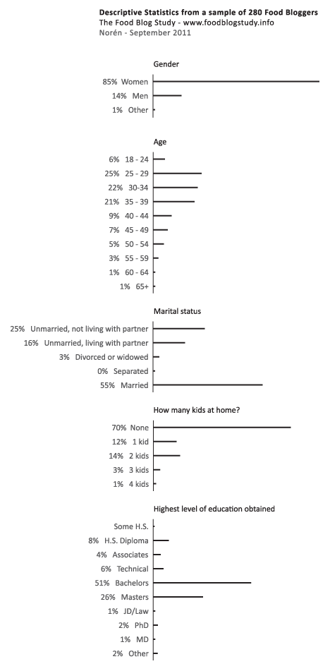
Over the summer I surveyed 280 English-speaking food bloggers who were randomly drawn from a network of 23,000. Only the bloggers with email addresses, contact forms, or twitter accounts were invited to participate (obvious reasons…if I couldn’t get in touch with them, I couldn’t invite them to participate).

The graphic above represents my first attempt to present some of the basic descriptive statistics – gender, age, marital status, educational attainment, number of kids – just to see what works visually. Normally, this kind of information is presented in tables (I have those, too), but I wanted to try to add some horizontal bar graphs for impact. I kept them horizontal so that the axes labels would be easier to read.

The percentages are listed; the frequencies are represented visually.

Just for comparison sake (which is kind of difficult): the average age of people in the US is 37.2 (it’s 38.5 for females); about 50.5% of Americans are married now and only 2.5% are cohabiting. As for education, 28.5% didn’t get another degree after H.S., 17.7% stopped after their bachelor’s degree, and 10.4% have professional degrees. Clearly, the food bloggers are well-educated and more likely to be cohabiting than the American averages. I added these comparisons in response to Rob’s request. I know it would have been better to add them to the graphic, but the comparisons are a little tricky because the Census data is looking at a wider age range and I haven’t found any good summary stats on bloggers in general (which would be better than the aggregate comparison to the whole national pool).

What needs work

This strategy would not work for the entire set of variables – boring after a while. I am trying to think of better ways to show more variables at once without just building a column that goes on and on forever.

For more on “what needs work” see the comments section.

Food Price Mashup | Mark Bittman

What works

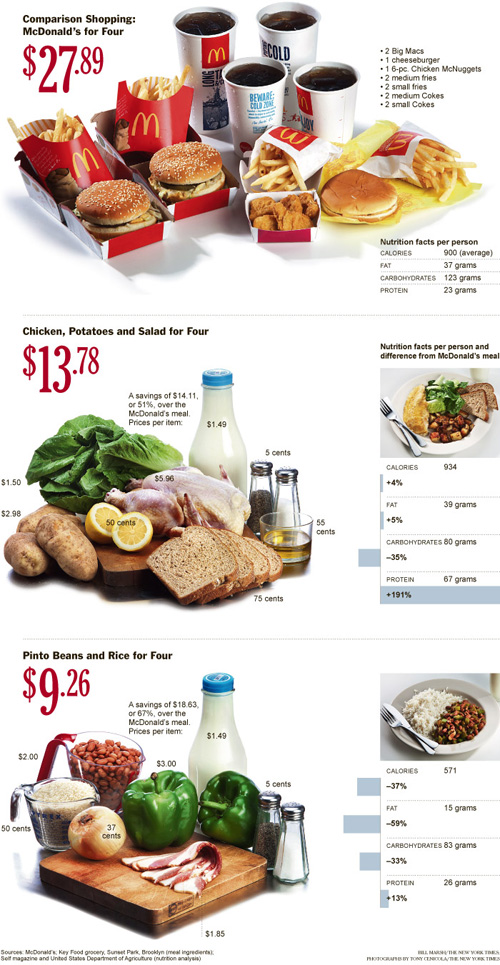
After looking at this graphic, I imagine most viewers come away thinking that fast food is more expensive than cooking at home, which was the intention of the accompanying opinion piece by Mark Bittman. The graphic succeeds in conveying visually just exactly the point that the article made using words.

The photographs are vibrant and catchy, bordering on food porn.

The sidebars feature the calorie counts for these meals in addition to the large price tags. The nutritional information graphs are useful for Bittman’s response to existing critics of the ‘cooking at home is better’ movement who have tried to argue that though fast food may be more expensive on a per meal basis, it is actually cheaper on a per calorie basis because fast food is so calorie dense (if a bit too heavily reliant on nutritionally vacuous fats and sugars). Bittman uses the nutritional information graphs to refute this claim and I applaud the graphic designer for including the rebuff of the critics in the graphic. It would have been easy enough to simply run the photos of the meals with their price tags.

What needs work

The photos take up too much space. This almost looks like an advertisement for McDonald’s, chicken, and beans.

The nutritional information bar graphs are potentially confusing. They do not measure absolutes so much as they show how each of the home-cooked meals stack up against McDonald’s. Since people are not used to thinking of their meals in comparison to what they would have eaten had they eaten at McDonald’s, I’m not sure the comparative nutritional graphs work as well as one graph that used absolute data and had all three meals on it. I am almost positive the graphic designer probably tried making just exactly that graph – if they are out there reading this I invite them to send me what that looked like to prove that my hunch to use a unified graph on this one would have been ugly, confusing, or just plain wrong.

References

Bittman, Mark. (24 September 2011) Is Junk Food Really Cheaper? New York Times, Sunday Review. Op-ed column.

Bittman, Mark. (20 September 2011) Cooking Solves Everything: How Time in the Kitchen Can Save Your Health, Your Budget, and Even the Planet [e-book] published by Byliner.

New Drug Wave Takes Toll | Star Tribune "A Lethal Dose" series

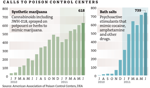
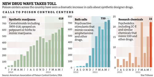
This graphic was subset from a larger graphic. I trimmed off the third drug comparison because it was problematic for reasons I explain below.

New Drug Wave Takes Toll | Star Tribune "A Lethal Dose" series

What works

Tracking illegal behaviors can be extremely difficult because the people participating do not want to be arrested or fined. How then, do health investigators find out what risky behaviors people are doing in their leisure time? In this case, the investigative team on the Lethal Dose series at the Minneapolis – St. Paul Star Tribune newspaper used calls to the poison control center as a proxy for tracking the rise of newly available synthetic drugs. As journalists rather than, say, doctors, they do not have access to patient data. Using poison control center calls is not a perfect indicator of the spread of the new synthetic drugs, but they have followed up these charts with an entire series in which they interview parents and friends of victims as well as a retailer more than willing to defend his right to sell.

What works for me about this graphic is that the investigators found a fairly unbiased source of information about this drug use, something that helps tie the other articles in the series together. Interviewing stubborn retailers and grieving friends and family is part of what journalists do, but those interviews are so emotionally and politically charged that it I appreciate the presence of trend information.

Because these drugs are new, it was necessary to spell out active ingredients because the average person will not know. I appreciate that they included that in the graphic rather than in a footnote.

What needs work

The shading behind the bar graphs is frivolous. It adds no information and is not necessary to guide the eye. It could be dropped and nothing would be lost.

Trend data is better as a line graph than a bar graph because it is easier for the eye to follow a line and to compare one line to another line than to follow a series of steps and compare one series of steps to another.

This blog post focuses on two drugs that use the same axis. I would have kept the same axis for the third drug even though it’s use numbers are lower. Note that all of the drugs started with low numbers and rapidly climbed – perhaps the third drug family “synthetic chemicals” is simply lagging behind by a year or so. It is hard to make that comparison when the axis is so dramatically different from the other two. There is a danger in lying with graphics here – making the third graph seem comparable to the first two implies that the third drug poses an equal threat. The numbers do not support that assumption.

References

Star Tribune staff writers. (2011) A Lethal Dose: The war on synthetic drugs Investigative reporting series.

Star Tribune. (2011) “New Drug Wave Takes Toll” [Information Graphic] American Association of Poison Control Centers, DEA.

Trends in taking pictures of food | blog360i

What works

I appreciate the attempt being made here to break food photography down into a set of categories, separating the cataloguing from the art and the gross/unusual from the special occasions.

It’s nice to see that people are about as likely to be excited about their vegetables as they are to be excited about their desserts/sweets. Perhaps this tells us something about the class position behind the sustainable foods movement? (People with more money are more likely to have fancy phones and phone plans equipped for sending pictures of food around to friends, family, and blog readers. Folks who have more education and are more well-to-do are also probably the most likely to be participating in sustainable/local food projects that spotlight locally grown foods while they are still recognizable in their whole forms such as vegetables before they are incorporated into a more complicated dish.)

The icons are nicely drawn.

What needs work

The colors in the main donut are too similar, especially as they approach red, to be easily distinguished. Further, the areas of the main donut graphic (and the food-type smaller graphics) would have been easier for the human eye to ‘weigh’ if they had been presented unfurled as bar graphs rather than wrapped around each as hoops/donuts.

Wordles do not fall into the realm of useful information graphics. If there is something to be said about the use of particular words – in this case, if there is some importance tied to the intensity of the use of “breakfast”, “lunch”, and especially “dinner” – simply making those words larger relative to other words does not help readers understand any larger meaning to the pattern. In my opinion, if there is something important about word usage, the best way to explain the meaning behind that word usage would be to use…words. I would be interested in reading some paragraphs about why this pattern of generic food words “breakfast”, “lunch”, “dinner”, and “food” is meaningful. The same basic critique applies to most wordles.

The images of the phone, the polaroids, and the door opening at the bottom of the graphic take up tons of space and communicate almost nothing. Personally, I am also not convinced by the argument that since people do not mention brands in their food photography that there is a “huge opportunity for marketers” in the day-to-day practice of food photography.

Overall, there is a glaring lack of context for this information. Even as descriptive information, it is hard to make sense of food photography as a practice without knowing more about the people who are actively doing it. Is it older or younger people? What’s the gender/race breakdown? Is there a core of photographers who are snapping tons of pictures while the rest of the population barely takes any? Many questions remain.

Reference

Wasserman, Todd. (9 May 2011) “What’s behind the food photography trend?” on mashable.com.

360i (2011) “Online food and photo sharing trends” available at scribd.

Philosophy is concerned with questions of perception. Does what I have learned to call ‘red’ elicit the same sensory experience for you? Or are we seeing two different things that become equivocal only through language?

I cannot answer that question.

But I was thinking about it recently because I spend a lot of time thinking about how physical things cross boundaries into digital space. What gets translated well? What is lost? And are there properties of physical objects that are actually richer in digital space than they were when they were physically tangible?

The Shape of a Song
The Shape of a Song

Seeing sound

Coming up with ways to visualize sound is not new. Musical scores ‘show’ players what they are supposed to do in relation to all of the other players. But any good player knows that the score is no substitute for figuring things out together – there is always more to be worked out than the score would seem to allow.

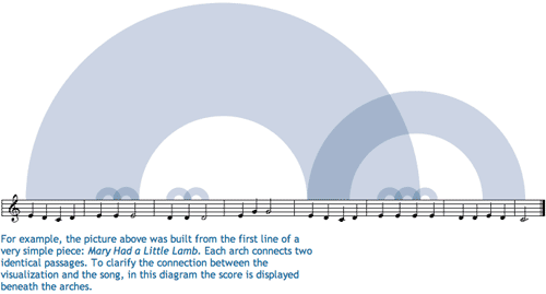
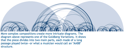
The project “Shape of a Song” by artist Martin Wattenberg and crew takes MIDI files and uses them to map out repetitive elements in songs in order to ‘see’ the patterns in the song.

The shape of "Mary Had a Little Lamb"

I found this to be quite enlightening, at least with respect to repetitive musical elements. It doesn’t do much for pitch, tempo, or anything else critical to song-making. The point is not to detail what is missing here, the point is that seeing the song diagrams helped me to think differently about the experience of listening to songs.

The shape of "Clementine"

This brought me back to the original quandary about whether humans perceive sensory input equally or differently. It seems to me that trying to depict sound as visual or the emotional register of an afternoon as sound requires border crossings, translation processes, that help pin down the original perceptual experience in such a way that it becomes more possible to assess whether the original perception is a shared experience.

The medium for this exchange seems to be a combination of emotion and hard-wired neurology which are not mutually exclusive categories. This isn’t a blog post about those questions. It is a blog for exploring the way that translating a perceptual experience – like hearing a song – into a visual infographic can change our understanding of the element (i.e. the song) in its original format.

First, just translating something into a visual medium might alter the emotional register. Colors are thought to have emotional registers. I’m not going to get into color theory in any kind of depth, but there have been a number of studies, some from evolutionary biology, that have shown red and orange to be routinely associated with danger. Thus, using them in graphics can evoke heightened awareness much like a little burst of adrenaline in a fight-or-flight situation would. Blue is supposed to be more calming; that’s probably why it is the go-to color for corporate America. All of the marketing people will have had color theory 101 beaten into them.

Secondly, translating a perceptual experience into something quantifiable offers are fairly rigid and particular framework for taking measurements and making assessments. I have a feeling that the quantitative turn itself has just as much impact on the interpreted meaning of the piece as the translation into a new perceptual format.

The shape of "The Goldberg Variations"

For ethnographers

Why are these questions about translation coming up? Because ethnographers – those whose craft is translating observations into written words – are constantly occupying themselves with the task of translating experiences and thoughts (often rather layered thoughts) into a static more-or-less linear narrative. Sometimes looking at how translation happens in another context – like from sound to image – can help isolate the process of translation so that the work of that mechanism becomes more obvious.

References

Wattenberg, Martin. (2010) “The Shape of a Song” at turbulence.org