Archive: Feb 2011

Market data for natural gas, 1990 - 2011
Market data for natural gas, 1990 - 2011 | The New York Times

What works

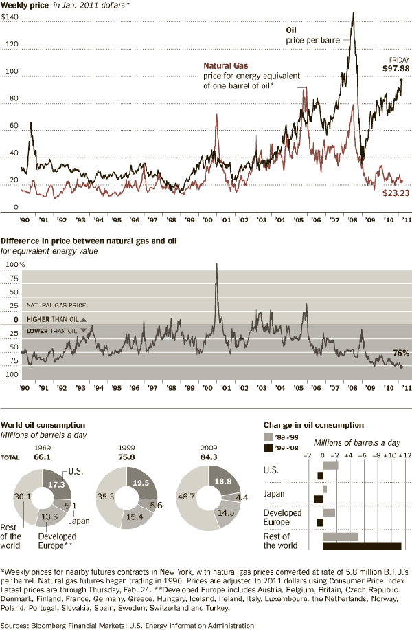
If one graphic cannot tell the whole story, use three. Or four. Or four static graphics plus an interactive graphic (keep reading)! Most people would have stopped creating graphics after they produced the first graph – the one that tracks oil and natural gas prices from 1990 up to 2011. I appreciate the second graph which compresses the salient point from the first graph into a single line. It hammers home the point that what we are meant to notice is not the fluctuation in natural gas prices so much as the fluctuation in the difference between gas and oil prices. The other two graphics both deal with oil consumption only, something I find slightly odd given that the story is about natural gas. Yes, it is clear that there is a relationship between oil and natural gas consumption – we see that with the first two graphs. But we also see from the first two graphs that the relationship between oil and gas is not always predictable, especially not right now where natural gas is significantly cheaper than oil, cheaper than we would have predicted if we had to use the past as a guide. Yes, of course oil prices might go up as they respond to increasing demand from “the rest of the world” (weird terminology that means NOT US, Japan, or “developed Europe”).

It’s also true that oil prices are sensitive to political unrest in the middle east, which has been underway lately in a number of countries. It is difficult to tell if these graphs are using numbers crunched before the revolution in Egypt and unrest in Middle Eastern countries or after. The graphic was published 25 February 2011, well after the Egyptian revolution began. But the weekly price is listed in January 2011 dollars which means the rest of the information might have preceded the Egyptian revolution. Still, the path towards divergence appears to have begun in 2009, which renders the timing question I raised a bit beside the point. And this is why we look at trends over long periods of time. Point estimates can be misleading.

More is more

Natural Gas Fracking

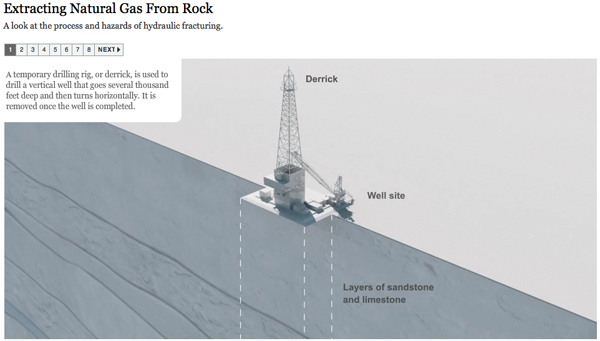
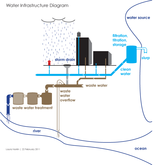
The Times has been covering natural gas regularly, and it seems they decided that more is more in pursuit of a fully comprehensive understanding of natural gas not just as a brute commodity being traded in a free market, but as a potentially harmful environmental toxin, especially when it is seen as being at the center of brutal extraction practices. There is an elegant slideshow-animation that describes how natural gas is extracted and explains what the consequences of this practice can be as a result of the mechanical changes the drilling process leaves behind.

The combination of slideshow and animation works well here. If it were just an animation, it would be hard to fit the explanatory text within the temporal flow. Giving the viewer a chance to watch a small segment of animation and then read an explanation about what is supposed to happen and what can go wrong brings appropriate pacing to the explanatory experience. What’s more, I think it is a great idea to force the viewer to keep clicking in order to advance the slides. It’s barely above a fully passive learning experience, but anything that raises the level of participation – like reading or having to click somewhere – helps keep the viewer’s body and mind more fully engaged and pumps up retention.

My favorite slide came near the end – these people built up some narrative tension. I kept wondering where this drilling process went wrong. So when do the toxins hit my drinking water? That’s what I was wondering, and this slide filled me in. It’s a simple question, one that we know we’ll find the answer to based on the title of the slideshow, but it’s always good if your viewer goes in with some direction. An obvious question is fine. Getting viewers to envision a more complicated question might be better, but overall I think this approach works well.

Natural Gas Fracking - Water problems

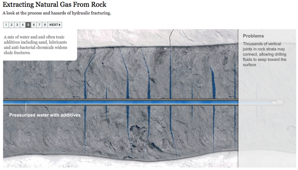
Please click through to make sure you understand why fracking presents environmental problems. I do not want to spell it out here because I think that would lessen your experience of the interactive graphic as a learning tool.

References

Norris, Floyd. 25 February 2011 Two Directions for the price of natural gas and oil New York Times.

Graham Roberts, Mika GrÖndahl and Bill Marsh. 26 February 2011 Extracting Natural Gas from Rock [Interactive Graphic]. The New York Times.

PS

It feels like swearing to talk about fracking. Thank you, Battlestar Galactica.

American Shame | Charles Blow for the New York Times

What works

To social scientists: you can make your own information graphics with the programs you are already comfortable using. This graphic is something you could put together in Excel. One of the common questions I hear goes something like this: “I want to use more infographics but HOW do I make them?” I often use the Adobe Suite to make my graphics, but sometimes Excel can be a decent tool for making fairly sophisticated tables. I would not recommend trying to use Word to make graphics. You will become so frustrated with the clunkiness of trying to use a word processor as a graphic design tool that you may be tempted to pick up your computer and throw it out the window. Or, if you are a pacifist, to pick up yourself and leave the office for the rest of the day. But Excel is a more robust, stable program that won’t get finicky if you start manipulating cell colors and border conditions.

What needs work

In general, Excel is probably not the program that’s going to generate elegance. It will allow you to use color and line weight to add layers of visual information, but as you can see here, the results are not necessarily going to be attractive.

In particular, this graphic makes weird color assumptions. The red is bad, the gold is good, and though there is a kind of natural spectrum between red and gold, this graphic doesn’t follow it. I would have used a single color and varied the hue. I have no idea why the middle category is grey. In my mind, grey does not appear on the color spectrum between red and gold. To strengthen this table-as-graphic, I’d go ahead and let every cell (except the empty ones) sit on the color spectrum being used to represent the best and worst. Color can be most meaningful only when it is used consistently. As it stands, there is an inconsistency in the middle categories here with the grey and an unnecessary use of two colors where one would have been enough.

I’m on the fence about the use of apparent depth or 3D-ness. The ‘worst’ buttons stick out like red pimples. On the one hand, the wannabe rebel in me is pleased to see that sort of flagrant display. On the other hand, the depth doesn’t so much add information as it adds visual clutter. Red is enough to make the ‘worst’ seem bad, right? I don’t know. Like I said, I’m on the fence. Maybe the depth element adds value because it helps anchor the eye *somewhere* in this rather extensive table. But it’s used so much that I’m not sure that purchase rings up when all is said and done.

Overall, presenting tables-as-graphics introduces an information overload scenario, one that this particular approach did not surmount. But that doesn’t mean all tables are bad or all uses of color in tables is bad.

I am also deeply skeptical about the Gallup Global Well-Being Index. I’d skip it. Who the heck knows what it means to have a failure to thrive? Very skeptical…

References

Blow, Charles. (2011) “Empire at the End of Decadence” in The New York Times, 19 February 2011. Featuring information graphic “American Shame”.

Water Supply Infrastructure Schematic
Water Supply Infrastructure Schematic | Laura Norén

Water Infrastructure Schematic Diagram*

I put together the diagram above to help me explain how water is delivered and taken away from urban locations. The point I want to make with the diagram is that the infrastructure is designed to deliver water to ‘typical’ buildings and that this means people who are wandering around cities where buildings are all private also lack access to water. There is a political debate going on right now about whether or not access to water is a human right – the UN voted on this and decided water IS a human right but large countries like the US disagreed. When the US does not back UN resolutions, those UN resolutions tend not to mean as much.

So why would the US vote against this resolution? I am not altogether sure, but I believe it has something to do with the fact that many places have privatized their water. Privatization of water takes different faces. Sometimes a system like the one diagrammed above is privatized. Studies have shown that when this happens, the company that sets up a system like the one above delivers a poorer quality product – more sedimentation and other low level contaminants which are the typical results of choosing sources quite close to cities. The closer the source is to the delivery, the lower the expenditure for engineering and installation of water mains, monitoring stations along the route, and reservoirs. The other way in which water can be privatized is through bottling – bottled water in some parts of Africa is more expensive than Coca-Cola. And this in areas that may have no access to safe alternatives for drinking water. Nestle owns the Poland Springs brand and folks in Maine are scrambling to get hydrological studies performed that can prove Nestle’s water extractions are drawing down lake volumes on adjacent properties. The only way to fight Nestle, it seems, is to prove that they are damaging one’s own property and yet water sources – rivers, lakes, oceans, springs – technically do not belong to private individuals. The individuals or corporations can own the land surrounding them, but the water is a bit like air and cannot be owned. (Rights to the fish found in the water CAN be owned. As you can see this gets complicated quickly.)

The diagram above contains none of the politics of the discussion below. For me, it is important to attempt to create graphics that are not political, even when I am creating them for the express purpose of delivering a presentation that takes a side in a political fight. For me, the challenge is two-fold. First, I face the technical difficulty of creating any kind of complex diagram. I’ll leave questions about execution out of this particular discussion though feel free to comment on execution below. Second, when I know I have a political message that I want to keep out of my graphics, I am often too far into my own head to be able to step back and determine whether I have created something that is both comprehensive enough to tell a complete (but apolitical) story and one that does not drift into the political. As it is, this diagram seems to err on the side of being incomplete rather than being more fully detailed where the details start to carry politics with them. My larger point is that this is one way in which cities are exclusionary zones by design. It would be easy to find a way to provide the basic infrastructure to supply water outside of buildings – fire hydrants do just that. But maintaining the ‘last mile’ of infrastructure is almost always completely given over to the private sector. Individuals and companies maintain bathrooms with all of their fixtures, cleaning, and maintenance requirements. This is big business. Just about every shop and restaurant on the street in New York reserves the rights to the bathroom for customers only.

2nd Avenue "no bathroom" sign, East Village, New York City (2009)

One of Starbucks redeeming qualities is that their bathrooms tend to be open to all, proving that it is possible to continue to service a relatively affluent clientele no matter who is in the bathroom.

Obama on Water

The word on the political street is that even though Obama’s stimulus efforts contain plans to address infrastructure, water infrastructure has been taken off the table at this point. Our water infrastructure is ageing; most of the current infrastructure is due to age out of acceptable functionality in the next ten years. Already there are an average of 240,000 water main breaks. Just yesterday the New York Times reported that a dam outside of Bakersfield is uncomfortably close to catastrophic failure, threatening the lives and livelihoods of thousands of people. There are another 4400 dams in the US that require work in order to fall within comfortable safety ranges. Some are publicly owned, some are privately owned. In either case, it is unclear which entities can foot the bill (projected at $16 billion dollars over 12 years).

*This diagram uses New York City as a guide. Not all cities have overflow valves that risk the release of raw sewage due to increases in rain. What’s more, in New York there are some other systems in place to recapture some of the overflow at the point of release. But this is a different kind of political discussion, one that focuses on the other typical focus of water discussions – the environment.

References

Ascher, Kate. (2005) The Works: Anatomy of a City. New York: The Penguin Press.

Bone, Kevin, ed. and Gina Pollara, Associate Ed. (2006) Water-Works: The architecture and engineering of the New York City water Supply. The Cooper Union School of Architecture, New York: The Monacelli Press.

Bozzo, Sam. (2009) Blue Gold: World Water Wars [Documentary film, available streaming for free]

Davis, Mike. (2006) Planet of Slums. Brooklyn, NY: Verso Books.

Fountain, Henry. (2011) Danger Pent Up Behind Aging Dams. New York Times. 21 February 2011.

Open Defecation by Region in India

India’s Public Restrooms

In “Squatting with dignity: Lessons from India” Kumar Alok details efforts to increase the provision of sanitation at the household and community level. Along the course of the book, he presents all sorts of interesting data – some of his studies present information rarely gathered in the US. In the first table I’ve chosen (on page 293), Alok demonstrates that even after areas have received ‘Clean Village Awards’ (Nirmal Gram Puraskar = NGP and means Clean Village Award) there is generally still open defecation, one of the key elements that was supposed to have been eradicated in order to achieve the NGP status in the first place. He writes that the reason for this is multiple. Of course, the first problem is the lack of household toilets, then there’s the lack of public toilets both of which force people out into the open. The Clean Village Award was intended as a measure to increase investment in toilet infrastructure and winners in the first year were photographed shaking hands with the President of India. Alok’s deep research revealed that this photo opportunity caused leaders in many villages to seek the award just to have a photo with the President. This increased the number of awardee villages in the second year of the program so much that the President was not able to shake all the hands: “…only few were allowed to personally receive the award from the President of India. For the rest, the photographers did the magic. Using the modern computer tools, they produced photographs of individual PRI members shaking hand with the President of India….There was a serpentine queue outside the photo shops in Bengali Market immediately after the NHP award distribution ceremony was over.”

It is hard to predict just what will stand in the way of public toilet provision. I would never have guessed photoshop (and its knock-offs) could have led to an increase in pro-toilet hype while subverting actual investment in toilet infrastructure.

Where do people excrete in India?

Where do people in India excrete?

The bars above are a bit clumsy as graphics, but they contextualize the information about open defecation by illustrating where else people might relieve themselves. The IHHL category refers to Individual Household Latrines and is the lowest section of the bars [the color coding does not come through at all]. Basically, this refers to people who use the toilet at home but does not indicate just how those toilets are plumbed. They may or may not be flush toilets. Many of them are not flush toilets. I find it useful to see how much variation there is across space. I also think it is worth noting that there are very few people who report using community or shared toilets. Open defecation is far more common than either of those two categories. In her film Q2P Paromita Vohra shows viewers that women have very few opportunities to use public or shared bathrooms. There are not many public facilities and where they do exist, the women’s areas are often taken over by men, leaving the women without a place to go. What’s more, where women’s rooms are still for women, the women have to pay to pee but men can use urinals in the men’s room for free.

Alok notes that another contributing factor to the relatively high proportion of open defecation is that not all toilets are being used. Sometimes open defecation is preferred. He writes that children are not deemed to need as much privacy as adults and that, furthermore, their feces is not thought to be as ‘dirty’ as adult feces. Thus, children are often allowed to go in the open rather than seeking out toilet facilities. As a result, “in only 51 per cent of the households either children are using toilets or child feces are disposed in the toilet. Forty-one per cent of households dispose feces in open space or along with solide waste, while 3 per cent drain out feces in the drain.” While it may at first seem a bit silly to think that children’s waste is somehow different than adult waste, think about what we do with dog waste. In the US people use hands covered with thin layers of plastic (or paper) to pick up dog poo and then dispose of it as if it were solid waste.

Alok continues to investigate sanitation practices, writing about hand-washing practices. This kind of information is something I would like to see for US-based populations. It is out there for hand-washing following the bathroom but there are not always break downs by what the person was doing (pooping or peeing) and I cannot recall coming across information about hand-washing before eating or after changing diapers…or picking up after dogs.
Hand Washing in Indian towns with "Clean Village Awards"

What works and needs work

My job here is to critique graphics and graphical representation of social science data. The tables and graphs here are not at all easy to use or beautiful to view. But the information is fascinating. It is almost always more important to get the information out in front of a public than to hide it away because it may not be formatted as well as you might like it to be.

References

Alok, Kumar. (2010) Squatting with Dignity: Lessons from India. New Delhi: Sage Publications India.

Trends in returns to college degrees, 1973-2009

What works

Looking at change over time is often best when using simple trend lines. They are easy for the eye to follow – easier than if the same figures were depicted as bar graphs. Given that there are measurable and meaningful differences between the returns for men and women, it is a good idea to show two separate trend lines, as they have done here.

What needs work

The major problem is that returns to college education do not come only from the education received. This trend line is a simple construction that cannot sort out how much income can be attributed to college alone. Sociologists know that a combination of factors – from parents’ educational attainment and parents’ income to things like the student’s aptitude – impact measures of the student’s attainment (like income and wealth). A far more sophisticated model would estimate just how much income one could expect, all other things being equal, for each additional year of schooling. That’s a much tougher model to construct and it wouldn’t be something that could be plotted using trendlines.

In fact, one of the big problems with trend lines is that they are often overly simplistic. On the other hand, they can be excellent representations of the big picture, whatever that might be. There is no simple rule I can think of that would help sort out when a trend line is a great idea and when it is overly simplistic. In this case, change over time is hardly the main story. The real wrinkle when it comes to education is that it can be difficult to determine if students are receiving indoctrination into social networks, ways of acting, and professional networks while they are at college and that these are the advantages that lead to the later bump in income or if they are receiving important knowledge that makes them better, more qualified workers. What’s more, even if we will never be able to divorce the networking from the knowledge gained, we still wouldn’t know how much the background a student starts school with influences their later life choices. Think about this. If someone deeply embedded in a network of people who would usually be a college attender chose not to go to college but continued to hang out with the same people and therefore received much of the same college experience, social and professional networks, how would they fare later in life? Since social scientists cannot randomly assign some students to attend college and others not to, it is very difficult to answer this question. And in this case, a trend line is an oversimplification that misses the major questions about returns to higher education altogether.

Knowing what we know about the various influences on wages later in life and what we see in the trend line, we might assume that women are better able to use educational attainment to escape lower incomes that would have been predicted by, for instance, their parents’ education and/or income. But again, the suggestion that educational attainment has some kind of positive influence on wage premiums is correct, but incomplete. Any assertion about the relationship represented by this graphic is likely to be inaccurate and certain to be incomplete.

References

Blau and Duncan’s Status Attainment Model.

Field of likely GOP candidates for Republican party nomination | Nate Silver

Nate Silver of 538 created this field map of the likely GOP candidates seeking the party’s nomination for President. I note, as does Mr. Silver, that none of these candidates have yet announced official intentions to run.

What works

Mr. Silver and I seem to share a fondness for two-axis field maps as a way to wrangle with a pool of qualitative information. Earlier, I used the same kind of strategy to sort my thoughts regarding peeing in public.

Here Mr. Silver is the field map approach (along with different sized/colored circles) to apply a system useful for thinking through the possible Republican nominees for President. As he explains, the x-axis is one of the most commonly used sorting devices for any candidate – political conservativism on the right, liberalism on the left. In this case, because all the candidates fall to the right of center, ‘moderate’ is used as the left hand label. Mr. Silver admits the y-axis need not have been the one he chose. But he decided to go with insider-outsider status because that will be an important element in this primary battle, given the claims made by the Tea Party.

The two axis field map works well for establishing some basic rules with which to sort out candidates who are attached to all manner of qualitative facts that may matter. The field map gives us a way to sort out messy, unmeasurable (qualitative, or quantitative but on different scales) information in a way that allows us a bit of clarity. If you want to use this as a tactic in your own work, I would suggest thinking through a number of different choices for axes. In this case, Silver was fairly confident about the x-axis (level of conservativism) but he was less sure that the y-axis was going to be the most meaningful compared to other choices. He didn’t discuss the other y-axes he might have considered – I can think of a few – but the point is that if you are using this approach in your own work, you need not limit yourself to coming up with one field map. In a situation like this one where you are reasonably certain about the x-axis, keep that same x-axis but redraw the field map with multiple y-axes. Maybe one of them will make the most sense. Likely they will all make some sense when it comes to explaining some things, but not as much when it comes to explaining something else. It is acceptable to end up with an array of field maps, not just one. The social world is a complicated places. Expecting it to fit into a two-axis field map is unrealistic, but helpful as a starting point.

Also, in this case, I like the use of different sized circles. The bigger the circle, the higher the odds of that candidate’s taking the nomination, according to a third party.

What needs work

I am unconvinced by the use of color. Silver himself wasn’t sure that it made sense to color-code these folks by their region of origin, but he threw in the color just because region of origin has mattered in some elections in the past. Again, if one variable doesn’t quite jive with what you think matters, I might try another. For instance, as the primary race heats up, maybe Silver would want to drop the concern with region-of-origin in favor of something like ‘attitude towards gun control’ or ‘attitude towards abortion’. Since neither of those are binary issues, he might be able to get away with using a single hue and darkening it for ardent supporters while moderate supports end up with lighter hues. Clearly, that graphic technique could be used to represent any kind of platform issue.

Further Reading

I encourage you to read Silver’s full post if you are interested in figuring out why he put the candidates where he did. No need to rehash what he has to say – he does a better job of explaining himself than I could.