What Works
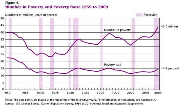
I love that recessionary periods are included in this graphic. They are the lavender columns and it is obvious that recessions tend to correlate with increases in the number of people in poverty and that the current recession is really a doozy.
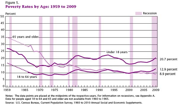
What saddens me the most is the graphic that depicts how poverty breaks down by age. First, note that people over age 65 have the lowest poverty rate of any age group. Then remember that they receive social security and health care. Now wonder what would happen to the economy if every US citizen were supported at that level or above. I cannot answer that question, but this graphic compels me to pose it.
Second, note that the age group most likely to be poverty stricken is children. Over 20 percent of people under the age of 18 are living in poverty. Think about it: if a parent with three kids loses his or her job, that means four people are negatively impacted from that single job loss. In this economy, I’m guessing that is part of the reason we see children sliding into poverty.
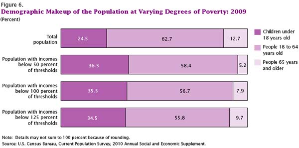
Third, have a look at this next graphic. Note that beyond the absolute number of poor kids and the rate of poverty among children, the proportion of impoverished Americans who are under 18 shows over-representation. Growing up poor is not only difficult for the kids, but it is not good for the future of the country. Being poor comes with all sorts of baggage for kids – they are more likely to live in poorer school districts with lower quality schools, they are more likely to live in more dangerous neighborhoods, they are more likely to have food insecurity (just try studying for a math test or writing a composition when you’re hungry), poor kids are more likely to be African or Hispanic American which might mean they are also dealing with face-to-face and institutional racism all throughout their lives, and so forth. Not trying to sound like Stevie Wonder here, but these kids are our future. As a country we’re doing a crap job at making sure they have the basic physical, social, and educational support they need to live up to their best potential. Quite stupid. Decision making made by people who have trouble seeing past the end of their own nose, perhaps?
Forgive me. I know I am supposed to keep politics out of my blog but it’s hard to see how making sure kids are not living in poverty is a political issue. It’s a human issue. I would hope we can at least agree kids should not be living in poverty. I realize that it is much more difficult to agree on how to go about getting them out of poverty and preventing others from becoming poverty-stricken in the first place.
What Needs Work
Right. So what needs work here is our economy. But that is not news so I’ll let that debate sit.
The New York Times article about this topic pointed out that what needs work is the way the poverty line is calculated. On one hand, at about $11,000 for a single adult and $22,000 for a family of four it’s awfully low. This is because when the original formula for calculating poverty was adopted, it was tied to food prices and food budgets now make up a smaller proportion of the overall family budget than they did when the formula was concocted. [Remember this example folks: equations are not unbiased.] Over the years, family food budgets have experienced a real drop due to subsidies (the true costs are not passed to consumers), technological advances (we can grow more for less $ with fertilizer, GMOs, antibiotics for livestock, and pesticides for greens/grains), and ‘advances’ in corporate agriculture (economies of scale, see Michael Pollan’s work, Eric Schlosser’s “Fast Food Nation”, Marion Nestle’s “Food Politics”). Other critical costs for surviving from day to day like housing and health care have risen. On the other hand, benefits from programs like food stamps are not included in ‘income’ so there might be a few people bouncing above that poverty line once we take their food stamps (and a few other benefits) into account. Then again, the poverty line is too low so even if food stamps sends a family above it, they are still likely to experience poverty even if they don’t fit the current fiscal definition of poverty. The other problem with the calculation is that it does not take into account differences in regional costs of living. Living in New York City is expensive. Living in a rural area may be less so though paying to own, insure, maintain, and fuel a car or two to drive to work, school, and the grocery store could hike up the rural cost of living more than I know. With an annual budget of $22,000 for a family of four, a car or two would be a real cost, one that an NYC resident would not need to handle.
There is a graphic in the report that shows where poverty rates would be if the poverty line were adjusted upward or downwards.
References
DeNavas-Walt, Carmen; Proctor, Bernadette; Smith, Jessica. (September 2010) Income, Poverty, and Health Insurance Coverage in the United States, 2009 US Census Bureau, Current Population Reports: Consumer Income.
Eckholm, Eric. (16 September 2010)
Poverty Rate Rose Sharply in 2009, Says Census Bureau. New York Times.