What Works
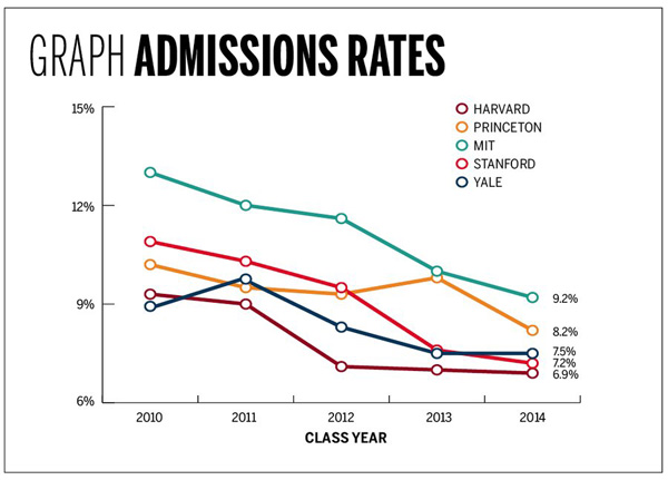
The above graph was produced by Yale Daily News. It is clean and does a good job of displaying their admission status compared to their competitors. The reason I thought it was worth mentioning is that a few small aesthetic decisions make the graph pleasing. I like the open circles. I like the fact that the ending values are included as numbers. I would have liked it if they had included starting numerical values, too.
Comparison
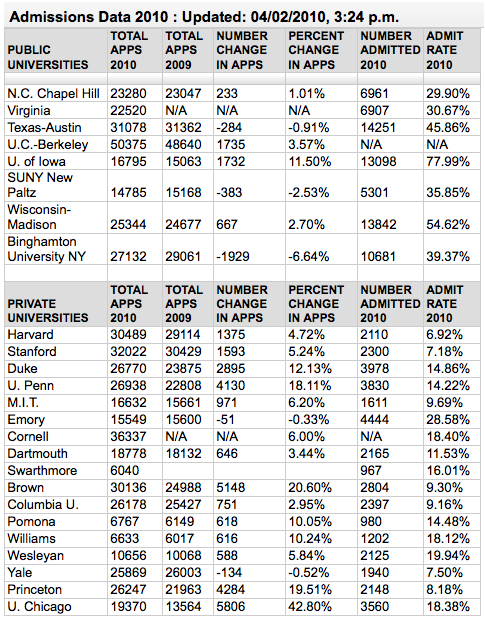
For those going through the college admissions process, it can be all-consuming. The New York Times runs a blog called The Choice that focuses solely on this process from the testing to wait lists to moving, transferring and everything in between. Unsurprisingly, then, they ran a table showing similar information about a larger number of schools which they gathered through a mix of old-fashioned reporting – contacting schools and asking them – and Web 2.0 reporting in which schools who had not made the initial deadline could email their data in to be added to the table. Have a look below.

Ask yourself about the difference between a table and a graph when it comes to conveying information. Edward Tufte is a fan of tables because they can display a great deal more information than a graph. That is true in this case – look at how many more categories of information there are in the table. What do you think? When is it better to present a table full of all the details and when is it better to display a graph like the one above?
References
Lu, Carmen. (5 April 2010) Admissions game getting riskier. Graph. Yale Daily News.*
Sternberg, Jacques. (2 April 2010) Applications to Selective Colleges Rise as Admission Rates Fall. The New York Times “The Choice” blog.
*Note that I wonder if the graphic designer got the data from The Choice blog piece – the publication dates could just be coincidental.

Comments 1
Jay Livingston — May 18, 2010
The graph, with the names of the schools, suggests that this is about colleges. But it's much more about high school seniors.
The downward trend of the lines coupled with the title ("Admission Rates") hints that colleges are admitting fewer people when in fact the decline in rates is almost entirely caused by an increase in applications. Why not a graph that showed the numbers of both applications and admits for each school?
And while we're at it, that increase in applications could have three causes
a. an increase in the percentage of high school kids applying
b. an increase in the average number of schools that each kid applies to
c. an increase in the number of kids (caused by an increase in birth rates 18 years earlier)
Which of these accounts for the largest share of the change in admission rates? My guess is c, then b, then a.