What needs work
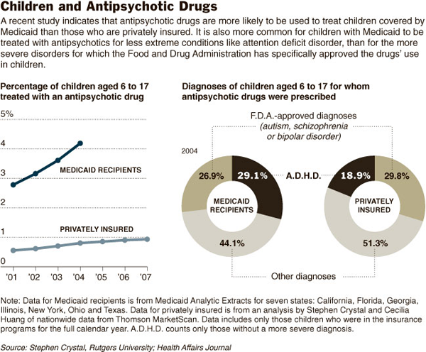
Forget the line graph for now and look at the donut chart. Pie charts are hard enough to read, I think donut charts are even harder. I would prefer that the donut get stretched out like in the literacy in the US graphic from last week. It’s easier to compare the length of a line segment than the length of a curve.
There is an obscurantist move going on with the use of percentages here. What we need to contextualize the data shown is the percentages of children on Medicaid and with private insurance who seek mental health diagnoses in the first place. Maybe the privately insured are self-selecting more intervention, even where it’s unwarranted, because their kids might be in schools that are more sensitive to classroom disruptions or for some other reason. In that case, a more sensitive trigger that sends these privately insured kids to the doctor in the first place would render the finding that fewer of them have serious problems not nearly so alarming as the article makes it out to be. The article implies that as a society, we are stigmatizing poor children as mentally unhealthy and prescribing them drugs with serious side effects. If that is what is happening, it is truly uncool. But I don’t feel like we can come to that conclusion based on this graphic. Not enough contextual information.
Furthermore, the slush category is just too big. Over half of the privately insured children are receiving “other diagnoses” and 44% of the kids on Medicaid find themselves in this category as well. I really don’t know how to fit that into the argument that Medicaid recipients are receiving drugs for lesser disorders than privately insured children. The category is so large and so ill-defined that it offers no contextualization for the diagnoses that the article is most interested in – namely, ADHD and autism+schizophrenia+bipolar disorder. Maybe the kids in the slush category are receiving essentially the same sort of diagnosis except that prescription drugs are not involved. We have no idea what is going on in this category and it is too big to write off.
The article points out that prescribing drugs for the treatment of psychotic disorders in children should be done quite carefully because the drugs carry many side effects. I think that the narrative of the article could have been strengthened by a graphic that fixed the above-mentioned problems as well as describing the more qualitative outcomes of the drugs. Show me a graphic of what happens to a kid who is properly diagnosed and takes the drugs (weight gain, etc) vs. a kid who should have been diagnosed and treated with drugs but wasn’t (more suspensions, etc.) vs. a kid who received non-drug treatment for a correct diagnosis vs. a kid who received drugs but had only a sub-clinical problem that shouldn’t have been medicated. And for the economists, throw in the economic cost of these various treatment options.
References
Wilson, Duff. (2009, 13 December) Poor Children Likelier to Get Antipsychotics New York Times, Health Section.

Comments 1
Mike — December 17, 2009
I'm not on a computer where I can easily access the article, but the other element that the graphic leaves out is what the underlying prevalence of each of the relative components of the graph are. I imagine that the researchers accounted for this in the article (and would be disappointed if they did not), but the graphic doesn't mention it anywhere. It could be the case, for example, that prescription patterns are entirely consistent across the Medicaid and private insurance groups, but that ADHD is simply more common among children on Medicaid. This would lead to differences in prescription rates, but not necessarily an underlying disparity in treatment rates.