Minnesota

World's water resources by type of water, via The Atlantic data from the USGS

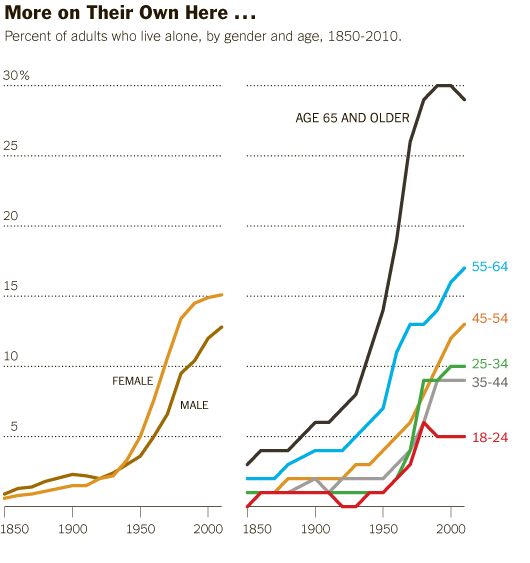
Is Minnesota like Saudi Arabia?

Minnesota is the land of 10.000 lakes and thus holds far more than its representative share of precious fresh water. Is this synonymous with the naturally granted wealth of oil in countries like Saudi Arabia? Maybe. But does that mean Minnesota is going to become a state with a similar level of political economic power? No…not so much. It is silly to compare nation states like Saudi Arabia to states in a federation like Minnesota; it is silly to think that a state with an existing economy relatively unreliant on water is going to suddenly transform itself into an economy with a single primary commodity; it is silly to think that a democratic governance system will respond like a dictatorship did to a valuable commodity. As an aside, Tim Mitchell’s latest book, Carbon Democracy makes a historically grounded argument about the relationship between the material qualities of oil and coal and the technics of the political economy that developed in concert with carbon-based wealth.

How are information graphics like propaganda?

This infographic is more than half graphic (and less than half ‘info’). Normally, that’s not the best balance for displaying social science data. Usually, social science data is multi-faceted, requires a contextual framework for adequate understanding, and the sheer amount of information necessary to tell the story makes it harder to include graphic elements that do not represent information. However, this is not social science data. Technically, it is geological data, but I think it would be more accurate to describe it as data that is being mobilized for political reasons. Hence, the title of this post makes a blatant comparison between water (blue gold) and oil (black gold) to emphasize the implicit political valence of the message in this graphic.

In short, information graphics are being mobilized for what are essentially purposes quite similar to propaganda. This particular graphic is not the best example. It is the example I happened to see yesterday, and it does a good job of demonstrating what is at stake in the current infoscape with respect to information graphics. These graphics are generally considered to be intellectual and political lightweights compared to communication that is based on the production of critical texts. Overlooking the work that these graphics do is both dangerous and foolish. For one, many critical voices from within the academy *have* critical messages they have trouble communicating with broader audiences because many audiences are unlikely to read academic writing, even if that writing is posted to blogs. If these academics can create their own graphics, they add another tool for communicating clearly just what their perspective is. Yet pretending that information graphics are either merely ‘pretty’ or that they are straightforward representations of empirical data avoids engaging with the way that political messaging is built into graphic design.

One reason this blog exists is to help people start to sharpen their critical visual analysis tools. As educators, we spend a lot of time in the classroom teaching students how to write and how to stop believing everything they read by becoming aware of rhetorical moves, selective mobilization of facts, and reliance on carefully chosen narratives that initiate particular kinds of human perceptual biases and emotional responses. Art historians teach the same kinds of critical skills for interrogating paintings and photographs. Media studies folks teach the same kinds of skills for interrogating popular culture products like television shows, films, and magazines. Social scientists would serve the discipline well if they begin to teach students how to critically consume information presented in infographics.

References

Thinking Big Series. (2012) The World’s Water Supply. The Atlantic. This series is sponsored by Fidelity Investments, LLC.

Mitchell, Tim. (2009) Carbon Democracy: Political power in the age of oil. Verso.

Living Alone by Gender, Age Cohort in the US
Living Alone by Gender, Age Cohort in the US since 1850

What works

This post is an update to an earlier post about the increasing rate of Americans living alone. The first graph does an excellent job of visualizing the change in Americans’ tendencies to live alone, by age and gender. It’s clear that living alone is on the rise, especially for Americans over 45. It’s interesting that there seems to be a collective slow down in this trend in the decade between 35 and 45 when I suppose some of the late-to-marry people finally settle down and before the marital dissolution rate starts to fire up.

The graphics in this post accompanied an article by Eric Klinenberg in the New York Times Sunday Review that laid out the basic findings in his latest book, “Going Solo” that was based on 300 interviews with people living alone. He finds that while for some, living alone is an unwanted, unpleasant experience, most people who live alone are satisfied with their personal lives more often than not. In fact, they are more social, at least in some ways, than are their counter-parts who live with others. Singletons (his word, not mine. I prefer ‘solos’ in part because it’s an anagram), go to restaurants and other social spaces more often than do those who live with others.

Living alone in Minneapolis

In a number of cities, including Minneapolis, more than 40% of households are single-people households. The article included an interactive map down to the census tract level that shows what percentage of households in that tract were single-person households in 2010. I took a look at Minneapolis and St. Paul and found that the map supported Klinenberg’s qualitative findings. The highest concentration of solos is in the center city areas where opportunities to get out and be social in the community are the highest. The suburbs and rural areas have fewer solos.

I encourage others to use the map and see if their local cities replicate this pattern, that more solos live in ‘happening’ areas than in quieter areas. Of course, this could be caused by a third variable, the presence of households that are affordable for single-earner households…but there isn’t enough analytical power in the map tool to be able to sort out the dependencies.

What needs work

The information about who lives alone by age, marital status, and race that is displayed in the following long skinny stack of datapoints is the right kind of detailed information to use as an entrance into a deeper discussion about living alone, now that we’ve gotten a sense of the view from 30.000 feet. The problem is that this graphic is hard to read, too long for a single computer screen (but in order to make sense of it, one needs to see the whole thing at once), and too optimistic about what color differences are able to do than is reasonable.

The article does a better job of subtly navigating the movement from historical and international context into a detailed, robust analysis. By awkwardly pinning all the data points onto the stalk at once, viewers lose the ability to see patterns within data subsets. Here’s a test. Look at the following data and try to explain to yourself how race and living alone go together. Or how age and living alone go together. The graphic designer was hoping color would be able to do more than it has been able to accomplish here. The color is supposed to tunnel your vision down to a particular color-coded subset so that you can start to understand well just what it is about race or age or marital status that produces particular patterns in living alone. But I had a lot of trouble with the color frame because, quite literally, I had to keep shifting the frame around this graphic – it didn’t fit on my laptop screen. [Graphic designers often work on nice, roomy screens where they end up seeing more at once than their eventual audience who is probably peering at this thing from a web browser on a laptop or occupying half of a monitor somewhere.]

All the clustering around the mean is another problem that could have been avoided had the graphic been organized differently. As it is, all sorts of groups lump on top of one another down around 14%.

I also kind of hate that I can’t add categories together in any meaningful way here. I can tell that being a widow would put someone at high risk for living alone, but that’s kind of a no-brainer, isn’t it? I would have gotten more mileage out of visualizing the absolute numbers of people living alone by marital status, age, and race. Maybe over half of all widows live alone, but I haven’t the faintest idea how many widows there are in America so I don’t know if half of all widows is half a million people? Or 3 million people? Or whether it’s more or less than the 38% of separated people who are living alone. 19% of never married’s live alone, but because these people are likely to be young, maybe that is actually a larger absolute group than the 58% of widows living alone.

Final verdict: There was both a data fail and a graphic design fail.

Who lives alone?
Who lives alone? A demographic breakdown

References

Going Solo Cover
Going Solo Cover

Klinenberg, Eric. (2012) Going Solo: The Extraordinary Rise and Surprising Appeal of Living Alone. The Penguin Press HC.

Klinenberg, Eric. (2012) One’s a Crowd. New York Times Sunday Review.

Weber, Susan and Beveridge, Andrew. (2012) [infographics]
Solo in America graphic Line graph looking of the changing percentage of singleton households in America, 1850-2000
More on their own here…and even more abroad American and International singleton households.
Mapping the US Census: Percentage of Households with only one occupant Interactive graphic of US singleton households by census tract.