media

Expert commentators on women's issues in American media | 4thEstate.net
Expert commentators on women’s issues in American media | 4thEstate.net

What works

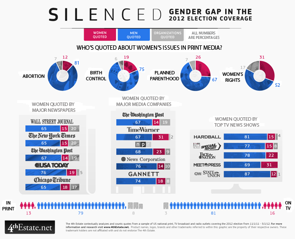
Election coverage dominates the American media in the months before any presidential election and the group (of unnamed people) over at the 4thestate.net are covering the coverage of the election. They tend to share their findings as graphics. The graphic above came from a special report on gender that looked at the gender of the experts who are called upon to comment on women’s issues like abortion, birth control, planned parenthood, and women’s rights. I can already tell that the first criticism is going to be that these issues are not just women’s issues. Fair enough. The point that they are trying to make, though, is that even in a media system that some say has a “liberal bias” women are significantly under-represented as expert voices. Or any kind of voices.

The graphic does a good job of showing THREE categories of commentators – men, women, and institutions.

In terms of color, the graphic resorts to a men-are-blue, women-are-red division which is fairly stereotypical. I am glad that women are not pink (see this post for an example of what happens when light blue and pink are used to represent gender). While I feel a lot of pressure to escape traditional gender binaries, in graphic design, harnessing people’s existing stereotypes is often a powerful way to make an instant impression. So while these designers could have used any two colors to represent men and women – purple and yellow, orange and green, teal and chartreuse – the fact that they leveraged the underlying American stereotypes associated with the gendering of colors gave them a way to tie together different graphical elements into one infographic. Personally, it does not bother me that women are represented as red and men are represented as blue, even if it is stereotypical. Some stereotypes hurt; this isn’t one of them as far as I am concerned. Pastel colors like light blue and light pink tend to infantilize the appearance of presumably adult behaviors and I would avoid using those to represent adults. But the red and blue used here are plenty grown up. Feel free to scold me about gender stereotypes in the comments if you disagree.

What needs work

Graphical donut - Women quoted in print media in 2012 election coverage on abortion
Graphical donut – Women quoted in print media in 2012 election coverage on abortion

I am on the fence about the donuts. Would the donut be easier to read as a bar graph? Perhaps. But turning the circle form into a bar form would eliminate a good deal of the natural division in the graphic between print media – all donuts – and specific media outlets – collections of bar graphs. Right now, without even bothering to read the titles, I can tell that the donuts are all comparable to one another but not necessarily directly comparable to the other elements of the graphic. This prompts me to read the titles to figure out how I ought to be making comparisons between the graphic elements. If the donuts were straightened out into bar graphs, I’m not sure I would instantly sense that they were unlike the rest of the graphic because they would look the same even if they had different titles. The graphical forms should emphasize the text of the headings and the designers here got that right.

My question about what needs work is that I am not sure any comparisons between donuts and bar graphs are easy to make because it seems like some members of the 4th estate team wanted to see the data broken down by issue, others wanted to see it broken down by specific publication, and instead of choosing one or the other, they compromised and showed both. Rather than thinking of this as a comparison issue, I guess I will think of it as simply two different sets of data that both deal with the question of how women are denied roles as expert commenters when it comes to women’s issues.

Acknowledgements

Thanks to Letta Wren Page for sending me the graphic and to the 4thestate for their decidedly graphic coverage of the 2012 election.

References

4th Estate. (2012) Silenced: Gender gap in 2012 election coverage [infographic] 4thestate.net

The Growth of US Newspapers, 1690-2011 from Geoff McGhee on Vimeo.

This animation is taken from the interactive data visualization of the Library of Congress’ “Chronicling America” directory of US newspapers. It shows all newspapers in all languages in the US from 1690 to 2011. View the full visualization at http://ruralwest.stanford.edu/newspapers. Created by the Rural West Initiative of the Bill Lane Center for the American West, Stanford University. Visualization by Dan Chang, Krissy Clark, Yuankai Ge, Geoff McGhee, Yinfeng Qin and Jason Wang.

What works

This visualization of the rise and fall of newspapers in America is interactive and not to be missed. Click over to the interactive visualization (or open it in a new window) and then come back and read commentary. The folks at Stanford’s Bill Lane Center for the American West have used Library of Congress records to create what they say, “would be fairer to call a “database” visualization than an omniscient creator’s-eye view of the growth of American newspapers”.

The trick with any kind of database visualization is that there is often way more information in the database than can comfortably fit in the first graphic representation that comes to mind. The folks at Stanford have done a masterful job.

Here are all of the variables I could pick out that are built into this graphic without overwhelming viewers with too much information:

  • Time | They embed a timeline at the top and turn the whole image into snapshots across time. The time variable is critical to their message.
  • Location of newspapers | They used a map with dots on it to show where these newspapers were being written. I am not always a fan of maps, but in this case, they needed to use a map because another main part of their message is the geographical distribution of newspapers, especially in the American West.
  • Number of newspapers per city | Each city is marked with a dot that grows and shrinks over time as the number of newspapers in that location grows and shrinks.
  • Language in which newspapers were written | The color of the dots correspond to one of seven languages, plus an 8th color for “other” languages. There is also a gray dot that represents all of the newspapers of any language. The languages and the pan-language grey dot can be turned on an off so that it is possible to see, for instance, just the changes in Spanish language newspapers.
  • Publication frequency | This is a filter option that allows users to see only daily or only weekly/biweekly or only monthly+ publications.
  • Textual description | There is a narrative about newspapers that is important to the authors as well as to us as readers/viewers trying to understand this massive amount of data. They chose to use 3-4 sentences to describe major changes every 10 years or so, less often before 1900. I found this to be the right amount of text – brief enough so that it didn’t overshadow the infographic, but dense enough so that it contained substantive material. Instead of trying to display major historical events on the map somehow, they use the text to mention things like the Civil War and Great Depression which allows them to describe the impact of these events on newspapers in particular.
  • Actual titles of newspapers by city | If users click on a particular city at a given moment in the timeline, they can see a list of all the titles of the newspapers that were being printed at that place and time. The languages of the newspapers correspond to the color coding system for languages used throughout the graphic. If users want additional information about any of the titles, they can click on the title and be taken to the entry for that title in the Library of Congress database.

I couldn’t be more excited (or proud) of this project. [Full disclosure: I am not personally acquainted with anyone involved in the project.] Please go play around with it this weekend. Even if you are not interested in newspapers, it is impressive to see how they managed to create such a thorough graphic – a database visualized – without making it impenetrable.

More information about newspapers, the west, and rural America

For more on these issues, the team at Stanford has also released two written reports on this topic: Rural Newspapers Doing Better Than Their City Counterparts and did the West Make Newspapers or Did Newspapers Make the West?.

References

Bill Lane Center for the Study of the American West at Stanford University.

[Graphic: Data Visualization: Journalism’s Voyage West]

Library of Congress: Chronicling America Project

Selling Out:  How do musicians earn money online? | Information is Beautiful via Flowing Data
Selling Out: How do musicians earn money online? | Information is Beautiful via Flowing Data

What works

Here’s another graphic from David McCandless atInformation is Beautiful (though I came across it when Nathan Yau wrote it up at Flowing Data) which was originally motivated by McCandless reading a piece written by independent recording artist Faza at The Cynical Musician. After the infographic hit the blogosphere, Faza ended up receiving some sort of secondhand criticism which he then countered by trying to explain what he was up to in a follow-up blog (see below for all the blogs in question).

Here’s how he described what he was originally trying to figure out:

“Most of what I write (apart from broader policy or economic issues) is aimed at the independent artist. I’m one myself, so I know the pain all too well. I know that deep down the independent artist hopes for the day when they are making enough money to be able to concentrate solely on their art.

The independent artist does not have a huge fanbase – the evolution of the Internet thus far has not changed this. The independent artist has few resources and usually cannot afford a huge marketing push. The independent artist’s financial situation largely depends on getting the most from her limited fanbase with the least expenditure possible. The biggest bang for the buck, if you will.”

This was in response to folks who pointed out that the future of the music is the past (ie live performance) or that the the profitability of music is not just in the ticket sales but the merchandise! Rightio. But Faza pointed out that for truly independent folks who do not have the resources to get out there and market themselves, going on tour and selling a bunch of tickets (and merch) probably isn’t going to happen. And, selling band t-shirts online is tougher than selling them at concerts, so the interwebs aren’t exactly making a huge difference there either.

10.000 ft view
10.000 ft view

One more thing before we get to the graphic itself. When I was fiddling with it in photoshop I realized that I had a greater appreciation of it when I started with the 10,000 foot view and then slowly zoomed in.

The colors are good. For some reason, black + some bright color is a good idea when it comes to contemporary cultural products like music and fashion. Smacks of a certain dynamism and ‘cool’ factor, which is just the spot this graphic is aiming to hit. Of course, the black + bright color = cultural cool formula will change and it doesn’t mean there are not many other components that could add up to cultural cool. Just saying, I think the basic strategy with the full bleed black background and a single bright color (100% M) is working here. The growing circles also do a good job of making the point that streaming music will not pay the bills and neither will selling downloads on napster or other similar sorts of sites.

The most surprising fact for me was that self-pressing a CD and selling it directly to consumers was more rapidly profitable than any of these other options. New respect for all the folks in New York and LA who have stopped me and tried to get me to buy their music while I’m walking down the street/beach.

What needs work

My biggest issue with this graphic is the the little pie charts are really where it’s at – they are not part of the big picture story that the more ‘advanced’ online music sales techniques are the less profitable per unit of effort they are for the artists. The little pie charts try to show us how the money is allotted. But the revenue pie is never a full pie and it’s difficult to tell where the money that doesn’t go to the artists or labels is going. Some clearly goes into things like the cost of the physical CD (where there is a physical CD) and some goes to the other players involved, right? But how much? And who are these other players? And why choose a pie graph technique if the pie is never completed and the incomplete part is not fully specified? In the end, what those pie charts do is compare revenue streams to two recipients – labels and artists – while offering a general sense of the amount of money going elsewhere (though we don’t know where that elsewhere is). Maybe a flowchart of dollars moving from consumers into different pots would have done a better job of demonstrating that portion of the story.

I would also point out, from a sociological perspective now, that minimum wage is both a logical reference point and a difficult reference point. Minimum wage puts a single person just over the poverty line but the poverty line is incredibly low. Poverty lines are tied to the cost of food rather than to some composite cost of daily living that includes not only food but rent, transportation/energy, health care, and all of those things that people have to spend money on which have increased more rapidly than the cost of food. It’s my long-winded way of saying that even if artists could make minimum wage they would not actually be able to live comfortably, especially not in cities like LA and NYC where there are large, vibrant music scenes. They would have an easier time in Nashville.

References

Faza. (10 January 2010) “The paradise that should have been” at The Cynical Musician.

Faza. (15 April 2010) The paradise that should have been – revisited at The Cynical Musician.

McCandless, David. (13 April 2010) How much do music artists learn online at Information is Beautiful.

Yau, Nathan. (4 June 2010) “How little musicians earn online” at Flowing Data.

John Kelly's map of the blogosphere

What works

Oversimplification makes this a surprisingly legible collection of tiny dots.

What needs work

I have no idea how to trust this graphic. The labels seem arbitrarily applied – that could just as easily be food blogs, design blogs, and gossip blogs. Or maybe if you left the labels blank it could be a Web 2.0 Rorschach test.

The article is built around these key findings:
+ “The Web sites of legacy media firms are the strongest performers. The top 10 mainstream media sites, led by nytimes.com, washingtonpost.com, and BBC.com, account for 10.9 percent of all dynamic links.”

+ “By contrast, the top 10 blogs account for only 3.2 percent of dynamic outlinks.”

In other words, old media (still) rules. Not exactly sure why, if those two points are the primary arguments, the story ran with a graphic about politics and tech blogs dominating the blogosphere.

[As far as I can tell, the author agrees with me that it’s not even all that interesting to talk about why politics and technology dominate the blogosphere. Tech geeks are comfortable in cyberspace (they may even prefer it). So that’s a no-brainer. Blogs are perfectly designed to facilitate the dissemination of opinions what with the casual tone and the comment features. Politics is heavily rationalized opinion. Thus: blogs + politics = eureka.]

I would love to see someone write about the relationship between recipe trading and the development of the internet. THOSE are the blogs that are inexplicably everywhere. And the early users of the internet were happy to use primitive bulletin boards for trading recipes.

Bottom line

Just because it’s pretty doesn’t mean it’s relevant.

References

Kelly, John. (2009) “Mapping the Blogosphere: Offering a Guide to Journalism’s Future” The Nieman Reports. Nieman Foundation for Journalism at Harvard University.