Europe

EU unemployment rates Nov. 2007 through April 2009

What works

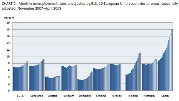
I was looking around for a nice EU-contextualized graph showing Spain’s unemployment rate. I found what you see above which shows unemployment rates in other EU countries. That was one of my requirements – in the EU economics are sort of local and then again not so local so it’s silly to try to look at one country without taking into account the others nearby. What we see, and what has continued since this graphs last data point in 2008 is that Spain has a notably high unemployment rate. News earlier this week put the current unemployment rate here (yes, I’m in Spain) at 19.7%.

Personal anecdotes with no scientific validity whatsoever

When I’m out on the street, I would say this appears to be true – everyday is like a holiday! Well, not really. There are no parades or obvious drunkenness. But there are all sorts of young, able-bodied folks walking around, having a caña, getting on with life. People’s demeanors and attitudes do not, on their surface, suggest depression, destitution, or downtroddenness. Furthermore, I had the brazenness to open my American mouth and ask a Spaniard man I barely know what he thinks of Spain’s economic situation. He said that the unemployment rate is not at all reflective of the actual unemployment rate because everyone is working under the table. That sort of reality, if it is true, would not be reflected in graphs like the ones above and below. If people are working under the table, I can’t imagine they have full time positions just judging by how many young capable-looking people are on the street on weekdays.

What needs work

I don’t know about you, but I don’t like the gradient on the graphs. Seems superfluous. I would have lost the grey background and just gone with some rather straightforward area blocks (no lines between each bar in the graph). In simplifying that portion of the visual, I think there would have been space for more contextual data. I’m no economist, so I looked around to see what economists think of as smart ways to contextualize unemployment rates.

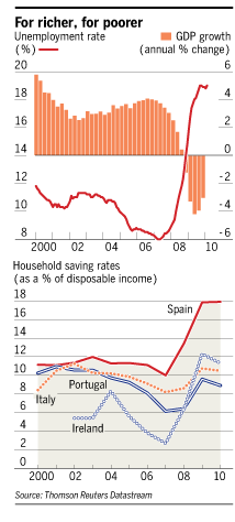
I found this (which has a Spanish focus):

Spain |  Unemployment rate, GDP, and household savings rate
Spain | Unemployment rate, GDP, and household savings rate

What works

The story here is that – oh yes – we can see that unemployment rate bouncing right up. But we also see that Spaniards are saving more. This has been attributed to the expectation by Spaniards that they are going to be taking in their out-of-work sons, daughters, and assorted other relatives during this crisis. We would be shocked to have such a high savings rate in America.

What needs work

I am still trying to figure out what is going on in Spain. At least as I perceive the general attitude, Spaniards appear to be prepared to weather this little ripple in the amazing growth of their prosperity over the last 60+ years by either working under the table (maybe) or leaning on family. Is an 18% savings rate meaningful in the context of a nearly 20% unemployment rate? Will this crisis simply introduce more inequality – those with stable jobs will go unscathed while those without steady unemployment sink lower than family are able to stoop to help them out? And if my man on the street is any kind of correct and the unmeasured economy is booming, how do we measure it?

If you happen to have some expertise on any of these questions, please post to the comments.

UK elections poll data | Information is Beautiful

What works

In the words of the creator of this graphic, the point here is that “there is no pattern”. The YouGov pollsters seemed to be a little more accurate, but then, as was also pointed out by the graphic’s creator, they only had one year to give it a go. Low N on that group, but maybe we can call them ‘one to watch’.

There is always a tendency in science – bench science, social science, any kind of science – to show positive results. It sort of sounds like: “Look! I found something!” Or, more likely, “After controlling for everything I could think of, including maternal grandmother’s underwear size, I have found a statistically significant correlation in the predicted direction.” But there is almost no support for saying, more or less, “I was looking for something but I found nothing.” In this particular case, a non-finding is of interest because it suggests action. We can stop paying attention to prediction polls (or chance it and continue to pay attention to YouGov, with a grain of salt). What works best here is the rigorous reporting of no pattern. Multiple polling companies, multiple elections, still no pattern.

What needs work

Seriously needs a key. Red and blue are always political colors, yellow not necessarily so, and the meanings of each cannot be assumed.

Love the title ‘poll dancing’ but wish it would mention ‘UK’ and ‘elections’ somewhere. We can deduce from the listing of the Guardian as a source that it probably has something to do with the UK, but information is global now, and we cannot assume national origins anymore. I often make this mistake myself, easy to forget to mention the nation-state. The good news is that our audiences are no longer only our neighbors. Or at least that’s how I like to think of it.

References

Suggestion from
Momin, a young fellow who contacted me by email suggested I post this one.

Graphic
McCandless, David and Key, James. (2010) “Poll Dancing: How accurate are poll predictions?” from Information is Beautiful.

See also:
McCandless, David. (2010, May 6) General election 2010: Information is Beautiful goes poll dancing at The Guardian, Data Blog.

Data
http://bit.ly/polldancing

Alcohol Statistics, England | from The Missing Graph

What works

Leading up to the World Cup I am going to try to focus on World Cup related issues. It isn’t that much of a stretch to think about the relationship between sport and the larger category recreation, which often includes drinking. I found this graphic at The Missing Graph by Antiforma Design. The point here was to look at drinking in England – when is it happening? who is doing it? and who is dying? As you can see, men drink more and die more from drinking. Most drinking happens on the weekend and on holidays (there are more Monday and Friday holidays than other weekday holidays in England). Most alarming is that drinking deaths are increasing, not decreasing. Hard to blame it on the recession since the collection period ended in 2008 and increased the most rapidly from 2005 to 2006, a period of relative prosperity and optimism.

What needs work

I would have loved to see a couple more points of information about drinking in England. First, I assume that the information that generated the size of the bottles for each drinking day was somehow related to gallons consumed. I want to know those gallon figures per capita. Then we would be able to compare England’s data to some other country’s data, assuming we ever had a similar set of information about some other country (like, say, South Africa).

I would also have liked some information on what it is that these folks are drinking. Wine? Whiskey? Beer? Absinthe? Something from the bathtub? Perhaps the drinking culture of the country supports more beer drinking but the death-drinkers are drinking something else. Or maybe they just drink too much of the standard fare. Again, since I’m thinking about cross-national comparisons, I’m interested in things that might contribute to a deadly or less deadly drinking culture.

One other consideration: a friend of mine has long been interested in the relationship between drinking and HIV transmission. You’d think someone would have done extensive research on this because it’s rather obvious – drunk folks may have less in the way of cognition and patience when it comes to reaching for a condom. But it has not been well explored. Out of that existing curiousity of mine, I wouldn’t have minded seeing some trend lines for HIV transmission, serious auto accidents, and other sorts of ill-planned behavior that we might associate with drunkenness.

Overall, I love the notion that there is a blog out there dedicated to making infographics out of an intrinsic interest in presenting information for public consumption.

Reference

Primentas, George. (May 28, 2010) “Alcohol-related deaths in England” at The Missing Graph.

Planes or volcano? What is emitting more CO2?

What works

Volcano = triangle. Love it. Red is bad, black is good = kind of perfect. Being able to see that the volcanic eruptions are actually net benefit events because they release less CO2 than they prevent is great. I do wonder if the uptick in flights that inevitably follows any singular event could be mapped. Furthermore, when I was in Europe during the first major eruption event and I would say plenty of people were renting cars. I know that isn’t nearly as bad as flying, but it does contribute some CO2. I also wonder if this graphic could be expanded over time to see if the volcano ends up contributing or inhibiting contributions to global CO2 over time. Will people stay home or at least stay out of Europe, taking shorter flights (or no flights) because they are worried about the volcano?

What needs work

The volcano needs work. It needs to stop eating my luggage. That’s all I have to say. I know that if you are reading this and even moderately awake, you will point out that if I stopped flying I would not have a luggage problem and I would not be polluting your world with all my flight traffic. So maybe I’m the one who needs work.

References

The Graphic
McCandless, David and Bartels, Ben. (16 April 2010) Planes or Volcano? at Information is Beautiful.

The Data
USGS, BBC, EEA, Nordic Volcanological Institute, AFP [lower estimates used]

Europe's Web of Debt | Bill Marsh, The New York Times

What Works

Headlines have lately focused on particular countries – Greece, Spain, Portugal – to discuss the current economic situation in Europe. I like this diagram because it is impossible to think of the EU situation from that one-country-at-a-time perspective. One currency, one tangled web of relationships. We also see that focusing on Greece could be considered short-sighted simply because Greece’s total debt is relatively small compared to, say, Italy which is a country we haven’t been hearing much about. Now, going back to my initial reason for liking this graphic, it’s important not to focus on one country. The adoption of the Euro was motivated by the robustness of networked flows and we see from the graphic that the problems of any one country should not bring it down but, if the cause of the single country’s problems are also putting downward pressure on other countries/nodes in the network, the cascade could be swift and deep. And the biggest losers are going to be France and Germany. Just look at all those arrows directing debt at those two countries. I am not an economist so I’m not making a prediction about the future of the EU economies or of the Euro as a stabilizing device.

What needs work

Because so much of the debt flows involve France and Germany, I think they belong in this diagrams as nodes. Or at the very least, one easy fix would be to show outgoing arrows to Germany all in the same color and to France all in a different color (like, say, the color of freedom).

Reference

Marsh, Bill. (2 May 2010) Europe’s Web of Debt. The New York Times, Week in Review Section from the intial source “Bank for International Settlements”.

Living Single is More Expensive than Marriage? | The Economist Online

What Works

In this particular case, where the point is to show the difference between two groups (not three or four) it is acceptable to use the stacked bar graph approach. This technique emphasizes the difference between the two groups. When people use the same technique with three or four groups, it becomes very difficult to pick out the visual differences. But the folks at the Economist stuck to two groups and it does show the difference in earnings between singles and married-with-two-kids people.

What Needs Work

The picture is not helping anything. Please, people, think twice before inserting stock photography in your infographics. There should never be an element of an infographic that fails to communicate information clearly. The whole money in the clouds motif is also…questionable in terms of the art direction.

Aside from my qualms about the aesthetic choices, I have a more important contention. It would seem that the point of this graphic is to suggest that married people operate under more favorable tax laws than unmarried people. If that is the case, I think it would be nice to see some information about the taxes coming into play. I say this in part because the commenters to the article revealed that they mistakenly believed this data is pre-tax. But it isn’t. Furthermore, this graphic implies that marrieds have more money on hand than singles in the same income brackets, but that isn’t necessarily true either. Those kids do cost something – they need clothes, food, bigger houses, bigger cars, and an endless list of other things. So even though Mr. and Ms. Single do not take home as much, I bet they have fewer carrying costs. Granted, the graphic is about taxation policy, not about discretionary spending opportunities, but it fails to emphasize taxation and leaves itself open for other interpretations. These interpretations are available for your reading pleasure in the comments section following the original post. I do encourage you to read the comments because it makes clear that people do not read, not even the single paragraph of explanatory text.

Reference

Economist Online Staff. (11 May 2010) Single supplement: The average single worker takes home less than his married counterpart. The Economist online.

Reinventing the Automobile* is a book that lays out a vision for a progressive evolution of urban mobility transition that offers a robust point-to-point on-demand mobility network of 2-passenger fully electric vehicles. These vehicles would take up less parking space because not only are they small, but one proposed design folds up when parked. And they’d be able to tell you where the nearest parking spot is as you’re approaching your destination. Being fully electric they require a plug….or do they? The authors suggest that after an initial period of individual owners plugging these babies into outlets in their garages overnight, folks in city planning departments or franchise owners would trust the technology and economics enough to start installing wireless charging devices available curbside or in the road bed itself. Stuck in a bottleneck at a bridge or tunnel entrance? At least charging pads in the roadway can ensure that your 2-seater won’t run out of juice before you get where you’re trying to go. You can sit there and it will charge itself with embedded charging device in the road surface while plodding through gridlock. Even farther down the timeline, the cars might be able to drive themselves. So you can sleep through the gridlock or make calls or surf the ‘net. Just don’t post facebook status updates about your traffic problems. Nobody cares.

What I like most about the book as an object of intellectual design is that even if readers decide to skip all the words and they only look at the images, charts, maps, and diagrams, they won’t miss much. This book is stuffed with great graphics. I haven’t included them all as that would constitute copyright infringement and be too long for a single post. What you see below is just a small sample from Chapter 9: Personal Mobility in an Urbanizing World.

Daily driving in Paris

Daily Trips in Paris - Reinventing the Automobile (Mitchell, Boroni-Bird, and Burns), Figure 9.6

What works

This graphic is both elegant and deep. (Or it would be elegant if I had a better scanner.) It’s a simple form – Paris as concentric circles – but the more you look at it the more you learn. Rewarding that way. What sometimes happens in elegant graphics is that the details become obscured in iconography or approximations. But this graphic includes percentages as well as absolute numbers of two different kinds of trips – public transit and trips by cars. We see that Central Paris is defined as Arrondissements 1-20, the first ring is Seine Saint-Denis, Val-de-Marne, and Hauts-de-Seine, and the second ring is the rest of the Île-de-France region. There’s a summary of all the trips over in the legend so that the graphic itself can just show you the break down of different kinds of trips.

What needs work

In terms of transit, things like rivers often represent real barriers. There are only so many bridges and tunnels which creates a bottleneck effect. Paris is a city on a river so the one thing the elegance of this graphic obscures is the impact of the natural geography on transit choices. Maybe it’s not important when it comes to the cars vs. transit question, but bottlenecks are critical factors when it comes to planning mobility and I’m curious about whether bottlenecks push more people to transit or cars. In Boston/Cambridge, MA only one bridge has a train running across it and I have always assumed that pushed more people into their cars because many of them would have to go out of their way if they took the train and could only go over that one bridge.

Parking in Albuquerque

Parking in Albuquerque - Reinventing the Automobile (Mitchell, Boroni-Bird, and Burns), Figure 9.13

What Works

What you are seeing here is a simplified map of downtown Albuquerque, New Mexico. The white areas are buildings. The teal areas are parking – darker teal represents multi-story parking structures while the lighter teal shows us where surface lots can be found. Lovely way to show this information. One could imagine the same sort of information as a percentage-of-land-use pie chart or some far less granular collection of numbers. This schematic doesn’t bother to calculate just how many square feet of land are dedicated to parking. Nope. This is the visual equivalent of the ‘show don’t tell’ rule that writing professors are always encouraging their students to adopt when constructing essays. A table with land use percentages would be telling. This graphic is showing.

Albuquerque is like a parking lot with some buildings in it.

What needs work

I have never been to Albuquerque but I’m guessing that if you lived in Albuquerque you might like to see some sort of orienting label. Even just a single recognizable street name thrown in their somewhere to help orient. Now, the point of Reinventing the Automobile is not to provide urban planning for Albuquerque so I know they aren’t all that concerned with just precisely which neighborhood in Albuquerque this schematic represents. Still. It’s almost too cleaned up to read as a city plan right away.

Vehicle-to-Vehicle Crashes

Vehicle-to-Vehicle Crashes - Reinventing the Automobile (Mitchell, Boroni-Bird, and Burns), Figure 9.16

What works

This graph does a great job of providing us with granular data and indicating a couple different trends visual. Keep in mind that they have multiple layers collapsed into a single graphic. It looks easy once it’s done but when one is faced with a pile of related numbers along multi-dimensions it isn’t always clear how to relate them to one another visually.

This graph has three levels of accident severity – minor, serious, fatal. It also shows the probability of injury. It also factors in variation in speed (which it does by creating five speed ranges). And then there’s the belted vs. unbelted division. That is a total of four different dimensions all displayed on one graph with a single measure on the y-axis. Color is used well. Grid lines are all that separates minor from serious from fatal accidents which are more or less three different graphs lined up next to one another.

References

Mitchell, William; Boroni-Bird, Christopher; and Burns, Lawrence. (2010) Reinventing the Automobile: Personal Urban Mobility for the 21st Century Cambridge, MA: MIT Press.

* The book specifically credits Ryan Chin, Chih-Chao Chuang, William Lark, Jr., Dimitris Papanikolaou, and Ruifeng Tian with “Illustration Production”.

Where does my money go? in the UK - Open Knowledge Foundation, raphic by Iconomical

What works

This visually arresting graphic does a great job of presenting data about national spending in an apolitical but altogether fascinating way. It’s interactive, by the way, but I’m not commenting on the interactive part, just the static graphic. I find that getting the static graphic clear is an important first step towards making a functional interactive graphic. If ever I hear someone say ‘but it’s interactive’ as an excuse for having a weak static graphic, I cringe. See my post about the USDA mypyramid food guide for a case study on the importance of a strong relationship between the static and interactive iterations of graphics as tools.

Each dot represents a different department or governmental program with the size corresponding to the funding level. Smart.

If you link through to the originating site, you’ll be able to follow blog posts that take readers through the development of the graphic. They ask for input and do their best to incorporate it. I like that approach. Good use of technology, OKF.

What needs work

I can’t quite tell why the circles are arranged the way they are or why their hues are the shades they are. Graphics, especially the beautiful ones, are the best when their simple clarity gives way to an elegant complexity. In other words, when I pose the question: “why does the hue vary within given funding types?” I’d like the graphic to lead me to an answer. I’m sure there is a reason for each hue, I just haven’t been able to figure it out.

One tiny, American-centric request: Add ‘UK’ to the page or the graphic somewhere. Maybe change “Total spending” to “Total UK spending”. Or “Where does my money go?” could be “Where do UK taxes go?”. These here interwebs are global. Yes, of course, the £ symbol tends to give it away. Maybe I’m just being too picky.

References

Open Knowledge Foundation. (2009) “Where does my money go?” United Kingdom. Data available

Stanley Lieberson’s “A Matter of Taste” looked at the way trends spread by examining baby names. He wanted to avoid the impact of marketing and advertising – the point was not to figure out how to create, perpetuate, or stop a trend, but to see if there is such a thing as a trend in the first place. Nobody is in the business of promoting baby names, and yet there are patterns. Lieberson looked for these patterns in the US. French sociologist Baptiste Coulmont has also looked at the way baby naming trends move across space and change in popularity over time.

The graph below shows how the final syllable of female names has changed over time. The -ette ending waned in popularity while the -ine and -a or -ah endings have increased in popularity. Graphically, I love that this diagram looks like sound intensity diagrams.

Female name endings in France - courtesy of Baptiste Coulmont

More interesting yet, Coulmont also animated a map to show how the name Loic spread from Brittany across the entire country over the course of about 60 years. I like this because it takes a static map and makes it dynamic. Sure, you could have lined up maps to march across a page at five or ten year intervals and cognitively filled in the blank spots. But here, his animations do the cognitive heavy lifting for you, revealing the pattern instantly.

Here’s what Coulmont had to say about the map graphic:

“As to my animation : there is no yet an accompanying sociological argument. I was struck by the spatial mobility of “Loic” from 1945 until 2005 : it seems to be a steady eastward shift [nowadays, Loic is one of the 20 top names for boys in francophone Switzerland : the eastward movement jumped the frontier!

How to explain this movement ? It seems that “Loic” moved from one district to another by means of personal interactions : some people knew some “Loic” living in the west, chose this name for their baby boy, and the movement continued eastward. “Loic” is not alone : especially during the nineties and now, names from Brittany are somewhat fashionable (“Celtic names”) : it could be the unforseen consequence of a strong nationalist movement in Brittany during the seventies. Those independantists fought for the right to name their children with “real” Celtic names… and the names spread in other regions.”

French provinces (note where Brittany/Bretagne is way to the west)
French provinces (note where Brittany is way to the west)

Relevant Resources

Coulmont, Baptiste. (2009) Prénoms typiques.

A Matter of Taste - Stanley Lieberson

Lieberson, Stanley. (2000) A Matter of Taste: How Names, Fashions, and Culture Change New Haven: Yale University Press.

Eye Color Map from Peter Frost (2006) via Beals & Hoijer (1965) An Introduction to Anthropology
Eye Color Map of Europe - In color!

What Works

Color works. It helps that in this case, the characteristic being mapped is eye color, so it’s kind of a no-brainer to shade the areas where blue eyes are prevalent in blue and the areas where brown eyes are prevalent in brown. Even if this graph were to be printed in a grayscale journal (which is probably why the one on the left tries to use hatching to distinguish the areas), using degrees of full shading is easier to distinguish than using hatching patterns. Most printers can handle printing 10% gray, 50% gray, and so on.

What Needs Work

The areas that need some work, even in the color version, are the areas between blue and brown. Right now, those areas are lighter blue and lighter brown. The problem is that because the blue is mapping directly to the characteristic in question – blue eyes, blue area – it’s easy to think that the lighter blue areas represent areas where people have really light blue eyes. But, in fact, those areas are full of a mix of people, some with light eyes, some with dark eyes. I might have gone with a staggered blue/brown pattern or just chosen a color that doesn’t have anything to do with eye color, like purple.

Relevant Resources

Peter Frost (2006) Why Do Europeans Have So Many Hair and Eye Colors?

Western Paradigm blog (February 2008) The Blue Eye Map of Europe [Note to Readers: I couldn’t find the original version of the color map so I am linking to the blog where I found it rather than the original source.]