What Works
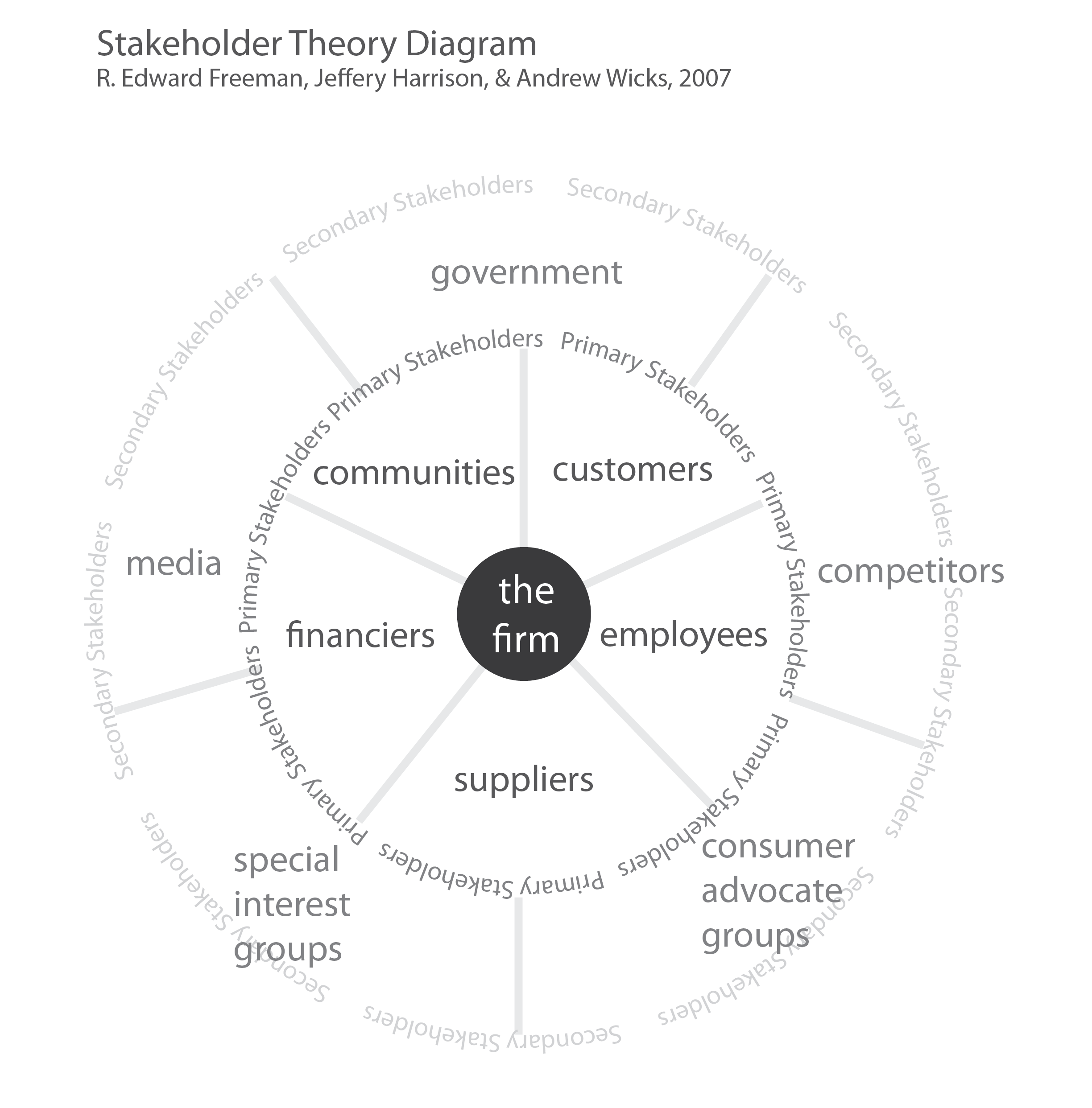
Many business courses introduce students to the stakeholder theory of management (Freeman, 2007) which offers a theoretical model that effectively opposes shareholder models in which decisions end up being viewed solely from the perspective of what might serve the firm’s financial goals. In many firms, financial goals are tied to shareholders or venture capitalists or other sorts of more creative investing scenarios.
I find that it is useful to show students a finance-centri version of the same diagram to make the point that the goals of finance (or financiers) are not exactly the same as the goals of the overall firm.
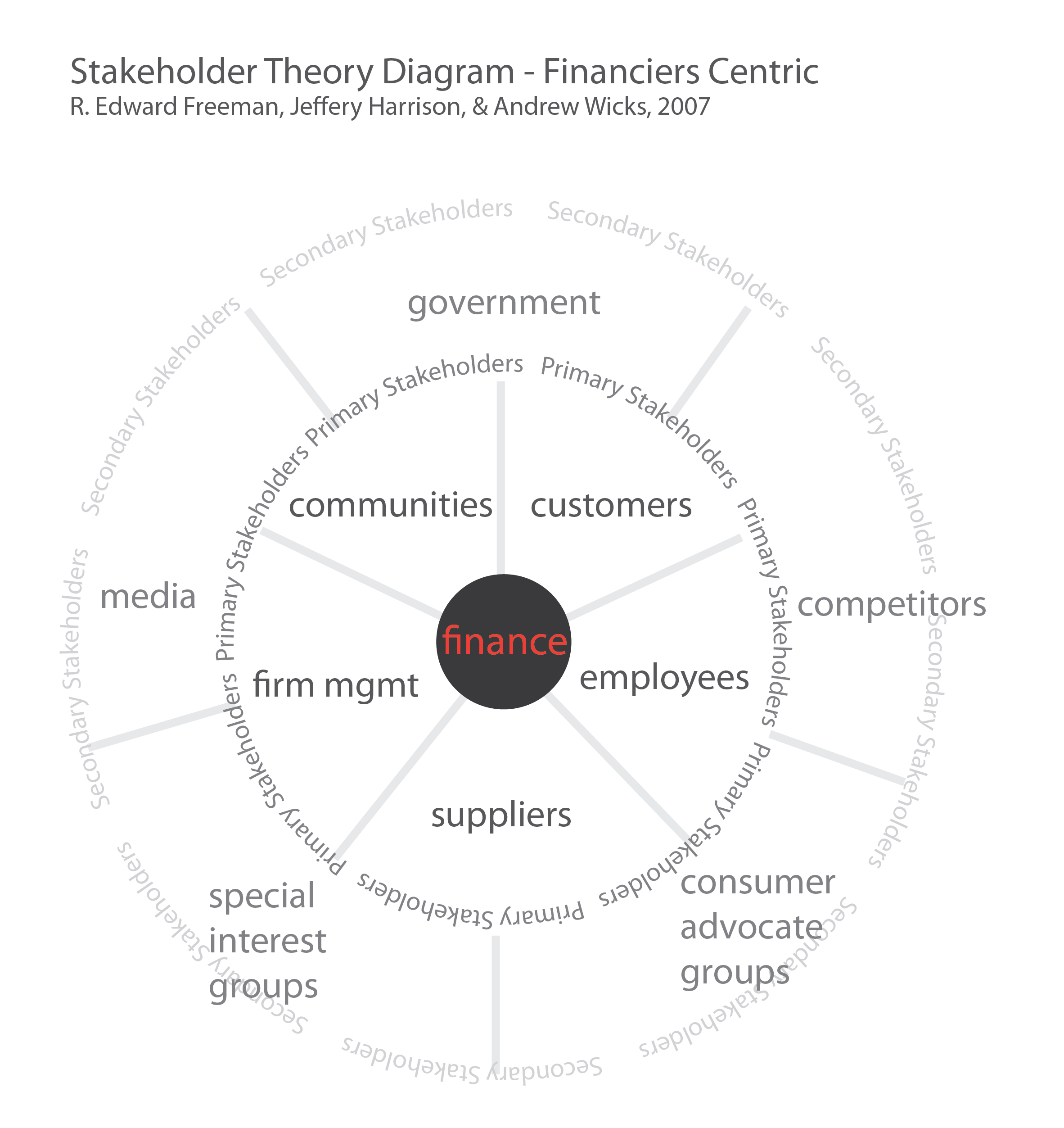
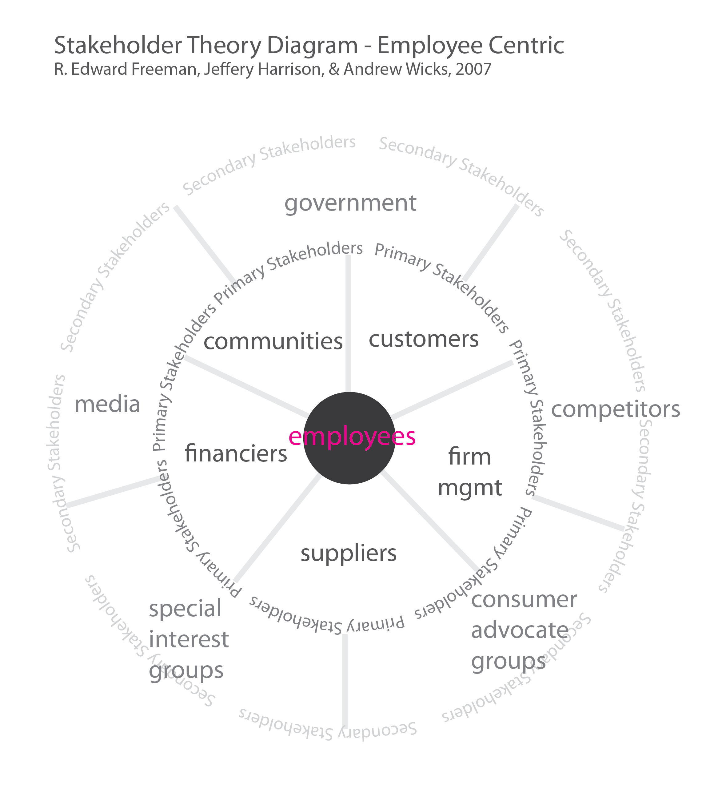
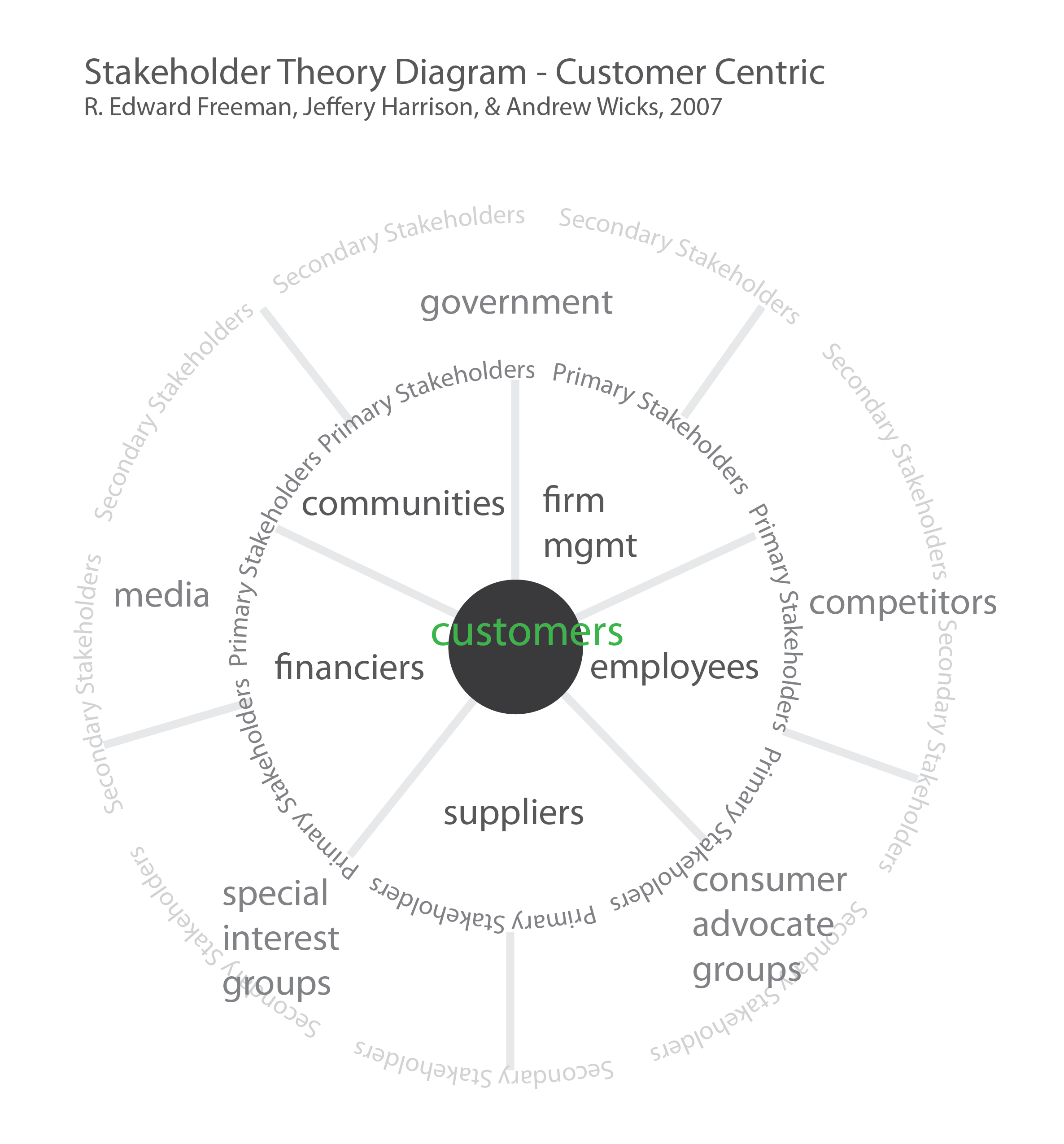
Once students see that finance and the firm are distinct, they are more open to the suggestion (which is made in R. Edward Freeman’s article) that any of the primary stakeholders could be viewed as the central stakeholder. In fact, as a theoretical exercise, every primary stakeholder *should* cycle into position at the center of the stakeholder donut to help understand what each stakeholders priorities are and what all the diverse sources of value may be.
When employees are at the center of the diagram, job tenure and ability to move into fresh and better-paid positions becomes part of the conversation. This is not some revolutionary idea in management. It’s the type of knowledge that becomes available in an organized way by systematically using the diagram to consider each successive primary stakeholder as the most central stakeholder.
When customers are at the center of the model, the user experience, product durability, cost, and delivery become the most salient characteristics alongside marketing and, for a growing number of customers, social and environmental responsibility.
What needs work
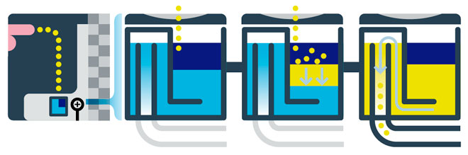
This set of static diagrams would work better as an animation.
Still, using them one after the next in a slide deck allows time to have a class discussion about what is at stake when the central stakeholder changes.