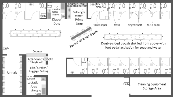
architecture

Efficiency Diagram of a Skyscraper | Kate Ascher

What works

Kate Ascher has a new book coming out soon – The Heights: Anatomy of a Skyscraper – which is hopefully just as good as her previous book: The Works: Anatomy of a City. The Works dissected the infrastructure cities need – from solid waste to electricity to water mains – using information graphics and relatively brief textual discussions. In that book Ascher did an incredible job of answering questions everyone has – where does all the garbage go? – and adding information that we probably ought to know but would never think to worry about (like: how can we design cities to mitigate the threat of flash flooding which is exacerbated by all the hard surfaces and the relative dearth of water-absorbing terrain?)

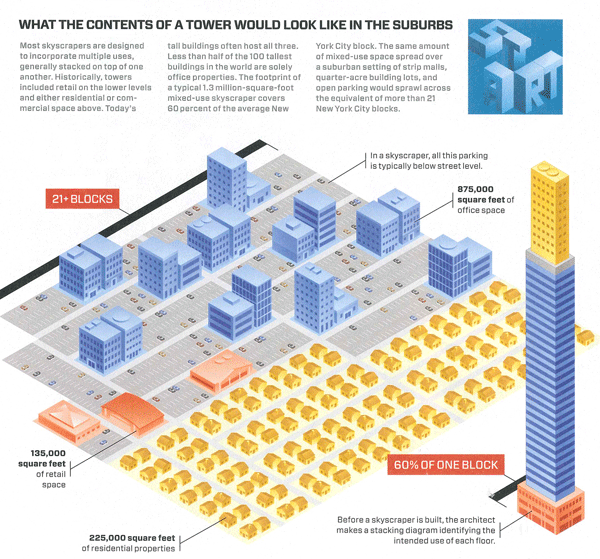
This graphic is from her new book which, from the looks of it and the kind words in Wired Magazine, will be just as good as her previous work. What she does here is display the land-use efficiency of skyscrapers. One of the things skyscrapers do particularly well, their raison d’etre depending on who you ask, is to concentrate activity and resources in a very small footprint. Ascher shows us what that footprint would look like if it were spread out in a typical suburban density. The typical skyscraper in the diagram takes up 60% of a New York City block. Unstacked and spread in a typical suburban-style configuration it would take up 21+ blocks.
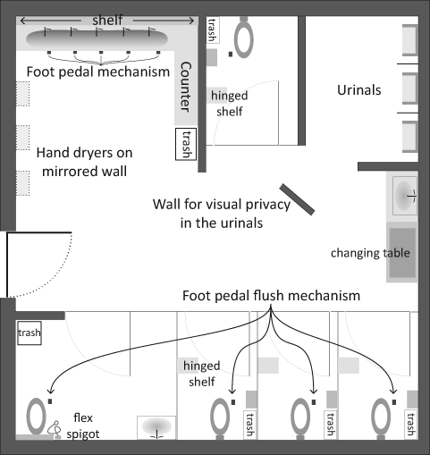
What needs work

Nothing needs work here. This is a clever diagram, easy to understand at first glance, easy enough to translate out of the New York City grid by using the number of square feet dedicated to each purpose that Ascher has listed. The colors are well used, the textual explanation provided is necessary but not too much, and the diagonal layout makes the image much more dynamic.

I would love to say more about the diagrams in the rest of the book but I haven’t yet seen it. Hopefully, they are all just as good as this one.

References

Ascher, Kate. (2011) The Heights: Anatomy of a skyscraper. New York: Penguin Books.

Roper, Caitlin. (2011, November) “Sky-High Efficiency” Wired Magazine, p. 36.

Stadium Variety Bathroom of the Future | Molotch and Nor&ecute;n

What’s new?

If you read the blog regularly, you’ve seen this before. So what’s new, you ask? Well, for one thing, we decided it was necessary to add a lactation area. It’s adjacent to the attendant’s booth; in a perfect world the attendant can watch the stroller while mom pumps or breastfeeds. The divider between the lactation area and the attendant’s booth is a heavy curtain – like a theatre’s curtain – so that if mom has little kids running around, there are fewer places for fingers to be pinched. Swinging doors and small children have been known to be a bad combination, especially when mom may not be able to react in a lightening quick fashion as she is in the midst of feeding a different child or pumping (or changing a different child’s diaper). Furthermore, the lactation area is near the attendant to lend the sensibility and the reality of extra watchfulness over both mom’s with their breasts out and the potentially escaping toddlers. This configuration also places the lactation area just about as far away from the noise and commotion of the rest of the bathroom as is possible. Nobody likes to eat where others…well, you know what I mean. We included a changing area in here in addition to the one in the main space because we figured it would be more convenient for moms who are breastfeeding to have the opportunity to change a baby right in the same spot. There wasn’t enough space for a toilet (for mom herself, or for accompanying folks like dads, siblings, and nannies). We were hoping to have space for at least two lactating moms or a lactating mom and a dad to fit in this cubby of a space. But I’ll leave it as an open question? Should we have fully enclosed this space and put a toilet in there? Or is it better that two moms can do what they need to do at the same time? Leaving it a little bigger and not stuffed with a toilet also means dad or grandma or whoever is part of the crew can have a spot next to mom while she pumps or breastfeeds.

Adding the lactation area forced us to reorient the attendant’s booth to face mostly into the main bathroom area. There is still a small window on the right hand side which will be the first thing most people see as they enter the bathroom. Folks who are a little shy about asking for tampons or clean needles or whatever like that might be able to approach the smaller, more private side window rather than the big one in the front. However, from the big front window, the attendant will be able to see most of what is going on in the main space, save for the urinal area. There was discussion of adding a one-way mirror between the attendant’s booth and the urinals, high enough so that no penises would be in view. This would allow the attendant to be within site of just about everything, save the individual stalls. Safety would be increased, privacy would be decreased. What do you think? Mirror or no mirror? Remember, the one-way mirror would be located too high to see any penises unless those penises were attached to someone standing well away from a urinal.

Office-scale bathroom of the future | Molotch and Norén

What’s new?

In this office scale version, I reconfigured some of the wall segments and added a completely new one in the middle of the space after a commenter on this blog mentioned that visibility into (and out of) the urinals might not be desirable and would be easy to screen. He was right. Now men can be more comfortable knowing that they cannot be seen and nobody will spot the back of a man at a urinal upon stepping into the bathroom. There are still more stalls than urinals – better for women and men, if you ask me. Not better for the environment since toilets use far more water than urinals (especially when the urinals are waterless, as they now are in many new construction projects).

Style points?

I admit these are not the most stylish of plans. I’m not an architect and not aware of all the style conventions employed to make plans both interesting and legible. I’m taking opinions on what to change. Bring it on, folks, bring it on.

I decided to give the sinks a radial gradient though now I’m not sure if it’s obvious that they are sinks. I made the font bigger in the stadium version because it appears that our publisher will be printing it at about the same scale as the one you see above. Small.

The book?

The book – “Toilet: The Public Restroom and the Politics of Sharing” will come out on World Toilet Day, November 19, 2010. These two images, or images quite like these, will appear in the concluding chapter by Harvey Molotch.