animation

Olympic Medal Winners | Ivo Afonso

Update: Award winners

Update: Both Ivo Afonso’s print graphic and Christian Gross’s interactive graphic won awards in the visualizing.org Olympic graphics contest. Ivo won the audience choice award and Christian won the award for interactive graphics.

Kudos to both!

Seeing the Olympics…

Olympics are visual. That is just the way it is. Most of the visualizing is happening on screens, either your TV or your computer if you happen to have access to nbc’s streaming content. But there are also graphics and animations about the Olympics out there so I thought I would share some of the ones I’ve run across over the past couple of weeks.

…in print

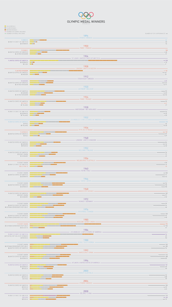
The graphic above by Ivo Afonso of Portugal is a print graphic that’s part of the visualizing.org graphic design contest sponsored by GE and voted on by viewers like you. (In order to vote, you’ll have to set up a free account.)

What I like about the graphic above is that it follows Edward Tufte’s recommendation that each drop of ink better be communicating salient data. In one (Portuguese sized) piece of paper, Afonso has summarized not only the top three country totals in each Olympics but also the number of triple podium instances and world records broken. Good job getting it all in there.

I am still a little confused about why some host countries have particular colors in their names though I do like that when host countries are in the top three, they use the same colors in their fonts as hosts and as medalists. It would appear that there is a correlation between hosting the Olympics and winning a lot of medals. Before jumping to the “home court advantage” assumption, please consider that perhaps only countries that dedicate lots of time and resources to developing world class athletes want to be bothered to host the games in the first place. But back to the graphic. Besides that linkage, though, I don’t see why host countries have the colors in their fonts that they do. I want there to be a pattern because there is so much going on in this single sheet that any choice should service the delivery of understanding about the data.

I also find the whole thing a little hard to read – I probably would have amped up the contrast between the background and the darkness of the fonts, especially with such small font sizes.

Rising Olympic Mountains, 1904 | Christian Gross
Rising Olympic Mountains, 1980 | Christian Gross

…in interactive graphics

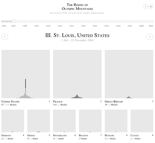
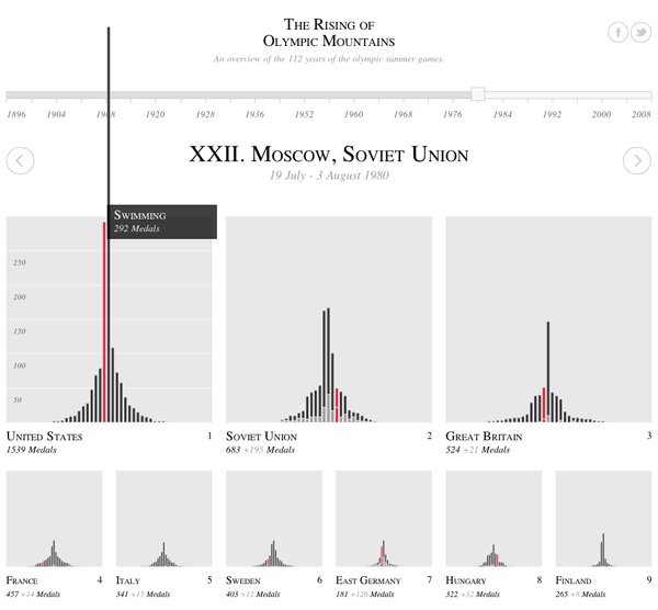
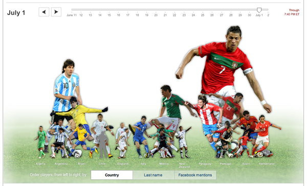
The Rising Olympic Mountains by Christian Gross that’s also part of the visualizing.org contest. It is an interactive graphic so, you know, click through and interact before reading the rest of this. Again, this is a favorite of mine so trust me and take the 30-60 seconds to go over and poke around a bit.

Things I like:
I like that the name is a play on Mount Olympus. Punny.

I enjoy the simplicity of watching the mountains pile up over time.

I love that when I hover over the winners in a particular country in a specific category like, say, gymnastics, all of the other gymnastics winners in other countries light up to make it easy for me to compare one country to the next. Without this feature, each country would only be comparable to the others with respect to the total size of the mountains which represents cumulative medals.

I like the animation that happens when countries switch rankings positions. Very exciting for a largely black and white animation.

What I don’t like as much is that these graphics automatically privilege sports in which there are more events. Of course there are going to be taller peaks for “athletics” than for, say, tennis. All of the race-oriented sports that have multiple events within the same sporting category will rack up more total medals than will sports with only a small number of events. Tennis, for instance, had only mens’ and womens’ singles and doubles for 4 total events. Mixed doubles came back this year, but that’s still only five total events compared to say, “athletics” which probably has upwards of 25 total events lumped into it. It would be nice if the graphic could at least give us a hint that the Olympics has far more events in some sporting categories than others.

All the medalists in the men's 100 meter race, ever | New York Times
All the medalists in the men’s 100 meter race, ever | New York Times

…as animations

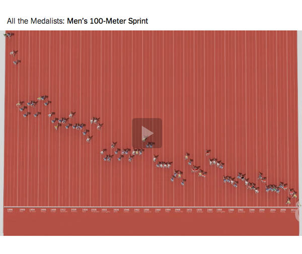
Click through and watch the animation. It’s worth it. They relate history to the present so effortlessly (well, it’s effortless for the viewer, I’m sure it was challenging for the designers) that these animations have now become part of my ‘best practices’ portfolio in the animations category. I was especially impressed at the way they incorporated information about young racers who are 8 or 10 years old compared to the historic record in the sport. It’s also not that easy to incorporate the basic elements of Olympic data that people tend to care about – from the cult of personality that surrounds champions to the national origins of the racers – in a way that feels like all part of a whole rather than disjointed bits and pieces.

Want more like this? Keven Quealy and Graham Roberts created similar graphics for all the medalists in the men’s long jump and the men’s 100-meter freestyle. Apparently, Quealy and Roberts are not all that interested in women’s races.

References

Afonso, Ivo. (2012) Olympic Medal Winners [Infographic] Uploaded to visualizing.org.

Gross, Christian. (2012) Rising Olympic Mountains [Infographic] Uploaded to visualizing.org.

Quealy, Kevin and Roberts, Graham. (2012) One Race, Every Medalist Ever [animation] New York, New York Times.

Wind Map

Viewing note

Click on the image above or here to go to the actual graphic. What you see above is just a screen grab. If you like the screen grab, you will love the active graphic in which you can see what it would look like the visualize the wind blowing across the US right now. Yes, whenever you are reading this, you can download recent data to populate the graphic.

What works

This is a great use of a map to display information. Think, for instance, what the same data would look like in a table.

State                     Speed      Direction
Bismarck, SD          16 mph     S
Columbus, OH        5 mph      W
Fargo, ND               8 mph      N
Minneapolis, MN     2 mph      SW
New York, NY         6 mph      E

In a table, cities would probably be arranged alphabetically which is fine if you want to know exactly what is happening in a given city but terrible if you are trying to discern if there’s any geographical pattern to wind flows. Looking at the map, it is easy to detect geographical patterns. In fact, it would be nearly impossible to avoid detecting geographical patterns. Huge win for the map as a graphic with respect to wind data.

The fact that the wind appears to blow is a programming achievement.

The fact that users can update the graphic with a fresh pull-down from the National Digital Forecast Database is another major programming achievement.

The creators of the graphic at hint.fm offer this disclaimer, “We’ve done our best to make this as accurate as possible, but can’t make any guarantees about the correctness of the data or our software. Please do not use the map or its data to fly a plane, sail a boat, or fight wildfires”. That being said, I think the graphic could be useful for those sorts of purposes. I also think it could be used to perform site selection for windfarms or at least as an educational tool to explain to people why the Dakotas make excellent states to harvest wind while the neighboring state Minnesota is a poor choice.

What needs work

I wish there were an easier way to find graphics like this. I stumbled upon this one via Albert Cairo’s twitter feed, but there must be other awesome graphic work out there just waiting to be discovered.

Reading suggestions

On that note, if you happen to enjoy stumbling upon information graphics, I highly recommend visiting visualizing.org and visual.ly, two websites that aggregate information graphics by allowing people to upload their own work. Both sites have relatively high collective standards for design and are trying to maintain the same high standards for data quality.

Then there’s Nathan Yau’s blog, flowingdata.com, which has long been on my list of must-reads. I assume many of my readers know about flowingdata but it is worth mentioning because it’s a great blog.

Good.is has a portion of their site set aside for GOOD information graphics.

For a more strictly aesthetic experience, behance.net is a giant collection of graphic artists’ portfolios. Looking through it is the digital equivalent of walking around in a flea market – great stuff, unique stuff, and lots that is instantly forgotten even though its presence adds to the atmosphere. Most graphic artists are not information graphic designers so much of what is on behance is not information oriented.

I sometimes find things on pinterest, too, which is more like the digital equivalent of a mash-up between jcrew and a flea market. Oddities organized. It’s much harder to find good information graphics there because, for reasons I do not understand, pinterest is dominated by the long vertical graphics that require lots of scrolling. I’m not a huge fan of those. They encourage laziness – nothing needs to be integrated when you have an infinite length of scroll to just layer unaffiliated fact upon unaffiliated fact and hope that with a picture or two thrown in, a narrative will emerge.

Besides newspapers and magazines, where else do you find information graphics?

References

hint.fm (2012) Wind Map Graphic.

visual.ly
visualizing.org
flowingdata.com
behance.net
pinterest.com

What works

This is an example of activism by animation. It’s not an information graphic so I’m not going to offer a critique, but I find it interesting that the economic benefits of coral reefs like tourism, fishing, and pharmaceutical discovery are foregrounded while environmental concerns like species biodiversity and ocean acidity are mentioned afterwards.

Have a happy Friday, readers.

What I would enjoy seeing

I would love to see an animation of this quality that explained the process of ocean acidification and what we would have to do to reverse it. How much would our carbon emissions have to be decreased to make a difference at this point? And how much would that impact the typical American lifestyle?

References

World Resources Institute. (9 July 2012) “Coral reefs: Polyps in peril”. Animation by Jim Toomey.

The Growth of US Newspapers, 1690-2011 from Geoff McGhee on Vimeo.

This animation is taken from the interactive data visualization of the Library of Congress’ “Chronicling America” directory of US newspapers. It shows all newspapers in all languages in the US from 1690 to 2011. View the full visualization at http://ruralwest.stanford.edu/newspapers. Created by the Rural West Initiative of the Bill Lane Center for the American West, Stanford University. Visualization by Dan Chang, Krissy Clark, Yuankai Ge, Geoff McGhee, Yinfeng Qin and Jason Wang.

What works

This visualization of the rise and fall of newspapers in America is interactive and not to be missed. Click over to the interactive visualization (or open it in a new window) and then come back and read commentary. The folks at Stanford’s Bill Lane Center for the American West have used Library of Congress records to create what they say, “would be fairer to call a “database” visualization than an omniscient creator’s-eye view of the growth of American newspapers”.

The trick with any kind of database visualization is that there is often way more information in the database than can comfortably fit in the first graphic representation that comes to mind. The folks at Stanford have done a masterful job.

Here are all of the variables I could pick out that are built into this graphic without overwhelming viewers with too much information:

  • Time | They embed a timeline at the top and turn the whole image into snapshots across time. The time variable is critical to their message.
  • Location of newspapers | They used a map with dots on it to show where these newspapers were being written. I am not always a fan of maps, but in this case, they needed to use a map because another main part of their message is the geographical distribution of newspapers, especially in the American West.
  • Number of newspapers per city | Each city is marked with a dot that grows and shrinks over time as the number of newspapers in that location grows and shrinks.
  • Language in which newspapers were written | The color of the dots correspond to one of seven languages, plus an 8th color for “other” languages. There is also a gray dot that represents all of the newspapers of any language. The languages and the pan-language grey dot can be turned on an off so that it is possible to see, for instance, just the changes in Spanish language newspapers.
  • Publication frequency | This is a filter option that allows users to see only daily or only weekly/biweekly or only monthly+ publications.
  • Textual description | There is a narrative about newspapers that is important to the authors as well as to us as readers/viewers trying to understand this massive amount of data. They chose to use 3-4 sentences to describe major changes every 10 years or so, less often before 1900. I found this to be the right amount of text – brief enough so that it didn’t overshadow the infographic, but dense enough so that it contained substantive material. Instead of trying to display major historical events on the map somehow, they use the text to mention things like the Civil War and Great Depression which allows them to describe the impact of these events on newspapers in particular.
  • Actual titles of newspapers by city | If users click on a particular city at a given moment in the timeline, they can see a list of all the titles of the newspapers that were being printed at that place and time. The languages of the newspapers correspond to the color coding system for languages used throughout the graphic. If users want additional information about any of the titles, they can click on the title and be taken to the entry for that title in the Library of Congress database.

I couldn’t be more excited (or proud) of this project. [Full disclosure: I am not personally acquainted with anyone involved in the project.] Please go play around with it this weekend. Even if you are not interested in newspapers, it is impressive to see how they managed to create such a thorough graphic – a database visualized – without making it impenetrable.

More information about newspapers, the west, and rural America

For more on these issues, the team at Stanford has also released two written reports on this topic: Rural Newspapers Doing Better Than Their City Counterparts and did the West Make Newspapers or Did Newspapers Make the West?.

References

Bill Lane Center for the Study of the American West at Stanford University.

[Graphic: Data Visualization: Journalism’s Voyage West]

Library of Congress: Chronicling America Project

World cites color map by size and location | Impure Blog

Introducing Impure

I have waited too long to introduce you to Impure Blog which is a blog presenting visualizations from the free-of-charge and powerful data visualization tool: Impure. The tool was developed (and is still being developed) by Spanish start-up visualization firm Bestario. Many posts are in both English and Castellano (that’s Spain’s version of Spanish for those of you who aren’t sure what Castellano means).

The work they have done in developing the visualization tool as well as the work they have done to use the tool well is commendable. IBM’s Many Eyes visualization tool is powerful, but the developers seem to have left a bit too much to the crowd when it comes to using the tool well. The gentleman at Bestario (and I believe they are all men, at least this was true the last time I checked) seem to be deeply interested in using the tool, not just building it.

I’ll have another post on the tool and what it’s good for, but today I think it makes sense to take a look at one of the projects they’ve recently released that uses a number of graphics to describe changes in urban growth around the globe since 1950.

The map at the top here uses rules about latitude and longitude to assign color values to all cities. This is one step above the rule used at gapminder which is that each country is assigned a single color based on it’s continent of origin. The Impure visualization is more sensitive – colors are assigned by latitude and longitude values so there is a gradient across each continent. Maybe it’s better to let them explain how they used longitude and latitude to assign color values:

Colors in the visualization are applied according to cities geographic coordinates: Hue varies with longitude, Saturation is always 1 and Value varies with latitude, based on the HSV color model, as the following image shows (cirlces areas are proportional to cities population in 2010)

This map works not because it tells the story they are trying to tell, but because it acts as a key for the interactive graphic below, which uses ordered-stacks of cities linked to themselves over time to demonstrate how city size has varied over time for 590 world cities.

Interactive City data

Embedded below is an interactive graphic that should have year labels starting at 1950 and ending at 2010. As a whole, it’s overwhelming to look at…no sense can be made of this block of color…until you start mousing over. Go ahead, mouse over, you’ll like it. I believe I said, “Oh!” when I did it the first time.

<<Disclaimer: most of the graphic embedded just fine but because of some size constraints that I wasn't able to overcome, the top cities are chopped off. Click through to get the full version and see what happens to Tokyo and Mumbai.>>

What works

Interactive graphics are often better than static graphics because they are not merely presented to the viewer, the viewer has an opportunity to alter which information she sees. As a pedagogical tool, dialogues are generally better for retention and comprehension than monologues. It’s hard to get a dialogue out of a static graphic – much easier to get a dialogue going with an interactive graphic.

I also applaud the team for presenting not only the crowning achievement – the interactive graphic – but also the map that acts as a color decoder, the line graph that contextualizes the growth in urban areas by illustrating the decline in population’s in rural areas, and the versions of the interactive graphic that breaks the world into continents (more or less) so that we can start to see larger trends.

Population change by rural/urban status, 1950-2010

Continent by continent comparison of population change in urban areas, 1950-2010

What needs work

My one major concern with the way the interactive graphic displays information is that it relies too heavily on rankings. It appears that the world population has remained the same since 1950, but people have just moved from one city to another, thereby changing the rank ordering of cities by population. That’s what happens when the size is constrained to a perfect rectangle. It would be nice if there were some way to show overall growth in population over time as well. I realize that would just look like a stacked, area-under-the-line graph. Not sure if that is an improvement or not. Quite sure that there is a creative way to solve the problem which hasn’t occurred to me yet.

References

Impure Blog

Bestario.org

Impure visualization tool

Urbanization at gapminder

Caloric availability in the US by food source, 1970

nutrition_circles_1990

nutrition_circles_2008

What works

These infographics are based on data from the United States Department of Agriculture. They depict the calories available per capita for the average American. It’s not an exact measurement of what’s on everyone’s plate, but it’s not bad. They made adjustments for waste and spoilage (which is not insignificant in this bountiful country of ours) saying:

Data on the availability of different foods per capita is adjusted for losses like spoilage and waste. Take for example the produce that goes bad at grocery stores or the leftovers tossed into the compost. By calculating such food losses, the USDA data closely approximates the amount of food that actually makes its way from the farm into the average American stomach.

This leaves us with a decent proxy for what passes through the average American in terms of nutritional categories. I think they’ve done a good job of breaking the categories down – looking at added fats and sugars as their own categories is useful and infrequently done in the world of nutritional infographics.

One more thing: this infographic is actually an interactive graphic that uses a slider bar to move across time. It’s a bit more pedagogically useful than the stills I have posted here. I encourage you to click through and play around with the full version of this infographic.

What needs work

Adding up the 2008 numbers shows a total intake of 2678 calories per person per day up from 2169 in 1970. As an infographic, I think this could have done a better job of showing the growth in total consumption – maybe just a bar somewhere that is either broken down by category or not. This is a meaningful change. The purpose of the infographic is to communicate that the change has mostly taken place in the grain category but that’s a little tough to see. I imagine part of the reason it’s tough to see is the way the graphic is constructed – lots of things are changing besides grain. But it’s also a problem inherent in the numbers since grain doesn’t change all that much. However, I still think this could have been done more clearly without the bubble approach. I still argue that the best way to show changes over time is by using line graphs. Humans are very adept at translating an upward sloping or downward sloping line. Of course, people tend to think that the upward and downward sloping lines are horribly boring and gravitate to bubbles and other mechanisms of pizzazzification.

References

Jezovit, Andrea. (5 April 2011) Is Grain Making Us Fat? From the Civil Eats blog as part of an ongoing collaboration between Civil Eats and the UC Berkeley Graduate School of Journalism.

Market data for natural gas, 1990 - 2011
Market data for natural gas, 1990 - 2011 | The New York Times

What works

If one graphic cannot tell the whole story, use three. Or four. Or four static graphics plus an interactive graphic (keep reading)! Most people would have stopped creating graphics after they produced the first graph – the one that tracks oil and natural gas prices from 1990 up to 2011. I appreciate the second graph which compresses the salient point from the first graph into a single line. It hammers home the point that what we are meant to notice is not the fluctuation in natural gas prices so much as the fluctuation in the difference between gas and oil prices. The other two graphics both deal with oil consumption only, something I find slightly odd given that the story is about natural gas. Yes, it is clear that there is a relationship between oil and natural gas consumption – we see that with the first two graphs. But we also see from the first two graphs that the relationship between oil and gas is not always predictable, especially not right now where natural gas is significantly cheaper than oil, cheaper than we would have predicted if we had to use the past as a guide. Yes, of course oil prices might go up as they respond to increasing demand from “the rest of the world” (weird terminology that means NOT US, Japan, or “developed Europe”).

It’s also true that oil prices are sensitive to political unrest in the middle east, which has been underway lately in a number of countries. It is difficult to tell if these graphs are using numbers crunched before the revolution in Egypt and unrest in Middle Eastern countries or after. The graphic was published 25 February 2011, well after the Egyptian revolution began. But the weekly price is listed in January 2011 dollars which means the rest of the information might have preceded the Egyptian revolution. Still, the path towards divergence appears to have begun in 2009, which renders the timing question I raised a bit beside the point. And this is why we look at trends over long periods of time. Point estimates can be misleading.

More is more

Natural Gas Fracking

The Times has been covering natural gas regularly, and it seems they decided that more is more in pursuit of a fully comprehensive understanding of natural gas not just as a brute commodity being traded in a free market, but as a potentially harmful environmental toxin, especially when it is seen as being at the center of brutal extraction practices. There is an elegant slideshow-animation that describes how natural gas is extracted and explains what the consequences of this practice can be as a result of the mechanical changes the drilling process leaves behind.

The combination of slideshow and animation works well here. If it were just an animation, it would be hard to fit the explanatory text within the temporal flow. Giving the viewer a chance to watch a small segment of animation and then read an explanation about what is supposed to happen and what can go wrong brings appropriate pacing to the explanatory experience. What’s more, I think it is a great idea to force the viewer to keep clicking in order to advance the slides. It’s barely above a fully passive learning experience, but anything that raises the level of participation – like reading or having to click somewhere – helps keep the viewer’s body and mind more fully engaged and pumps up retention.

My favorite slide came near the end – these people built up some narrative tension. I kept wondering where this drilling process went wrong. So when do the toxins hit my drinking water? That’s what I was wondering, and this slide filled me in. It’s a simple question, one that we know we’ll find the answer to based on the title of the slideshow, but it’s always good if your viewer goes in with some direction. An obvious question is fine. Getting viewers to envision a more complicated question might be better, but overall I think this approach works well.

Natural Gas Fracking - Water problems

Please click through to make sure you understand why fracking presents environmental problems. I do not want to spell it out here because I think that would lessen your experience of the interactive graphic as a learning tool.

References

Norris, Floyd. 25 February 2011 Two Directions for the price of natural gas and oil New York Times.

Graham Roberts, Mika GrÖndahl and Bill Marsh. 26 February 2011 Extracting Natural Gas from Rock [Interactive Graphic]. The New York Times.

PS

It feels like swearing to talk about fracking. Thank you, Battlestar Galactica.

What facebook has to say about the World Cup
What facebook has to say about the World Cup | New York Times interactive graphic

What works

This is really fun to play with and technically sophisticated. Move the slider around the the image of the players grow and shrink relative to their mentions on facebook that day. Hold the mouse over a player and it will tell you their name, what country they play for, and the percentage of facebook wall posts in which they were mentioned that day.

Try it. You’ll like it.

What needs work

Of course, I lament the fact that so much time and effort is devoted to sport when it could be devoted to making similarly complex graphics about social science topics. On the other hand, I am somewhat glad that social scientists aren’t using facebook wall posts as evidence. Sure, they are useful within the realm of facebook, but even this example amply demonstrates that facebook is not holding a mirror up to the “real world”. (I believe facebook to be part of the real world, not a mirror of the real world. As such, it cannot be taken to contain some kind of 1:1 relationship with the rest of our experience, if only we can use bigger processors and more sophisticated techniques to analyze the steady flow of new data.)

I wonder how the mentions of individual players matches up with viewership information. While we’re wondering about that, I’d also add the wonder that the World Cup has inspired collective watching like nothing I can think of besides the Super Bowl and the World Series. Bars in Manhattan can barely contain all the people who want to watch. And people are watching on their computers (thanks univision!) at work. How does Nielsen deal with that? Will we ever have more or less accurate information about how many people watched the 2010 World Cup? Besides advertisers, does anyone care about how many of us watched this? (Personally, I’m curious to see the demographic breakdown of who watched – seems to skew quite young as far as sporting events go.)

Important note

Viva España!
But I won’t be posting to facebook about their match tomorrow because I’ll be too busy watching it. And then celebrating their win.

Reference

SHAN CARTER, BEN KOSKI and KEVIN QUEALY. (2 July 2010) Top World Cup Players on Facebook, Day by Day. New York Times interactive graphic.

Fibonacci sequence snapshot 1
Fibonacci sequence | Still
Fibonacci sequence snapshot 2
Fibonacci sequence | Still 2

What Works

The above images are stills from a flash animation by textist. It is worth watching and blissfully silent. It does a great job of bringing dynamism to an online lesson. I have often thought about how Open Course Ware projects could be improved. Flash animations are one step above static content – here’s another that helps visually explain the sine curve. Good for teaching trigonometry.

Graph of the sine curve | Emerson and Talman

What Needs Work

I realize that sociology doesn’t always lead itself to animations in the same ways that math and physics do. What needs work, in this case, is that I need to find a way to use animations to help understand social science teaching best practices, not math and engineering teaching best practices. Even though I wasn’t able to find something a bit more relevant to sociology, the increase in online and remote digital teaching is moving fast enough to warrant a post even though it’s not directly sociological yet.

References

Emerson and Talman. (1999) The Graph of the Sine Curve” at Mathematics Animated.

Allen, Dean (Texist). Fibonacci Sequence

Stanley Lieberson’s “A Matter of Taste” looked at the way trends spread by examining baby names. He wanted to avoid the impact of marketing and advertising – the point was not to figure out how to create, perpetuate, or stop a trend, but to see if there is such a thing as a trend in the first place. Nobody is in the business of promoting baby names, and yet there are patterns. Lieberson looked for these patterns in the US. French sociologist Baptiste Coulmont has also looked at the way baby naming trends move across space and change in popularity over time.

The graph below shows how the final syllable of female names has changed over time. The -ette ending waned in popularity while the -ine and -a or -ah endings have increased in popularity. Graphically, I love that this diagram looks like sound intensity diagrams.

Female name endings in France - courtesy of Baptiste Coulmont

More interesting yet, Coulmont also animated a map to show how the name Loic spread from Brittany across the entire country over the course of about 60 years. I like this because it takes a static map and makes it dynamic. Sure, you could have lined up maps to march across a page at five or ten year intervals and cognitively filled in the blank spots. But here, his animations do the cognitive heavy lifting for you, revealing the pattern instantly.

Here’s what Coulmont had to say about the map graphic:

“As to my animation : there is no yet an accompanying sociological argument. I was struck by the spatial mobility of “Loic” from 1945 until 2005 : it seems to be a steady eastward shift [nowadays, Loic is one of the 20 top names for boys in francophone Switzerland : the eastward movement jumped the frontier!

How to explain this movement ? It seems that “Loic” moved from one district to another by means of personal interactions : some people knew some “Loic” living in the west, chose this name for their baby boy, and the movement continued eastward. “Loic” is not alone : especially during the nineties and now, names from Brittany are somewhat fashionable (“Celtic names”) : it could be the unforseen consequence of a strong nationalist movement in Brittany during the seventies. Those independantists fought for the right to name their children with “real” Celtic names… and the names spread in other regions.”

French provinces (note where Brittany/Bretagne is way to the west)
French provinces (note where Brittany is way to the west)

Relevant Resources

Coulmont, Baptiste. (2009) Prénoms typiques.

A Matter of Taste - Stanley Lieberson

Lieberson, Stanley. (2000) A Matter of Taste: How Names, Fashions, and Culture Change New Haven: Yale University Press.