Archive: Aug 2010

tokyo-map-metro
Tokyo Metro Map (click to embiggen)

Away message

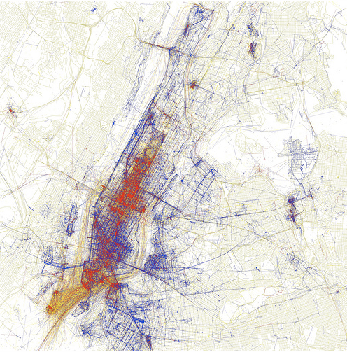
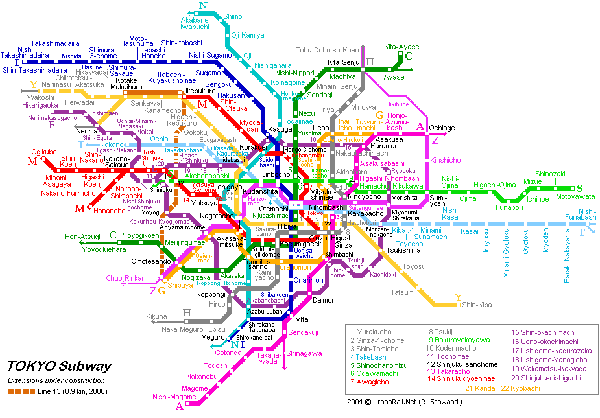
Maps of public transportation are my favorite visual shorthand for any major city, not only because I have to rely on mass transit where ever I go, but also because these highly stylized versions of cities contain much more than the bare minimum amount of information to get from one point to the next. I will be in Tokyo checking out the public transit system and attending the 4S conference through the end of the month.

See you back here in September.

Worldwide Text Messaging Trends Graphic
Worldwide Texting Trends | by shanesnow for Mashable using Pew Internet research

What works

What I like most about this graphic is that it summarizes great research from Pew that many folks would not have perused by reading Pew’s publicly available reports. That’s always one of the reasons I tout information graphics – they make information accessible and interesting to people who don’t have the drive/access/time to read full reports and the graphics often give more detail than do executive summaries. Clearly, any summary cannot give all the granularity of the report, but I assume most people do not read full reports. This comprehensive visual summary packs in more information than would a journalistic article about the research that have to include the requisite interview with a teen who texts or the parent who pays her bill or the person who was injured by a texting driver (or the guilty driver). Only sprinkled among the vox populi would we see a couple of quotes from a couple of ‘experts’ who conducted the survey. And nobody can summarize all that much in a total of four-ish quotes. I am still weighing the pros and cons of recommending that standard executive summaries be replaced by (accompanied by?) information graphics like this, at least in the case of survey-based reports.

Out with the written executive summary, in with the infographic summary? Please debate.

What needs work

I couldn’t find the actual references so I added some of my own where you can corroborate things like the Finnish PM who broke up with a girlfriend over text and the story of the first text message sent by Neil Papworth. My guess is that the bulk of the information comes from Pew while a lot of the fun facts come from the other sources. But I couldn’t find that out for sure without a great deal of effort (like tracing back every single datapoint in each of the components of this graphic).

The interwebs has a social policy of hyperlinking to sources. Please folks, keep that going someway, somehow. Otherwise we risk plagiarism which is bad in itself (see my dissertation 2011). Additionally, when it is not possible to check facts, exaggerations, methodological mistakes, made up info, and just plain lies are harder to ferret out.

References

Pew Internet and American Life Project
   Report on Mobile Access (7 July 2010)
   Report on Teens and Mobile Phones (20 April 2010)

shanesnow. (18 August 2010) “US and Worldwide Texting Trends” Original post at mashable.

Boyes, Roger. (14 March 2007) How potato love affair with Finnish PM went off the boil. The Sunday Times online.

BBC News Online. (3 December 2002) Hppy Bthdy Txt.

New York mapped by geotagged photos

Just thought this was cool

This map of New York was created by Eric Fisher. He gathered the geotags of the photos uploaded to flickr. The colors work like this: blue photos were taken by locals (deemed to be local because they had taken pictures in the same location over an extended period of time), red indicates photos taken by tourists (people taking photos outside of their frequent-photo-taking-zone), and the yellow ones were indeterminate (taken by people who hadn’t uploaded any photos in the previous 30 days though we guess they might be tourists because they may be the kind of people who only take photos while on vacation).

I like the aesthetic and the method so that’s why I decided to share.

Time and Newsweek Circulation from the year 2007

Time and Newsweek Reader Demographics - Table
Time and Newsweek Reader Demographics Table (US Pop. data from 2008 American Community Survey)

Time and Newsweek Reader Demographics - Graph

What works

These graphics accompany the graphic in my previous post about the counts of humanitarian images in Time and Newsweek. They are meant to give context to the methods section which describes these two magazines in terms of a few demographic variables and circulation information. I do not have access to the original source so I could not go back and get more demographic information besides household income and readers’ ages. It is possible that those were the only two pieces of information available in that source about reader demographics.

What needs work

The big question is: do you like the graph of the demographic data or should I just leave it in a table? I won’t tell you which way I’m leaning so as not to prejudice your opinions.

Go ahead, feel free to leave a one word comment (the one word being graph, table, or neither). If you’re feeling especially motivated, it would be nice if you explained your reasoning. But it’s August, so I’ll cut you some slack if all you can muster is a single word.

References

American Community Survey – 2008.

Mediamark Research & Intelligence (MRI). 2008 (Fall). Magazine Audience Estimates. New York: MRI.

Married with Children | The Venn Diagram

What works

1. Menlo is my favorite font of the moment for information graphics.
2. I have no idea why I haven’t seen this Venn diagram before. In my humble opinion, if you are a social scientist and you are attempting to display a concept that may or may not have solid numbers to back it up, start with the Venn diagram because:
a. Venn diagrams are easy to make.
b. Venn diagrams are easy to understand.
c. Venn diagrams are not expected to represent solid numbers. They certainly can be employed in that way, but they are not always employed in that way so you are not likely to mislead readers that you are backing your claim up with census data.
3. I am doing a bit of research on marriage and I have run up against many arguments that seem to believe that marriage and childbearing always go together, or at least that they OUGHT to always go together. News flash: 36.9% of children are born out of wedlock (Cherlin, 2008). Other adults get married but do not have children. Yet other adults get married, have children, and then end up unmarried again because divorce and death ended their marriage. The above graphic should help clear up what actually happens in the world. Marriage and child raising frequently have no overlap.

What needs work

I was so upset that I didn’t stop and look up the actual data for each of these segments. In part, I wanted to leave it as a universal concept and NOT tie it to US data. But yeah, I realize it would be better if I had sat down and figured out how many people are in each of these three areas. That’s coming in the article version. And after I take a deep breath to disperse the anger I feel at people who make illogical arguments.

References

Cherlin, Andrew. (2008) “The Marriage Go-Round.” New York: Vintage.