
What works
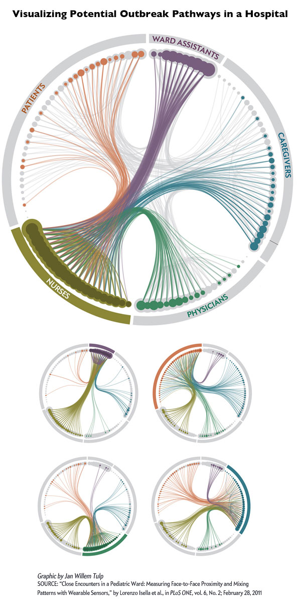
Using RFID tags worn by hospital staff and patients at the Bambino Ges&#uacute; pediatric hospital in Rome, researchers with the SocioPatterns group tracked interaction patterns to help understand how nosocomial illnesses spread. Nosocomial infections are infections patients and hospital staff contract while they are in the hospital. According to wikipedia, about 10% of patients in hospitals in the US contract some kind of nosocomial infection every year; the most common infection is the urinary tract infection (36%).
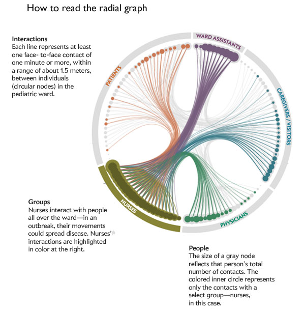
The RFID tags were distributed to 119 individuals to tally up each person’s encounters with anyone who came within 1.5 meters for a minute or more. Of course, this generated a great deal of data. The graphic above does a good job of condensing the data into a single image – well, actually, there is one image for each category of person in the hospital and it is important to look at all five images for full analytical impact. Click on the graphic to go to Scientific American and see them all.
Somewhat unsurprisingly, nurses proved to be the most well-connected people in the hospital. They interact frequently with each other and with every other category of person: patients, ward assistants, doctors, and care givers. Even though I said this finding was “unsurprising” it is extremely important to have solid data supporting what seem to be obvious findings. For instance, imagine you had not read the previous paragraphs or looked at the graphics and I had written: “Unsurprisingly, doctors proved to be the most well-connected people in the hospital, interacting frequently with patients, care givers, nurses, and ward assistants”. It sounds almost as logical as what I wrote about nurses (quite frankly, I would have found it hard to believe that doctors interact frequently with ward assistants). The point is, before data exists, it is easy to convince ourselves that a variety of different logical scenarios are playing out. The RFID methodology was a wise choice because it did not rely on self-reports. Self-reports are tough because they ask responders to remember all their contacts AND to be unbiased about reporting them. Some encounters in hospitals are more valued than others. Contacts with patients are valuable because patient care is the manifest purpose of a hospital and would thus be more likely to be reported than, say, standing next to another nurse at the bathroom sink or urinal for a minute.
What needs work
Radial graphs, to me, are difficult to read. The science of networks is still what I would call an emerging field in the sense that both the methodologies and the techniques for analyzing data are not yet fixed. New strategies are still being developed at a relatively rapid rate. I think there might be a better way to present the data than the above radial graph, but the radial graph is a huge step ahead of the messy network nests that used to dominate the presentations/analysis of network research.
Here’s where I am having a hard time making sense of the radial graph. First of all, I didn’t get the immediate impression that nurses were the network hubs holding this whole situation together. I had to click through each of the five graphics twice to ‘see’ the finding that nurses are more well-connected than others in the network. Even then, it would have been relatively easy to make a mistake and think that ward assistants were just about equally important (and maybe they are!) because the dots representing their total contacts are just as large and somewhat more tightly clustered than the dots representing the nurses total contacts. However, the size of the dots records only total contacts and it seems that ward assistants have a great deal of contacts with each other (perhaps they work in teams?), but relatively little contact with patients or physicians. But the lines representing that data are faint compared to the weight of the dots making that part of the data analysis seem secondary, which is not the case.
I don’t have a great solution to the radial graph visualization of networks situation. To me, it seems like it is a huge step beyond the messy nests that used to be the go-to for network visualization but not yet fully baked as the gold standard.
References
Matson, John. (November 2012) RFID tags track possible outbreak pathways in the hospital Scientific American.
Note: The official date on the above source is 15 November 2012 but since it is only 4 November 2012, I left the day out of the date field.
Graphic by Jan Willem Tulp; Source: “Close Encounters in a Pediatric Ward: Measuring Face-to-Face Proximity and Mixing Patterns with Wearable Sensors,” by Lorenzo Isella et al., in PLoS ONE, vol. 6, No. 2, article e17144; 2011