Congress

Congressional demographics
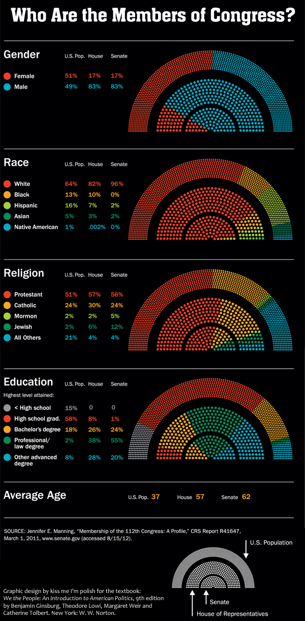
Congressional demographics | “Who are the members of Congress?” graphic by Kiss Me I’m Polish from the textbook “We the people: An introduction to American politics” by Ginsberg, Lowi, Weir, and Tolbert.

What works: Big picture

In the midst of election season, it can be easy to lose sight of the forest because we’re so entranced by the trees (or the leaves, for that matter). This graphic was developed by the design firm kiss me i’m polish in partnership with W. W. Norton and the authors of “We the People” to help students think through what it means to live in a representative democracy. The biggest outer arch of the rainbow depicts the breakdown of the total US population. So, for instance, we are split 50/50 when it comes to gender and just slightly less than half of us are Protestant. Then the middle arch illustrates how the 435 members of the House are divided and the smallest inner arch does the same thing for the 100 members of the Senate. It’s a great way to keep students thinking about not only the members of Congress but also about how that membership compares to the population they are supposed to represent.

The graphic lead me to wonder how it is that we come to collectively held opinions about what kind of parity is important. Gender parity – having about the same percentage of women in the House and Senate as we do in the general population – is a worthy goal. But age parity and educational parity are murkier. Legally, there are age minimums for serving in the House and Senate so we are never going to have age parity. I tend to agree with the founding folks who believed that wisdom and age have a measurable positive correlation, though I would probably argue that age is simply a fairly reliable proxy for experience. A young person with a great deal of life experience might be considerably wiser than an older person with very little life experience.

It would be easy enough to argue that we should also elect more well-educated people and feel like we are making a sensible choice as we do so. Right? More well-educated people have taken up lots of the facts and ideas circulating in a given time and place so education is probably a good thing for representatives to have. But education is correlated with class. Electing people who are overwhelmingly more well-educated also tends to mean we elect higher class folks. Of course, this is not a perfect relationship and it matters only if we think that class and political behavior are related. And, well, they are, but not in entirely linear ways, especially if education is our only proxy variable for class.

The main concern of this particular post is to show you a graphic that does an excellent job of raising fairly complicated questions without simultaneously implying answers. I am not going to push closer to any answers about how to understand the meaning of parity between individuals and their elected representatives is something we’d like to see in our representative democracy.

What works: Specific details

Color: The use of color here – especially for race – overcomes the typical tendency to try to use pink for women and maybe something dark brown for African American people. Yeah, both of those choices may make sense in some contexts, but unless there is a great justification for reinforcing stereotypes, buck stereotypes.

Fan + rainbow shape: The fan + rainbow shape is striking from a distance and allows for both segments and stripes. It offers more visual vectors for categories than I would have imagined. I probably would have gotten hung up thinking only about the stripes in rainbows and forgotten that the rainbow shape is also like a fan, and fans have segments.

Rainbow and Fan

Numbers are not layered over the graphic: The graphics stand on their own and the numbers are presented directly adjacent to them in small tables. This is a best-of-both-worlds approach that displays the actual numbers accompanying the impressionistic visualization of the data without having to deal with the clutter of seeing the numbers layered over or arrowing into the data which messes up the visual comparison task and also makes the numbers harder to read.

What I would have liked…

The age variable is listed as averages here, nothing visual. That’s fine, but whether or not the information is displayed just as a mean or it is developed as a graphic similar to the others, it would have been nice to be reminded that Senators have to be at least 30 and Representatives have to be at least 25 years old. This is a relevant contextual touch, helping to remind the (young) students that there are slightly different elements structuring the age disparity. Some of the extremely astute students might have been reminded that the racial category used to have a similar asterisk pointing to the role of law in politics.

References

(2012) “Who are the members of Congress?” [infographic] by kiss me i’m polish. New York.

Ginsberg, Benjamin; Lowi, Theodore; Weir, Margaret; and Tolbert, Caroline. (2012) We the people: An introduction to American politics, 9th edition. New York: W. W. Norton.
[Note: The link here goes to the web page for the 8th edition of this book but the graphic was taken from the 9th edition. A similar graphic was included in the 8th edition. The 9th edition image above includes updates that reflect the results of elections that have happened since the 8th edition was published but the overall look-feel and the design concept remained the same.]

SOPA Opera in Congress

Graphic Sociology opposes PIPA/SOPA

The proposed PIPA and SOPA legislation has been roundly criticized with solid, logical arguments here by danah boyd, here by Tarleton Gillespie who links to 16 other authors who have argued against SOPA/PIPA, and here in a letter Harvard Law Professor Laurence Tribe sent to members of Congress.

As someone who is a passionate scholar of collaboration (both in its cooperative and competitive forms), I worry about the legal and economic repercussions of SOPA/PIPA that have been brought up by the authors mentioned above as well as the negative impact the threat of discretionary censorship would have on the kinds of sharing and borrowing that have made the internet and digital files such a rich source of remixing, incremental improving, and all around innovation. There is no way I could put a dollar figure or other empirical metric on what might happen to remix culture (what the cool kids call it) or innovation (what the business schools call it) under a legal regime in which just about anyone can censor just about anyone else. I can say that the internet as we know it would cease to exist. I post things here on Graphic Sociology that I have designed and created without even mentioning Creative Commons or standard copyright or anything else. If people take my work and get something out of it, that’s fantastic. I don’t even care if they give me credit, though many creative people do, and for good reason. I’m afraid if PIPA and SOPA were to pass, fewer people would re-mix my work and that’s the best kind of use, as far as I am concerned. Reposting is fine, remixing is divine.

I also post the work of others and critique them as an academic, something that is legal under the fair use doctrine. I’m not sure how SOPA and PIPA would mesh with the particular provision of the fair use doctrine that I am exercising. Presumably, they can co-exist, but I certainly don’t have the resources to hire a lawyer and defend myself against anyone who might claim that I’m violating SOPA/PIPA. And as just one of a family of bloggers, any infringement claim against any blog post on the society pages could darken the entire site. So if someone got upset with me, that would mean lights out for Sociological Images, Thick Culture, and all the rest of the blogs here.

The rest of this post is written by guest blogger Alec Campbell of Reed College in Oregon.


Guest post by Alec Campbell, Reed College


What works

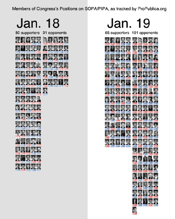
This graphic clearly shows that something caused a change between January 18 and January 19. That something was almost certainly the focused attention on SOPA and PIPA resulting from shutdowns, blackouts and other actions taken or led by a number of popular Internet sites (wikipdedia, reddit, the Social Media Collective, and even here at thesocietypages there was a blackout of sorts).

What needs work

The most important flaw in this graph is that it excludes members of congress who are undecided or whose opinions are unknown. Looking at the graph it appears that the distribution of opinion moves from 72% in favor before the Internet shut down to 39% in favor after. In reality the distribution is 15% in favor, 6% opposed and 79% unknown/undecided before the shutdown and 12% in favor, 19% opposed and 69% unknown /undecided after the shutdown. The two graphs aren’t comparable because they don’t include the same total number of observations. When comparing populations of different sizes one has to compare percentages which this graphic does not do.

In fairness, the article accompanying this graphic has links to much more detailed data on SOPA
and PIPA
that does include a full accounting of all members of congress. However, those data don’t allow for comparison over time, which is the central point of this graphic.

What I can’t figure out

It’s clear that there are fewer supporters on January 19 but it isn’t clear if the people who no longer support PIPA/SOPA now oppose it or if they are now undecided. Did the Internet action make converts or agnostics? Arstechnica is keeping a running tally of Senators who are now opposing PIPA, including many of the former co-sponsors of the bill.

The graphic could have used arrows to show movement from one of the three camps (supporters, opposers, undecideds) to help illustrate where the movement happened.

Why it Matters

None of this matters much if our interest is in the fate of SOPA/PIPA. It matters a great deal if we are interested in the power of Internet protest. This graphic is about the power of protest because the prominently displayed time dimension is only relevant to this issue. This graphic overstates the power of Internet protests by omitting the unknown/undecided category making it appear that people changed their minds overnight. Clearly, some did. The number of supporters dropped in absolute terms. However, the larger effect is in convincing people to publicly state their opinion or to finally make up their minds. It is entirely possible that the major effect of the Internet protest was to get congresspersons that were leaning towards opposition to publicly state their opposition and force some supporters to claim an undecided status. That is certainly something but it isn’t the same thing as changing supporters into opponents, which is what the graphic implies.

References

propublic.org following House support of SOPA

propublic.org following Senators support of PIPA

Lee, Timothy. (19 January 2012) PIPA support collapses, with 13 new Senators opposed. [blog post] arstechnica