animation

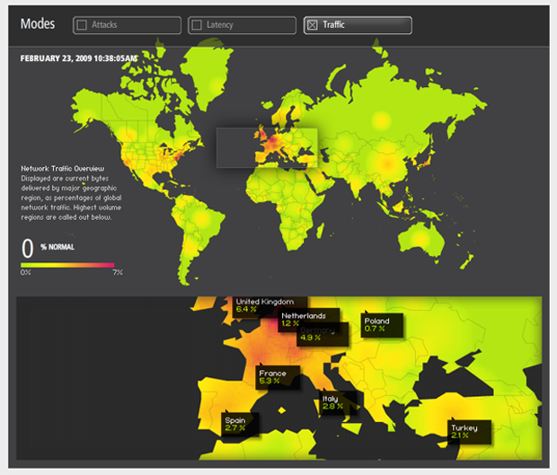
Akamai Internet Traffic - Click Through for Interactive Graphic

Internet Traffic

This week we’re going to have a look at the internet. Here are two reasons why:

  • 1. The not entirely superficial reason is that there are many great visualizations out there dealing with the internet, internet traffic, internet usage patterns, and so on. Many are interactive so you can play around with them yourselves.
  • 2. The larger theoretical question about studying the internet and online behavior goes something like this: How much is people’s online behavior reflective of their offline behavior? Are people role-playing when they’re online, trying out personas they may not fully embrace offline (see Sherry Turkle)? Or is online behavior seamlessly integrated with offline behavior? We IM the people we’re about to have dinner with indicating that the people we talk to online are just about the exact same people we talk to offline? And if the relationship between online and offline behavior is somewhere between these two, how can we figure out just what is going on?

What Works

The graphic above is just a screen capture from Akamai’s site. In order to get the full impact, you have to click through and play around with it. Akamai has a slew of other visualizations you can play with that deal with network attacks, latency/network failure, retail data, news traffic, and so on.

Just to be clear, Akamai is a private company providing web-optimization services. In their shareholders’ quick facts, they say they serve up 10-20% of global internet traffic. What does this mean? It’s easy to forget that the internet requires physical structures, but this is part of what Akamai does. They maintain “40,000 servers in 70 countries within nearly 950 networks” all over the world slurping up electricity and information at about equal rates. The reason they do this is because if you are, say, a blogger in New York and you store your files on a server just down the hall (which is unlikely, but play along), if someone in Singapore wants to read your blog, the request is going to have to come all the way from Singapore to the server down the hall from you in New York and then the files will have to be sent all the way back to Singapore. This takes time, there might be network congestion along the way and if you are serving your readers in Singapore something a bit more bandwidth intensive than text (say a little clip of a new car racing around a track or a high quality music download) the person in Singapore may just lose interest before they even get the whole file. Akamai gets around this in part by duplicating files and storing them on servers all over. So if your reader in Singapore wants to access your site and you’re an Akamai customer, they will end up pulling those files from a server much closer to them, maybe in Singapore, but at least somewhere much closer than New York. Akamai’s clients tend to be Fortune 500 companies with global client bases and companies that rely on being able to transfer heavy files reliably and quickly (like music and software downloads). They do more than just the physical infrastructure, they mobilize their resources to detect net attacks, congestion, and then to re-route and avoid those things. The bottom line for us is that they make some of their knowledge of the ‘net available in these visualizations like the one above.

What Needs Work

I would love to have more granularity and access to the actual numbers and the methodology. All these shiny interactive graphical toys run the risk of being too glossy, not data-transparent enough.

Not as Shiny, Quite Helpful
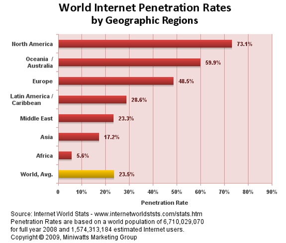
Internet Global Penetration Rates - Internet World Stats
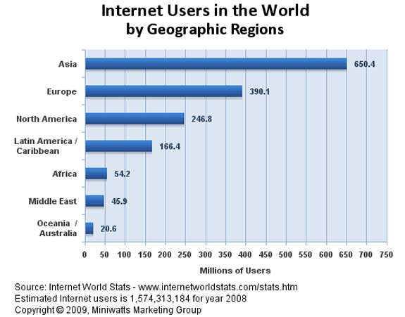
Global Distribution of Internet Users - Internet World Stats

These two graphs give a quick overview of who is using the internet by geographical location. You’ll see that rates of traffic can be a bit misleading – not all continents have the same population. That’s why I included the rate of internet penetration within the continents. A low rate of penetration tells you a lot about how the digital divide which is a very real problem. More on that later this week when we will address the digital divide directly. For now, it’s enough just to notice the difference in looking at the flashy, glossy Akamai graphic and the simple bar graphs. I don’t know about you, but I quite enjoyed playing with the Akamai graphic and encourage interactivity. Still, the combination of these two bar graphs above gave me a clearer answer to the big question about who in the world has access to the internet in the first place.

Relevant Resources

Akamai – Data Visualizations

The Berkman Center for Internet and Society at Harvard University School of Law.

Deibert, Ronald, Palfrey, John; Rohozinsky, Rafal; and Zittrain, Jonathan (2008) Access Denied: The Practice and Policy of Global Internet Filtering Cambridge, MIT Press.

Internet World Stats

Turkle, Sherry. (1984) The Second Self: Computers and the Human Spirit Cambridge, MIT Press.

USA Today Flash Animated Graphic accompanying the headline “Deaths Down on America’s Roads”

What Works

Nothing is working here and I’m not just saying that because it’s flash and I can’t repost it. Please link through for a hot minute and look at it anyways.

What Needs Work

My problem with this graphic is that it is ONLY a map of the US, except for the few seconds when you roll your mouse over it. Even then, you don’t end up seeing a pattern, you just see little pop up windows with some numbers in them. Information graphics need to artfully, intelligently, dare I say cleverly weave the information into the graphic so that the two become greater than the sum of their parts. None of that happens here.

The map of the US is still just a map of the US. No shading, no numbers, no way to tell that we’re talking about traffic deaths. Even just mapping out the interstate highway system would have given a hint of a visual clue to tell us what we’re talking about. In the previous post, Snow stacked bars to indicate dead bodies. Maybe it’s a little over the top, but if we are addressing the notion of a change in body count, I would like to see some visual representation either of bodies or of change (change is more abstract and probably more appropriate for USA Today than a visual representation of a body count). Furthermore, I want to know if there really is a relationship between gas prices and body counts which *could* be explored looking across states. States tax gas at different rates resulting in variations from one state to the next. Sensitively factor in income and unemployment and we might be able to get a sense of how much gas prices impact mortality on the roads. Even more interesting would be whether it’s the fact that people aren’t on the road at all that prevents them from dying out there (no gas = no go) or if it is somewhat more subtle – perhaps people drive slower to be more fuel efficient rather than staying home and it is the slow down, not the no-go that keeps people alive. The more likely scenario would also point out that cars continue to get safer and that seatbelt laws work. If we could look at the data over time, we’d have a better idea how more quickly traffic fatalities dropped in 2008 than in other recent years, which would help factor in the cars-are-safer-now + more-states-have-seatbelt-laws effects.

This graphic falls woefully short of even hinting at any of these questions. I wish they had left it out altogether, forcing everyone to read the article in full.

Click Here to View the Animation by Aaron Koblin

What Works

Click on the link in the caption to go to Aaron Koblin’s site and watch the animation. It’s mesmerizing and I ended up watching it more than once, trying to pick out the patterns. And, in fact, what works about this approach is it’s ability to help quickly identify patterns. Generally speaking, data that is dynamic (usually the change is happening over time, as in this case) is data that may lend itself to this sort of pattern recognition analysis via visualization.

As you watch the whole visualization, you’ll see that Aaron Koblin experimented with three different ways of displaying the same data. He starts with impermanent white lines over a dark background, then globs of oil-ish substance over a white background, then he applies color to the original white-on-black version. I like the political implication of using the oily blobs – that is what we are collectively doing when we’re flying – burning up vast quantities of fossil fuels by using just about the least fuel-efficient form of transportation we’ve got. Vehicles for traveling outside earth’s orbit are even less efficient. I still think the white-on-black version works best because I couldn’t figure out what the colors represented.

I love the total flight counter and the running clock. Adds a great deal of contextual information very subtly.

What Needs Work

I think this animation does a great job of showing what it sets out to show – the flight patterns in the US over a 24 hour period. If there was an intention to include data about the environmental cost, I would have liked something that isn’t quite as subtle as showing the patterns using blobs of oil-like substance. But modeling that sort of data would be even more complicated than what was done here because it would count on knowing how big each plane was – jets use more fuel than smaller planes – and some estimate of how heavy it was – full flights use more fuel than empty ones.

I also wanted to know if this represents all passenger and cargo flights, or if it is just passenger flights?

Relevant Resources

Aaron Koblin’s website and a link to the specific animation related to this post.

For more on globalisation, see Saskia Sassen who was interviewed about her work by John Sutherland at the Guardian in 2004.

For more on the relationship between aircraft and climate change see this slightly outdated 2001 report from the Intergovernmental Panel on Climate Change (UNEP)