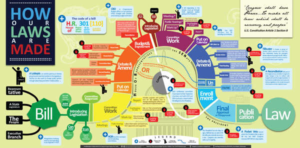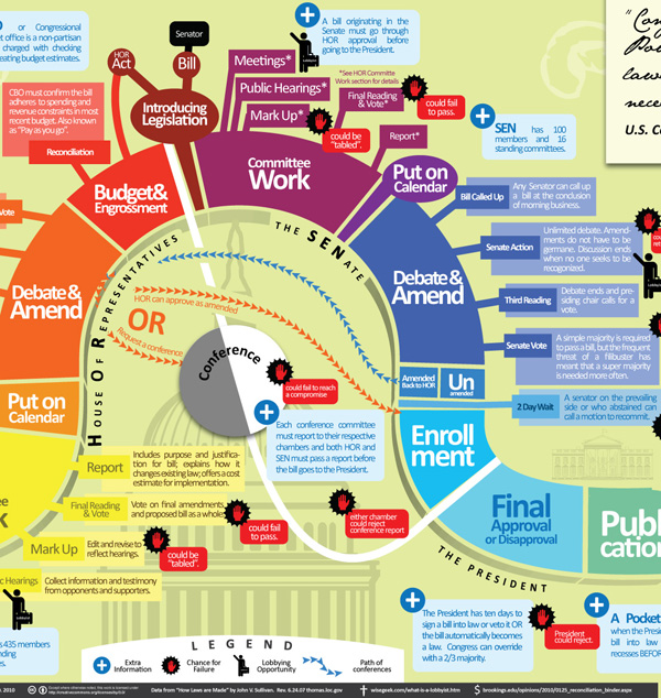
Click through to get the full version or be lazy and just look at the graphic excerpt below

What works
My favorite part of this graphic is the inclusion of lobbyists along the way. I might have represented them with some sort of hint about the fact that lots of their power comes from money. Maybe some bills popping out of their suitcase?
Furthermore, it’s impressive that each step is so fully spelled out. Filibusters are in, as they should be.
What needs work
This is so busy. Information graphics are supposed to be relatively easy for the eye to digest. With this one, I do know where to start, but I get lost trying to follow the process along.
Here are some concrete suggestions:
- Instead of gray-scaling the House of Representatives, the Senate and the President in underneath the curve, just make the segments related to the House, say, all one color, the Senate all another color, and the President a third color. To show variation within those three, play with saturation. It becomes less colorful but more intuitive.
- The font sizes that vary within a segment and in the title are confusing. Just one font size per segment. This is a graphic, not a wordle. Plus, I never liked wordles. Words are mostly for writing, sometimes for labeling, but they do not make good graphics on their own with very few exceptions. Use words as words, not as graphics.
- I would have tried to find a way to incorporate some of the balloons hanging off the main body into the main body. Aesthetic decision, but the whole thing looks hairy with all those balloons, lobbyist icons, kill points, and so on. Get some of that content into the segments, even if the segments have to expand to accept a bit of explanation.
- I am not a fan of the buildings and whatnot sort of faded into the background. They don’t add to the story and the image is already too cluttered. Nix ’em.
- The color of the conference committee – gray and white – makes it seem as though it is unrelated to the House or the Senate or anything else going on here. Maybe the members are extras from Twilight? This is actually the one place where a bit more color would have made sense. Blend the color of the HOR and the Senate and get them swirling around in conference.
- The terms that are randomly defined or explained in blue boxes in what would have been ‘white space’ around the snake could have been collected and stuck into a single box somewhere. They could have been numbered and the numbers could have been applied to the graphic at the point where the viewer might have been most likely to wonder about them. Or not. With fewer than 10 terms, I think people would find their way through them without too much trouble even if they weren’t numbered and keyed directly to a particular spot on the graphic.
What needs to be said
This graphic was a winnner at Sunlight Labs Design for America contest. So all of my criticisms are, apparently, bunk. Because this one was judged to be the best of the “how the bill becomes a law” submissions. More from this design series coming soon. I can just tell you’re all getting excited about the IRS themed graphics.
References
Mike Wirth. “How a Bill Becomes a Law”
Johnson, Clay of Sunlight Labs. (26 May 2010) Design for America contest.

Comments 2
Rob — June 9, 2010
My biggest complaint is that this entirely neglects the House Rules Committee, ordering the previous question, and voting on the rule. That's a key place that shapes a lot of what happens to a bill.
Here’s a nice one to start off with | 47 Graphs — June 18, 2010
[...] via Graphical Society [...]