What works
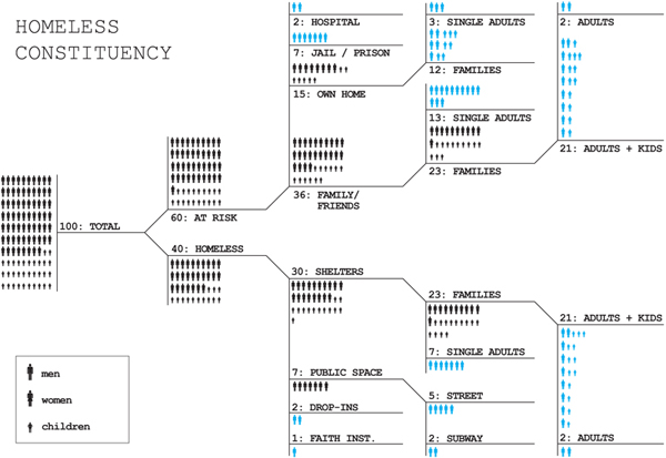
What Terri Chiao and Deborah Grossberg Katz from Columbia University’s GSAPP design school have done is come up with a way to represent percentages using a flow-chart. Not only is it creative in the sense that this sort of data rarely gets displayed this way, but it helps turn the data into a narrative. In order to figure it out, the viewer quite literally has to reconstruct a story that sounded something like this in my head: “The population they are concerned about has 40% of people already experiencing homelessness with another 60% at risk of homelessness. The folks who are already homeless are the only ones living on the street, but really, 75% of already homeless people live in shelters. As for the at-risk-of-homelessness people, 60% live with family or friends. Twenty-five percent of the at-risk population owns their homes … why, then, are they at risk of homelessness? Both the at-risk and already homeless groups have far more families than single folks. And what does it mean to be homeless in jail/prison? That you aren’t sure where you will go when you exit? Somehow I feel like that could describe a lot of the prison population. And what about half-way houses? Those still exist, right?”
The flow-chart concept is not typically used to describe the breakdown of percentages and what works here is that it forces the viewer to walk through the narrative. As a pedagogical maneuver, it’s quite successful. Because of the way the information is presented, it invites questions in a way that a pie chart or a bar graph may not. It’s also a little harder to interpret. Graphics that invite questions often are a bit more challenging to ingest, not quite so perfectly sealed as other more common strategies might appear.
What needs work
I spent a good deal of time looking at this chart trying to figure out what the blue means. I still don’t understand what the blue means.
I also would like to see on the graphic some explanation of how they determined who was at risk of being homeless. Because when I got to the section of the flow-chart that showed how many of the at-risk population owned their homes, I began to get confused. By ‘own home’ do they not mean actually owning the home, but renting it or paying a mortgage on it? And if they do mean that folks actually own their homes outright, how can they be at risk of homelessness? Is the home about to be seized by eminent domain to make way for Atlantic Yards? At risk of being condemned (I hope NYC doesn’t have so many properties at risk of condemnation)? I’m sure if the makers of the graphic ever find their way to this page they will be upset because ‘at-riskness’ is described in the paper. But in life online, stuffing a little more text into the graphic is often a good idea because cheap folks like me will take the graphic out of context and whatever isn’t included will be lost. In this case, though, all is not lost. First, you can visit the blog on which I found this lovely graphic and get the whole story. But if you aren’t ready for all that, note that the authors define those who are at risk of homelessness as anyone who has spent some time in a shelter in the past year, regardless of whether they happened to have been homeless at the time of the survey.
Bonus Graphic
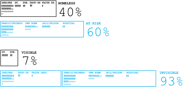
They also included the graphic below. I still don’t know what the blue means. This graphic does make it easier to understand that being truly homeless appears to mean running out of friends and family who have homes to share. Because none of the truly homeless live with family and friends. It’s also clear from both graphics that most homeless people are not visibly homeless. The folks you might see sleeping on the train or the street 1) may not be homeless, they could be sleeping away from home for reasons unrelated to homelessness per se and 2) if they are homeless, they may be quite different from the rest of the homeless population. They’re more likely to be single adults than families and more likely to be men than women.

References
Chiao, Terri and Grossberg Katz, Deborah. (11 November 2009) “Public/Private: Rethinking Design for the Homeless” at Urban Omnibus.

Comments 4
ja — June 1, 2010
fwiw - i don't think the "own homes" indicates that 15% "own their homes" but that 15% "live in their own homes" (i.e., could be renting/owning/etc.).
Rob — June 1, 2010
at least in the first chart, blue seems to represent the "end of the line" for that particular group; they aren't broken into further subgroups. All the blue people in the first chart will add up to 100
Homelessness in New York – Representing percentages » Graphic … | the world cares.com — June 1, 2010
[...] this link: Homelessness in New York – Representing percentages » Graphic … Tags: figure-it-out, Homelessness, sounded-something, the-viewer, viewer Share this [...]