What works
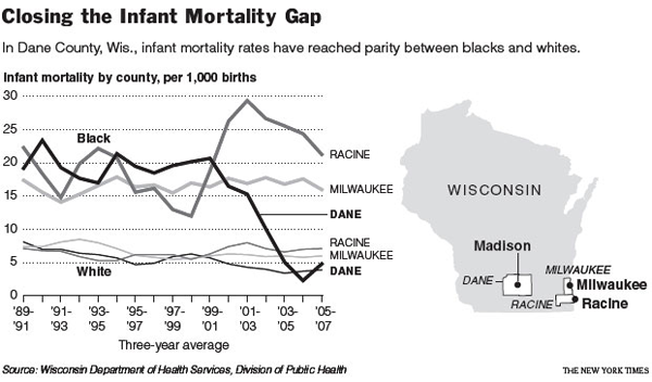
I like the inset map. Architects often include a small site map in the main exterior section of a new building to help the viewer understand where the building is in relation to the rest of the world. News programs often start out international stories with maps. I love that this line graph comes with an orienting map. I might have included just a shadow of some neighboring states simply because many Americans have only a fuzzy idea of where Wisconsin is. Sad but true.
The lines show a great deal of information, some of which is not addressed in the article. Quoting the main thrust of the article:
“Here in Dane County, Wis., which includes Madison, the implausible has happened: the rate of infant deaths among blacks plummeted between the 1990s and the current decade, from an average of 19 deaths per thousand births to, in recent years, fewer than 5. The steep decline, reaching parity with whites, is particularly intriguing, experts say, because obstetrical services for low-income women in the county have not changed that much.”
Then it goes on to quote a local doctor and professor: ““This kind of dramatic elimination of the black-white gap in a short period has never been seen,” Dr. Philip M. Farrell, professor of pediatrics and former dean of the University of Wisconsin School of Medicine and Public Health, said of the progress in Dane County. “We don’t have a medical model to explain it,” Dr. Farrell added, explaining that no significant changes had occurred in the extent of prenatal care or in medical technology.””
The graph suggests an explanation that the article (and the doctor) may not have considered. Presenting information visually is about more than presentation; rearranging data to reveal patterns is a research tool in itself.
What needs work
This is a critique of the article, based on the line graph: isn’t it possible that the at-risk folks in Dane County ended up moving to Racine for some reason? Right at the time the infant mortality rate in Dane was plummeting, the rate in Racine was spiking. From the line graph it seems that this happened in the vicinity of Clinton era welfare reform. Maybe there were some reasons for the most at-risk folks to get out of Dane and into Racine at this time.
If there is no medical explanation, let’s have a look at other possible explanations.
References
Eckholm, Eric. (2009, November 26) Trying to Explain a Drop in Infant Mortality The New York Times US Section, reporting from Madison, WI.

Comments 4
mikebader — December 4, 2009
I know a little bit about this study, and I think that researchers at Wisconsin are starting to look at the reasons behind the shift -- including demographic transition. Yet, even if residential mobility is behind the shift, it is a rather drastic amount of moves in a very short time-span which, in turn, would need a lot of explaining as well.
The problem studying these questions is that there is not any really good mobility data available to researchers. The Census measures whether someone has lived in the same house/county/metro area for the past 1/5/10 years (although different surveys differ on the length of time that they measure), so it would be difficult to assess if this is the case. Although one might be able to do it with county-level American Community Survey data.
Tweets that mention Infant mortality – race matters » Graphic Sociology -- Topsy.com — December 5, 2009
[...] This post was mentioned on Twitter by Pierre Bourdieu, Ian Wardle. Ian Wardle said: RT @bourdieu: Infant mortality. Race matters http://bit.ly/5ckEFK [...]
Pamela Oliver — December 21, 2009
Given economic patterns, it is very unlikely that people moved from Dane to Racine. Racine has suffered much more economic distress than Dane. Movement from Racine to Dane is more likely. It seems likely to me that much of the change is due to the switch from 1990s population estimates to the 2000 Census and subsequent estimates. More Blacks showed up in the 2000 Census for Dane County that you would have guessed from the 1999 population estimate. The inclusion of "two or more races" in the 2000 Census also adds to the confusion, as different ways of handling mixed race people can impact the population bases. The percentage of people with some Black ancestry ending up in the "two or more" category was larger in Dane than Milwaukee; I don't know about Racine. The Black populations in Dane and Racine are both small enough to lead rates to be heavily influenced by small changes in the base.
Note however that the White rates show the same trend as the Black rates: rising in Racine, falling in Dane. This suggests that whatever is going on isn't entirely race-specific and may actually be something "real" about infant mortality.
Pamela Oliver — December 21, 2009
PS. It is important to remember the VERY SMALL numbers involved. We are well within the range of sampling fluctuations. From a news article speaking of the uptick at the end of the series:
"Of 506 black babies, 10 died. If the previous trend had continued, there would have been three such deaths, Schlenker said. So there were seven "excess" deaths of black babies, he said.
The percentage of black babies born prematurely, or before 29 weeks gestation, went up only slightly last year. There were nine such births, five of which were among the 10 deaths. Schlenker and others have cited the decrease in premature births among blacks in recent years as one of the main reasons for the drop in infant mortality." DAVID WAHLBERG, Wisconsin State Journal December 5, 2009.
A change in hospital procedures regarding the coding of the race of a baby could also have an impact. Has anybody checked to see what was happening to the mortality of "race unknown" babies?