
Note to Readers
I want to thank Mike Bader, PhD candidate in Sociology at the University of Michigan, for pointing me to these graphics. Please follow his example and send me what you come across.
In another note, for this post you really have to click through and play around with the interactive graphics at Pew or you are going to miss out on the best part.
What Works
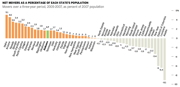
These graphics are high quality and thoughtful, they offer more the more you look at them and play around with them. I especially like the “net movers” diagram because it works as a static graphic and as an interactive graphic. They are high quality and represent a clear effort on the part of the people at Pew to develop information graphics as a tool of information dissemination. The immigration data they use is all available from the Census Bureau (either from the decennial census or from the American Community Survey) and here that data has been masterfully presented.
The interactive graphic based on the map works the best. Because it offers just a bare minimum of information at first glance – either positive or negative net migration – users are compelled to actively engage. They have to actually move the mouse over the graphic in order to unlock the richness. It’s not a huge hurdle, there aren’t too many people who will be deterred from the interaction because it’s just too much for them, but it does mean that they have to have some kind of motivating question. And asking a question, even it the question is so simple its almost sub-conscious, “what does this thing do?” means that the user is actively looking for an answer. Pedagogically, when learners generate their own questions, they are more likely to retain the information presented. For this reason, most interactive graphics are likely to be better learning tools than would, say, a list of bulleted points about immigration patterns.
I also like the detail available in the pop-out tables. Tables are tricky beasts – they have the ability to offer a great deal of precise data which is generally tantalizing to empirical researchers. It’s tempting to build row on row and column on column of exacting detail in a grid that allows for efficient reference. But tables are much better for answering questions for posing them. If you know what you want to look up, you’re happy to have a table. But if you don’t come to a table full of data with a question, it’s highly unlikely that seeing table data is going to help you generate a question. Think: how often do you pour over the train schedules for distant cities? Probably only when you’re about to travel to those cities. A table as a graphic is about as interesting to readers as a bus schedule for nowheresville. On the other hand, if you happen to live in nowheresville, you are extremely motivated to check the train schedule because it’s imperative that you get on a bus to somewheresville.
This graphic wouldn’t have worked if it were simply a table by state with all the same data that is in the mouseovers. And yet, that same data presented in bite size table format in a rollover is suddenly interesting because the user was internally motivated to find out. Even if the motivation was no more than, “hey, what happens on mouseover?” that is enough to hook viewers into the project going on here. It’s kind of like a modern version of jack-in-the-box. An empty box is so boring one might not even see it. But a box that something is going to pop out of is irresistible. It’s not like the act of mousing over or winding a spring is inherently interesting. Both are boring in themselves. But even a little element of surprise can not only motivate people to act, but can spark a spot of enthusiasm.
What Needs Work
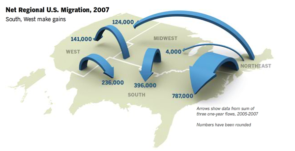
The static graphic with the giant arrows floating around the country wastes its 3D quality Does anyone else see something like a giant game of chutes and ladders where emigrants climb up out of one area and then turn into immigrants as they slide down into a new area? Maybe it would be more engaging if little animated people were actually sliding around the country. The interactive graphic offers so much more information than what is contained in the static graphic – let’s face it, all we’ve got is a loose sense that there is internal movement – that I can’t even stand to look at this for more than about ten seconds before I move on to the interactive part. However, static graphics CAN be just as rich, offering just as much deep information, as interactive graphics. This one fails, but there have been many successful static graphics featured. (list of static graphics here – Jaegerman, death penalty, tomorrow’s post)
Relevant Resources
Cohn and Morin. (2008, December) Who Moves? Who Stays Put? Where’s Home?. Pew Research Center.
Keegan, M. and Rountree, S. (2008) Comings and Goings: Migration Flows in the US Pew Center for Social and Demographic Trends.

Comments 1
max — March 25, 2009
The graphic diagrams showed above caught myself with sheer amazment. What is stated above of the internal migrations that is occuring in the United States is that the demographic shows people living in colder climates seem to appear moving westword or along the gulf coast. The only reason i believe this is occuring is the simple fact that people leave there settlement in the winter to escape the harshness of the winter monthes.