What works
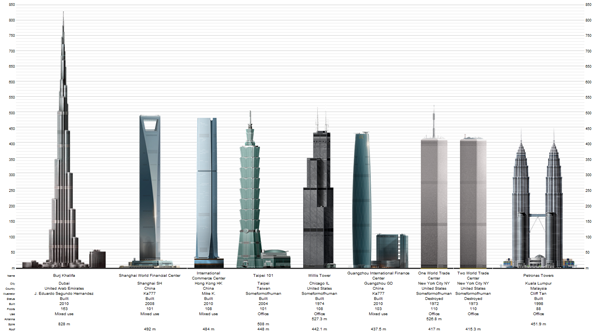
Following my post about Kate Ascher’s new book, “The Heights: Anatomy of a Skyscraper” I realized that one of the things I liked best about her take on skyscrapers was that she found a way to compare skyscrapers to their alternatives. Usually skyscrapers are just compared to one another, usually stripped of their urban contexts. So there will be a graph like the one below with skyscrapers from all over the world – different cities and climates and purposes – all lined up in height order.

What I like about the graphic at the top (that originally appeared in Scientific American) is that it goes beyond the all-too-common height comparison and describes how weight and other architectural engineering concerns are handled.
What needs work
Given that the graphic by Beau and Allen Daniels was commissioned to appear alongside an article in a magazine that I have not read, I am qualified to discuss what is NOT working. I retrieved the image from their digital portfolio which did not mention the date or title (or author) of the Scientific American piece with which it ran.
References
Ascher, Kate. (2011) The Heights: Anatomy of a Skyscraper. New York: Penguin Press. [see my blog post about Ascher’s new book here]
Daniels, Beau. Skyscraper Construction and web-based portfolio.

Comments 1
jesse — November 2, 2011
The second image looks like its from SkyscraperPage.com