Note
My dad sent this along to me and I decided to leave his handwritten note at the top. Since he was interested in the graphic and not the article, I do not know exactly which article in the March 2011 issue of National Geographic contained the Human Impact graph, but my educated guess suggests it came from the one entitled, “The Age of Man” by Elizabeth Kolbert. I checked out the online version and could not find this graphic, but print and online versions of magazines do not always contain the same content.
This is why it’s nice to have parents who will cut things out of print magazines for me. Thanks, dad.
What works
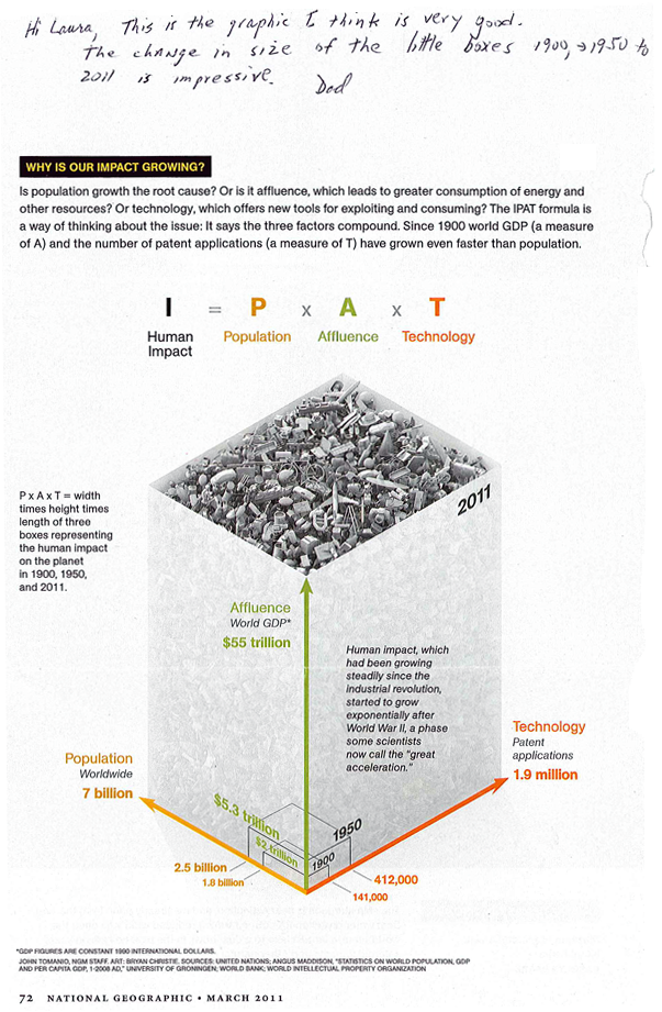
The best feature of this graphic is that it provides a way for readers to understand population growth taking into consideration the qualities of the population – and the way that changes in those qualities over time mean that population growth at one point in time is not the same as population growth at a different point in time. As we all get richer, we demand more of the planet in terms of food (increased affluence leads to eating higher up the food chain which is less ecologically efficient), in terms of energy (more affluence means more demands for electricity and fossil fuels), and all of our affluence allows us to spend more time inventing things that will make our lives even better than they already are. The increase in affluence as measured by global GDP and the increase in technological sophistication as measured by patent applications are going to go hand in hand. I would point out that patent applications would not be necessary in economic systems other than capitalism, so that particular metric might be off in countries that aren’t wholly capitalist (Cuba comes to mind).
What needs work
What’s weird about this to me is that this growth is exponential and yet it has been represented linearly. I’m wondering what an exponentially growing volume looks like – probably looks pretty interesting depending on how the parameters constraining the volume are keyed to the variables. This is a tough criticism because I don’t even know the answer myself, I just know that something isn’t quite right with the tidy right angles here.
I’m a bit upset, too, about the fact that we’ve run into the apples and oranges problem again. One unit on any of these axes cannot be compared to one unit on the other two – a patent application is not like a human and neither of these are like dollars of GDP. Because I cannot compare one axis to the next, I know that I cannot use this graphic to form anything other than an impression about the factors comprising the impact of humans being born today. I cannot, say, decide that cutting back on technological growth would be better or worse for the planet than limiting population growth.
There is something good to be said about graphics that represent concepts rather than data. Impressions are not worthless so if this thing gives viewers the impression that population growth is not a problem on its own, but only a problem in the context of the way humans live, that is an accomplishment of which to be proud.
References
Tomanio, John and Bryan Christie. (March 2011) “Why is our impact growing?” [Graphic] in National Geographic p. 72.
Kolbert, Elizabeth. (2011) Age of Man National Geographic Magazine.

Comments 1
Mike Hout — April 27, 2011
The PxAxT expression only makes sense if every technological innovation (operationalized as patents) multiplies the earth-impact of PxA (the product of population and affluence). Many technological advances reduce the human impact. Take catalytic converters for cars; they helped reduce particulates from cars, blunting the potential impact of PxA instead of multiplying it. Prominent inventions like the jetliner at the top of the junk heap in the graphic might conform to the PxAxT equation, but I want some evidence that PxAxT is the right function before endorsing this graphic.
First step: Most outcomes -- life expectancy, happiness, etc. -- show marginally declining impacts of GDP. So the multiplier should be lnA not A itself.