Reading Suggestion
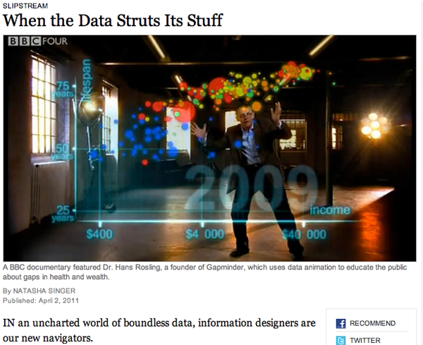
In case you missed it over the weekend, the New York Times ran a story about information graphics and the people who use them to communicate with the public. Unsurprisingly, Hans Rosling of Gapminder in Sweden – one of the new heroic figures in infographics – was the man in the picture and the first to be quoted. Rosling deserves the attention – gapminder had fairly humble origins and has grown because it draws from sound data, it is free to use, and it does a predictably good job of providing a visual overview of country level comparisons over time. Natasha Singer, the journalist who wrote the article, also interviewed Professor Ben Schneiderman of the Human-Computer Interaction Lab at the University of Maryland and Jim Bartoo of the Hive Group. And that’s where the article obliquely addressed the growing divide between infographics that are meant to be serious, complex, and complete and those that are meant to be beautiful and compelling, but user-directed. This second sort of infographic is the sort of thing that gets accused of being ‘info-porn’ and often covers information that is of dubious social value. Do we really care about celebrity’s twitter usage patterns? Is that as important as the work Hans Rosling does? What can the academic side of information graphics makers learn from the commercial side?
The article has a slightly different take on these questions,
The fact that serious software companies are now tree mapping the pop charts is a sign that data visualization is no longer just a useful tool for researchers and corporations. It’s also an entertainment and marketing vehicle.
but it’s clear that there are some divisions within the world of infographics that are worth considering more seriously. Nobody ever claimed that all writing is of the same species or that everything on TV is trying to do the same thing. Documentaries are not like sit coms which are not like dramas which are not like soap operas…but then again, they can all be found on TV and thus have some common elements. It’s no surprise that there is a wide variety of infographics out there with distinct goals.
Figuring out just how each type fits into the information ecology and changes the expectations about the entire range of infographics is worthwhile. When graphic designers started to take infographics seriously, it raised the bar for social scientists who were trying to communicate with information graphics. No longer was a chunky bar graph going to look sophisticated. It might look so generic and grade-school that it would reflect poorly on the overall quality of the argument.
References
Singer, Natasha. (2 April 2011) When the data struts its stuff. New York Times, Business Day Section: Slipstream.
Hans Rosling. Gapminder.org Hans Rosling is also a frequent TED Talks presenter.
Ben Schneiderman. Human Computer Interaction Lab at the University of Maryland.
Hillman, Dan [Director and Producer] | Rosling, Hans [Presenter] (7 December 2010 was first broadcast date) The Joy of Stats BBC. [Documentary] 60 minutes.
In the US you can stream The Joy of Stats from Hans Rosling’s gapminder.org website. Perhaps this works in other countries as well, but I haven’t had a chance to test it.


Comments 1
Jim Meade — April 9, 2011
There is enormous potential for infographics in the world of research. Statistics are data, but uncovering the 'apparent' relationships between facts and figures allows us to extract meaning from the data. Rosling's work could prove invaluable to sociologists and others, even if it simply inspired new avenues of exploration based on new interpretations of data.
Regrettably, we live in a world where we are in danger of entertaining ourselves to death. Any new technology is automatically subject to the rules of market share and democratization,therefore ultimately being brought to the lowest common denominator in terms of its application. I spent years learning to play guitar, only to find that RockBand has reduced this endeavor to a sequence of primary colors for a new generation reliant on instant gratification (say it ain't so).
For those who need to apply infographics for sociological research, let's get on with it. For those who want to keep up with Charlie Sheen's tweets, feel free.