Crime and Criminal Justice
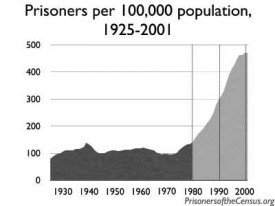
The theme for this week, in case you haven’t figured it out by glancing at the graphics, is crime, deviance and justice in these here United States. I thought it would be a nice exercise to see what is available from official sources (ie government agencies). In the US, we’ve got the CIA, the FBI, the Bureau of Justice Statistics, and then lots of state and local agencies. I stuck with the feds here but the rest of the week will look at cities and states as the level of analysis. So far, none of the federal agencies has produced a graphic that tells a comprehensive story about incarceration, crime, and/or justice in the US. I couldn’t even find much about the immense expenditures dedicated to incarceration (in a handful of states, more is spent on criminal justice, including incarceration, than on education). There also were very few graphics dedicated to the differential impact of incarceration practices on poor and minority communities.
CIA
The CIA doesn’t do much with graphics, but this is what they had to say about the US and drugs: “world’s largest consumer of cocaine (shipped from Colombia through Mexico and the Caribbean), Colombian heroin, and Mexican heroin and marijuana; major consumer of ecstasy and Mexican methamphetamine; minor consumer of high-quality Southeast Asian heroin; illicit producer of cannabis, marijuana, depressants, stimulants, hallucinogens, and methamphetamine; money-laundering center”
I would love to see this on a map, especially if the map were able to show how much of our illicit habit, by weight, is made in America and how many people and plants in other countries are dying to stock our habits.
FBI
The FBI doesn’t do much with graphics either, but they had this factoid box:

This is an easy but illogical way to summarize data points. This style of arbitrary ratio style summary misses opportunities to provide context and compelling visuals. X crimes per unit of time seems a strange way to measure; going by victims or convicted criminals by 100,000 people or by percentage of the total population might make more sense. Furthermore, a good information graphic should begin to tell the story at first glance, before you have to read anything. One quick test: if someone who doesn’t speak the language can’t make heads or tails of the graphic, it just isn’t that good. Granted, language is often necessary to pin down the details, but the overall theme should be clear without resorting to text. There’s no way to tell this is about crime in America. Again, I’m always skeptical of these ratio summaries. It’s really hard to understand much about crime by recounting how often it happens. Then smaller populations are going to look safer because crime happens less often even though it might be just as common in terms of the percent of the population who ends up becoming a victim or a perpetrator.
Bureau of Justice Statistics
The Bureau of Justice Statistics had by far the most info graphics though, as you can see, they are all the same style. As for “What Works”, well, it works that they tried to map trends in crime over time graphically. What needs work? Besides the rather uninventive presentation – I think these line graphs are easily understood but so standard in appearance that they risk putting people to sleep – my biggest concern is that there is no overview graphic that tells the whole story. All of these graphs tell one tiny little part of the story and are designed to be read in isolation from all the other graphics. In that sense, they help viewers understand crime and punishment in America about as much as that FBI Crime Clock factoid box does. Information graphics are at their most deceiving when they appear to be depicting simple, straightforward relationships in absence of all the messy real life context that frames just about any problem on the ground.
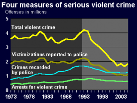
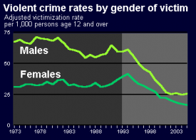
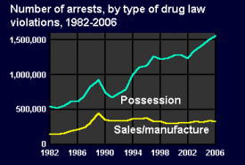
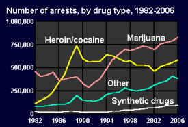
Just to take one example, the graph showing victims by gender is on the brink of revealing one of the most interesting elements of the bursting incarceration system. Violent crimes are way down but the prisons are bursting indicating that more and more of the people in prison are serving time for property crimes. That’s why I included the arrest rates for drug crimes – the huge majority are for possession, most likely possession of marijuana. It bothers me that I have to throw in little graph after little graph to tell a partial story. I couldn’t even find a little graphic that shows that black folks are far more likely to be arrested for possession than white folks even though white folks are slightly more likely to use (marijuana) than black folks. Community policing gone wrong? Perhaps.
If you know of a graphic that attempts to tell the story of the three-strikes/broken windows policy impacts on incarceration practices all in one image, please send it in and I’ll amend this post and thank you profusely.

Comments 1
chuk — February 19, 2009
My hyper ecology oriented partner and I were recently discussing how human made things tend to multiply at a linear rate, whereas, natural things tend to multiply at an exponential rate. The conversation was just for kicks, but I couldn't come up with an example of something humans create that increases exponentially. Bingo!-->The US imprisonment rate. Malthus would be proud.
(later I came up with the passing on of information)