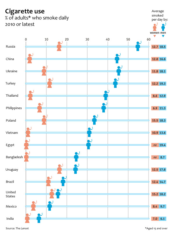
What works
The Economist put together an infographic using data from a study published last week in The Lancet collected by an impressively large team of researchers from three different institutions in three different countries (The World Health Organisation, America’s Centres for Disease Control and the Canadian Public Health Association). The article in the Lancet has much more detailed data about all sorts of smoking traits that did not make it into this chart, but the chart succeeds in portraying two gendered vectors of smoking behavior: the different rates of smoking between men and women and the difference in the number of cigarettes smoked between the two genders.
Globally speaking, it is safe to say that smoking is a masculine activity. There is no country in which more women than men are smokers. That particular take-away is made extremely clear in the chart. Just a glance is enough exposure to the data to absorb the idea that smoking is somehow masculine.
What needs work
The graphic designers at the Economist try to expand on the notion that smoking is “somehow masculine” by layering another set of findings onto the basic rates of smoking by men and women. Way off to the right they have what is essentially two columns of a table that report the average number of cigarettes smoked by men and women. My fuzzy and addled brain wants this little table to be more like a bar chart in which the length of the bars corresponds to the number of smokes. Countries where smoking rates are highest would have longer bars. Countries where smoking rates are low would have shorter bars. Visually, the impact would increase dramatically if the size of the bar corresponded to the amount of cigarettes smoked.
Importantly for the point about the gendered nature of smoking, we could see another way in which smoking is gendered by looking at how many cigarettes are smoked by each gender. Some countries have dramatic differences: in Russia and Turkey men smoke about 1.5 times as many cigarettes as women. This is a marked contrast to the other end of the spectrum where in India, women who smoke (and there are very few women who smoke in India), smoke 7 cigarettes per day while the smoking men only smoke 6.1 cigarettes per day. If that part of the graphic had been given more space, it would have been easier to quickly absorb that pattern. As it is, only a careful reading of that table yields insight; we might as well just look at the data in Excel.
The other change I would order up for this graphic is to make the blue horizontal bars that run the full length of the graphic a different color than the male icon. My best option would have been to make the horizontal bars grey and truncate them after the male icon. There’s no need for them to go all the way across and it makes the table slightly harder to read. I realize that changing the horizontal bars to grey would then give the whole table a gridlike look due to the presence of the vertical bars. I would just shorten the vertical bars to tick marks at the top and tick marks at the bottom (it is a tall chart so tick marks only at the top or only at the bottom would be invisible to people who have to scroll to see the whole graphic).
I like the coral color used for the female icons. I would have turned the men navy because coral and navy are complimentary colors and look especially good together.
I wasn’t able to add the bar graphs out to the side or to fully eliminate the baby blue, but I did make some of the changes I suggested on the jpg below for your viewing ease.
References
The Economist. (20 August 2012) Puffed Out: Daily cigarette smoking by men and women The Economist: Daily Charts. [graphic design]
Giovino, Gary, et al. (18 August 2012) Tobacco use in 3 billion individuals from 16 countries: an analysis of nationally representative cross-sectional household surveys. The Lancet, Volume 380, Issue 9842, Pages 668 – 679, doi:10.1016/S0140-6736(12)61085-X


Comments 6
a — August 21, 2012
Hm. Interesting changes. I would have removed the figures representing N/A as they're just confusing; that note could be added in with the other notes. Even bigger, I would have changed the gendered figures into cigarettes with the data printed on them, replacing the now-superfluous labels down the right side. That remedies the reinforcing of "woman=skirt, man=pant" (which is not true of many countries listed) and simplifies the graphic altogether.
Umlud — August 21, 2012
An interesting choice in cherry picking their data. Chile stands out as an example of an exception to the apparent trend in which the smoking rate of women tends to be far lower than half the rate of men.
According to tradingeconomics.com, in 2006, Chilean smoking rates were:
Men: 42%
Women: 31%
While the rates for women were still lower than men, it's strange that these data weren't included in the Economist article, especially since the 31% smoking rate would put Chilean women at a higher smoking rate than Polish men.
Expert commenters on abortion, women’s issues are…mostly men » Graphic Sociology — August 30, 2012
[...] women-are-red division which is fairly stereotypical. I am glad that women are not pink (see this post for an example of what happens when light blue and pink are used to represent gender). While I feel [...]