Update: Award winners
Update: Both Ivo Afonso’s print graphic and Christian Gross’s interactive graphic won awards in the visualizing.org Olympic graphics contest. Ivo won the audience choice award and Christian won the award for interactive graphics.
Kudos to both!
Seeing the Olympics…
Olympics are visual. That is just the way it is. Most of the visualizing is happening on screens, either your TV or your computer if you happen to have access to nbc’s streaming content. But there are also graphics and animations about the Olympics out there so I thought I would share some of the ones I’ve run across over the past couple of weeks.
…in print
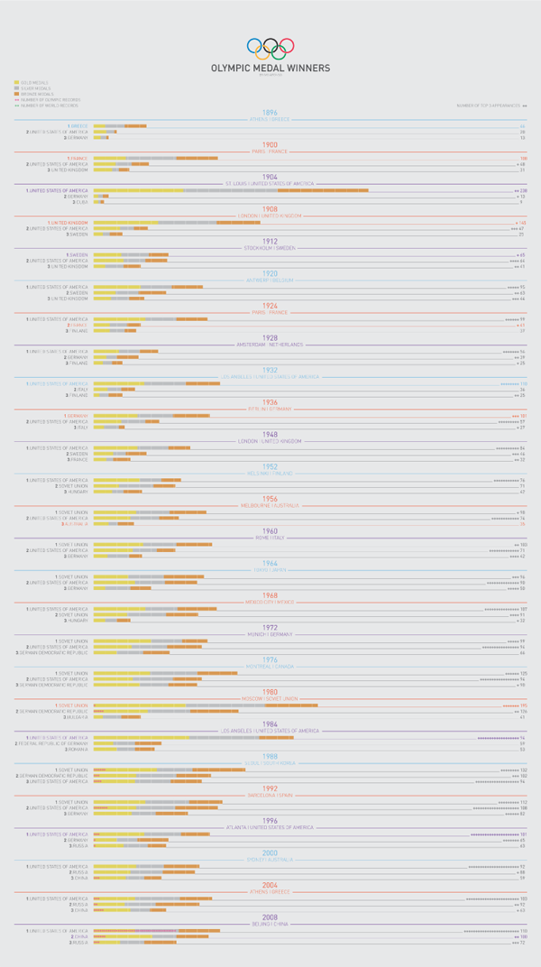
The graphic above by Ivo Afonso of Portugal is a print graphic that’s part of the visualizing.org graphic design contest sponsored by GE and voted on by viewers like you. (In order to vote, you’ll have to set up a free account.)
What I like about the graphic above is that it follows Edward Tufte’s recommendation that each drop of ink better be communicating salient data. In one (Portuguese sized) piece of paper, Afonso has summarized not only the top three country totals in each Olympics but also the number of triple podium instances and world records broken. Good job getting it all in there.
I am still a little confused about why some host countries have particular colors in their names though I do like that when host countries are in the top three, they use the same colors in their fonts as hosts and as medalists. It would appear that there is a correlation between hosting the Olympics and winning a lot of medals. Before jumping to the “home court advantage” assumption, please consider that perhaps only countries that dedicate lots of time and resources to developing world class athletes want to be bothered to host the games in the first place. But back to the graphic. Besides that linkage, though, I don’t see why host countries have the colors in their fonts that they do. I want there to be a pattern because there is so much going on in this single sheet that any choice should service the delivery of understanding about the data.
I also find the whole thing a little hard to read – I probably would have amped up the contrast between the background and the darkness of the fonts, especially with such small font sizes.


…in interactive graphics
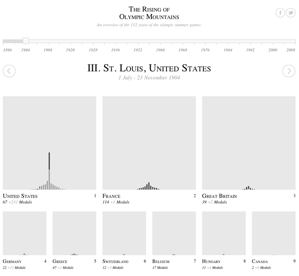
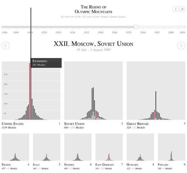
The Rising Olympic Mountains by Christian Gross that’s also part of the visualizing.org contest. It is an interactive graphic so, you know, click through and interact before reading the rest of this. Again, this is a favorite of mine so trust me and take the 30-60 seconds to go over and poke around a bit.
Things I like:
I like that the name is a play on Mount Olympus. Punny.
I enjoy the simplicity of watching the mountains pile up over time.
I love that when I hover over the winners in a particular country in a specific category like, say, gymnastics, all of the other gymnastics winners in other countries light up to make it easy for me to compare one country to the next. Without this feature, each country would only be comparable to the others with respect to the total size of the mountains which represents cumulative medals.
I like the animation that happens when countries switch rankings positions. Very exciting for a largely black and white animation.
What I don’t like as much is that these graphics automatically privilege sports in which there are more events. Of course there are going to be taller peaks for “athletics” than for, say, tennis. All of the race-oriented sports that have multiple events within the same sporting category will rack up more total medals than will sports with only a small number of events. Tennis, for instance, had only mens’ and womens’ singles and doubles for 4 total events. Mixed doubles came back this year, but that’s still only five total events compared to say, “athletics” which probably has upwards of 25 total events lumped into it. It would be nice if the graphic could at least give us a hint that the Olympics has far more events in some sporting categories than others.

…as animations
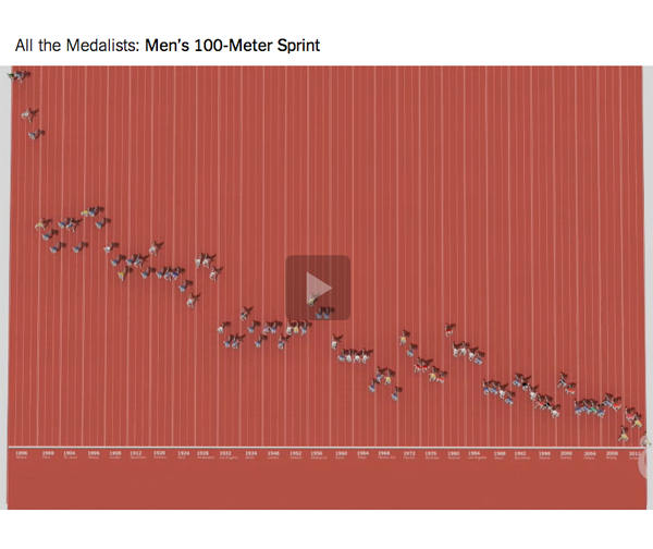
Click through and watch the animation. It’s worth it. They relate history to the present so effortlessly (well, it’s effortless for the viewer, I’m sure it was challenging for the designers) that these animations have now become part of my ‘best practices’ portfolio in the animations category. I was especially impressed at the way they incorporated information about young racers who are 8 or 10 years old compared to the historic record in the sport. It’s also not that easy to incorporate the basic elements of Olympic data that people tend to care about – from the cult of personality that surrounds champions to the national origins of the racers – in a way that feels like all part of a whole rather than disjointed bits and pieces.
Want more like this? Keven Quealy and Graham Roberts created similar graphics for all the medalists in the men’s long jump and the men’s 100-meter freestyle. Apparently, Quealy and Roberts are not all that interested in women’s races.
References
Afonso, Ivo. (2012) Olympic Medal Winners [Infographic] Uploaded to visualizing.org.
Gross, Christian. (2012) Rising Olympic Mountains [Infographic] Uploaded to visualizing.org.
Quealy, Kevin and Roberts, Graham. (2012) One Race, Every Medalist Ever [animation] New York, New York Times.
