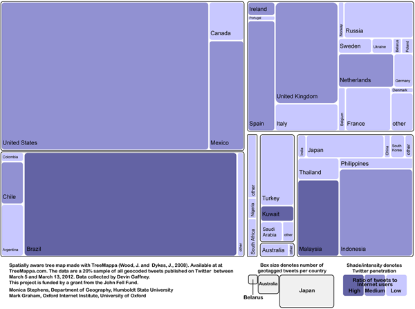
What works
1. Boxes-in-a-box diagrams aka treemaps achieve an efficient use of space without sacrificing granularity of information.
2. Intelligent grouping – all of the countries from each continent are grouped together in boxes that fit neatly into the perimeter of the overall boundary.
3. The color in the boxes does not obscure the labels. Also, the font size is well chosen.
4. The treemappa algorithm rigorously adheres to scale which is critical for visual analysis. Scale communicates across language barriers and that’s one of the reasons visual communication has advantages over text-only communication.
5. Treemappa is free to use.
What needs work
1a. The legend is efficiently small to benefit the efficiency goals of the design, but it doesn’t explain what numerical value underlies the High, Medium, and Low internet users-to-tweets ratio. The blog post accompanying the graphic does not describe this ratio either though I would imagine it is discussed in the as-yet-unpublished manuscript “Where in the world are you? Geolocation and language identification in Twitter” listed (but not linked) in the references. We’ll have to wait for formal publication.
1b. We also can’t tell what the scale is with respect to the activity comparisons between countries. Scale is extremely important for interpretation [see number 4 above]. It’s critical to include numbers in the legend so that viewers can calculate ratios. [For instance, I would like to know if they’re using a log or a linear scale but without a numerical legend I can’t tell…]
2. The biggest problem with this graphic is a problem I have been contemplating about many different information graphics: information graphics are consumed as hermetically sealed information objects that offer a kind of apolitical truthiness. Within the social science tradition – and within most scientific traditions – it’s incredibly important to make the messiness of research transparent. In this particular case, the blog author does an excellent job of representing the dubious validity of this research in the blog post that accompanies this image when he writes:
As a first step, we decided to collect all georeferenced tweets sent between March 5 and March 13, 2012. It is important to point out that georeferenced tweets comprise fewer than 1% of all tweets and it is possible that significant geographic biases exist in where and how people georeference their content.
So should we trust that the numbers above are representative of the actual geolocation of tweets? Well, we should only assume that this is a good representation if we believe that there is no systematic geographical correlation between users who include geolocation data with their tweets and those who do not. I am not a twitter expert, but it’s hard for me to swallow the idea that users of twitter have the same attitudes about privacy and competence with privacy settings the world over.
The tyranny of beauty
The bigger question for information graphics, though, is how can we ensure that the graphics themselves reveal their own messiness, incompleteness, and methodological underpinnings? If information graphics are to become legitimate components of (social) scientific practice, they need to find ways to include the kinds of doubts, disclaimers, and methodological difficulties that appear in the discussion section of academic papers.
I struggle with this immensely in the graphics I make. I’ve found that the designerly desire that graphics be beautiful in order that they communicate instantaneously through first impressions lead to a tyranny of aesthetics in which graphics that are deemed “good” are those that specifically avoid messiness and present a sanitized, sealed, image-as-object that deliberately obscures many of the problems that remain open questions. The graphic presents itself as an answer. In text, it is possible to differentiate between the elements of questions that are leaning towards answers. In photographs, interpretations can be meaningfully multiple. But in information graphics, the image is often so tightly bounded that it leaves no invitation to skepticism.
Boxes-in-a-box diagrams like the tree map above is a particularly clear illustration of the larger tension in which information graphics are asked to present clear and complex information at the same time that academic requirements ask that they make their messiness and unknowns obvious. The graphics were created in order to present information efficiently at first glance and then reveal granular detail upon further inspection. This is a worthy set of goals and the boxes-in-a-box tree map diagrams deliver on both of those goals. I would argue that those goals satisfy only one side of the problem – to communicate what is known in a clear, compelling fashion – leaving aside the notion that much remains unknown, that many other relationships have been left out, and that even the things we think we know rely on sound methodology which may or may not be possible. Social science research has always been blessed/plagued with the challenges of drawing meaning from incomplete, intersecting, and incommensurable information.
This is an issue I’ll continue to explore and I encourage both designers and social scientists to share thoughts about the benefits and drawbacks of ‘beautiful’ information.
References
Graham, Mark; Stephens, Monica; and Gaffney, Devin. (2012) “A Geography of Twitter” [blog post] Visualizing Data blog. Oxford, UK: University of Oxford, Oxford Internet Institute.
TreeMappa [free online graphic creation tool]

Comments 2
Letta Page — July 10, 2012
Excellent analysis! The thing that catches my eye about the graphic is the simplicity, but then I look down and get overwhelmed by what looks, at first glance, like a really complex key. I know the information needs to be there, but I'd be interested in how to make both graphics and keys beautiful and inviting, as well as informative.
What is the geography of Twitter? | Oxford Internet Institute » Graphic Sociology | Data Visualization & Infographics | Scoop.it — July 12, 2012
[...] Geography of twitter in a tree map. Graphic created using TreeMappa. Data gathered by Devin Gaffney; analysis by Monica Stephens and Mark Graham. [...]