Is Minnesota like Saudi Arabia?
Minnesota is the land of 10.000 lakes and thus holds far more than its representative share of precious fresh water. Is this synonymous with the naturally granted wealth of oil in countries like Saudi Arabia? Maybe. But does that mean Minnesota is going to become a state with a similar level of political economic power? No…not so much. It is silly to compare nation states like Saudi Arabia to states in a federation like Minnesota; it is silly to think that a state with an existing economy relatively unreliant on water is going to suddenly transform itself into an economy with a single primary commodity; it is silly to think that a democratic governance system will respond like a dictatorship did to a valuable commodity. As an aside, Tim Mitchell’s latest book, Carbon Democracy makes a historically grounded argument about the relationship between the material qualities of oil and coal and the technics of the political economy that developed in concert with carbon-based wealth.
How are information graphics like propaganda?
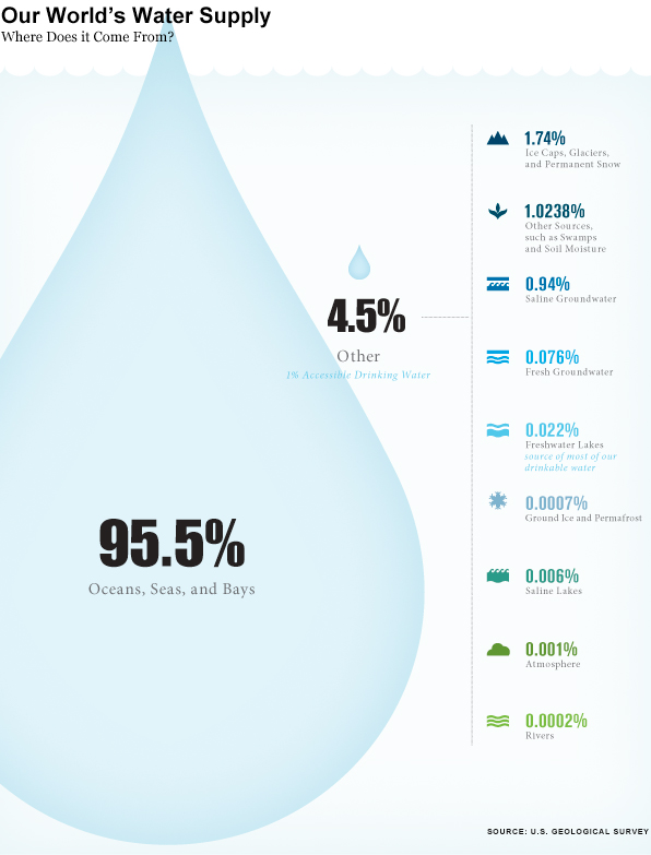
This infographic is more than half graphic (and less than half ‘info’). Normally, that’s not the best balance for displaying social science data. Usually, social science data is multi-faceted, requires a contextual framework for adequate understanding, and the sheer amount of information necessary to tell the story makes it harder to include graphic elements that do not represent information. However, this is not social science data. Technically, it is geological data, but I think it would be more accurate to describe it as data that is being mobilized for political reasons. Hence, the title of this post makes a blatant comparison between water (blue gold) and oil (black gold) to emphasize the implicit political valence of the message in this graphic.
In short, information graphics are being mobilized for what are essentially purposes quite similar to propaganda. This particular graphic is not the best example. It is the example I happened to see yesterday, and it does a good job of demonstrating what is at stake in the current infoscape with respect to information graphics. These graphics are generally considered to be intellectual and political lightweights compared to communication that is based on the production of critical texts. Overlooking the work that these graphics do is both dangerous and foolish. For one, many critical voices from within the academy *have* critical messages they have trouble communicating with broader audiences because many audiences are unlikely to read academic writing, even if that writing is posted to blogs. If these academics can create their own graphics, they add another tool for communicating clearly just what their perspective is. Yet pretending that information graphics are either merely ‘pretty’ or that they are straightforward representations of empirical data avoids engaging with the way that political messaging is built into graphic design.
One reason this blog exists is to help people start to sharpen their critical visual analysis tools. As educators, we spend a lot of time in the classroom teaching students how to write and how to stop believing everything they read by becoming aware of rhetorical moves, selective mobilization of facts, and reliance on carefully chosen narratives that initiate particular kinds of human perceptual biases and emotional responses. Art historians teach the same kinds of critical skills for interrogating paintings and photographs. Media studies folks teach the same kinds of skills for interrogating popular culture products like television shows, films, and magazines. Social scientists would serve the discipline well if they begin to teach students how to critically consume information presented in infographics.
References
Thinking Big Series. (2012) The World’s Water Supply. The Atlantic. This series is sponsored by Fidelity Investments, LLC.
Mitchell, Tim. (2009) Carbon Democracy: Political power in the age of oil. Verso.

Comments 1
Umlud — March 27, 2012
If:
Minnesota:Water :: Saudia Arabia:Oil,
then:
Michigan:Water :: [??]:Oil
Minnesota has 11,841 inland lakes of 10 acres or more (I'm including Lake of the Woods as an "inland lake", even though it isn't fully contained within Minnesota), as well as a small portion of Lake Superior.... which is - in total - nothing to sneeze at.
However, although Michigan's 6,532 inland lakes (>10 acres) is roughly half Minnesota's number, it does have roughly half of Lake Superior, roughly half of Lake Michigan, roughly one-third of Lake Huron, roughly half of Lake St. Claire, and roughly one tenth of Lake Erie.... which puts Michigan's water quantity head, shoulders, torso, and most of a pair of legs above Minnesota's number.
Not to say that the rest of your article is problematic, merely that your headline analogy doesn't "hold as much water" as it could.