What needs work
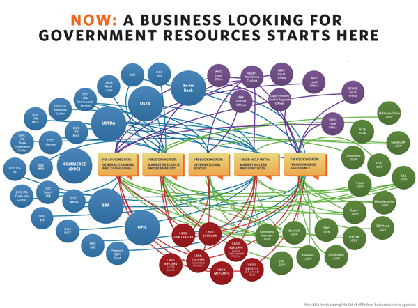
The complete view of the bureaucracy in the federal government is totally confusing, even when it is color coded and arranged so as to be easily viewed from 30,000 feet (see above).

What works
The US Federal Government has copied a kind of 311-style approach to helping businesses navigate the portions of the federal bureaucracy relevant to them. One department, one number, one website.
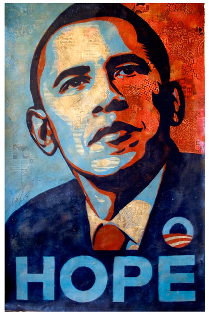
What interests me the most is the choice of those in the White House to promote this program through information graphics. This reflects the visual skills of Obama’s administration which have been evident since the middle of his campaign where not only those like Shepard Fairey but also his official campaign team launched an extremely successful visual campaign.


The White House choice to use graphics in order to explain and promote their simplification of a portion of the federal government is also evidence of a growing shift towards the use of infographic stylings in the service of persuasion. Infographics gain a great deal of traction from the notion that humans tend to believe what they see. They gain even more traction when they mobilize numerical data that many people feel uncomfortable processing on their own. This graphic manipulates that sense of visual numeracy by taking a network (nest?) of dizzying resources and simplifying it into three nodes, each of which will bring businesses to the same pool of resources. ‘From many, one’ is an extremely powerful message, made all the more powerful by the strength of this visualization – it is clean, the nest part is detailed, and the resolution in the ‘one’ is not represented as a single node (which wouldn’t work as well because it would appear hyperbolic and would efface the modern entry modes into the federal government – the phone and the internet).
