What works
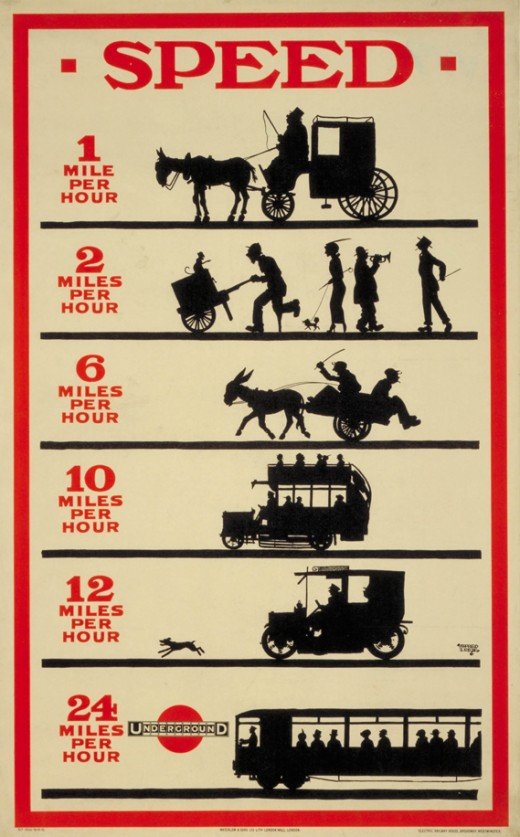
The London Underground has a lengthy history of using infographic thinking in their advertisements (see these ads and more on retronaut.co). What works here is that some of these ads, especially the first one, could still be used with positive impact today if the silhouettes were updated to include the transit types actually on the street out there. If I saw an infographic that compared the speed of walking (with and without a stroller), taking the subway, taking a cab, and biking to incite me to take the subway or bike, I would find that compelling. I’d imagine many New Yorkers would agree with me. Probably so would Londoners. It is remarkable how long lasting this ad is.
What needs work
The ad needs to have a better implementation of the scale associations in the miles per hour that would help communicate the idea that the underground is faster than all the other modes of mobility. If someone were to make this infographic today, they would probably make the slower forms of mobility look shorter (almost like applying a bar graph where the slower mobility forms haven’t made it as far across the page). They probably would also scale the size of the number representing kilometers per hour. Maybe they would become more and more italicized, leaning farther and farther to the right to indicate speed. Maybe they just would have gotten bigger as they approached the fastest speed.
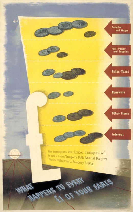
Moving on in time, I think the next ads for the London Underground are actually not as strong as this first one, at least until we get to 1969. We see below a graphic that is supposed to help Londoners understand what their Underground fares are actually funding, but there is no scale comparison available from one ‘bar’ in the bar graph to the next. What’s more, the numbers associated with the bars are represented by the coinage. The viewer has to do the math by himself or herself. Personally, I find that to be a kind of naive approach to representing the fare distribution, one that has the viewer doing mental work to add up coinage, which is kind of incidental to the question, rather than comparing one category of expenditures to the others, which is the heart of the question that was posed.
The Individual Group, Pop Art, and London Underground ad improvements
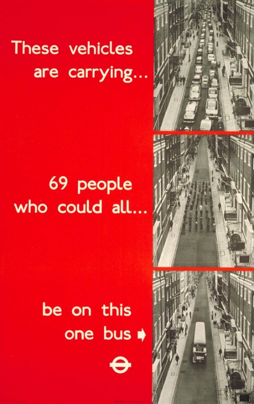
This ad is much better, more compelling, it still carries the idea of infographic representation from the fare split into coinage by representing people not as dots but by keeping them as actual people (or passenger cars). The photo of a street full of cars that stretch so far we can’t see the end of it steps to a photo of just the human bodies carried by those cars and finally all those humans on a single bus. This particular instantiation of that idea is much stronger. In my opinion, I imagine the advertisers here having been influenced by the artistic work of the UK’s Individual Group who were the British version of American Pop Artists.
Artistic comparison
Just for fun, compare the ad above with some work by American Feminist Artist Barbara Kruger (for you non-art history people, feminist art followed pop art and used a lot of performance work but also maintained some of the pop art movement’s interest in the tropes of advertising, collage techniques, and the use of text in art. See also later conceptual artist Jenny Holzer.)



References
Retronaut.co (4 January 2012) London Transport Infographics, 1912-1969 [blog post].
Kruger, Barbara. (1981) Untitled. [collage] Accessed online at http://www.eng.fju.edu.tw/Literary_Criticism/feminism/kruger/kruger.htm
Kruger, Barbara. (1981) Untitled. [collage] Accessed online at http://www.eng.fju.edu.tw/Literary_Criticism/feminism/kruger/kruger.htm
Kruger, Barbara. (1982) “Your gaze hits the side of my face” [collage] Accessed online at New York University’s Fales Collection at Bobst Library http://www.nyu.edu/library/bobst/research/fales/exhibits/downtown/soho/sohoart/documents/kruger.html.

Comments 1
London Underground – Historical Ads » Graphic Sociology | Underground tunnels | Scoop.it — January 9, 2012
[...] jQuery("#errors*").hide(); window.location= data.themeInternalUrl; } }); } thesocietypages.org - Today, 10:27 [...]