What works
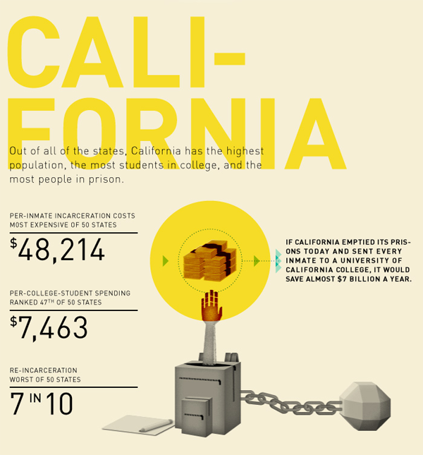
The only part of this graphic I kind of liked was the part about California. Here, we are able to compare the average cost of education for a year with the average cost of prison for a year. This is better than comparing the cost of a single school to the average cost of prison, especially when that school is as expensive as Princeton. I still have a problem with this comparison because the cost of school is running over about 8 months whereas the cost of prison is running the full 12 months, or at least that seems to be true from what I can gather. My back-of-the-envelope math suggests prison would be about $32,143 for 8 months. This is still much higher than the average of $7,463 per student spending for 8 months of school. Parent and student contributions to schooling are not factored in, though the point of the graphic is to compare what the state spends on students to what it spends on prisoners, ignoring the total amount spent on students.
What needs work
The information included in this graphic could have been presented in about one fifth of the space. I support the addition of graphical elements to information presentation only when they increase the clarity of the information provided or make the information delivery inarguably more elegant.
What I vastly dislike are the long columns of graphics stacked on top of each other, meant to be viewed as some kind of visual essay. That was where I drew the California graphic from. I pasted it below.
I’m curious. Do other people like these long, internet-only graphic essays? I find them extremely hard to digest. They seem to be plagued by apples-to-oranges faux comparisons, and unbashedly so. A year’s tuition at Princeton doesn’t include room and board. Prison does. Even if that were taken into account, the time frame is off.
One more item to highlight
Note that in the last panel they clue us into an uncomfortable reality: recent college graduates have a higher unemployment rate (12%) than the general population (9%). Ouch.

References
Public Administration. (October 2011) “Prison vs. Princeton” [information graphic]
Resnick, Brian. (1 November 2011) Chart: One year of prison costs more than Princeton The Atlantic online.

Comments 2
Rose Ross — November 3, 2011
Lets educate not discriminate. California state prisons are way out of control! The United States could get out of debt just by releasing inmates out of prisons with non-violent crimes. The three strikes law of California contributes to half of the problems with over crowning the prisons. If the California legal system would release those prisoners with crimes that carry lessor sentences, instead of striking them out over a dime of crack cocaine, or stealing a piece of pizza pursay....and concentrate on rapist, murderers, and serial killers like that law was intended to be in the first place the United States would be in a much better place. If the system would start programs for training those inmates and making it possible for them to get an education there would be less crimes committed. But the prison systems are set up for failure because it is a business and thats how they make money, off of the inmates. It's sad but you can see its all about the money! It costs a lot to house the inmates but the prisons make more money and is not concerned about the world we live in. We as people need to stand up and change some things. We need to start voting in laws that will stop this foolishness. Harsh abused sentences, is what it is about.
Elizabeth Goodman — November 19, 2011
These visual essays might work well as a series of large posters, but drive me a little crazy on a laptop screen. By the time I'm done scrolling to the bottom, I've forgotten what's on the top. This example is particularly good at illustrating another problem: they're often very beautiful, but the overlay of illustration and numbers ends up obscuring a clear visual narrative. This one is particularly illustration-heavy, and the typography seems aimed at print resolution, not screen.