Archive: Oct 2011

American Agricultural Value map | Bill Rankin, Radical Cartography
American Cropland map | Bill Rankin, Radical Cartography
American livestock map | Bill Rankin, Radical Cartography

What works

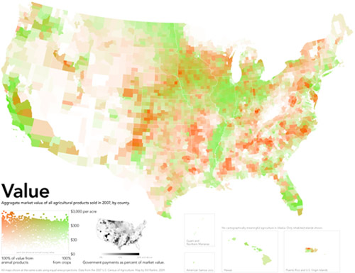
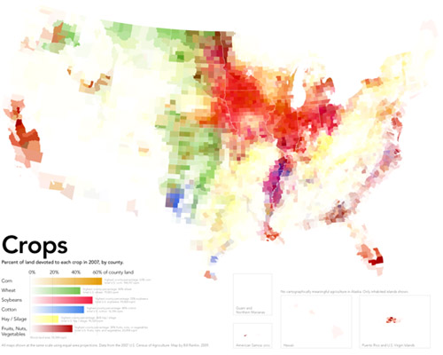
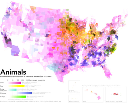
Produced by Bill Rankin, Assistant Professor of History of Science at Yale University and editor/graphic designer at Radical Cartography, these three maps work together to show how American agriculture is organized both spatially and economically. [Click through to Radical Cartography to see much bigger versions. Since that site is in Flash, I can’t embed links that take you directly to the big versions. Once you get to Radical Cartography click: Projects -> The United States -> Animal/Vegetable.] The top map here is the dollar value combination of the cropland and livestock areas in the US. For activist types, what’s even more exciting is the small black and white inset map that takes into account federal agriculture subsidies. The next two maps were combined to produce the top map – one shows how cropland is distributed, the other displays the distribution of livestock.

Bill Rankin is a rigorous researcher with a background in history and the thing he does best here is context. In order to understand the top map – which is what I believe Prof. Rankin wants viewers to store in their memory banks as the critical take-away – he first shows us how cropland and livestock land are distributed and then layers them over one another to show us how they are differentially valued. This type of data is sensitive to geography and location in two ways: 1. crops are sensitive to elements of geography like climate and available water supplies – there are no crops growing in the dessert of the American southwest 2. because the US hands out a variety of agricultural subsidies, the political boundaries of states have to be seen in conjunction with the crop distribution in order to understand how the political levers lead to the current subsidy scenario.

What needs work

The approach he takes is to color each county based on the percentage of area covered by a particular crop. This means that counties with multiple crops will end up with blended color values. For instance, cotton is coded blue and ‘fruits, nuts, and vegetables’ are coded maroon. This means that in some southern counties growing roughly equal amounts of cotton and ‘fruits, nuts, and vegetables’ the counties are neither blue nor maroon but purple. But wait. The blue of cotton might have combined not with the maroon of ‘fruits, nuts, and vegetables’ but with the brighter red of soybeans to produce that purple color. Confused? I am. I don’t know if those southern counties are a mix of peanut and cotton farms (likely) or a mix of soybean and cotton farms (also likely).

Another problem with the additive colors is that the choice of each color has a major impact on the impressionistic take-away of the maps overall. Corn is the most prevalent crop in the US covering over 144,000 square miles. The next most prevalent crop is soybeans which covers about 100,000 square miles. Soy beans and corn are often grown in the same counties (unlike, say, wheat which is a hardier crop and therefore ends up as a monoculture in northern counties where growing corn and soy are riskier endeavors). This means that soy and corn are going to have layering colors the same way that we saw crops layering with cotton along the Mississippi River in the south. Since the bright red color for soy is more aggressive than the somewhat subdued dusty orange chosen for corn, the impression we take away from the map is that soy is more prevalent than corn where the opposite is true. If the color values had been switched so that corn was coded in bright red and soy was coded in the dusty orange, the middle section of the country would end up looking like a corn field, not a soy bean field. Either way, the trouble with blending colors is that our eyes are not very good at looking at a color and saying – “Gee, that looks like it’s about 50% blue and 50% red.” We just say, “Gee, that looks like purple”. Or, in this case, “Gee, all those reddish colors either look like soy beans or maybe an 80% coverage of the ‘fruit, nut, vegetable’ category.”

A solution (that I am too lazy to put together)

In summary, the inclination to display crop and livestock coverage using maps was a solid inclination. I often criticize the inappropriate use of maps. In this case, I still think it could have gone either way. A clever Venn-diagram that used circles based on the total coverage of each crop which then overlapped with other crops in places where they are grown together could have been more illustrative. It would have been easier to see that corn is king, for instance, and that cotton and wheat are never grown together because cotton needs heat and wheat is cold-tolerant. The same sort of Venn-diagram could have been constructed for livestock. A final Venn diagram where the size of the circles is keyed to the dollar-per-square mile value of these crops could have then displayed how agriculture functions economically.

References

Rankin, Bill. (2009) Food: Animal/Vegetable” [Information Graphic, Flash] RadicalCartography.net.

American Generation Age Timeline (Age measured in 2009) | Pew Research

What works

Pew Research has created a tidy series of interactive graphics to describe the demographic characteristics of American generational cohorts from the the Silent Generation (born 1928 – 1945) through the Boomers (born 1946 – 1964), Generation X (1965 – 1980) [this is a disputed age range – a more recent report from Pew suggests that Gen Xers were born from 1965-1976), and the Millennial Generation (born 1981+ [now defined as being born between 1977 and 1992]). The interactive graphics frame the data well. They offer the timeline above as contextual background and a graphic way to offer an impressionistic framework for understanding generational change.

Then users can flip back and forth between comparing each generation to another along a range of variables – labor force participation, education, household income, marital status – while they were in the 18-29 year old age group OR by looking at where each generation is now. The ability to interact makes the presentation extremely illustrative and pedagogically meaningful. It is much easier to understand patterns that are changing over time versus patterns that are life course specific.

Marital status

Marital status by generation measured when young | Pew Research
Marital status by generation measured in 2009 (snapshot) | Pew Research

For instance, marital trends have been hard to talk about because the age at first marriage moves up over time, so it’s hard to figure out at what age we can expect that people will have gotten married if they are ever going to do so (I tried looking at marriage here).

What I like about the Pew Research graphics is that they show us not only what the generations looked like when they were between 18 and 29 years old (above) but also what they look like now (below). Not only does it become obvious how many millennials are choosing to remain unmarried (either until they are quite a bit older or forever – hard to say because the oldest millennials are still in their 30s), but it also becomes clear that in addition to divorce, widowhood is a major contributor to the end of marriage. Keep that in mind: somewhere around half of all marriages end in divorce so that means the other half ends in death. I would guess that a vanishingly small number of couples die simultaneously which means there are quite a few single older folks who did not choose to be single (of course, even if they didn’t choose to outlive their spouses, they may prefer widowhood to other alternatives, especially if their spouse had a long illness).

Labor force participation

Here’s another set of “when they were young” vs. “where they are now” comparisons, this time on labor force participation. It appears that the recession has walloped the youngest, least experienced workers the hardest. They have the highest unemployment rate AND the highest rate of educational attainment (and school loan debt), which leaves them much worse off as they start out than their parents were in the Boomer Generation. Even if their parents were in Generation X, they were still better off than today’s 20-something Millennials.

American labor force participation by generation (2009) | Pew Research
American Labor Force Participation by Generation (measured in 2009) | Pew Research

What needs work – Are generations meaningful?

My first minor complaint is that the graphic does not make clear *exactly* what “when they were young” means. If we look at the first graphic in the series, the timeline, it appears that “when they were young” was measured when each generation was between 18 and 29 years old. I hope that is the case. I might have had an asterisk somewhere explaining that “when they were young = when they were 18-29 years old”.

The concept of generations, in my opinion, is a head-scratcher. The idea that I had to come update this blog because the definition Pew was using to define Millennials and GenXers changed (without explanation that I could find) adds to my initial skepticism about the analytical purchase of generational categories. What is the analytical purchase of looking at generations – strictly birth-year delimited groups that supposedly share a greater internal coherence than other affinal or ascribed statuses we might imagine? If we believe that social, technological, and most all kinds of change happen over time, of course there are going to be measurable differences between one generation and the next. I imagine, though I have never seen the comparison, that if social scientists split people into 10- or 20-year pools based on their birth years they would end up with the same sorts of results. So why not think of generations as even units? And is it clear that the meaningful changes are happening in 20-year cycles? Or would 10-year age cohorts also work?

The real trickiness comes in when we think about individuals. Say someone is like myself, born in a year on the border between one generation and the next. Am I going to be just as much like a person born firmly in the middle of my cohort as a person on the far end of it? Or will people like me have about as much in common with the people about 8 years above and below us, but less in common with the people 15 years older than us who are considered to be in the same generation, and thus to have many similar tendencies/life chances/characteristics?

A better way to measure the cohort effect would seem to be to consider each individual’s age distance from each other individual in the sample – the closer we are in age, the more similar we could be expected to be with respect to things like labor force participation and educational attainment. Large structural realities like recessions are going to hit us all when we have roughly similar amounts of work force experience, impacting us similarly (though someone 10 years older and still officially in the same generation will probably fare much better). Since it is computationally possible to run models that can take the actual age distances of individuals in the same into account, I don’t understand the analytical purchase of the concept of generations.

The take-away: great graphics, bad premise.

References

Taylor, Paul and Keeter, Scott, eds. (24 February 2011) The Millenials. Confident. Connected. Open to Change. [Full Report] [See also: Executive Summary and Interactive Infographic] Washington, DC: Pew Research Center.