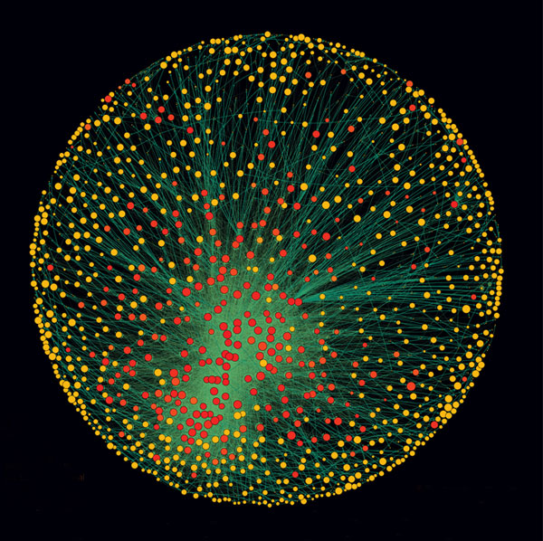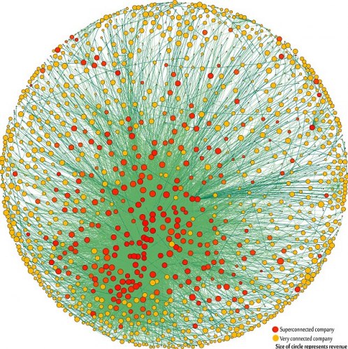
Note: The 1318 transnational corporations that form the core of the economy. Superconnected companies are red, very connected companies are yellow. The size of the dot represents revenue (Image: PLoS One).
The top 50 of the 147 superconnected companies
1. Barclays plc
2. Capital Group Companies Inc
3. FMR Corporation
4. AXA
5. State Street Corporation
6. JP Morgan Chase & Co
7. Legal & General Group plc
8. Vanguard Group Inc
9. UBS AG
10. Merrill Lynch & Co Inc
11. Wellington Management Co LLP
12. Deutsche Bank AG
13. Franklin Resources Inc
14. Credit Suisse Group
15. Walton Enterprises LLC
16. Bank of New York Mellon Corp
17. Natixis
18. Goldman Sachs Group Inc
19. T Rowe Price Group Inc
20. Legg Mason Inc
21. Morgan Stanley
22. Mitsubishi UFJ Financial Group Inc
23. Northern Trust Corporation
24. Société Générale
25. Bank of America Corporation
26. Lloyds TSB Group plc
27. Invesco plc
28. Allianz SE 29. TIAA
30. Old Mutual Public Limited Company
31. Aviva plc
32. Schroders plc
33. Dodge & Cox
34. Lehman Brothers Holdings Inc*
35. Sun Life Financial Inc
36. Standard Life plc
37. CNCE
38. Nomura Holdings Inc
39. The Depository Trust Company
40. Massachusetts Mutual Life Insurance
41. ING Groep NV
42. Brandes Investment Partners LP
43. Unicredito Italiano SPA
44. Deposit Insurance Corporation of Japan
45. Vereniging Aegon
46. BNP Paribas
47. Affiliated Managers Group Inc
48. Resona Holdings Inc
49. Capital Group International Inc
50. China Petrochemical Group Company
* Lehman still existed in the 2007 dataset used
What works
This graphic has been running all over the internet so I will point you to the New Scientist to get the back story. I will focus on the graphic itself.
Network graphics are difficult to produce. They are inherently challenging to graph because network space is Euclidean, not Cartesian. What I mean by that is that the distance between any two nodes in a network cannot be measured in miles or any other linear sort of distance. The distance between two nodes in a network is measured by how many other nodes you would have to go through in order to get from one node to the next. If the two nodes are connected they have a distance of one. If we would have to take a path that hits four other nodes before we can connect our node A to our desired node B, we have a distance of four. That distance does not relate to actual space. The distance between two people in a dorm social network is not the distance between their rooms, it depends on how many friends and friends of friends you would have to talk to if you wanted to get from one person in a dorm to some other randomly chosen person in a dorm.
Representing these paths that are not related to physical distance is hard. Network diagrams are often quite difficult to produce – how do you plot the 1318 nodes in this network of capitalists? Usually people do not create network diagrams by hand, they write code (or use someone else’s code) to make these visualizations. In this case the authors, Stefania Vitali, James Glattfelder, and Stefano Battiston, used the Cuttlefish program developed in their research group and the services of someone acknowledged as D. Garcia.
This graphic is done relatively well. It is easy to see that there is some kind of red cluster though the red cluster is not located in the middle. I think it is better off to the side – if it were in the middle it would be harder to identify it as a cluster because it would just look like the red nodes in the middle. The point of this diagram is to communicate that clustering within these 1318 powerful, globally dominant companies is inherently dangerous because the impact of a copy-cat phenomenon is greater when all the most powerful companies are well-positioned to copy one another. It’s hard for them to get new information when all of their information is coming from within the same highly clustered group of companies.
What would a more stable arrangement look like? In theory, it would look like a network with, oh, say about 4-6 clusters spread around the larger network of these 1318 companies. Rather than one big cluster of the most powerful, there would have been smaller clusters composed of both really big, powerful companies and smaller, less powerful companies. Companies that are not yet at the peak of their power (or trying to get to a new peak of capital under management) are going to look for different kinds of information and thus have different information to share and different management/development strategies in place than the larger, more well-capitalized companies. These two groups might do well to share their information with one another, even if – and maybe especially because – they will not act on it in the same way. The entire capitalist system would be more stable if there were more strategies being tested and rejected simultaneously.
I’m not sure the graphic actually communicates that point on its own, but it certainly makes the case in the text stronger by visually displaying the concentration of capital. It also makes this research more accessible to a broader audience who would not be able to understand the meaning of a clustering coefficient.
What needs work
I like the white background version better than the black background version because it is much easier to see the edges.

Seeing the edges is nice – without being able to see all the little edges scattered around it is possible to think that all edges lead to that central cluster and that there are hardly any connections between nodes that are not in the center.
References
Vitalia, Stefania; Glattfelder, James; and Battiston, Stefano. (2011) “The network of global corporate control” working paper from Systems Design, Zurich ETH.
Coghlan, Andy and MacKenzie, Debora. (24 October 2011) Revealed – the capitalist network that runs the world The New Scientist.
