Philosophy is concerned with questions of perception. Does what I have learned to call ‘red’ elicit the same sensory experience for you? Or are we seeing two different things that become equivocal only through language?
I cannot answer that question.
But I was thinking about it recently because I spend a lot of time thinking about how physical things cross boundaries into digital space. What gets translated well? What is lost? And are there properties of physical objects that are actually richer in digital space than they were when they were physically tangible?

Seeing sound
Coming up with ways to visualize sound is not new. Musical scores ‘show’ players what they are supposed to do in relation to all of the other players. But any good player knows that the score is no substitute for figuring things out together – there is always more to be worked out than the score would seem to allow.
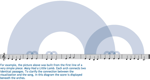
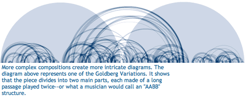
The project “Shape of a Song” by artist Martin Wattenberg and crew takes MIDI files and uses them to map out repetitive elements in songs in order to ‘see’ the patterns in the song.

I found this to be quite enlightening, at least with respect to repetitive musical elements. It doesn’t do much for pitch, tempo, or anything else critical to song-making. The point is not to detail what is missing here, the point is that seeing the song diagrams helped me to think differently about the experience of listening to songs.

This brought me back to the original quandary about whether humans perceive sensory input equally or differently. It seems to me that trying to depict sound as visual or the emotional register of an afternoon as sound requires border crossings, translation processes, that help pin down the original perceptual experience in such a way that it becomes more possible to assess whether the original perception is a shared experience.
The medium for this exchange seems to be a combination of emotion and hard-wired neurology which are not mutually exclusive categories. This isn’t a blog post about those questions. It is a blog for exploring the way that translating a perceptual experience – like hearing a song – into a visual infographic can change our understanding of the element (i.e. the song) in its original format.
First, just translating something into a visual medium might alter the emotional register. Colors are thought to have emotional registers. I’m not going to get into color theory in any kind of depth, but there have been a number of studies, some from evolutionary biology, that have shown red and orange to be routinely associated with danger. Thus, using them in graphics can evoke heightened awareness much like a little burst of adrenaline in a fight-or-flight situation would. Blue is supposed to be more calming; that’s probably why it is the go-to color for corporate America. All of the marketing people will have had color theory 101 beaten into them.
Secondly, translating a perceptual experience into something quantifiable offers are fairly rigid and particular framework for taking measurements and making assessments. I have a feeling that the quantitative turn itself has just as much impact on the interpreted meaning of the piece as the translation into a new perceptual format.

For ethnographers
Why are these questions about translation coming up? Because ethnographers – those whose craft is translating observations into written words – are constantly occupying themselves with the task of translating experiences and thoughts (often rather layered thoughts) into a static more-or-less linear narrative. Sometimes looking at how translation happens in another context – like from sound to image – can help isolate the process of translation so that the work of that mechanism becomes more obvious.
References
Wattenberg, Martin. (2010) “The Shape of a Song” at turbulence.org
