Data Pointed
I experienced the vastness of the internet today, stumbling across Data Pointed which is a not-new blog featuring original data visualizations. Why haven’t I come across it before? I wish I knew the answer to that as well as to the related question: how many other interesting data visualizations sites are out there that I do not know about?
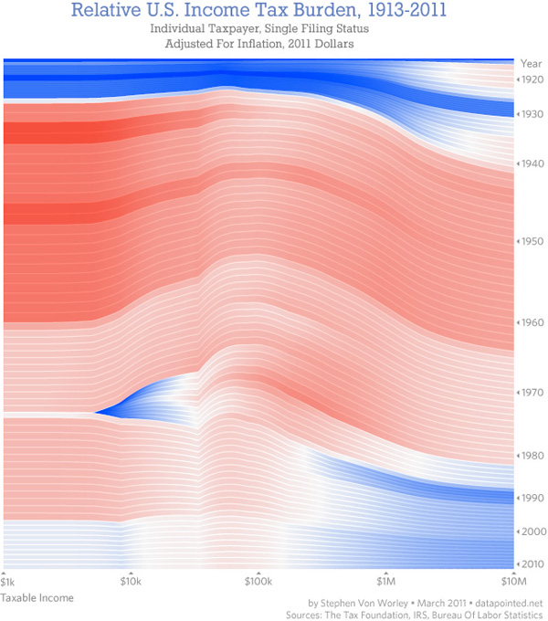
What you see above is the most recent post at Data Pointed by Stephen Von Worley. He produces sophisticated graphics across a wide array of subject areas. Just so happens that this one is about the inter-relationship of the income distribution and the tax distribution which is of keen interest to social scientists, and policy people in particular. I find this visualization to be beautiful looking but a little hard to read. Each year is represented by a line, that line is drawn through all of the income brackets you see along the x-axis. As the line passes through these income brackets it changes both color and thickness. Thick red lines indicate areas in which people are paying more than their share of taxes; thin blue lines are areas in which people are paying less than their share of taxes. Von Worley had this to say:
“A modified Reagan-era tax system lingers to this day. To his credit, Dubya did reduce taxes on very low earners, so they’re no longer getting hammered. But, the people at our economy’s core – the full-time workers earning between $20,000 and $150,000 a year – still pay at up to double the rate of the ultra-wealthy, relative to what history suggests they should.”
Personally, I had a hard time drawing that message out of the graphic, despite the fact that it is so beautiful and elegant that I was compelled to stare at it and read the explanation until I could figure out how it worked.
McDonald’s Distances in the US
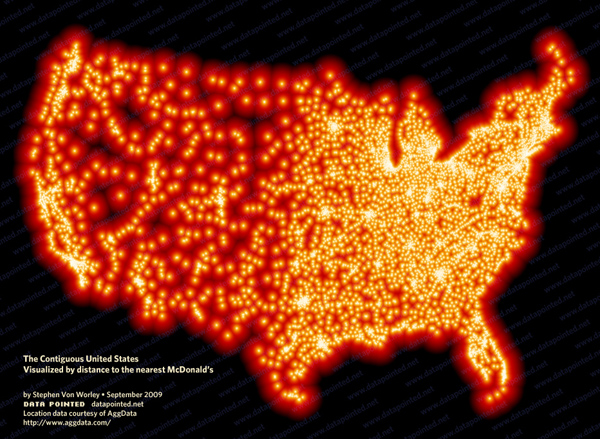
Von Worley himself notes that Data Visualization was not the popular success he had hoped, at least not at first. [Note: Graphic Sociology isn’t exactly a success in terms of page traffic, but it has a core of steady followers generating a four-digit count of unique page views per week.] Data Visualization got popular after Von Worley created the map graphic below that uses blobbiness to indicate distances between points on the US map and the nearest McDonald’s. The farthest you can get from a McDonald’s in the US is 107 miles and you would be in South Dakota.

Does the map work?
I am not entirely sure the map is working – again, it is beautiful. Beautiful is compelling and being compelled, I wanted to spend time looking at it. I also love that it kind of looks like fat globules. How appropriate and subtly political. We also end up with a very good proxy for American population density. Not bad. But what would have been even more awesome is if we could tell this was a distance map without having to read the caption. I want to know that there’s a McD’s at the center of each blob and that what I’m supposed to notice is the distance I need to go to get from the darkness to the light. (In my version, I might have had the centers of the blobs be dark and the peripheries be light but I’m guessing it wouldn’t read as well visually no matter how well it fits with my understanding of McD’s as a morally shady place.)
References
Stephen Von Worley (15 March 2011) Shifting Burdens: U.S. Taxes By Income Level Over The Years at Data Pointed Blog.
