What works
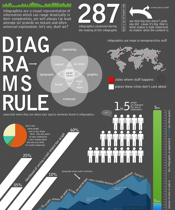
Using an infographic to deconstruct and critique trends in infographic design is a bit more clever than what I do – using text to deconstruct and critique infographics – though I still think there is good reason to do what I’m doing.
Even though Think Brilliant does a good job of spelling out some of tropes of information design that often populate information graphics, they leave some of these pesky problems obvious-yet-unarticulated. In particular, I love the way they split the word DIAGRAMS in odd places so that it would conform to the shape of the text box it inhabits. I very much dislike that sort of trick. The text need not conform so tightly to its text box that it stops looking like a word and starts looking like an advertisement for the typeface.
Click through on the image or the caption and read it over yourself. Notice that Think Brilliant agrees with me about maps – they get used at times when it seems as though there is barely any geographical information being displayed. Sure, cities exist somewhere in the global geography, but if the viewer is supposed to be comparing one city to the next, it is usually far easier to do that using a graph, table, or chart than a map. If you want to tell me about the weather, go ahead and use a map. But if there is no good reason to use a map rather than a chart or table, using that map often dilutes the message by implying that geography is the primary element determining the quantities in question when it is rarely the case that geography is primary.
I also dislike 3D graphs because they make it harder for the eye to connect the bar back to the axis in for purposes of interpretation. And even though it often seems that infographics have the number one purpose of being pretty, in fact, their number one purpose is to make complicated multi-variable situations easier to interpret.
Well done, Think Brilliant.
Friday afternoon thoughts about infographics vs. writing
Writing about something generally requires a linear interpretation because it is nearly impossible to read two things at the same time and it isn’t all that easy to read something that does not have a singular flow. I guess one could read unordered, bulleted lists…but that’s tedious and inelegant. Making an infographic does not require linearity. It does require just as much thought and craft as writing. Where the story is mostly linear, by all means do us all a favor and write about it. Unless you cannot write and then you are welcome to try your hand at infographic creation (ahem, NYU undergrads, that bit about not being able to write well includes more of you than you think).
In the best of all possible worlds, graphics will be used alongside writing in order to offer readers/viewers multiple ways to understand and engage with your work. Social scientists generally present multi-layered research findings based on sometimes complex sets of assumptions. Asking the reader to get with the program and hold all those moving parts in mind at once can be a lot to ask. For all we know, the reader has not consumed anywhere near the amount of caffeine that they need to operate at peak efficiency. Help the reader. Tell the same story with your words, graphics, and images. This goes for both qualitative and quantitative methods. Just because a project is based on interview and ethnographic data does not mean it is impossible to make graphics or acceptable to skip their inclusion in your work.
As you can see from the graphic above, people can see through designerly gimmicks. Folks want meaningful information in their graphics. Better to create a simple infographic that risks being a bit plain than to skip creating a graphic (or to turn a simple graphic into something that makes ridiculous use of 3D, color, maps, typeface, layout, or any other graphic design trope applied without any value-add in the meaning department).
