

What works
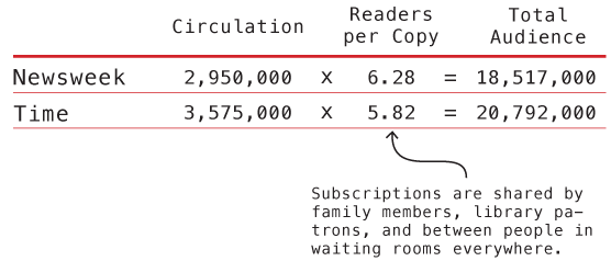
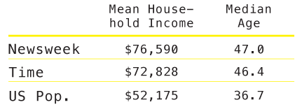
These graphics accompany the graphic in my previous post about the counts of humanitarian images in Time and Newsweek. They are meant to give context to the methods section which describes these two magazines in terms of a few demographic variables and circulation information. I do not have access to the original source so I could not go back and get more demographic information besides household income and readers’ ages. It is possible that those were the only two pieces of information available in that source about reader demographics.
What needs work
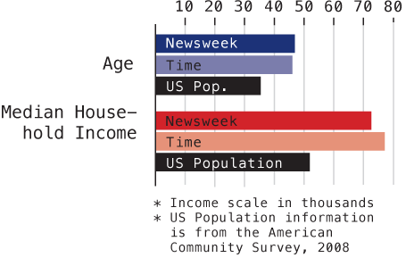
The big question is: do you like the graph of the demographic data or should I just leave it in a table? I won’t tell you which way I’m leaning so as not to prejudice your opinions.
Go ahead, feel free to leave a one word comment (the one word being graph, table, or neither). If you’re feeling especially motivated, it would be nice if you explained your reasoning. But it’s August, so I’ll cut you some slack if all you can muster is a single word.
References
American Community Survey – 2008.
Mediamark Research & Intelligence (MRI). 2008 (Fall). Magazine Audience Estimates. New York: MRI.

Comments 3
PS Birch — August 16, 2010
The table provides more detailed information and lends to a slightly more interesting analysis (e.g., Time and Newsweek readers are roughly the same age, but Newsweek readers appear to be slightly more successful, and they share that information with more people).
I'm not entirely sure what the bar graph adds to this conversation, except by visually noting the disparity between Time & Newsweek subscribers and the general US Population.
In regards the readers per copy, you note the ways subscriptions are shared. It might be interested to see the subsequent data normalized for private citizens -- excluding Doctors offices, libraries, etc, insomuch as that is possible.
Also, the table indicates Mean household income, while the bar graph labels this as the Median. Don't know if this was intentional or not, but if you were to include both I would use the same data points for both.
PS Birch — August 18, 2010
I would suggest the analysis of differences between Time and Newsweek is heavily dependent on the viewer's own income. Those within or below that band will likely focus on the 4k difference more than those below, who'll look more at the more significant digits. Those above will likely not find much meaning in the 4k difference at all, or perhaps even the 20-25k difference between Time or Newsweek readers and the US Median.
Also, I just noticed; the Time and Newsweek labels are flipped on the second set (income).