What works
1. Menlo is my favorite font of the moment for information graphics.
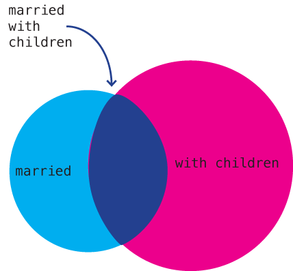
2. I have no idea why I haven’t seen this Venn diagram before. In my humble opinion, if you are a social scientist and you are attempting to display a concept that may or may not have solid numbers to back it up, start with the Venn diagram because:
a. Venn diagrams are easy to make.
b. Venn diagrams are easy to understand.
c. Venn diagrams are not expected to represent solid numbers. They certainly can be employed in that way, but they are not always employed in that way so you are not likely to mislead readers that you are backing your claim up with census data.
3. I am doing a bit of research on marriage and I have run up against many arguments that seem to believe that marriage and childbearing always go together, or at least that they OUGHT to always go together. News flash: 36.9% of children are born out of wedlock (Cherlin, 2008). Other adults get married but do not have children. Yet other adults get married, have children, and then end up unmarried again because divorce and death ended their marriage. The above graphic should help clear up what actually happens in the world. Marriage and child raising frequently have no overlap.
What needs work
I was so upset that I didn’t stop and look up the actual data for each of these segments. In part, I wanted to leave it as a universal concept and NOT tie it to US data. But yeah, I realize it would be better if I had sat down and figured out how many people are in each of these three areas. That’s coming in the article version. And after I take a deep breath to disperse the anger I feel at people who make illogical arguments.
References
Cherlin, Andrew. (2008) “The Marriage Go-Round.” New York: Vintage.


Comments 7
Jon Smajda — August 4, 2010
A good Venn diagram. Not sure about the data backing it up, but anecdotal evidence suggests this is very accurate.
PS Birch — August 5, 2010
You must certainly be in a tizzy still if you let "for each of these pieces of pie" stand :)
PS Birch — August 5, 2010
A Venn diagram is a good place to start with this, however your point (that marriage == kids is a false statement and the reality is much messier) may be more clearly made by representing _how_ messy it is. Here's a sample off the top of my head:
- Got married, [had kids | didn't have kids|adopted], [divorced|never divorced|death of spouse]
- Married once, [had kids | didn't have kids|had kids with someone other than spouse | adopted], [got divorced | never divorced | death of spouse]
- Had kids from previous [marriage(s)| out-of-wedlock | adoption], married a [first|second|third|fourth|Nth] time, [had more kids | didn't have more kids | adopted], [divorced | never divorced |death of spouse]
- Had children out of wedlock, married [child's other parent | someone else], [divorced | never divorced|death of spouse]
- Had children out of wedlock, never married
That would be an interesting Venn diagram
Loren Needles — August 10, 2010
Seems to me the two circles should be "Married" and "Children". The overlap is then married with children. You could add other overlapping circles to reveal sub-complexities.