Archive: Jul 2010

What facebook has to say about the World Cup
What facebook has to say about the World Cup | New York Times interactive graphic

What works

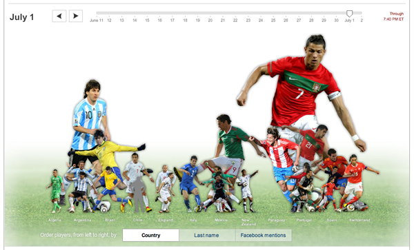
This is really fun to play with and technically sophisticated. Move the slider around the the image of the players grow and shrink relative to their mentions on facebook that day. Hold the mouse over a player and it will tell you their name, what country they play for, and the percentage of facebook wall posts in which they were mentioned that day.

Try it. You’ll like it.

What needs work

Of course, I lament the fact that so much time and effort is devoted to sport when it could be devoted to making similarly complex graphics about social science topics. On the other hand, I am somewhat glad that social scientists aren’t using facebook wall posts as evidence. Sure, they are useful within the realm of facebook, but even this example amply demonstrates that facebook is not holding a mirror up to the “real world”. (I believe facebook to be part of the real world, not a mirror of the real world. As such, it cannot be taken to contain some kind of 1:1 relationship with the rest of our experience, if only we can use bigger processors and more sophisticated techniques to analyze the steady flow of new data.)

I wonder how the mentions of individual players matches up with viewership information. While we’re wondering about that, I’d also add the wonder that the World Cup has inspired collective watching like nothing I can think of besides the Super Bowl and the World Series. Bars in Manhattan can barely contain all the people who want to watch. And people are watching on their computers (thanks univision!) at work. How does Nielsen deal with that? Will we ever have more or less accurate information about how many people watched the 2010 World Cup? Besides advertisers, does anyone care about how many of us watched this? (Personally, I’m curious to see the demographic breakdown of who watched – seems to skew quite young as far as sporting events go.)

Important note

Viva España!
But I won’t be posting to facebook about their match tomorrow because I’ll be too busy watching it. And then celebrating their win.

Reference

SHAN CARTER, BEN KOSKI and KEVIN QUEALY. (2 July 2010) Top World Cup Players on Facebook, Day by Day. New York Times interactive graphic.

Getting drugs to market faster, timeline graphic | Wired Magazine May 2010
Getting drugs to market faster | Wired Magazine May 2010

What works

I am not a huge fan of this graphic though I admit it works better in print than it does in this crappy scan of the print article. My apologies. Click through here for a crisp version.

In summary, the article is about the way that research is done in the presence of many more data points (specifically, complete DNA maps of numerous individuals) and much more processing capacity. They argue using a case study revolving around the personal story of Sergey Brin who is at risk of developing the as-yet-untreatable Parkison’s disease, that data mining means research will progress much faster with no loss of accuracy over traditional research methods. They use a medical research case so they get to conclude that moving to data mining will mean people who might have died waiting around for some peer review committee (or other tedious component of double-blind research methodology) will live. Hallelujah for data mining!

They summarize their happiness in this Punky Brewster of a timeline.

What needs work

First, why did the art director order a timeline and not a diagram about how the assumptions underlying the research method have changed? It is clear that the article is taking a stand that the new research methods are better because they are faster and, in the case of Parkinson’s, could save lives by speeding things up. That is undoubtedly true, as it would be for any disease for which we currently don’t have anything that could be referred to as a “cure”. However, as a skeptical sort of reader, I find it difficult to simply believe that the new data-mining variety research is always going to come up with such a similar result – “people with Parkinson’s are 5.4 times more likely to carry the GBA mutation” (hypothesis driven method) vs. “people with Parkinson’s are 5 times more likely to carry the GBA mutation” (data-mining method). If the article is about research methods, which is ostensibly what it claims. However, featuring the chosen cause of e-world celebrity Sergey Brin could indicate that Wired doesn’t so much care about changing research methods as it cares about selling magazines via celeb power. Fair enough. It’s kind of like when Newsweek runs a cover story about AIDS in Africa accompanied by a picture of Angelina Jolie cradling a thin African child. Are we talking about the issue or the celebrity? In this particular article, it seems to me that if the core message were to focus appropriately on the method, the graphic could have depicted all of the costs and benefits of each research model. The traditional model is slower but it makes more conservative assumptions and subjects all findings to a great deal of peer review which offers fairly robust protection against fallacies of type 1 and type 2 (ie it protects us from rejecting a true hypothesis as false and accepting a false hypothesis as true). In the data mining scenario, since the process begins not with a hypothesis but with the design of a tool, there are reasons to believe that we may be more likely to run into trouble by designing tools that too narrowly define the problem. A graphic describing just how these tools are constructed and where the analogous checks and balances come in – where are the peer reviewers? What is the hypothesis? How do data-miners, who start by developing tools to extract data rather than hypotheses in line with the current literature, make sure they aren’t prematurely narrowing their vision so much that they only end up collecting context-free data (which is basically useless in my opinion)?

Don’t get me wrong, I am excited by the vast quantities of data that are both available and easy to analyze on desk top computers (even more can be done on big work stations and so forth). Caution is in order lest we throw out all that is reliable and robust about current research methods in favor of getting to a result more quickly. We could use the traditional hypothesis driven, double-blind kind of trial procedure coupled with the power of DNA analysis and greater processing capacity. It’s somewhat unclear why we would abandon the elements of the traditional scientific method that have served us well. There is a way to integrate the advances in technology to smooth over some of our stumbling blocks from the past without reinventing the wheel.

Concerns about the graphic

My second major problem is that this graphic is one of a type commonly referred to as a ‘time line’. In this case, what we appear to have is a time line warped by a psychedelic drug. This might, in fact, be appropriate give that the article is about neurology and neuropathy. Yet, the darn thing is much harder to read in the Rainbow Brite configuration than it would be if it were, well, a line. Time. Line. And the loop back factor implies that there is going to be a repetition of the research cycle starting with the same question (or dataset) all over again. That’s sort of true – the research cycle has a repetitive quality – but it is not strictly true because hopefully the researchers will have learned enough not to ask the exact same question, following the exact same path all over again.

References

Goetz, Thomas. (July 2010) Sergey’s Story Wired Magazine.

Wired magazine. (12 March 2009) Science as Search: Sergey Brin to Fund Parkinson’s Study on the Wired Science blog.

23andme (11 March 2009) A New Approach to Research: The 23andMe Parkinson’s Disease Initiative. [This was an early announcement about this project from 23andme who offered the DNA analysis].